Who invented the color wheel?
Short answer
Sir Isaac Newton is credited with inventing the first color wheel in 1666. By refracting white light through a prism, he identified the visible spectrum and joined the two ends of the color band to form a circle. This scientific breakthrough laid the foundational framework for understanding color relationships in art and science.
On this page
Who invented the color wheel?
Sir Isaac Newton developed the first circular color diagram in 1666 as part of his groundbreaking research into optics. While experimenting with prisms, he discovered that white light is composed of a spectrum of colors. He mapped these colors—red, orange, yellow, green, blue, indigo, and violet—onto a circle to demonstrate their physical relationships. Newton’s primary goal was to show how colors could be organized based on their wavelengths and how they interact when blended.
This innovation was not initially intended for artists but rather for scientists studying the physics of light. By arranging the colors in a wheel, Newton illustrated that colors possess a logical order and a mathematical structure. His work effectively bridged the gap between the study of light and the practical application of pigments, establishing a precedent that would influence color theory for centuries to come.
How does the color wheel work?
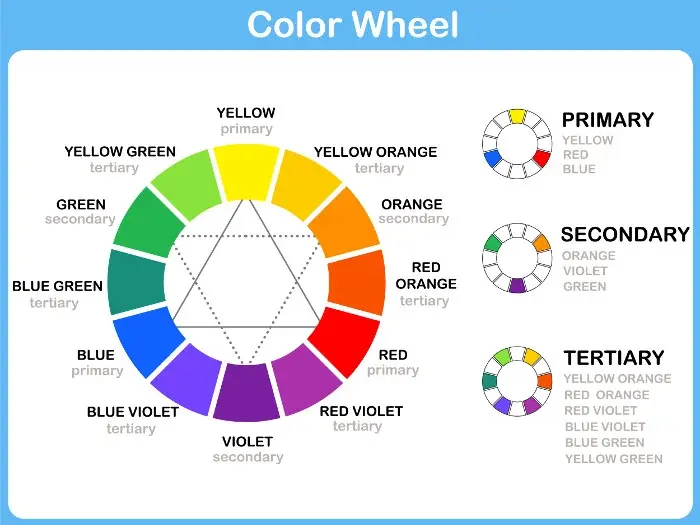
The modern color wheel functions as a visual representation of how colors relate to one another. It is organized into three distinct categories that help designers and artists create balanced compositions. Understanding these categories is essential for anyone looking to master color theory in their own work.
- Primary colors: Red, yellow, and blue, which cannot be created by mixing other pigments.
- Secondary colors: Green, orange, and purple, created by mixing two primary colors.
- Tertiary colors: Hues created by mixing a primary color with an adjacent secondary color.
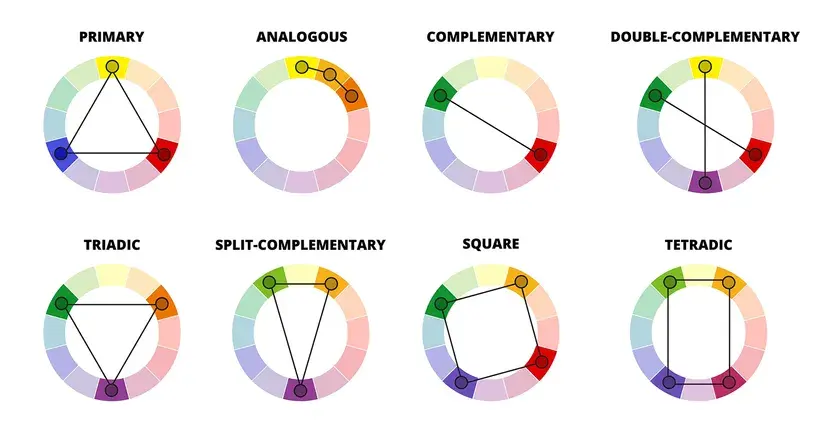
These colors are arranged so that complementary colors—those directly opposite each other—create the highest contrast. Analogous colors, which sit side-by-side, provide a harmonious, softer look. By using the wheel as a guide, you can predict how different hues will interact within a design, ensuring that your color choices are intentional rather than accidental.
How to use the color wheel for design
Using the color wheel effectively involves selecting a color scheme that suits the mood or purpose of your project. Whether you are painting a room or designing a logo, the wheel provides a reliable roadmap for success. Follow these steps to build a professional-grade color palette:
- Choose a base color that will serve as the primary focus of your design.
- Select a color harmony, such as monochromatic, complementary, or triadic, to determine your secondary colors.
- Adjust the saturation and brightness of your chosen hues to create depth and visual interest.
- Test your palette on a small scale before applying it to your entire project to ensure the colors work well together.
By following this systematic approach, you can avoid the frustration of clashing colors. Always remember that the color wheel is a tool for guidance, not a rigid set of laws that must be followed without exception.
Why do artists use the color wheel?
Artists rely on the color wheel to achieve visual balance and emotional impact in their work. Because human eyes are naturally drawn to specific color combinations, using the wheel allows creators to manipulate viewer perception. For instance, using complementary colors can make a subject pop, while analogous colors can create a sense of calm and unity.
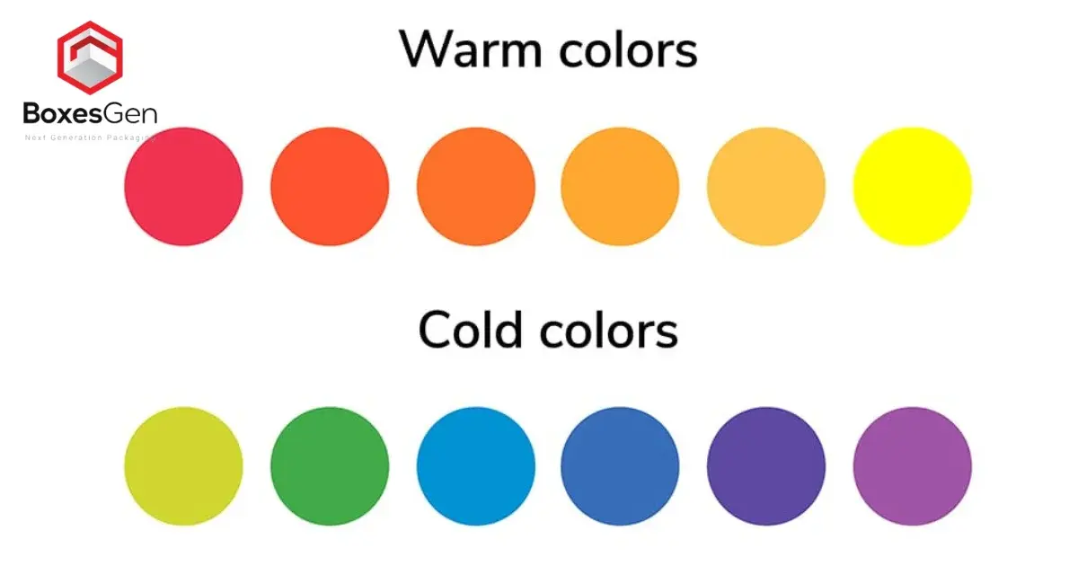
Beyond aesthetics, the color wheel helps artists understand the temperature of colors. Warm colors, such as reds and yellows, tend to advance toward the viewer, while cool colors, like blues and greens, seem to recede. By strategically placing these colors, an artist can create the illusion of three-dimensional space on a flat surface. This scientific approach to art ensures that the final piece communicates the intended message clearly and effectively to the audience.
Common mistakes when using the color wheel
One of the most frequent errors beginners make is using too many colors at once. This often leads to a chaotic, overwhelming design that lacks a clear focal point. To avoid this, try to limit your palette to three or four colors, using the wheel to ensure they share a logical relationship. Another common mistake is ignoring the importance of neutral colors like white, black, or gray. These tones are vital for providing the eye with a place to rest, preventing the vibrant colors from becoming visually taxing.
- Over-saturating every color in your design, which makes it feel aggressive.
- Neglecting the value of colors, which refers to how light or dark they are.
- Failing to consider the context of the environment where the colors will be displayed.
Always check your work in different lighting conditions, as light can drastically alter how colors appear. By being mindful of these pitfalls, you can use the color wheel to elevate your creative projects and achieve professional results every time you sit down to work.
Key facts
- Sir Isaac Newton is credited with inventing the first circular color diagram in 1666.
- Newton divided the visible spectrum into seven colors: red, orange, yellow, green, blue, indigo, and violet.
- He joined the two ends of the spectrum to form a circle, illustrating the relationship between colors.
- Johann Wolfgang von Goethe later expanded this concept in 1810 by focusing on the psychological impact of colors.
- Johannes Itten, a teacher at the Bauhaus school, developed the modern 12-hue color wheel used by designers today.
- To use a color wheel effectively, select colors that are directly opposite each other to create high-contrast, complementary schemes.
The bottom line
The color wheel evolved from Sir Isaac Newton’s 17th-century scientific observations into the practical design tool used by artists today. By organizing hues into a logical circular format, it reveals the relationships between colors, helping creators achieve balance and harmony. Whether you are painting a room or designing a digital graphic, understanding these foundational color interactions is essential for making informed and aesthetically pleasing choices.
People also ask
What is the difference between primary and secondary colors?
Primary colors—red, yellow, and blue—cannot be created by mixing other colors together. Secondary colors, such as green, orange, and violet, are produced by mixing two primary colors in equal proportions.
Read the full answer →How do I use a color wheel to pick a paint palette?
Choose a base color and then look at the wheel to find its complement, which sits directly across from it. For a more subtle look, choose three colors that sit next to each other, known as an analogous scheme.
Why are there different versions of the color wheel?
Different wheels serve different purposes, such as the RYB model for painters and the RGB model for digital screens. Each model is designed to represent how light or pigments interact within a specific medium.
What is a common mistake when using a color wheel?
A frequent error is using too many bright, saturated colors at once, which can overwhelm the eye. Balance your chosen colors by adding neutral tones like white, gray, or black to create visual harmony.
How does the color wheel help with interior design?
It provides a mathematical framework for creating balanced rooms. By following established rules like triadic or split-complementary schemes, you ensure that the colors in your space feel intentional rather than chaotic.
Can I create my own color wheel?
Yes, you can start by painting the three primary colors at equal intervals on a circle. Then, mix these to create secondary colors, and finally blend those to fill in the tertiary gaps.
This answer was created with the help of AI research tools and reference sources. Spotted an error? Let us know — we correct mistakes quickly. See our editorial policy.