What are tertiary colors?
Short answer
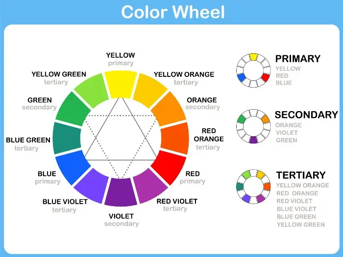
Tertiary colors are created by mixing a primary color with an adjacent secondary color on the color wheel. These six hues—such as red-orange, yellow-orange, yellow-green, blue-green, blue-violet, and red-violet—bridge the gap between primary and secondary colors, providing artists and designers with a broader, more nuanced palette for sophisticated color compositions.
On this page
What are tertiary colors exactly?
Tertiary colors represent the third level of color classification within the traditional RYB (red, yellow, blue) color model. While primary colors like red, yellow, and blue serve as the foundation, and secondary colors like green, orange, and purple result from mixing two primaries, tertiary colors emerge from a more specific blend. Specifically, they are formed by combining one primary color with an equal amount of a neighboring secondary color. This blending process produces colors that are more complex and subtle than their parent hues, acting as the essential "in-between" shades that allow for smooth gradients and naturalistic transitions in art.
The six recognized tertiary colors are named by combining the names of the two colors used to make them, with the primary color typically listed first. For instance, mixing primary yellow with secondary green results in yellow-green. This systematic naming convention helps artists identify the exact composition of a hue at a glance. By understanding these relationships, you can better predict how colors will interact, which is vital for creating harmonious designs that feel balanced rather than chaotic or jarring.
How to mix tertiary colors effectively
To achieve the most accurate tertiary colors, you must maintain precise ratios during the mixing process. Using too much of one color will cause the resulting hue to lean too heavily toward that parent, losing the distinct character of the tertiary shade. Start with a small amount of the primary color and gradually introduce the secondary color until you reach the desired balance. It is always easier to add more paint than it is to correct an oversaturated mixture, so work slowly and keep your brush clean between additions to avoid muddying the pigment.
Follow these steps to create a consistent tertiary palette:
- Select a primary color, such as blue, and its adjacent secondary color, such as green.
- Place a small dollop of each on your palette, ensuring they are separated by enough space to avoid premature mixing.
- Use a palette knife to pull a small amount of each color into a neutral area between them.
- Blend the two pigments thoroughly until you achieve a uniform color that sits visually between the blue and the green.
- Adjust the hue by adding a tiny amount of either parent color if the result is not yet the desired blue-green shade.
Best ways to use tertiary colors in design
Tertiary colors are excellent for creating depth and interest in a design because they are inherently more complex than primary or secondary colors. In interior design, they are often used to create a sophisticated, high-end look because they do not have the aggressive intensity of pure primary colors. For example, using red-violet as an accent wall can provide warmth and drama without the overwhelming boldness of pure red. They work exceptionally well in "analogous" color schemes, which utilize colors that sit next to each other on the wheel to create a sense of calm and visual flow.
When building a color scheme, consider these common applications for tertiary hues:
- Fashion design: Using blue-violet to create a calming, professional aesthetic in apparel.
- Graphic design: Incorporating yellow-orange to add a sense of energy and optimism to logos or marketing materials.
- Fine art: Utilizing red-orange to create focal points that draw the viewer's eye toward specific areas of a canvas.
- Landscape design: Selecting yellow-green foliage to provide a vibrant, lively contrast against darker, more muted garden elements.
Common mistakes when mixing tertiary colors
One of the most frequent errors beginners make is over-mixing their pigments, which often leads to a dull, muddy appearance. This happens when you continue to stir the paint long after the colors have combined, or when you use a dirty brush that introduces unwanted pigments into the mix. Another common mistake is failing to account for the "tinting strength" of certain colors. For instance, a small amount of blue can quickly overpower a larger amount of yellow, turning a intended yellow-green into a dark, muddy green. Always test your colors on a scrap piece of paper before applying them to your final project.
You should also avoid these pitfalls to maintain color clarity:
- Do not mix more than two colors at once, as adding a third color often results in a neutral brown or gray.
- Avoid using low-quality paints that contain too much filler, as these will never produce vibrant tertiary shades.
- Do not ignore the lighting conditions of your workspace, as artificial or natural light can drastically change how a tertiary color appears to the human eye.
- Never assume that all red-oranges are identical; different brands of paint use different pigments, which will affect the final outcome.
Why tertiary colors matter in color theory
Tertiary colors are the key to unlocking a truly professional-looking color wheel. Without them, the jump between colors is too abrupt, making it difficult to create realistic shading or subtle highlights in a painting. By including these intermediate steps, you provide your eyes with a logical progression of hues, which makes images look more three-dimensional and lifelike. Understanding these colors is a fundamental step for anyone moving from basic color theory to advanced artistic techniques, as it allows for the creation of nuanced palettes that reflect the complexity of the natural world.
Beyond technical skill, mastering tertiary colors improves your visual literacy. You will begin to see the world not just in basic categories like "green" or "orange," but in a spectrum of specific, identifiable tones. This awareness allows you to make more informed decisions about everything from the clothes you wear to the way you decorate your living space. By practicing the identification and creation of these colors, you develop a more refined aesthetic sense that will serve you in any creative endeavor you choose to pursue throughout your life.
Key facts
- Tertiary colors are created by mixing one primary color with an adjacent secondary color.
- The standard color wheel includes six tertiary colors: red-orange, yellow-orange, yellow-green, blue-green, blue-violet, and red-violet.
- These colors are also known as intermediate colors because they sit between the primary and secondary hues.
- To create a tertiary color, mix a 1:1 ratio of the primary and secondary colors for a balanced, vibrant result.
- Avoid over-mixing paints, as adding too much of a third color can turn the mixture into a dull, muddy brown.
- Artists use tertiary colors to add nuance and complexity to a composition, bridging the gap between bold primary and secondary tones.
The bottom line
Tertiary colors are essential tools for any artist or designer looking to expand their palette beyond basic hues. By blending primary and secondary colors, you create sophisticated tones that add depth, harmony, and visual interest to your work. Mastering these intermediate shades allows for subtle color transitions and more professional results, ensuring your projects feel balanced, intentional, and vibrant rather than flat or overly simplistic.
People also ask
How do tertiary colors differ from secondary colors?
Secondary colors are made by mixing two primary colors, such as blue and yellow to make green. Tertiary colors are more complex because they involve mixing a primary color with a secondary color.
Are tertiary colors considered neutral?
No, tertiary colors are chromatic, meaning they possess a distinct hue. Neutrals are colors like gray, brown, or beige that lack strong chromatic content.
Can you create a tertiary color using only primary colors?
Yes, you can create a tertiary color by mixing two parts of one primary color with one part of another. For example, two parts yellow and one part blue will result in a yellow-green tertiary shade.
Why do some tertiary colors look brown?
If you mix complementary colors—those directly opposite on the color wheel—you will neutralize the hue into brown or gray. Ensure your primary and secondary colors are adjacent to maintain a clean, bright tertiary color.
Do tertiary colors have specific names in interior design?
Designers often use descriptive names like teal, chartreuse, or coral to identify tertiary colors. These names help communicate the specific temperature and mood of the color more effectively than technical labels.
How many colors are in the traditional RYB color wheel?
The traditional RYB color wheel contains 12 colors total. This includes three primary colors, three secondary colors, and six tertiary colors.
This answer was created with the help of AI research tools and reference sources. Spotted an error? Let us know — we correct mistakes quickly. See our editorial policy.