What are pastel colors?
Short answer
Pastel colors are soft, muted tints created by mixing a pure, saturated hue with a significant amount of white. These desaturated shades possess high luminosity and low saturation, resulting in a gentle, calming aesthetic. Often associated with springtime and light, pastels are widely used in interior design, fashion, and graphic arts.
On this page
What defines a pastel color?
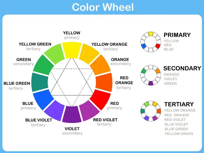
Pastels are technically classified as tints in color theory. A tint is produced when a base color is blended with white, which increases the lightness of the hue while reducing its intensity. Unlike neon or primary colors, which command immediate attention, pastels are characterized by their subtlety and airy quality. They occupy the space between vibrant colors and white, creating a soothing visual experience that is easy on the eyes.
The psychological impact of these colors is significant, as they are frequently linked to feelings of tranquility, youth, and cleanliness. Because they lack the aggressive intensity of darker or more saturated tones, they are often utilized in environments where relaxation is the primary goal. Whether it is a nursery, a spa, or a spring wardrobe, pastels provide a sense of harmony and balance. Their versatility allows them to act as neutral backgrounds or soft accents in a broader color palette.
How to create pastel color palettes
Designing with pastels requires an understanding of balance to avoid a look that feels too washed out or juvenile. When building a palette, it is helpful to start with one primary pastel shade and complement it with neutral tones like cream, light gray, or soft beige. If you want to use multiple pastels together, ensure they share a similar temperature—either warm or cool—to maintain visual cohesion.
- Choose a dominant base pastel, such as soft mint or pale lavender.
- Add a neutral anchor color to prevent the design from feeling cluttered.
- Introduce a slightly darker or more saturated accent color to provide necessary contrast.
- Test the balance by squinting at your palette; if it looks like a flat, uniform blur, add a deeper shade to ground the composition.
Common mistakes include using too many competing pastels at once, which can make a space feel chaotic. Additionally, failing to incorporate texture can make pastel-heavy designs appear sterile or uninspired.
Where are pastel colors used?
Pastels have a long history of use across various creative industries. In interior design, they are a staple for creating light, airy rooms that maximize natural illumination. In fashion, they are perennial favorites for spring and summer collections, representing renewal and lightheartedness. Graphic designers also rely on these shades for user interfaces, as they provide a clean, modern aesthetic that is less straining than high-contrast, bold color schemes.
- Interior design: Used on walls, upholstery, and decorative pillows to create a serene atmosphere.
- Fashion: Popular in light fabrics like linen, silk, and cotton for seasonal apparel.
- Graphic design: Utilized in mobile app backgrounds and branding to evoke a friendly, approachable tone.
- Fine art: Frequently employed in watercolor painting and impressionist works to capture light and atmosphere.
These applications demonstrate that pastels are not merely decorative but functional tools for influencing mood and perception.
How to mix pastel paints
Mixing your own pastel colors is a practical skill for artists and DIY enthusiasts. The process is straightforward, but it requires patience to achieve the exact shade you desire. Always start with a large amount of white paint and add the concentrated color in very small increments. It is much easier to darken a tint than it is to lighten a mixture that has become too saturated.
- Begin with a clean palette and a generous dollop of white paint.
- Dip your brush into the desired saturated hue and mix it into the white.
- Stir thoroughly until the color is consistent and no streaks remain.
- Compare your result against a reference or test it on a scrap piece of paper.
- If the color is still too intense, add more white until you reach the desired level of softness.
Avoid using dirty brushes or mixing too many different hues at once, as this will result in a muddy, unattractive gray rather than a clean pastel.
Common mistakes when using pastels
One of the most frequent errors when working with pastels is neglecting the importance of contrast. Because these colors are inherently light, they can easily disappear against white backgrounds or look washed out in bright lighting. To solve this, designers often pair pastels with darker, muted tones or metallic accents like gold or copper. This provides the necessary structure to keep the design from feeling too soft or indistinct.
Another common mistake is ignoring the undertones of the colors chosen. For example, a "cool" pastel blue might clash with a "warm" pastel yellow if they are placed directly next to each other without a bridge color. Always consider the lighting conditions of your space or project; natural sunlight can make pastels look even lighter, while artificial yellow-toned lighting can shift the appearance of the colors entirely. By carefully evaluating the environment and balancing the saturation levels, you can effectively harness the gentle, inviting nature of the pastel spectrum in any project you undertake.
Key facts
- Pastel colors are created by mixing a base hue with a high proportion of white, resulting in a low-saturation, high-value appearance.
- The term "pastel" originates from the Italian word "pastello," referring to the dry pigment sticks used by artists since the 16th century.
- Common pastel shades include baby blue, mint green, lavender, peach, pale yellow, and blush pink.
- In color theory, pastels are categorized as "tints" because they occupy the lighter end of the color spectrum.
- When decorating, pastels are frequently used to create a sense of calm, airiness, and soft illumination in interior spaces.
- A common mistake is pairing too many pastels together, which can make a room look washed out; experts recommend adding a neutral or a darker accent color for contrast.
The bottom line
Pastel colors are soft, light-valued tints achieved by blending pure pigments with significant amounts of white. These versatile shades offer a soothing aesthetic perfect for interior design, fashion, and artistic expression. By understanding the balance between white and base pigment, you can effectively incorporate these gentle hues into your life, ensuring you maintain visual interest by pairing them thoughtfully with bolder, contrasting accents or neutral tones.
People also ask
Are pastel colors considered warm or cool?
Pastels can be either warm or cool depending on the base color used. For example, pale yellow and peach are warm, while mint green and lavender are generally considered cool.
How do I mix pastel paint colors at home?
Start with a large amount of white paint and add your chosen color in very small increments. Stir thoroughly until you reach the desired lightness, testing the color on a scrap piece of paper as it dries.
Why are pastels often associated with spring?
Pastels are traditionally linked to the spring season because they mimic the soft, fresh colors of blooming flowers and budding leaves. This association is reinforced by their frequent use in Easter and springtime marketing campaigns.
Do pastel colors look good on all skin tones?
While anyone can wear pastels, certain shades flatter specific undertones better than others. Cool-toned skin often pairs well with icy blues and lavenders, while warm-toned skin may look better in creamy peaches or soft yellows.
Can pastel colors make a small room look larger?
Yes, because pastel colors are light and reflective, they help bounce natural light around a room. This creates an optical illusion of depth, making small or cramped spaces feel more open and airy.
Is there a difference between "muted" colors and "pastels"?
Yes, muted colors are created by adding gray to a hue, which lowers the intensity without necessarily making it lighter. Pastels are specifically created by adding white, which increases the brightness while reducing the intensity.
This answer was created with the help of AI research tools and reference sources. Spotted an error? Let us know — we correct mistakes quickly. See our editorial policy.