What is the complementary color of teal?
Short answer
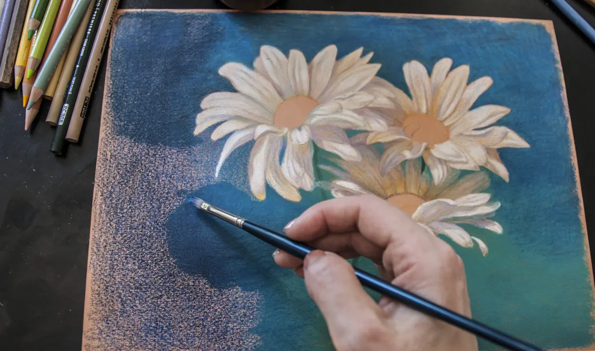
The complementary color of teal is a reddish-orange, often described as coral or a warm terracotta. In color theory, complementary colors sit directly opposite each other on the color wheel. Because teal is a dark, blue-green hue, its direct opposite is a vibrant, warm red-orange that provides maximum visual contrast.

On this page
How to find complementary colors on the color wheel
The color wheel is a circular diagram that organizes colors based on their chromatic relationship. Primary colors—red, yellow, and blue—form the foundation, while secondary colors like green, orange, and purple emerge from mixing them. Teal is a tertiary color, created by blending blue and green. When you identify the position of a specific hue on the wheel, the complementary color is always located exactly 180 degrees across from it.
Using this geometric approach helps designers create balanced palettes. Because teal leans heavily into the cool spectrum, pairing it with its warm opposite creates a dynamic tension that draws the eye. This relationship is foundational in art and interior design, as it ensures that colors do not look muddy or discordant when placed side-by-side. To visualize this, imagine a standard 12-hue color wheel:
- Locate the blue-green segment where teal resides.
- Trace a straight line directly across the center point.
- Identify the red-orange segment on the opposite edge.
Why teal and coral create high visual contrast
Contrast is the degree of difference between two elements in a design. When you pair teal with its complementary reddish-orange, you achieve the highest possible level of contrast in terms of temperature. Teal is inherently cool and calming, while coral or terracotta-toned oranges are warm and energetic. This combination works because the human eye naturally seeks balance; the intensity of the warm tone makes the cool tone appear deeper and more saturated.
This pairing is frequently used in branding and fashion because it feels both sophisticated and energetic. If you want to highlight a specific element, such as a call-to-action button on a website or an accent pillow in a living room, placing a coral object against a teal background ensures the object stands out immediately. The key to success is adjusting the brightness and saturation of the colors so that they do not compete for dominance, but rather support one another in the composition.
How to use teal and its complement in interior design
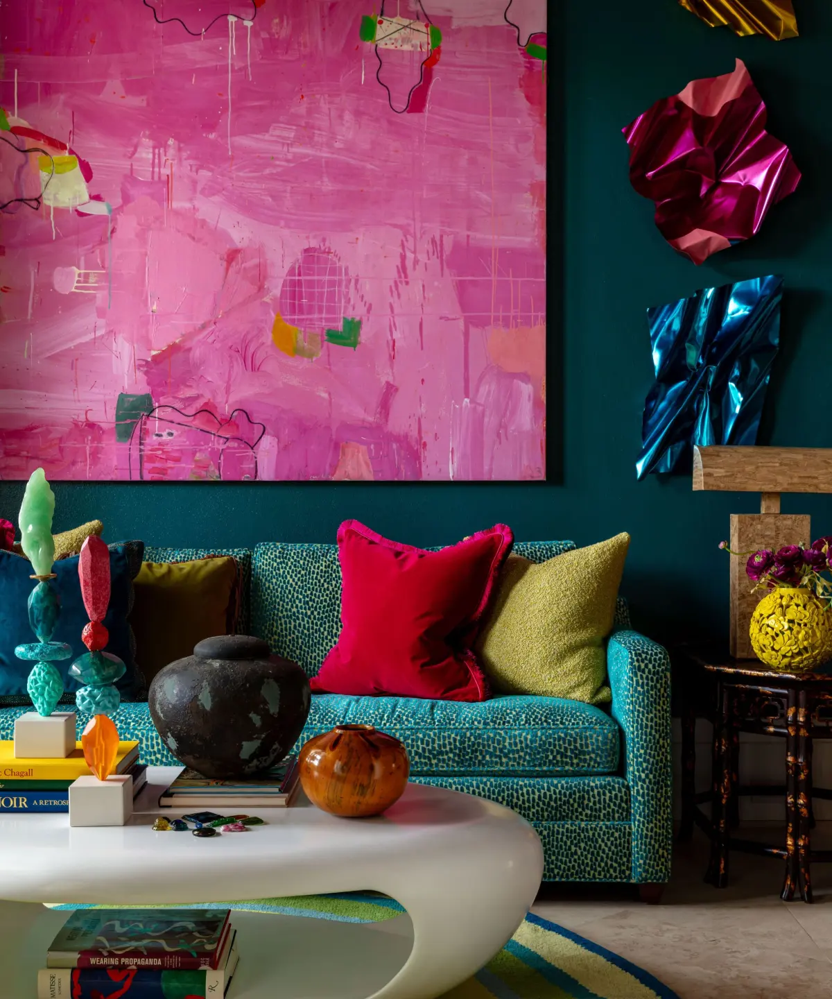
Integrating teal and coral into a home requires a strategic approach to avoid overwhelming the space. Because both colors are typically quite saturated, they can easily dominate a room if used in equal proportions. Professionals often recommend the 60-30-10 rule, where 60 percent of the room is a neutral base, 30 percent is a secondary color, and 10 percent is an accent color.
- Paint the walls in a neutral tone like warm gray or cream to provide a canvas.
- Use teal for larger furniture items, such as a velvet sofa or a set of curtains.
- Introduce coral through smaller accessories like throw pillows, artwork, or decorative vases.
- Add metallic elements like gold or brass to bridge the gap between the cool teal and warm coral.
By following these steps, you ensure that the vibrant contrast of the complementary colors adds personality to the room without making the environment feel chaotic or visually exhausting.
Common mistakes when pairing complementary colors
One of the most frequent errors when working with complementary colors is failing to account for value and saturation. If you choose a dark, muted teal and pair it with a neon, high-intensity orange, the result can be jarring rather than harmonious. The colors may vibrate against each other, causing eye strain. Always consider the "weight" of the colors; if one is very dark, the other should ideally have a similar depth or a carefully calculated brightness to maintain balance.
Another common mistake is using the colors in equal amounts across a large surface area. This creates a "tug-of-war" effect where the viewer's eye does not know where to focus. Instead of splitting the space 50/50, designate one color as the primary anchor and the other as the secondary accent. Avoiding these pitfalls ensures that your design choices remain intentional, professional, and aesthetically pleasing to the viewer.
Best ways to balance bold color palettes
If you find that direct teal and coral pairings feel too aggressive for your personal style, you can soften the effect by using variations of the colors. Instead of a bright, true orange, consider a muted terracotta or a dusty sunset pink. These shades still function as complements to teal but offer a more subdued, mature aesthetic. You can also incorporate neutral bridge colors to act as a buffer between the two high-contrast hues.
- Introduce white or off-white to provide "breathing room" between the colors.
- Use wood tones to ground the vibrancy of the teal and coral.
- Incorporate textures like linen or wool to soften the visual impact of the colors.
- Experiment with different shades of teal, such as deep navy-teal or light seafoam, to see how they interact with different intensities of red-orange.
By experimenting with these variations, you can maintain the fundamental harmony of the complementary relationship while tailoring the final look to fit your specific project requirements or personal preferences.
Key facts
- The complementary color of teal is a reddish-orange, often described as coral or a warm terracotta.
- Teal is a medium-to-deep blue-green hue, created by mixing blue and green with a touch of white.
- On a standard 12-hue color wheel, complementary colors sit directly opposite one another to create maximum visual contrast.
- Using teal and coral together creates a vibrant, balanced palette suitable for both interior design and graphic branding.
- To soften the intensity of this pairing, incorporate neutral tones like cream, charcoal, or soft gray to bridge the gap between the two opposites.
- A common mistake is using two colors of identical saturation and brightness, which can cause "vibrating" edges that strain the eyes.
The bottom line
The complementary color of teal is reddish-orange, a pairing that offers a striking balance between cool, calming blue-greens and warm, energetic tones. By understanding this relationship, you can create visually dynamic designs that feel intentional and harmonious. Whether you are painting a room or designing a logo, use these opposites strategically to ensure your color palette remains balanced, professional, and aesthetically pleasing to the viewer.
People also ask
Does teal look good with yellow?
Teal and yellow create a high-energy, analogous-adjacent scheme that feels fresh and modern. Because yellow is a primary color and teal is a secondary blend, they work well when one is used as an accent against the other.
Is turquoise the same as teal?
No, turquoise is generally brighter and contains more yellow than teal. Teal is darker, muted, and leans closer to the blue end of the spectrum, which changes its specific complementary match.
How do I use complementary colors in a room?
Follow the 60-30-10 rule: use a neutral for 60% of the space, a primary color for 30%, and the complementary accent for the final 10%. This prevents the bold contrast from overwhelming the room's design.
What is the difference between complementary and split-complementary?
Complementary colors use two hues directly across from each other. Split-complementary uses a base color and the two colors adjacent to its direct opposite, offering a softer, more sophisticated contrast.
Can teal be considered a neutral?
In interior design, deep, dark teal is often treated as a neutral because it pairs easily with a wide variety of textures and wood tones. It provides depth without the harshness of pure black.
Why do complementary colors vibrate when placed together?
This optical effect occurs when two highly saturated colors of similar value are placed side-by-side. The human eye struggles to focus on both simultaneously, causing the boundary between them to appear to flicker.
This answer was created with the help of AI research tools and reference sources. Spotted an error? Let us know — we correct mistakes quickly. See our editorial policy.