What are the primary colors in painting?
Short answer
The primary colors in traditional painting are red, yellow, and blue. These three pigments are considered primary because they cannot be created by mixing other colors together. By combining these primaries in varying proportions, artists can produce a wide spectrum of secondary and tertiary colors to complete their compositions.
On this page
What are the primary colors in painting?
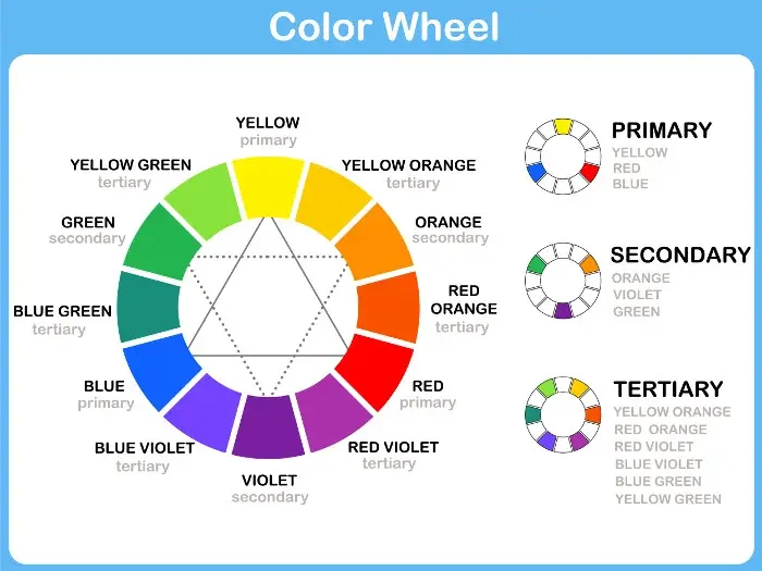
In the context of traditional fine arts and color theory, the primary colors are red, yellow, and blue. These hues serve as the foundational building blocks for the color wheel. Because they are elemental, you cannot derive them from any combination of other pigments. When you purchase a basic set of paints, these are the three colors that allow you to explore the full potential of your palette.
While light-based color systems—such as those used for digital screens—rely on Red, Green, and Blue (RGB), painters utilize the Subtractive Color Model. This system works by absorbing specific light wavelengths and reflecting others. By mastering the interaction between red, yellow, and blue, you gain the ability to mix almost any color required for your artwork, from vibrant oranges to subtle, muddy earth tones.
How do you mix primary colors?
Mixing colors is a fundamental skill that requires practice and patience. When you combine two primary colors, you create a secondary color. For example, mixing red and yellow produces orange, while yellow and blue creates green. Combining blue and red results in violet. These secondary colors act as the bridge between your primary pigments.
To achieve consistent results, follow these basic steps for color blending:
- Start with a small amount of the lighter color on your palette.
- Gradually add the darker color in tiny increments, mixing thoroughly after each addition.
- Test your mixture on a scrap piece of paper or canvas before applying it to your final work, as colors often darken or shift when they dry.
- Clean your brush completely between color changes to avoid muddying your mixtures with residual pigment.
Why do colors look muddy when mixed?
Many beginners experience "muddy" colors, which occur when you mix all three primary colors together or use low-quality pigments. When you combine red, yellow, and blue in equal proportions, you neutralize the chroma, resulting in a dark gray or brownish tone. While this can be useful for creating shadows, it is often frustrating when you are attempting to create a clean, vibrant hue.
Another common cause of muddy color is contamination. If your brush is not properly cleaned, small amounts of a previous color will bleed into your new mixture. This is especially problematic when working with yellow, as it is the most sensitive color to contamination. To keep your mixtures vibrant, always keep two jars of water nearby: one for the initial rinse and one for the final cleaning of your brush.
Best primary paint sets for beginners
For those just starting their artistic journey, investing in a high-quality "primary" set is more effective than buying a large kit with dozens of colors. A professional-grade set of red, yellow, and blue allows you to understand color temperature and mixing ratios without the distraction of pre-mixed tubes. Look for pigments labeled as "cadmium-free" or "artist-grade" to ensure high lightfastness and color intensity.
When selecting your paints, consider these essential types:
- Cadmium Red or Naphthol Red: Provides a strong, warm base for mixing.
- Cadmium Yellow or Hansa Yellow: Offers the necessary brightness for light-value mixtures.
- Ultramarine Blue or Phthalo Blue: Acts as the deep, cool anchor for your palette.
- Titanium White: Essential for adjusting the value and tint of your primary mixtures.
Common mistakes when mixing colors
One of the most frequent errors artists make is over-mixing their paint. If you stir your colors too much, they can lose their vibrancy and become flat. Aim to blend your colors just enough to achieve a uniform hue while still maintaining some of the individual character of the pigments. Another mistake is failing to account for the drying shift, which is particularly common in acrylic paints.
Avoid these pitfalls to improve your painting technique:
- Adding too much black to darken a color: Instead, try using a complementary color to deepen the shade.
- Using a dirty palette: Old, dried paint on your mixing surface will inevitably contaminate your fresh mixtures.
- Ignoring color temperature: Remember that some reds lean toward orange and others toward violet. Choosing the wrong "version" of a primary color can lead to dull secondary mixtures.
- Using too many colors at once: Stick to your three primaries and white for your first few projects to build a strong foundation of color knowledge before expanding your palette.
Key facts
- The traditional primary colors for painting are red, yellow, and blue.
- These colors are considered "primary" because they cannot be created by mixing other pigments together.
- Secondary colors, such as green, orange, and purple, are produced by mixing two primary colors in equal parts.
- Modern color theory often uses the CMY model—cyan, magenta, and yellow—which provides a wider range of vibrant mixtures.
- Always start with a small amount of paint when mixing; it is much easier to add more color than to lighten a dark mixture.
- Avoid mixing all three primaries together at once unless you intend to create a neutral gray or muddy brown.
The bottom line
Understanding the traditional red, yellow, and blue primary system is the foundation for all color mixing in painting. By mastering how these three colors interact to form secondary hues and neutral tones, you gain full control over your palette. Practice mixing in small increments to avoid waste, and remember that limiting your initial choices will ultimately lead to more cohesive and vibrant artistic results.
People also ask
What is the difference between additive and subtractive color mixing?
Additive mixing involves light, such as on a computer screen, where red, green, and blue combine to create white. Subtractive mixing involves physical pigments, where colors absorb light and combine to create darker tones or black.
Why does my paint turn brown when I mix colors?
You are likely mixing too many colors together or using colors that are complements, which neutralize each other. To keep colors bright, limit your mixtures to two pigments whenever possible.
What are complementary colors?
These are colors located directly opposite each other on the color wheel, such as blue and orange. Placing them side-by-side creates high contrast, but mixing them results in a muted, neutral tone.
How do I make secondary colors?
Mix equal parts of two primaries: red and yellow make orange, yellow and blue make green, and blue and red make purple. Adjust the ratios to create variations like lime green or deep violet.
Is black a primary color?
No, black is not a primary color because it can be created by mixing various pigments together. While artists often use tube black, mixing your own darks creates more depth and harmony in a painting.
What is the benefit of using a limited palette?
Using only a few colors forces you to master mixing and ensures your painting has a unified, professional look. Beginners often struggle with "mud" when using too many different tubes of paint at once.
This answer was created with the help of AI research tools and reference sources. Spotted an error? Let us know — we correct mistakes quickly. See our editorial policy.