What is color theory in art?
Short answer
Color theory is the collection of rules and guidelines that artists use to communicate with viewers through appealing color combinations. By understanding how colors interact, mix, and relate to one another on the color wheel, creators can effectively establish mood, create visual balance, and guide the viewer's eye across a composition.
On this page
What is the color wheel and how does it work?
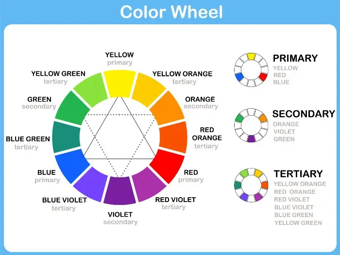
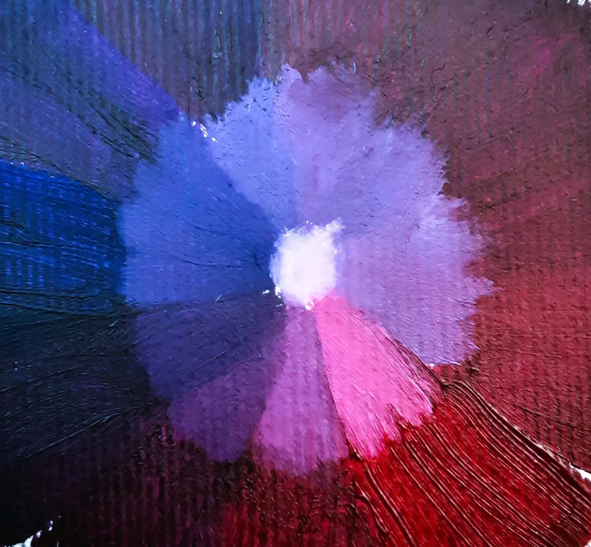
The color wheel is the foundational tool of color theory, first organized by Sir Isaac Newton in 1666. It maps the visible spectrum into a circle, showing the relationships between primary, secondary, and tertiary colors. Primary colors—red, yellow, and blue—serve as the building blocks because they cannot be created by mixing other pigments. Secondary colors, such as green, orange, and purple, emerge when you mix two primary colors in equal parts. Tertiary colors fill the gaps by mixing a primary color with an adjacent secondary color.
Understanding this structure allows artists to predict how colors will behave when placed next to each other. The wheel is typically divided into warm and cool sides. Warm colors like red and orange often appear to advance toward the viewer, while cool colors like blue and green tend to recede. By utilizing these spatial properties, artists manipulate the depth and energy of their work.
How to use color harmonies for better design
Color harmonies are specific combinations of colors that are aesthetically pleasing to the human eye. These schemes rely on geometric relationships found on the color wheel to ensure balance. Using these established formulas helps artists avoid clashing colors and creates a cohesive visual experience for the audience.
- Monochromatic: Uses a single hue with varying tints, tones, and shades to create a sophisticated, unified look.
- Analogous: Combines colors that sit side-by-side on the wheel, such as blue, blue-green, and green, for a serene effect.
- Complementary: Pairs colors directly opposite each other, like red and green, to generate high contrast and vibrant energy.
- Triadic: Selects three colors evenly spaced around the wheel, offering a balanced yet colorful palette.
When applying these harmonies, it is helpful to follow the 60-30-10 rule. This guideline suggests using a dominant color for 60 percent of the space, a secondary color for 30 percent, and an accent color for the final 10 percent. This prevents any single color from overwhelming the composition while maintaining interest.
Why color temperature affects the mood of art
Color temperature is the psychological perception of warmth or coolness in a hue. Warm colors are associated with sunlight, fire, and heat, often evoking feelings of passion, excitement, or comfort. Cool colors are linked to water, sky, and ice, typically conveying calmness, sadness, or professionalism. Artists manipulate these temperatures to dictate the emotional response of the viewer.
Beyond emotion, temperature is vital for creating atmospheric perspective. In landscape painting, objects that are further away should be cooler and less saturated to mimic the effect of the atmosphere. Objects in the foreground should be warmer and more saturated to appear closer. By mastering these shifts, you can transform a flat, two-dimensional surface into a convincing three-dimensional environment.
Common mistakes when mixing and applying color
Even experienced artists often fall into traps that weaken their work. One of the most frequent errors is using colors straight from the tube without modification. Pure, highly saturated colors can be jarring; mixing them with a touch of gray or a complementary color often makes them look more natural and sophisticated.
- Ignoring value: If your colors have the same level of lightness and darkness, the image will look flat regardless of the hues used.
- Over-mixing: Combining too many colors at once often results in "mud," a dull, brownish-gray mess that lacks vibrancy.
- Neglecting context: A color will look entirely different depending on what is placed next to it, a phenomenon known as simultaneous contrast.
- Using too many colors: A palette with too many competing hues can confuse the eye and make the focal point of the artwork difficult to identify.
Always test your colors on a scrap piece of paper before applying them to your final canvas. Checking your work in grayscale can also reveal if your value structure is strong enough to support your color choices.
Best color theory exercises for beginners
Practical application is the fastest way to internalize these concepts. Start by creating your own color wheel using only the three primary colors. This exercise forces you to understand the precise ratios needed to reach secondary and tertiary hues, which is far more educational than using pre-mixed paints.
- Paint a monochromatic scale: Choose one color and create five versions, ranging from the lightest tint (adding white) to the darkest shade (adding black or a complementary color).
- Create a value study: Draw a simple object and paint it using only shades of gray to practice light and shadow without the distraction of hue.
- Limit your palette: Attempt to paint a complex scene using only three colors plus white. This restriction forces you to learn how to mix a wide range of tones.
By limiting your tools, you sharpen your observation skills. Once you understand how to manipulate a restricted palette, you will find it much easier to handle more complex color schemes in your future artistic projects.
Key facts
- The primary colors in traditional art—red, yellow, and blue—cannot be created by mixing other pigments.
- Secondary colors, such as green, orange, and purple, are formed by mixing two primary colors in equal parts.
- Complementary colors sit directly opposite each other on the color wheel and create the highest visual contrast.
- Warm colors like red and orange appear to advance toward the viewer, while cool colors like blue and green recede.
- A monochromatic scheme uses only one hue, modified by varying its lightness, darkness, and saturation.
- To avoid "muddy" colors, limit the number of pigments you mix together and clean your brush between applications.
The bottom line
Color theory is the essential framework for understanding how colors interact, harmonize, and influence human perception. By mastering the relationships found on the color wheel, artists can effectively manipulate mood, depth, and focus within their work. Whether you are painting or designing, applying these fundamental principles helps you create balanced, professional results that communicate your intended message clearly and avoid common pitfalls like dull or chaotic color choices.
People also ask
How do I create a color scheme for a painting?
Start by choosing a base color and then apply a specific harmony rule, such as complementary or analogous, to select your supporting colors. Using a color wheel tool helps you visualize these relationships before you apply paint to your canvas.
What is the difference between hue, tint, and shade?
Hue refers to the pure color itself, such as red or blue. A tint is created by adding white to a hue, while a shade is created by adding black to a hue.
Why do my colors look dull when I mix them?
Mixing too many colors together often results in a neutral, brownish-gray color. Stick to mixing two or three pigments at most to maintain the vibrancy and clarity of your final result.
What is the 60-30-10 rule in design?
This rule suggests using a dominant color for 60 percent of a space or composition, a secondary color for 30 percent, and an accent color for the final 10 percent. It ensures a balanced distribution that is visually pleasing to the eye.
How can I make a color look brighter without changing the hue?
Place the color next to its direct complement on the color wheel. The high contrast between the two colors will make each appear more vivid and intense to the human eye.
Are primary colors the same for print and digital media?
No, print uses the CMYK model (cyan, magenta, yellow, and black), while digital screens use the RGB model (red, green, and blue). Traditional art typically follows the RYB (red, yellow, and blue) model for mixing physical pigments.
This answer was created with the help of AI research tools and reference sources. Spotted an error? Let us know — we correct mistakes quickly. See our editorial policy.