What colors make plum?
Short answer
Plum is created by mixing red and blue to form a purple base, then adding a small amount of white to lighten it and a touch of yellow or black to desaturate the hue. The exact ratio depends on the desired warmth, typically requiring more red than blue for a reddish-plum shade.
On this page
How to mix plum color from primary paints
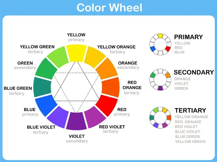
Creating plum requires a systematic approach to color theory. Start by mixing a standard purple using equal parts of primary red and primary blue. If your red is warm (leaning toward orange) or your blue is greenish, the resulting purple may appear muddy, so choose cool-toned pigments for the cleanest base. Once you have a deep violet, introduce white paint in very small increments to reach the desired level of brightness. Because plum is essentially a muted, dusty purple, you must then neutralize the vibrancy. Adding a tiny amount of yellow—the complement of purple—will dull the intensity, shifting the color toward a natural, organic plum tone.
- Combine equal parts of cool red and blue to establish a deep violet base.
- Gradually stir in white paint until the mixture reaches a mid-tone value.
- Add a minuscule amount of yellow or a touch of gray to desaturate the color.
- Adjust the red-to-blue ratio if you prefer a warmer, burgundy-leaning plum or a cooler, grape-toned plum.
Why plum color looks different in various lights
Color perception is highly dependent on the light source, a phenomenon known as metamerism. Plum is particularly sensitive because it sits at the intersection of warm red and cool blue wavelengths. Under cool, fluorescent office lighting, the blue undertones in plum often become more prominent, making the color appear more like a dark grape or navy-purple. Conversely, in warm incandescent light or late afternoon sunlight, the red components are emphasized, causing the plum to shift toward a rich, brownish-maroon. Always test your color samples in the specific environment where they will be displayed to ensure the hue remains consistent with your expectations throughout the day.
- Natural daylight: Reveals the most accurate balance between red and blue components.
- Incandescent light: Enhances red and orange undertones, making plum appear warmer and browner.
- Fluorescent light: Often flattens the color, emphasizing blue or gray undertones.
- LED lighting: Can be calibrated, but cool-white LEDs often make plum look overly clinical or muted.
Best tools for color matching plum
Achieving the perfect plum is easier with the right equipment, especially if you are working with digital design or physical paint. For digital artists, the CMYK color model is essential for print, while RGB is the standard for screens. A typical plum shade in hex code format is #8E4585, which provides a balanced starting point for digital projects. When working with physical media, such as acrylics or oils, use a palette knife rather than a brush to mix your colors. A knife prevents the paint from trapping air bubbles and ensures that the pigments are thoroughly integrated, which is vital when combining multiple hues to reach a complex tertiary color like plum.
- Use a high-quality artist-grade palette knife for thorough pigment integration.
- Keep a dedicated "neutral" brush nearby to clean up edges while mixing.
- Utilize a color wheel to understand the exact position of plum between violet and magenta.
- Maintain a clean mixing surface to prevent unwanted brown streaks from leftover pigments.
Common mistakes when mixing plum
The most frequent error when mixing plum is adding too much black paint. Many beginners reach for black to darken their purple, but this often results in a flat, muddy gray rather than a rich, deep plum. Black paint contains a broad spectrum of pigments that can "kill" the vibrancy of your red and blue base. Instead of black, use a dark complementary color like deep green or burnt umber to darken the shade while maintaining its character. Another mistake is over-mixing the colors, which can lead to a dull appearance. Stop mixing as soon as the streaks disappear to keep the color looking fresh and multidimensional rather than overworked and flat.
- Avoid using pure black to darken your mixture, as it creates a muddy, lifeless tone.
- Do not add too much white at once, as it is difficult to darken a color once it becomes too pastel.
- Refrain from using cheap, low-pigment paints, which often contain fillers that turn plum into a dusty gray.
- Watch for "paint separation" if you are using different brands, as varying binders can cause the mixture to curdle.
How to adjust plum for different design styles
Plum is a versatile color that can be adapted to suit various aesthetic needs by shifting its undertones. If you are aiming for a sophisticated, modern look, lean into a "cool plum" by increasing the blue content and adding a hint of gray. This creates a muted, elegant shade that pairs well with metallic accents like silver or chrome. For a more traditional or cozy atmosphere, create a "warm plum" by adding a touch more red and a drop of ochre or yellow. This version of the color harmonizes beautifully with natural wood tones, gold hardware, and cream-colored textiles. By understanding these subtle adjustments, you can customize plum to fit any interior design scheme or artistic project perfectly.
Key facts
- Plum is a deep, muted purple color that sits between violet and brown on the color wheel.
- To mix plum using primary colors, combine a large amount of red with a smaller amount of blue, then add a touch of yellow to dull the vibrancy.
- Adding a tiny amount of white will lighten the mixture to create a lavender-plum shade, while black will deepen it into a dark, moody plum.
- If your mixture looks too bright or neon, add a small amount of its complementary color, which is yellow or a warm ochre, to neutralize the intensity.
- Always add dark pigments like blue or black to the red base in very small increments to avoid over-darkening the color.
- Test your paint on a scrap piece of paper and let it dry completely, as many pigments shift in tone once the moisture evaporates.
The bottom line
Creating the perfect plum requires a careful balance of warm red and cool blue, tempered by a touch of yellow or brown to achieve its signature muted depth. By starting with a red base and slowly introducing blue, you maintain control over the final hue. Always test your paint as it dries, as the color will naturally darken and settle into its final, sophisticated shade.
People also ask
How do I make plum look more sophisticated?
You can add a tiny drop of burnt umber or raw sienna to your mixture. These earth tones provide a subtle warmth that prevents the plum from looking too artificial or "flat."
Why does my plum paint look muddy?
This usually happens if you mix too many colors together or use paints with high levels of green undertones. Stick to a clean red and blue base to maintain clarity.
Can I make plum from secondary colors?
Yes, you can mix purple paint with a small amount of red and a hint of brown. This is often easier than starting from scratch with primary colors.
What is the difference between plum and eggplant?
Plum is generally lighter and warmer, often leaning toward a reddish-purple. Eggplant is typically much darker, closer to a near-black or deep charcoal purple.
Does the lighting in my room affect how plum looks?
Absolutely, as plum is highly sensitive to ambient light. In cool, natural light, it may appear more blue, while warm artificial light will bring out its red undertones.
How do I lighten plum without it turning pink?
Avoid adding pure white, which can create a chalky pastel. Instead, use a very pale gray or a cream color to soften the pigment while maintaining its depth.
This answer was created with the help of AI research tools and reference sources. Spotted an error? Let us know — we correct mistakes quickly. See our editorial policy.