What colors make violet?
Short answer
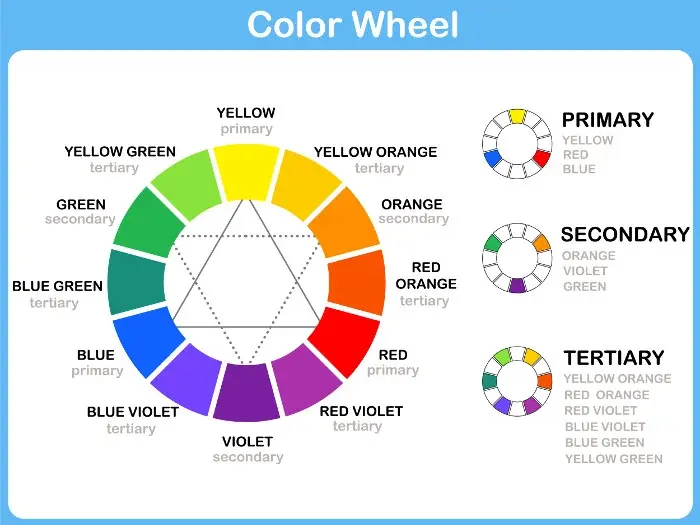
Violet is created by mixing blue and red pigments. In subtractive color theory, such as paint mixing, combining these primary colors produces a secondary purple hue. While violet is technically a spectral color found at the end of the visible light rainbow, painters replicate its appearance by blending these two foundational colors.
On this page
How to mix violet with paint
To create violet using standard artist paints, you must begin with a cool-toned red and a cool-toned blue. Warm reds, which contain hints of yellow, will result in a muddy brown or a muted plum rather than a vibrant violet. Similarly, using a blue that leans toward green will dull the final mixture.
- Start with a small amount of cool red, such as Alizarin Crimson or Quinacridone Rose.
- Gradually add a cool blue, such as Ultramarine or Phthalo Blue, in very small increments.
- Mix thoroughly with a palette knife until you reach your desired shade of violet.
- Adjust the intensity by adding more of either color until the balance feels correct for your project.
Because pigments vary by brand, experimentation is essential. Keep a clean palette to ensure that stray particles of yellow or orange do not contaminate your mixture, as these complementary colors will neutralize your violet and turn it gray.
Why violet is different from purple
The distinction between violet and purple is both scientific and linguistic. Violet is a true spectral color, meaning it occupies a specific wavelength on the electromagnetic spectrum, typically between 380 and 450 nanometers. It is a fundamental color of light that cannot be created by mixing other spectral colors, as it sits at the very edge of human vision.
Purple, by contrast, is a non-spectral color. It does not exist as a single wavelength of light. Instead, purple is a human perceptual construct created when our eyes detect a combination of red and blue light simultaneously. While we often use the terms interchangeably in casual conversation, artists and scientists maintain this separation to describe whether a color is a pure frequency or a blended visual sensation.
Best tools for color mixing
Achieving a clean, brilliant violet requires high-quality pigments with high tinting strength. Student-grade paints often contain fillers that can make the final mixture look chalky or weak. Professional-grade tubes, such as those made by Winsor & Newton or Gamblin, offer pure pigments that maintain their hue even when diluted with white or mixed with other colors.
- Use a glass or plastic palette to prevent the paint from absorbing into the surface.
- Employ a metal palette knife for mixing to ensure that the pigments are fully integrated without trapping air bubbles.
- Keep a separate container of water or solvent to clean your brush between additions, preventing cross-contamination.
- Use a white surface for mixing to accurately judge the undertones of your violet as you add more blue or red.
Proper tools allow you to control the saturation and value of your violet with much greater precision than using improvised surfaces or low-quality brushes.
Common mistakes when mixing violet
A frequent error is adding too much white too quickly. While white is necessary to create shades like lavender or lilac, it desaturates the color immediately, making it difficult to return to a deep, intense violet. Always add white in tiny amounts, testing the color on a scrap piece of paper before applying it to your main canvas.
Another common issue is "muddying," which occurs when a third color is accidentally introduced. If your red has a yellow undertone or your blue has a green undertone, the mixture will naturally lean toward brown. To avoid this, check the label on your paint tubes for the pigment index number. Look for reds labeled "PV" (Pigment Violet) or "PR" (Pigment Red) that specifically lack yellow additives. If your mixture looks dull, it is likely that a trace of yellow has entered the mix, which acts as the complementary color to violet and effectively cancels it out.
How to adjust violet shades
Once you have successfully created a base violet, you can manipulate its appearance to suit your specific artistic needs. To make the violet warmer and more reddish, add a touch of magenta or crimson. To shift the color toward a cooler, more indigo-like state, incorporate a small amount of extra blue. If you wish to darken the violet without losing its vibrancy, avoid using black, which can make the color appear dirty. Instead, use a deep blue or a dark violet pigment to deepen the value while maintaining the hue's integrity.
- Add a tiny amount of white to create pastel shades for highlights.
- Mix in a small amount of ultramarine to shift the violet toward a deep, moody indigo.
- Incorporate a touch of glazing medium to increase the transparency of the paint for layering.
- Test the color against a neutral gray background to see how the violet interacts with different light levels.
By mastering these subtle adjustments, you can create a full range of violet tones, from soft, ethereal lavenders to deep, royal shades that add depth and dimension to any composition.
Key facts
- Violet is a secondary color created by mixing the primary colors red and blue.
- In traditional RYB (red-yellow-blue) color theory used by painters, violet is achieved by combining equal parts red and blue.
- To create a lighter shade of violet, known as lavender or lilac, add a small amount of white paint to your mixture.
- If your violet appears too dull or "muddy," you likely added too much yellow or a red with a strong orange undertone.
- Use a cool-toned red, such as Alizarin Crimson, and a cool-toned blue, such as Ultramarine, to achieve the most vibrant violet.
- When mixing, always add the darker color (blue) to the lighter color (red) gradually to maintain better control over the final hue.
The bottom line
To create violet, combine red and blue pigments in equal proportions. For the best results, select cool-toned paints to ensure the color remains vibrant rather than dull. Always add the darker blue into the red slowly, testing the hue as you go. By adjusting these ratios or adding white for tints, you can master a wide range of violet shades for your artistic projects.
People also ask
Is violet the same color as purple?
While often used interchangeably, violet is a spectral color found on the visible light spectrum, whereas purple is a non-spectral color created by mixing red and blue. Violet has a shorter wavelength than purple, which is essentially a bridge between red and blue.
Why does my violet look brown when I mix it?
You likely introduced a primary color that contains yellow, which is the complementary color to violet. Mixing all three primary colors—red, blue, and yellow—results in a neutral brown or gray rather than a clean violet.
How do I make a deep, dark violet?
To darken your violet without making it muddy, add a tiny amount of black or a dark complementary color like burnt umber. Be very careful with black, as it can quickly overpower the mixture and turn the color into a flat charcoal.
What is the difference between violet and indigo?
Indigo is a deep, dark blue-violet color that sits between blue and violet on the color spectrum. While violet is distinctly reddish-blue, indigo leans much closer to the blue side of the spectrum.
Can I make violet using markers or colored pencils?
You cannot physically mix markers or pencils like paint, so you must use a layering technique called optical mixing. Color your paper with a light layer of blue, then gently color over it with a layer of red to create the illusion of violet.
How can I adjust the temperature of my violet?
To make a "warm" violet, increase the ratio of red in your mixture. To make a "cool" violet, increase the ratio of blue, which shifts the hue toward the indigo side of the color wheel.
This answer was created with the help of AI research tools and reference sources. Spotted an error? Let us know — we correct mistakes quickly. See our editorial policy.