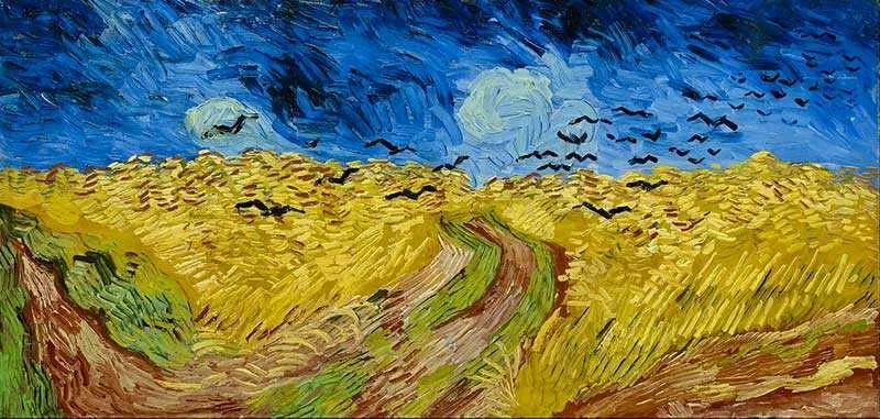
What is a color study?
Short answer
A color study is a focused exercise where artists, designers, or architects test how different hues interact within a composition. By creating small-scale sketches or digital swatches, practitioners evaluate color harmony, light, and emotional impact before committing to a final project. These studies ensure visual balance and technical success in complex creative works.
On this page
Why do artists use color studies?
Color studies serve as a vital planning tool that prevents costly errors in large-scale projects. When an artist begins a painting or a designer starts a branding campaign, the interaction of colors can be unpredictable. By isolating specific palettes in a controlled study, the creator can observe how colors influence one another through simultaneous contrast. This phenomenon occurs when a color appears different depending on the shade placed next to it, such as a gray square appearing bluish against a yellow background.
Beyond technical precision, these studies allow for rapid experimentation with mood and atmosphere. A scene can shift from melancholic to vibrant simply by adjusting the saturation or temperature of the primary colors. Designers often create multiple versions of a study to compare how different color schemes evoke specific psychological responses from an audience. This iterative process builds confidence and provides a clear roadmap for the final execution, ensuring that the chosen palette effectively communicates the intended narrative or brand identity.
How to perform a basic color study
Conducting a color study requires minimal materials, such as a sketchbook, a set of paints, or digital software. The goal is to create small, manageable samples that represent the intended final composition. By limiting the scope, you can focus entirely on the relationships between colors rather than the complexity of the subject matter.
- Select a limited palette of three to five colors to avoid visual clutter.
- Divide your canvas or paper into several small squares or rectangles.
- Apply different combinations of your chosen colors to each section, varying the proportions.
- Observe how the dominant color changes the perceived temperature of the surrounding hues.
- Annotate your findings to remember which combinations created the most successful visual harmony.
By following these steps, you create a reference library of color interactions. This methodical approach helps you understand how light and shadow can be represented through color temperature shifts rather than just adding black or white paint.
Best materials for color study beginners
Beginners should prioritize materials that allow for quick adjustments and easy color mixing. Gouache is widely considered the gold standard for color studies because it is opaque, dries quickly, and maintains a matte finish that prevents glare from interfering with color perception. Unlike oil paints, which take days to dry, gouache allows a student to complete several studies in a single sitting. If you prefer digital tools, software like Adobe Photoshop or Procreate offers the advantage of instant color adjustment and infinite layers for testing variations.
Regardless of the medium, keep your studies small. A standard size is roughly three by three inches. Working at this scale forces you to focus on the overall effect of the colors rather than getting distracted by fine details. Using a neutral gray background for your workspace is also recommended, as it prevents the surrounding environment from skewing your perception of the colors you are testing. Consistency in your setup will lead to more reliable and professional results over time.
Common mistakes when creating color studies
The most frequent error in color studies is the use of too many colors at once. When a palette is overly broad, it becomes impossible to determine which specific color interaction is causing a visual conflict. Another mistake is ignoring the value—the lightness or darkness—of the colors. A study might have beautiful hues, but if all the colors have the same value, the final image will appear flat and lack depth. Always convert your studies to grayscale to check if the values provide enough contrast to define the shapes.
- Failing to test colors in different lighting conditions, such as warm indoor light versus cool daylight.
- Using high-chroma, intense colors for every element, which creates visual fatigue for the viewer.
- Neglecting the "60-30-10" rule, where one color dominates, a second supports, and a third acts as an accent.
- Overworking the study until the colors become muddy from excessive mixing or layering.
- Forgetting to label your color mixtures, making it impossible to replicate successful results later.
How long does it take to complete a study?
The time required for a color study depends on the complexity of the project, but most effective exercises take between 15 and 45 minutes. Because the purpose is to test a specific concept—such as a color temperature shift or a complementary scheme—you should not aim for a polished piece of art. If you find yourself spending hours on a single study, you are likely focusing on rendering rather than color theory. The speed of the process is a feature, not a bug, as it encourages intuition and quick decision-making.
Advanced professionals may complete dozens of these small studies for a single major commission, viewing them as essential research. By dedicating a short, focused block of time to these exercises before starting a project, you save hours of frustration later. You will find that your ability to predict color behavior improves significantly after just a few weeks of consistent practice. This discipline transforms color from a source of anxiety into a powerful, reliable tool that enhances every creative endeavor you undertake.
Key facts
- A color study is a small-scale painting or sketch used to test color harmonies before committing to a final, larger work.
- Artists like Claude Monet and J.M.W. Turner frequently used color studies to capture fleeting light conditions during the 19th century.
- The primary goal is to establish the "color temperature" and "value structure" of a composition rather than focusing on fine detail.
- Using a limited palette of only three or four colors prevents muddy mixtures and helps maintain visual unity across the canvas.
- Thumbnails for color studies should be kept small, typically no larger than 4x6 inches, to encourage focus on broad shapes.
- Common mistakes include over-blending colors on the palette and failing to squint, which obscures the essential value relationships.
The bottom line
A color study is an essential diagnostic tool for artists to map out the light and mood of a project before beginning a final work. By focusing on simplified values and limited palettes, you can resolve complex visual problems efficiently. These quick exercises build technical intuition, ensuring that your final piece possesses a cohesive, professional color harmony that effectively communicates the intended emotional narrative to the viewer.
People also ask
How long should a color study take to complete?
A productive color study should be completed quickly, usually within 15 to 30 minutes. The goal is to capture the essence of the light and color relationships before the artist becomes distracted by unnecessary details.
Can I use digital tools to perform a color study?
Yes, digital painting software is an excellent medium for color studies because it allows for instant color sampling and layering. Many artists use digital tools to quickly iterate through different color schemes for the same composition.
Do I need to use expensive paints for these studies?
No, professional-grade materials are unnecessary for studies meant for practice. Student-grade gouache or acrylics are ideal because they are affordable, dry quickly, and allow for rapid experimentation.
Should I include textures in my color studies?
It is generally better to ignore textures and focus entirely on hue, saturation, and value. Adding texture often leads to overworking the piece, which defeats the purpose of a quick, analytical exercise.
How many color studies should I do for one painting?
There is no set number, but three to five variations are usually sufficient to determine the best approach. Each study should explore a different mood, such as cool shadows versus warm highlights, to see which best serves the subject.
What is the difference between a color study and a color wheel?
A color wheel is a theoretical tool used to understand the relationships between primary, secondary, and tertiary colors. A color study is a practical application of those theories to solve specific visual problems in a composition.
This answer was created with the help of AI research tools and reference sources. Spotted an error? Let us know — we correct mistakes quickly. See our editorial policy.