What are analogous colors?
Short answer
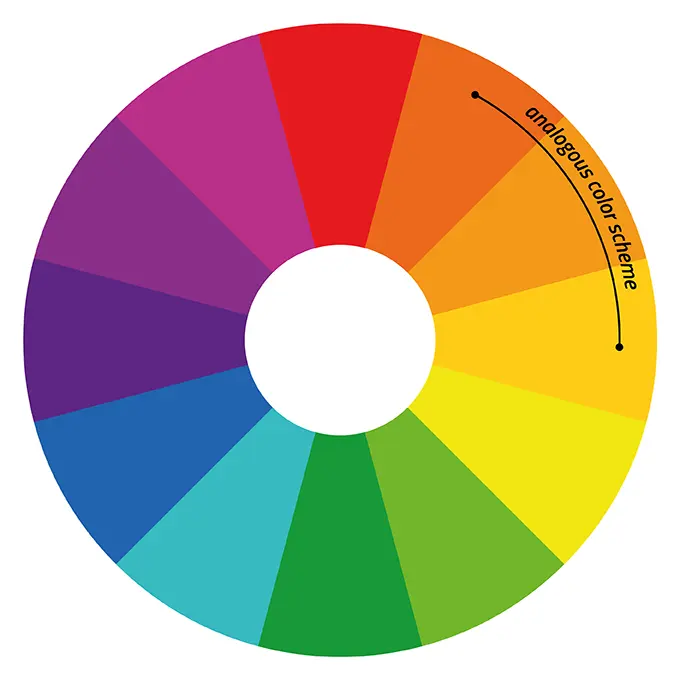
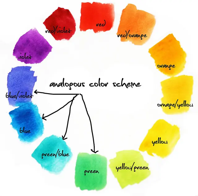
Analogous colors are groups of three to four hues located side-by-side on the traditional 12-part color wheel. By sharing a common base color, these palettes create a harmonious, serene, and visually unified appearance. They are widely used in art, interior design, and fashion to establish a balanced, low-contrast aesthetic that feels natural.
On this page
What are analogous colors on the color wheel?
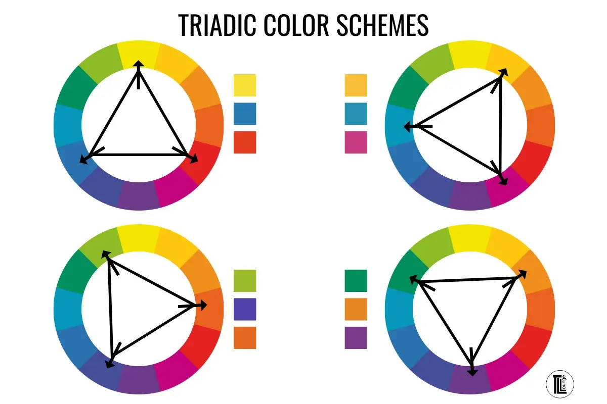
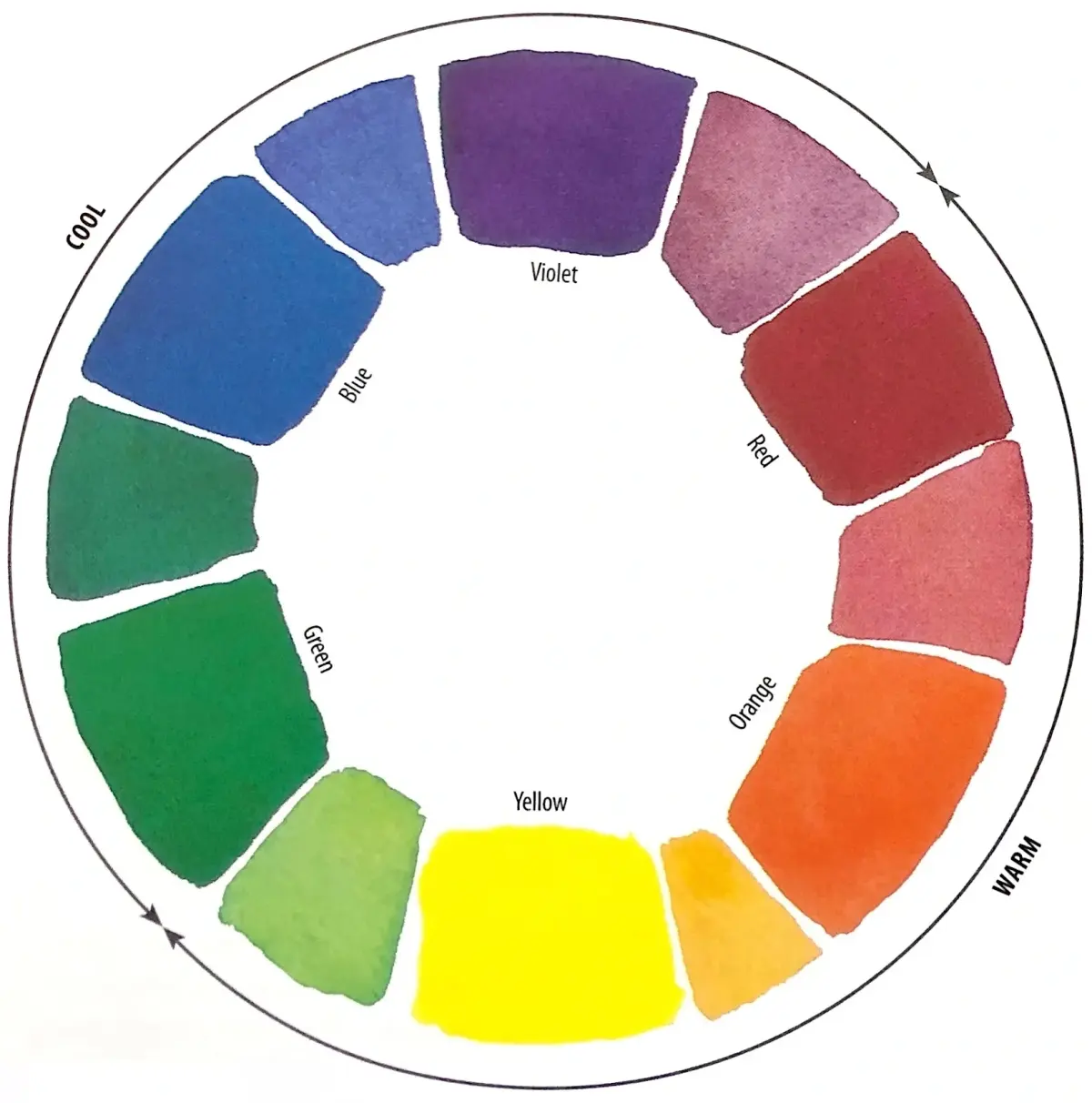
The color wheel, popularized by Sir Isaac Newton in 1666, serves as the foundation for modern color theory. Analogous color schemes consist of one dominant color, a secondary color that supports the primary, and a third color that acts as an accent. Because these colors sit adjacent to one another, they share a common undertone, which prevents the jarring visual tension often found in high-contrast complementary schemes.
For instance, a yellow-based analogous palette might include yellow, yellow-orange, and orange. Because each of these hues contains yellow, the human eye perceives them as belonging to the same family. This relationship creates a sense of comfort and cohesion, as the transition between shades is smooth rather than abrupt. Designers often use these schemes to evoke specific moods, such as warmth in autumn-themed palettes or coolness in aquatic, blue-green arrangements.
How to create an analogous color scheme
Creating a balanced palette requires careful selection of your dominant hue. Start by choosing a primary color from the wheel, such as blue, and then identify the two colors immediately to its left and right, such as blue-green and blue-violet. This selection process ensures that your palette maintains a consistent temperature, which is essential for professional-looking results.
Follow these steps to build your own scheme:
- Select a dominant color that will occupy the largest surface area of your design.
- Choose two adjacent colors to serve as secondary and tertiary accents.
- Adjust the saturation and brightness of each color to create depth and prevent the design from looking flat.
- Use a neutral color, such as white, gray, or black, to break up the colors and provide visual relief.
By following these steps, you can ensure that your composition remains organized while still offering enough variety to keep the viewer’s attention engaged.
Why use analogous colors in design?
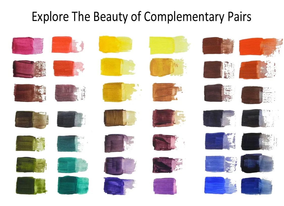
Analogous schemes are favored by interior designers and artists because they are inherently pleasing to the eye. Unlike complementary colors, which sit opposite each other and create high-energy vibration, analogous colors produce a sense of tranquility. This makes them ideal for spaces intended for relaxation, such as bedrooms, living rooms, or meditation areas where you want to avoid visual clutter.
Beyond interior design, this approach is vital in fashion and graphic design for establishing brand identity. A brand using a blue, blue-green, and green palette often signals reliability, nature, and growth. Because the colors are closely related, the design feels intentional and sophisticated. When you want to convey a message of unity or harmony, an analogous palette is the most effective tool at your disposal, as it minimizes conflict and maximizes aesthetic flow.
Common mistakes when using analogous colors
One of the most frequent errors is failing to provide enough contrast between the chosen colors. If all three colors have the same level of saturation and value, the design can look muddy or indistinct. To avoid this, you must manipulate the lightness and darkness of each hue. Adding white to create a tint or black to create a shade allows you to distinguish between elements, ensuring that your focal points remain visible.
Avoid these common pitfalls to keep your work looking sharp:
- Overusing all three colors equally, which leads to a lack of hierarchy.
- Ignoring the role of neutrals, which act as the "white space" of your color palette.
- Choosing colors that are too close in hue, which can make the design look like a mistake rather than a deliberate choice.
- Neglecting the lighting conditions of your environment, as colors will shift depending on whether the light source is cool or warm.
Best practices for color balance
To master this technique, remember the 60-30-10 rule. This classic design principle suggests that you should use your dominant color for 60% of the space, your secondary color for 30%, and your accent color for the remaining 10%. This ratio ensures that your design has a clear focal point while still benefiting from the subtle variety provided by the other two colors in your analogous set.
Always test your colors in the actual environment where they will be displayed. If you are painting a room, apply small swatches to the wall to see how the natural light changes the appearance of the colors throughout the day. If you are designing a digital interface, view your palette on different screen types to ensure the colors do not clash or lose their distinctiveness. By maintaining this level of control, you can harness the power of analogous colors to create truly professional and harmonious visual experiences.
Key facts
- Analogous colors are groups of three colors that sit side-by-side on the 12-part color wheel.
- These schemes share a common hue, which creates a natural, harmonious, and visually soothing effect.
- To create a balanced palette, choose one dominant color, one supporting color, and a third used as an accent.
- Avoid using colors with vastly different saturation levels, as this can make the scheme feel chaotic rather than cohesive.
- Incorporate a neutral color like white, gray, or black to provide visual rest and prevent the colors from clashing.
- Use the 60-30-10 rule: 60% for the dominant color, 30% for the secondary, and 10% for the accent.
The bottom line
Analogous color schemes offer a reliable way to create harmonious, professional, and aesthetically pleasing designs. By selecting three neighboring hues on the color wheel and applying the 60-30-10 rule, you can achieve a sophisticated balance. Remember to incorporate neutrals and vary the saturation to add depth. This approach is perfect for anyone seeking a cohesive look that feels natural, calm, and visually intentional.
People also ask
How do analogous colors differ from complementary colors?
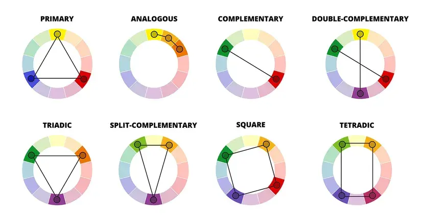
Analogous colors are neighbors on the color wheel, creating a soft and unified look. Complementary colors sit directly opposite each other, creating high-contrast, bold, and vibrant visual tension.
Are analogous color schemes considered professional?
Yes, they are widely used in professional graphic design and interior decorating because they are inherently pleasing to the human eye. They provide a sense of order and calm that is often preferred for branding and living spaces.
Can I use more than three colors in an analogous scheme?
While the classic definition uses three, you can extend the scheme to four colors if they remain adjacent on the wheel. However, adding too many colors can dilute the harmony and make the palette look muddy.
Why do analogous colors look more natural than other schemes?
Analogous color palettes frequently appear in nature, such as in changing autumn leaves or a sunset. Because our eyes are accustomed to these transitions, the brain processes these combinations with less effort.
What is the biggest mistake people make with analogous colors?
The most common error is ignoring value and saturation. If all three colors are equally bright or dark, the design can look flat or overwhelming; varying the tones adds depth and interest.
Can I use black or white with an analogous palette?
Absolutely, as neutrals are essential for grounding an analogous scheme. Using white or black helps separate the colors, preventing them from bleeding into one another and clarifying the overall design.
This answer was created with the help of AI research tools and reference sources. Spotted an error? Let us know — we correct mistakes quickly. See our editorial policy.