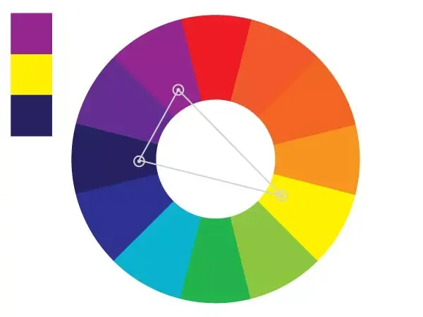
What are complementary colors?
Short answer
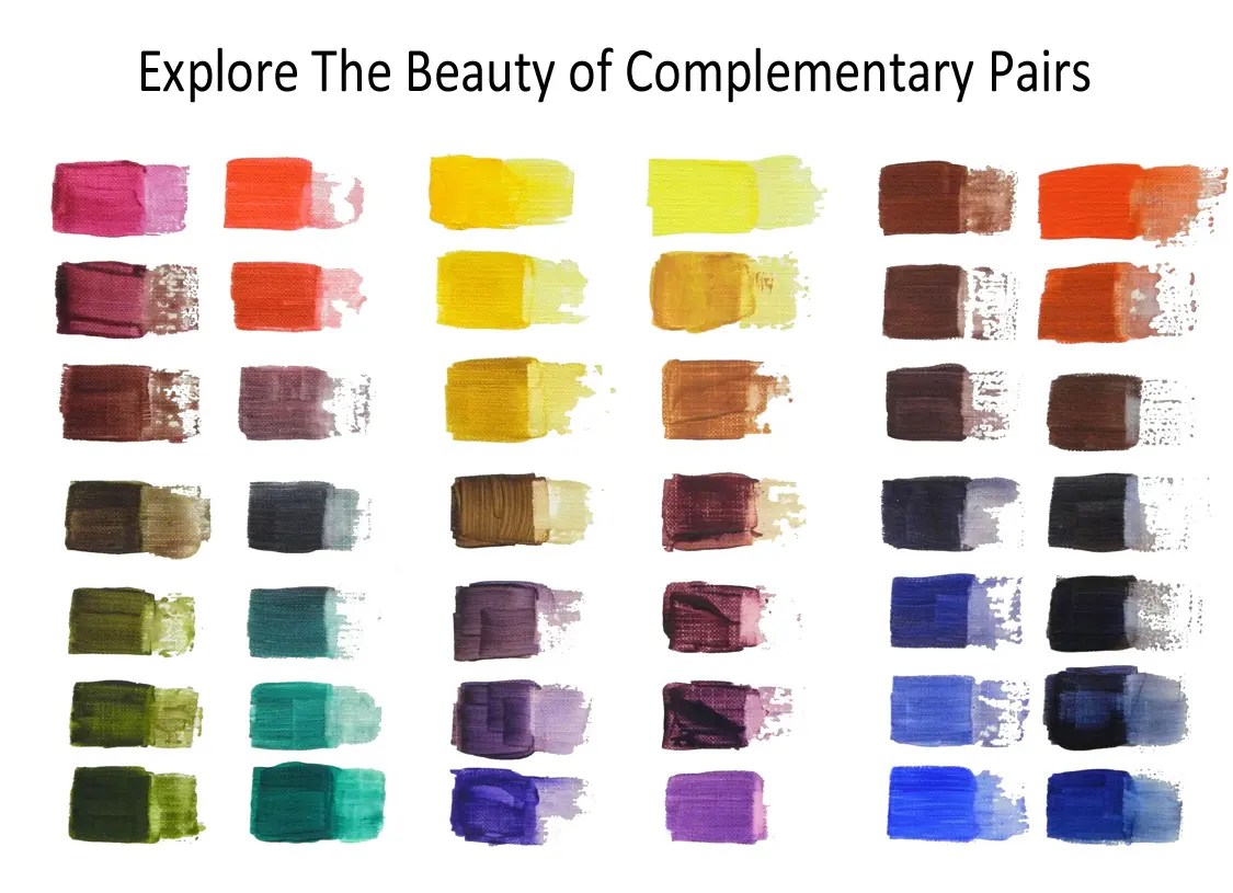
Complementary colors are pairs that sit directly opposite each other on the traditional color wheel. When placed side-by-side, they create the highest possible visual contrast, making each color appear more vibrant. When mixed together in equal amounts, they neutralize one another, typically producing a neutral gray, brown, or black pigment.
On this page
What are complementary colors?
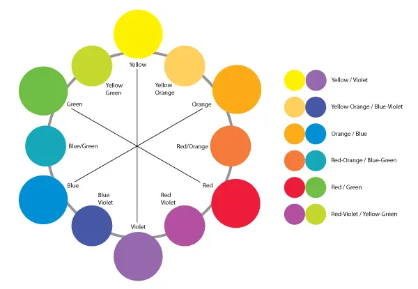
Complementary colors are defined by their position on the color wheel, which is a circular diagram representing the relationships between hues. In the traditional RYB (red, yellow, blue) color model used by artists, the primary colors are red, yellow, and blue. Their complements are the secondary colors created by mixing the other two primaries. For instance, the complement of red is green, which is a mixture of yellow and blue.
The physics behind this phenomenon relates to the additive and subtractive properties of light and pigment. When you look at a color for an extended period and then shift your gaze to a white surface, your eyes often perceive the "afterimage" of the color's complement. This happens because the photoreceptors in your retina become fatigued by the primary hue, causing the brain to compensate by firing the signals for the opposite wavelength.
How to use the color wheel for design
Using a color wheel is the most effective way to identify complementary pairs for art, fashion, or interior design. By selecting two colors directly across from one another, you ensure a balanced but high-energy aesthetic. Common pairs include:
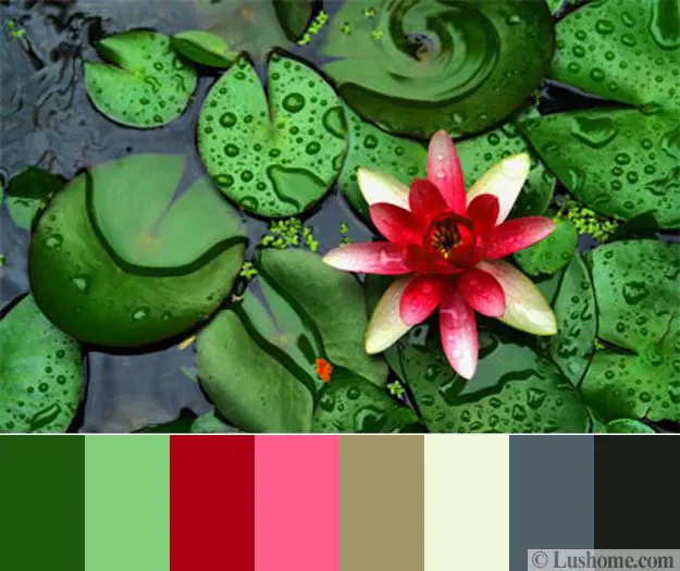
- Red and Green
- Blue and Orange
- Yellow and Purple
- Red-Orange and Blue-Green
- Yellow-Orange and Blue-Violet
Designers often use these pairs to create a focal point. Because the contrast is so intense, it is rarely recommended to use complementary colors in equal proportions. Instead, professional designers suggest using one color as the dominant base and the other as a small, strategic accent. This prevents the design from feeling chaotic or overwhelming to the viewer's eye while still maintaining a dynamic visual impact.
Why do complementary colors create contrast?
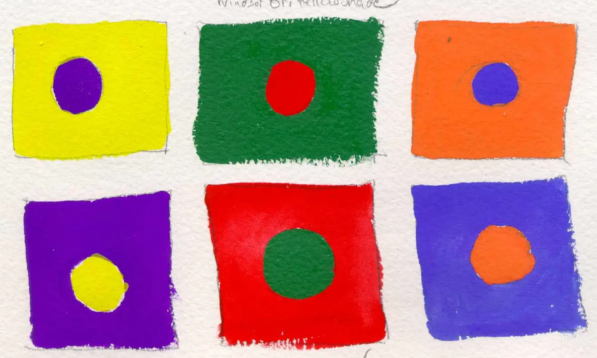
The visual intensity of complementary colors is rooted in the concept of simultaneous contrast. When two opposites are placed next to each other, the human brain perceives the difference between them more sharply than if they were placed against neutral backgrounds. This effect makes the colors appear brighter and more saturated than they actually are. It is a fundamental tool for artists who want to draw the viewer's attention to a specific part of a canvas.
Beyond simple brightness, these pairings provide a sense of equilibrium. Because they represent the full spectrum of the color wheel, they feel "complete" to the human eye. This is why they are frequently used in branding and marketing to create logos that stand out against busy backgrounds. The high contrast ensures that the message or image remains legible and memorable, even from a distance or in low-light conditions.
Common mistakes when using complementary colors
One of the most frequent errors in design is using complementary colors in equal amounts. If you paint a wall half red and half green, the colors will compete for dominance, creating a vibrating effect that can be physically uncomfortable to look at. This "vibration" occurs because the eye cannot easily focus on the boundary between two high-contrast, high-saturation colors.
- Avoid using two highly saturated complementary colors in equal ratios.
- Do not ignore the value of the colors; try mixing a light tint of one with a dark shade of the other.
- Avoid using them in large, busy patterns that make the eyes strain to process the information.
- Do not forget to use neutral colors like white, black, or gray to provide a "breathing room" between the two intense hues.
How to mix complementary colors to create neutrals
Mixing complementary colors is the standard method for artists to create muted tones and shadows. If you want to tone down a bright, artificial-looking color, you do not need to add black, which often makes a color look muddy or dirty. Instead, adding a small amount of the color's complement will desaturate the hue, creating a sophisticated, natural-looking shade that is much more harmonious in a composition.
- Start with your primary color on your palette.
- Add a very small amount of its complement, mixing thoroughly.
- Observe the shift in saturation; add more of the complement if you want a deeper, more neutral tone.
- Test the mixture on a scrap piece of paper to ensure the color is exactly what you need for your shadows or background elements.
By mastering this technique, you gain control over the temperature and depth of your artwork. It allows you to create a cohesive palette where all colors feel related to one another, rather than appearing as isolated, disjointed spots of paint on the canvas.
Key facts
- Complementary colors are pairs that sit directly opposite each other on the traditional color wheel.
- Mixing two complementary colors together in equal amounts typically results in a neutral brown or gray.
- Placing complementary colors side-by-side creates maximum visual contrast and makes both colors appear more vibrant.
- The primary complementary pairs in the RYB (Red, Yellow, Blue) model are red-green, blue-orange, and yellow-purple.
- Artists often use complementary colors to create focal points, as the human eye is naturally drawn to high-contrast areas.
- To tone down a color that is too intense, mix in a small amount of its complement rather than adding black or white.
The bottom line
Complementary colors are essential tools for creating visual impact and balance in art, design, and fashion. By understanding the relationship between opposing hues on the color wheel, you can manipulate contrast to draw attention or neutralize intensity. Whether you are painting a canvas or decorating a room, mastering these pairs allows you to craft dynamic, professional-looking compositions that naturally appeal to the human eye.
People also ask
Why do complementary colors look so bright when placed together?
This effect, known as simultaneous contrast, occurs because the human eye perceives the difference between the two colors as more extreme than it actually is. When the brain processes these opposing wavelengths, it intensifies the saturation of both colors to distinguish them clearly.
How can I use complementary colors in interior design?
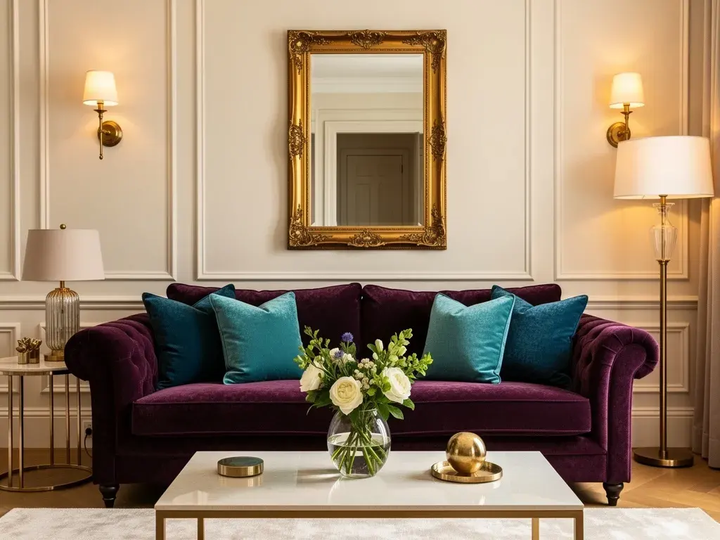
Use one color as your dominant base and the other as a subtle accent to avoid overwhelming the room. For example, a navy blue sofa paired with soft orange throw pillows creates a balanced, sophisticated look without appearing chaotic.
Are complementary colors the same as contrasting colors?
While all complementary colors are contrasting, not all contrasting colors are complementary. Complementary colors represent the most extreme form of contrast because they occupy the exact opposite positions on the color wheel.
What are split-complementary colors?
A split-complementary scheme uses one base color and the two colors adjacent to its direct complement. This approach provides high visual contrast while offering more color variety and a softer, less jarring aesthetic than a standard pair.
Read the full answer →Do digital screens use the same complementary colors as paint?
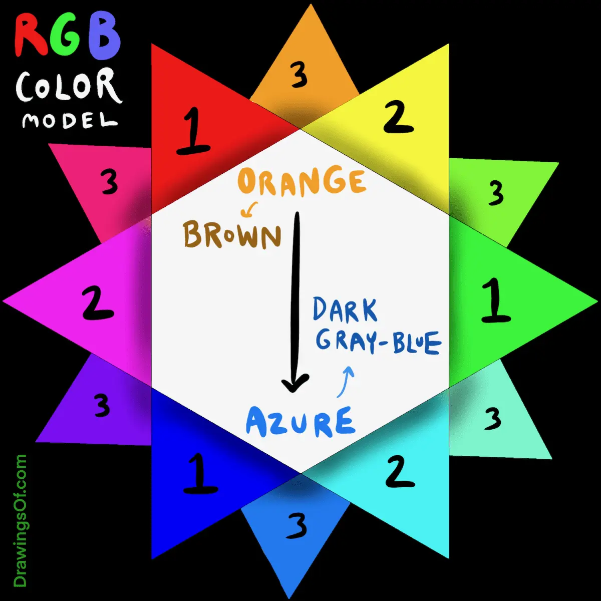
Digital screens use the RGB (Red, Green, Blue) color model, which results in different complementary pairs than the traditional RYB paint model. In RGB, the complement of red is cyan, green is magenta, and blue is yellow.
Is it a mistake to use only complementary colors in a design?
Using only complementary pairs can create a vibrating, high-energy effect that may cause eye strain if not balanced properly. It is usually best to incorporate neutral tones like white, gray, or beige to give the eyes a place to rest.
This answer was created with the help of AI research tools and reference sources. Spotted an error? Let us know — we correct mistakes quickly. See our editorial policy.