What is the complementary color of purple?
Short answer
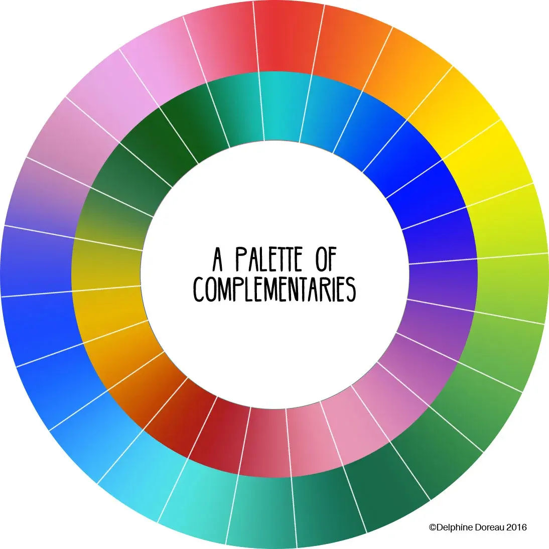
The complementary color of purple is yellow. On the traditional color wheel, complementary colors are located directly opposite each other. When placed side-by-side, these hues create maximum visual contrast, making each appear more vibrant. This relationship is a fundamental principle in art theory, color science, and professional graphic design applications today.
On this page
Why is yellow the complement of purple?
The relationship between purple and yellow is defined by the traditional RYB (Red-Yellow-Blue) color model used by artists for centuries. In this system, purple is a secondary color created by mixing red and blue. Because yellow is the primary color not used in the creation of purple, it sits directly across from it on the color wheel. This geometric opposition is what defines a complementary pair.
When you view these two colors together, your eyes perceive a high level of intensity. This occurs because the human brain is sensitive to the difference between these specific wavelengths of light. While purple is a cool, receding color, yellow is a warm, advancing color. Their interaction creates a balanced yet dynamic visual tension that artists have utilized since the Renaissance to draw the viewer's eye to specific focal points.
How to use complementary colors in design
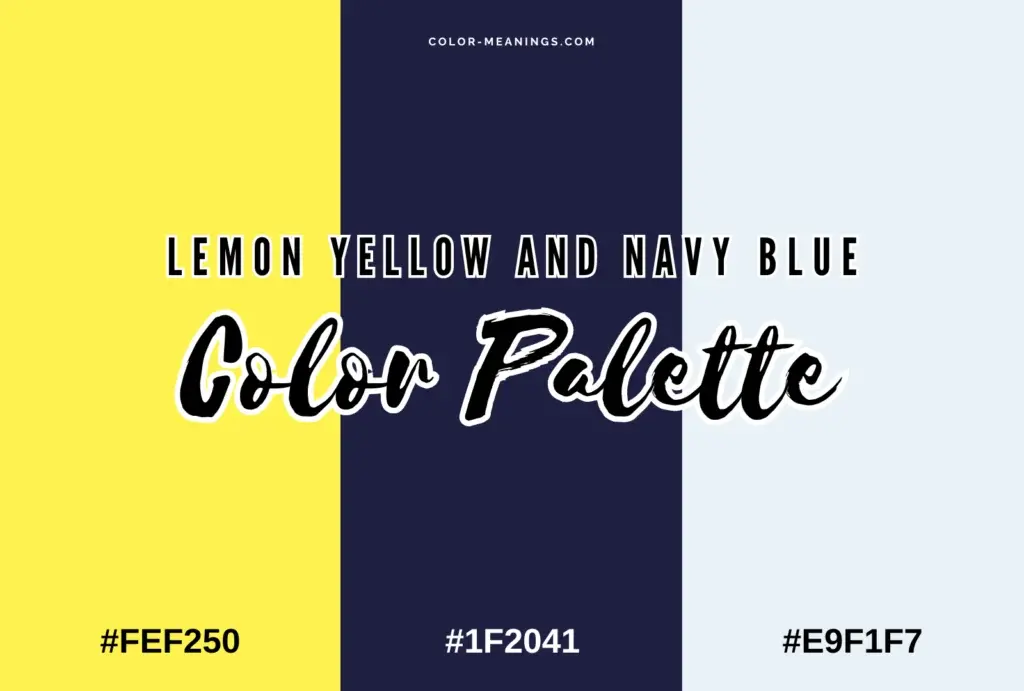
To effectively use purple and yellow in a project, you must consider the saturation and brightness of each shade. Using pure, high-intensity versions of both colors can be overwhelming to the viewer, often resulting in a harsh or "vibrating" effect. Instead, designers often use one color as the dominant base and the other as a small, strategic accent.
- Select a base color, such as a deep plum or violet, for your background.
- Choose a lighter or more muted yellow for the primary text to ensure readability.
- Use a vibrant, bright yellow for call-to-action buttons or important headings.
- Adjust the brightness levels to ensure sufficient contrast for accessibility standards.
By following these steps, you create a professional aesthetic that feels intentional rather than chaotic. This technique is widely used in branding, where companies want to appear energetic and sophisticated simultaneously.
Common mistakes when mixing colors
A frequent error is assuming that all purples have the same complement. In reality, the specific shade of purple—whether it leans toward red or blue—changes the ideal complement. A reddish-purple, such as magenta, technically pairs better with a greenish-yellow, while a blue-leaning purple pairs better with a warm, golden yellow. Ignoring these subtle undertones can make a color palette look muddy or uncoordinated.
Another mistake is failing to account for the "vibration" effect. When two highly saturated complementary colors are placed directly against each other, the boundary between them can appear to shimmer or blur. This is physically uncomfortable for the eye and makes text difficult to read. To avoid this, always separate the two colors with a neutral buffer, such as white, black, or a soft gray.
What is the difference between RYB and RGB?
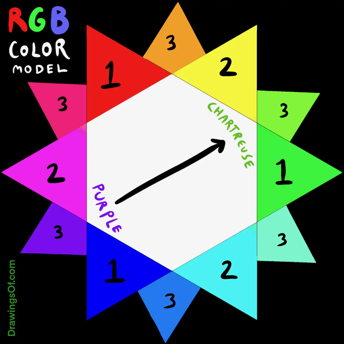
The definition of a complementary color changes depending on the color model being used. While the RYB model is standard for painting and traditional art, digital screens use the RGB (Red-Green-Blue) model. In the RGB system, the complement of purple (which is a mixture of red and blue light) is actually green. This happens because light behaves differently than physical pigment.
- RYB Model: Used for physical paint, ink, and traditional art education.
- RGB Model: Used for digital displays, televisions, and smartphone screens.
- CMYK Model: Used for professional printing, where the complement of purple is a specific lime green.
Understanding these distinctions is vital for professionals. If you design a logo that looks perfect in purple and yellow on your computer screen, it may look different when printed on paper because the ink mixing process follows different physical laws than light emission.
Best tools for finding color harmonies
To find the perfect shade of yellow to complement your specific purple, you can use digital color wheels. Many free online tools allow you to input a hex code for your chosen purple and automatically generate the exact complementary yellow. These tools are invaluable for maintaining consistency across different media, from web design to physical marketing materials.
- Identify the hex code of your primary purple color.
- Input the code into a digital color wheel or palette generator.
- Select the "complementary" harmony rule to see the corresponding yellow.
- Experiment with the "split-complementary" option if you want a more complex, three-color scheme.
Using these digital aids ensures that your color choices are mathematically sound. By relying on these tools, you remove the guesswork from your creative process and ensure that your final product is visually harmonious, professional, and effective at capturing the attention of your intended audience.
Key facts
- The complementary color of purple is yellow.
- Complementary colors sit directly opposite each other on the traditional color wheel.
- Placing purple and yellow side-by-side creates maximum visual contrast and makes both colors appear more vibrant.
- In color theory, purple is a secondary color created by mixing the primary colors red and blue.
- Artists often use complementary pairs to create focal points or to balance a composition.
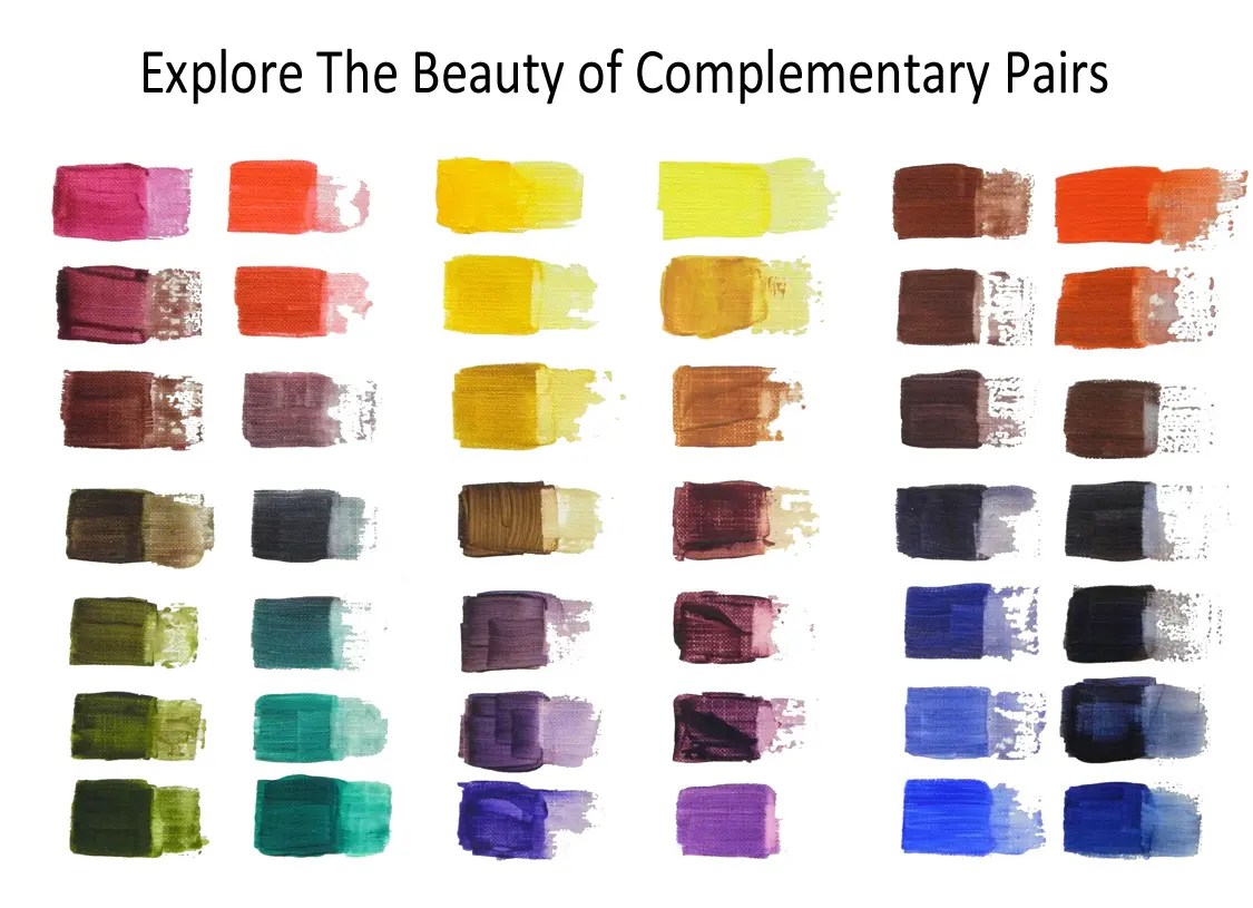
- When mixing physical pigments, combining purple and yellow will result in a muddy, neutral brown or gray.
The bottom line
The complementary color of purple is yellow, a pairing defined by their direct opposition on the standard color wheel. This relationship creates high visual contrast that artists and designers use to make colors pop. While these hues look striking when placed side-by-side, avoid mixing them directly in paint unless you intend to create a muted, neutral brown. Use this dynamic duo to create balance in your projects.
People also ask
What is the difference between purple and violet?
Purple is a broad term for a range of shades, while violet is a specific spectral color found at the end of the visible light spectrum. Violet has a shorter wavelength than purple and is considered a primary color in physics.
How do I use complementary colors in interior design?
Use one color as the dominant base and the other as a small accent to avoid visual fatigue. For example, a yellow room can be punctuated with purple throw pillows to add energy and sophistication.
Why do complementary colors look good together?
They provide the highest level of color contrast, which stimulates the human eye. This biological response makes the pairing feel balanced, dynamic, and intentional rather than chaotic.
Can I use complementary colors for text on a website?
Avoid using high-contrast complementary colors for body text because it causes eye strain and reduces readability. Reserve these pairings for buttons, icons, or decorative elements where you want to draw immediate attention.
What happens if I mix complementary colors in paint?
Mixing them creates a neutral tone because you are combining all three primary colors—red, blue, and yellow. The result is typically a muted, brownish-gray that is useful for creating shadows.
Are there different color wheels for light and pigment?
Yes, the RYB model is used for paint and art, while the RGB model is used for digital screens. In the RGB model, the complement of magenta is green, reflecting how light waves interact differently than physical pigments.
This answer was created with the help of AI research tools and reference sources. Spotted an error? Let us know — we correct mistakes quickly. See our editorial policy.