What is the complementary color of magenta?
Short answer
The complementary color of magenta is green. In the context of the RGB color model used for digital displays, magenta is a secondary color created by mixing red and blue light. Because green is the primary color absent from this mixture, it serves as the direct opposite on the color wheel.

On this page
What is the color wheel theory?
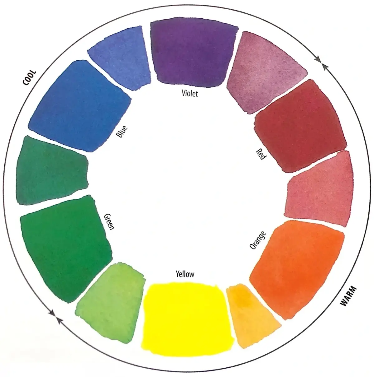
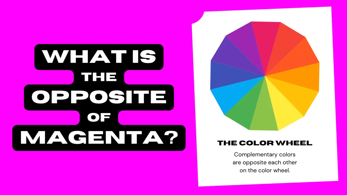
The color wheel is a visual representation of colors arranged according to their chromatic relationship. It serves as the foundational tool for understanding color theory, which dictates how colors interact, harmonize, and contrast with one another. By placing colors in a circular format, artists and designers can easily identify complementary pairs that sit directly across from each other.
Complementary colors are defined as two hues that, when combined, neutralize each other to create a grayscale or brown tone. Magenta occupies a unique space on the wheel because it is an extra-spectral color, meaning it does not exist as a single wavelength of light. Instead, the human brain perceives magenta when both red and violet wavelengths are stimulated simultaneously. Because it bridges the gap between the red and blue ends of the spectrum, its direct opposite must be the center of the visible spectrum, which is green.
How to use complementary colors in design
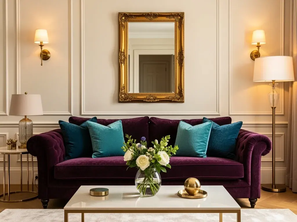
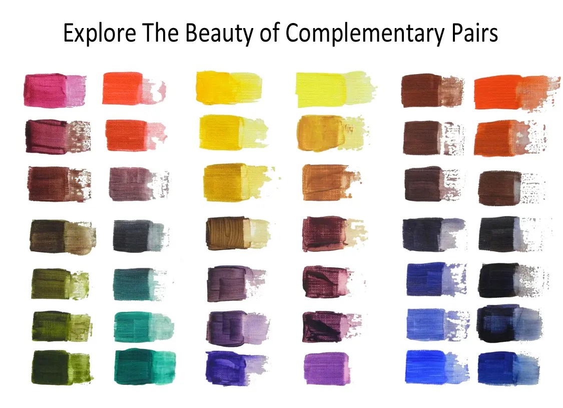
Using complementary colors is a reliable method for creating high-contrast, vibrant designs. Because these colors sit on opposite sides of the wheel, they naturally draw the eye and create a sense of visual tension that can be used to highlight specific elements. For instance, a magenta button on a green background will stand out significantly more than one placed on a neutral or analogous background.
When working with these pairs, consider the following strategies to maintain balance:
- Use one color as the dominant background and the other as a small, focused accent.
- Adjust the saturation or brightness of one color to prevent the pairing from becoming visually jarring.
- Incorporate neutral tones like white, black, or gray to provide a "resting place" for the eye between the two intense colors.
- Experiment with tints (adding white) or shades (adding black) to soften the contrast while maintaining the complementary relationship.
Why magenta and green are opposites
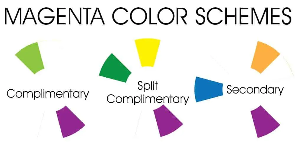
The relationship between magenta and green is rooted in the physics of light. In the additive RGB (Red, Green, Blue) color model, magenta is produced by mixing equal parts of red and blue light. Since green is the third primary color in this system, it acts as the mathematical opposite to the magenta mixture. When you combine red, green, and blue light at full intensity, you produce white light; therefore, removing the green component from that white light leaves you with magenta.
This relationship is also observed in subtractive color mixing, such as in printing. In the CMYK (Cyan, Magenta, Yellow, Key/Black) model, magenta is a primary pigment. While the traditional artist's color wheel often pairs magenta with green, printers often view the relationship through the lens of light absorption. Magenta ink absorbs green light, which is why the two colors appear to vibrate when placed next to each other. Understanding this interaction allows designers to predict how colors will behave under different lighting conditions or printing processes.
Common mistakes when using complementary colors
A frequent error when working with complementary colors is using them at full saturation in equal proportions. This creates a "vibration" effect, where the edges between the two colors appear to blur or flicker, which can be physically uncomfortable for the viewer to look at for extended periods. To avoid this, always aim for a hierarchy where one color is clearly dominant.
Another common mistake is ignoring the value of the colors. Even if two colors are complementary, they might share the same level of darkness or lightness, which can make text unreadable or images look flat. Follow these steps to ensure better readability:
- Convert your design to grayscale to check the contrast levels between your magenta and green elements.
- Adjust the brightness of one color so that it stands out against the other, regardless of hue.
- Use a thin white or black stroke around text to separate it from the background.
- Test your design on various screen types to ensure the colors do not shift too drastically.
Best tools for finding complementary colors
Modern digital tools have made identifying complementary colors an exact science rather than a matter of guesswork. Most graphic design software includes built-in color pickers that automatically calculate the opposite hue based on the specific color space you are using. These tools allow you to input a hex code, such as #FF00FF for magenta, and instantly generate the corresponding green hex code.
If you are looking for resources to help you build palettes, consider these popular options:
- Adobe Color: A browser-based tool that allows you to explore color rules and extract themes from images.
- Coolors: A fast generator that lets you lock specific colors and shuffle through complementary or analogous variations.
- Canva Color Wheel: A beginner-friendly interface that explains the theory while helping you build a professional palette.
- ColorHexa: A comprehensive tool that provides detailed information about a color, including its complementary, split-complementary, and triadic relationships.
By utilizing these digital resources, you can move beyond simple pairs and develop complex, harmonious color schemes that utilize magenta and green effectively in any project.
Key facts
- The complementary color of magenta is green.
- In the CMYK color model used for printing, magenta is a primary subtractive color.
- Complementary colors are located directly opposite each other on the traditional color wheel.
- When magenta and green light are mixed in equal intensity, they produce white light.
- Magenta is an extra-spectral color, meaning it does not exist as a single wavelength of light.
- Artists often use green to neutralize or "desaturate" magenta pigments in painting and design.
The bottom line
The complementary color of magenta is green, a relationship defined by their positions on the color wheel. As a non-spectral color, magenta relies on the brain to interpret the combination of red and blue light, making its relationship with green essential for color theory. Understanding this pairing allows artists and designers to effectively balance, neutralize, or highlight colors to achieve professional visual results in any medium.
People also ask
Why is magenta not found on the visible light spectrum?
Magenta is a psychological construct created by the brain when the red and blue cones in the eye are stimulated simultaneously. Because it does not correspond to a single wavelength of light, it is absent from the rainbow or the visible spectrum.
How do I create a neutral gray using magenta?
You can create a neutral gray by mixing magenta with its complementary color, green, in precise proportions. If the mixture appears too reddish, add a touch more green to balance the hue.
Does magenta have a complementary color in the RGB model?
Yes, in the RGB color model used for digital screens, the complement of magenta is pure green. This is because magenta is formed by combining red and blue light, leaving green as the missing primary component.
What is the difference between magenta and purple?
Purple exists on the visible spectrum as a distinct wavelength between blue and violet. Magenta, however, is a non-spectral color that sits between red and violet on the color wheel.
Can I use magenta and green together in design?
Using magenta and green together creates a high-contrast, vibrant aesthetic often associated with bold or pop-art styles. To avoid a jarring effect, use one color as a dominant base and the other as a small accent.
Are there different shades of magenta?
Yes, shades like fuchsia, hot pink, and deep magenta vary in their brightness and saturation levels. Regardless of the specific shade, the complementary color remains in the green family, though the exact green tone may shift to maintain balance.
This answer was created with the help of AI research tools and reference sources. Spotted an error? Let us know — we correct mistakes quickly. See our editorial policy.