What is the complementary color of pink?
Short answer
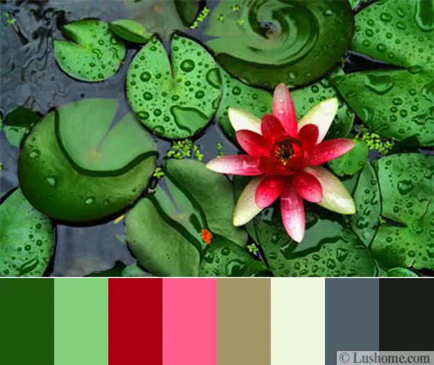
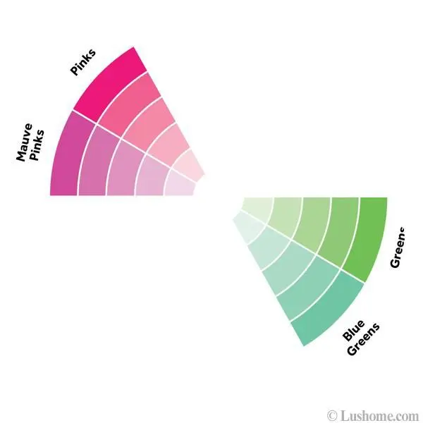
The complementary color of pink is green. In color theory, pink is a tint of red created by adding white. Because red and green are opposites on the traditional color wheel, their lighter variations maintain this relationship. Pairing these hues creates high-contrast, visually striking combinations often seen in nature and design.
On this page
How color theory defines complementary relationships
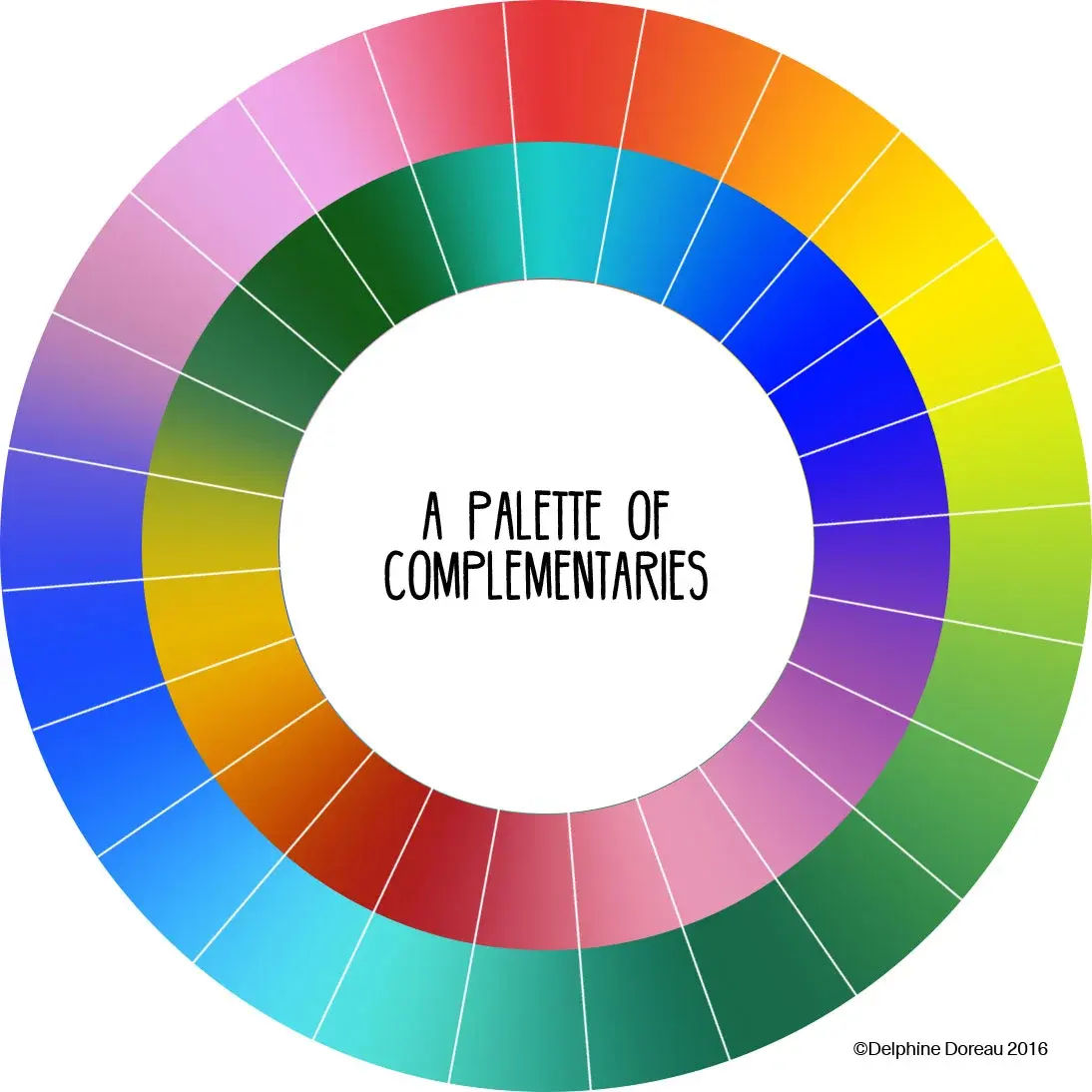
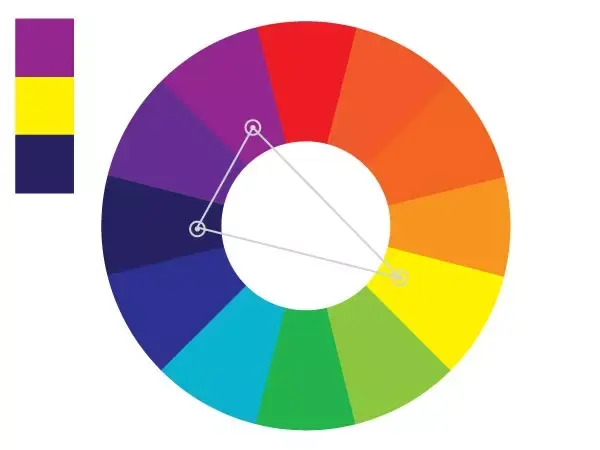
Complementary colors are pairs that sit directly opposite each other on the standard color wheel. This wheel, popularized by Sir Isaac Newton in the 17th century, organizes hues based on their chromatic relationships. When placed side-by-side, these opposites create the strongest possible visual contrast, making each color appear more vibrant and intense to the human eye. Because pink is technically a tint of red—meaning it is red mixed with white—it retains the same complementary partner as its parent hue, which is green.
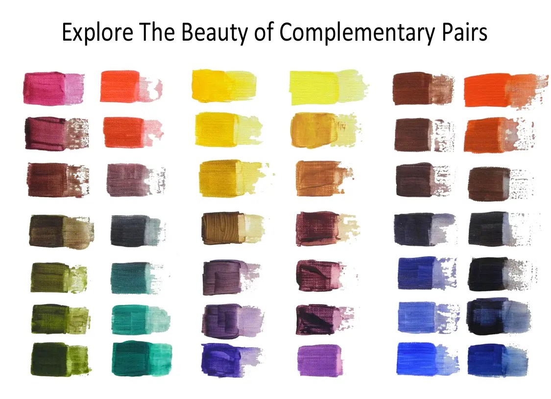
Understanding this dynamic requires looking at the primary and secondary color systems. Red is a primary color, while green is a secondary color formed by mixing blue and yellow. When you place a soft blush pink next to a muted sage green, the contrast is subtle and harmonious. Conversely, pairing a hot neon pink with a vibrant lime green creates an aggressive, high-energy aesthetic. Designers use these relationships to guide the viewer's eye toward specific focal points in a composition.
Why pink and green work well together
The pairing of pink and green is a classic combination that mimics the organic beauty found in the natural world. Flowers like roses, tulips, and peonies frequently display this exact color scheme, providing a blueprint for aesthetic balance. Because these colors occur together in nature, the human brain perceives them as a "natural" combination, which makes them feel comfortable and familiar even when used in modern interior design or fashion.
Beyond nature, this combination offers a wide range of versatility depending on the saturation levels chosen. You can utilize this relationship by following these general guidelines for color balancing:
- Use a neutral, desaturated green to ground a bright, punchy pink.
- Apply a 60-30-10 rule where pink acts as an accent color against a dominant green background.
- Incorporate textures like wood or stone to bridge the gap between these two distinct color families.
- Adjust the undertones of the green to match the warmth or coolness of the specific pink shade.
How to use pink and green in interior design
Integrating pink and green into a living space requires careful consideration of light and scale. Start by determining the mood you wish to achieve, as the intensity of the colors will dictate the atmosphere of the room. A soft, dusty rose paired with olive green creates a sophisticated, vintage-inspired look, while bright fuchsia and emerald green evoke a bold, maximalist energy. Always test paint swatches on your walls at different times of the day, as natural light can significantly shift how these colors interact.
When implementing this scheme in your home, consider these practical steps to ensure success:
- Select a primary base color—usually the more neutral of the two—to cover larger areas like walls or sofas.
- Introduce the secondary color through textiles, such as throw pillows, rugs, or window treatments.
- Use small decorative items like vases, artwork, or table lamps to add the final pop of the complementary color.
- Add metallic accents, such as gold or brass, to provide a bridge between the pink and green, adding a sense of luxury.
Common mistakes when pairing complementary colors
One of the most frequent errors when working with pink and green is failing to account for color temperature. Not all pinks are created equal; some have cool, blue-based undertones, while others lean toward warm, orange-based tones. If you pair a cool-toned bubblegum pink with a warm, yellow-based lime green, the colors may clash rather than complement each other. Always ensure that the undertones of your chosen shades share a similar temperature to maintain visual coherence and avoid a jarring, muddy appearance.
Another common mistake is neglecting the importance of balance and proportion. Using pink and green in equal amounts can create a chaotic, overwhelming effect that tires the eye quickly. Instead of a 50/50 split, aim for one color to be the clear hero of the room while the other serves as a supportive accent. Additionally, avoid using too many competing patterns in these colors, as the high contrast can make a space feel smaller or cluttered. Stick to solid blocks of color or one patterned item to keep the design clean.
Best ways to experiment with color combinations
Experimenting with pink and green is an excellent way to build confidence in your personal style. Start small by creating mood boards or digital collages to see how different shades interact before committing to expensive purchases or permanent changes. You can also look to fashion trends, as the apparel industry frequently cycles through variations of this combination. By observing how designers manipulate the brightness and depth of these hues, you can learn how to adapt the complementary relationship to suit your own preferences and specific environmental needs.
If you are just beginning to explore color theory, keep these tips in mind for a stress-free experience:
- Keep a small color wheel handy to visualize how shifting one hue affects the other.
- Use digital tools or mobile applications that allow you to upload photos and extract color palettes.
- Focus on the "value" of the colors, ensuring there is enough difference in lightness and darkness to create depth.
- Remember that white, black, and gray act as perfect buffers to separate intense complementary colors if they feel too overwhelming.
Key facts
- Pink is technically a tint of red, created by mixing red with white, meaning it does not have a unique position on the traditional color wheel.
- In color theory, the complementary color of red is green; therefore, the complementary color of pink is a light, desaturated green or mint.
- Complementary colors are those positioned directly opposite each other on the color wheel, creating the highest possible visual contrast.
- Using a complementary green with pink helps balance the warmth of the pink, preventing it from appearing too overwhelming or saccharine.
- When working with digital design, you can find the exact complement of any pink hex code by inverting the color values in software like Adobe Photoshop.
- A common mistake is choosing a dark, forest green to complement a pastel pink, which can create a jarring, muddy effect rather than a harmonious balance.
The bottom line
While pink is a tint of red rather than a distinct spectral color, its complementary counterpart is found in the green family. By pairing pink with a soft mint or light green, you achieve a balanced aesthetic that leverages high visual contrast. Whether for interior design or graphic projects, remember to adjust the saturation of your green to match the intensity of your chosen pink shade.
People also ask
Does pink exist on the visible light spectrum?
No, pink is not a spectral color because it does not have its own wavelength of light. It is a non-spectral color perceived by the brain when red light is mixed with white or violet light.
How can I use complementary colors in interior design?
Use the primary color as the dominant shade for walls or furniture and the complementary color for smaller accents like pillows or vases. This creates a balanced, professional look without making the room feel chaotic.
Why do some people say the complement of pink is cyan?
This confusion arises from the CMYK color model used in printing, where magenta is a primary ink. In that specific system, the direct opposite of magenta is green, but different shades of pink may shift the required complement toward cyan or lime.
What is the difference between a complementary color and an analogous color?
Complementary colors sit directly opposite each other on the color wheel to create high contrast. Analogous colors sit next to each other, such as pink, red, and orange, creating a softer, more harmonious palette.
Can I use complementary colors for professional branding?
Yes, using complementary colors is an effective way to make a logo or advertisement stand out. However, use them sparingly to avoid visual fatigue, as the high contrast can be intense for the viewer.
How do I find the complement of a specific shade of pink?
You can use online color wheel generators by inputting the specific hex code of your pink. These tools calculate the mathematical opposite to provide the most accurate complementary shade for your specific project.
This answer was created with the help of AI research tools and reference sources. Spotted an error? Let us know — we correct mistakes quickly. See our editorial policy.