What colors go with pink?
Short answer
Pink is a versatile color that pairs beautifully with neutrals like white, gray, and beige for a sophisticated look. For bolder aesthetics, combine it with contrasting shades such as navy blue, forest green, or charcoal. Metallic accents like gold and copper also elevate pink, adding warmth and depth to any interior design.

On this page
How to choose the right shade of pink
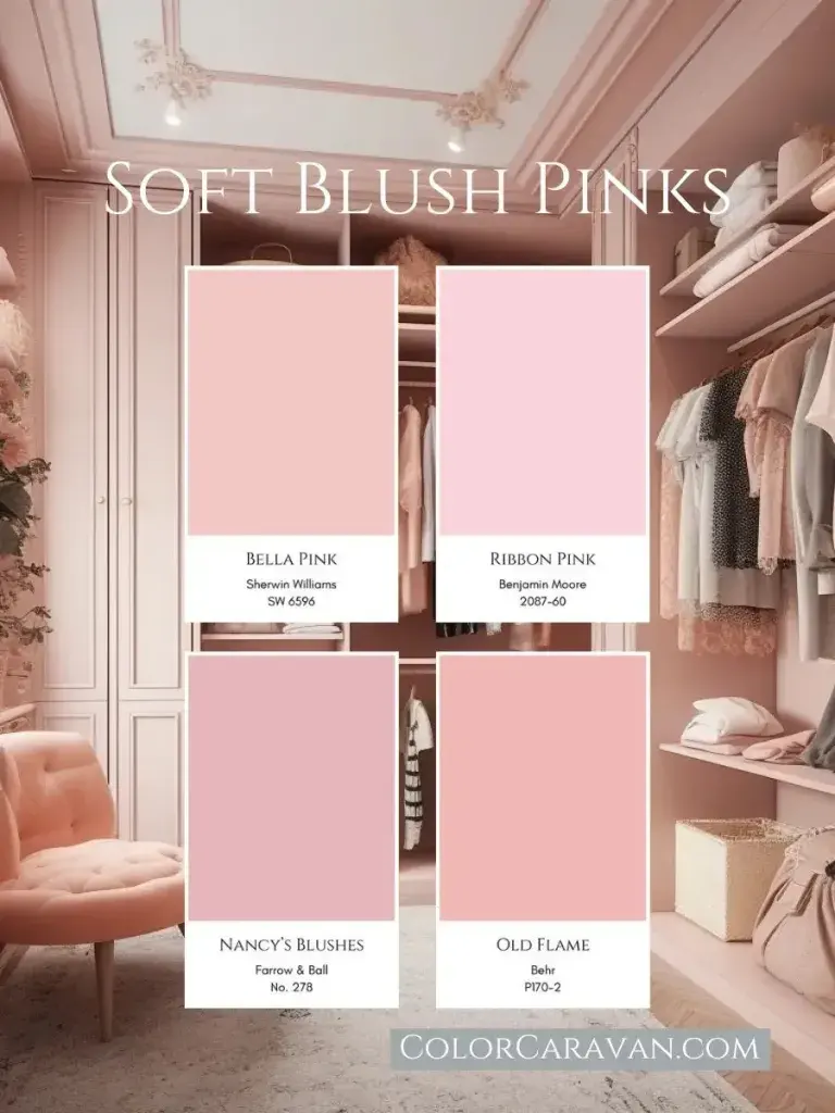
Selecting the appropriate shade of pink is the critical first step in creating a balanced color palette. Pink ranges from delicate, pale blush tones to vibrant, saturated fuchsias and deep, moody magentas. To determine which colors will complement your chosen pink, you must first identify its undertones. Cool-toned pinks, which lean toward blue or purple, work best with crisp whites, cool grays, and silver accents. Conversely, warm-toned pinks, which contain hints of yellow or orange, pair harmoniously with cream, beige, gold, and earthy browns.
When selecting secondary colors, consider the intended mood of the space. If you want a calming atmosphere, stick to muted, dusty pinks paired with soft neutrals. If you prefer a high-energy environment, opt for bright pinks paired with high-contrast colors like black or emerald green. Always test paint swatches or fabric samples in the room’s natural light, as pink is notoriously sensitive to shifting light conditions throughout the day.
Best color combinations for interior design
The most effective color combinations rely on the principle of balance, ensuring that the pink does not overwhelm the other elements in the room. Neutral foundations serve as the safest starting point for beginners, while bold pairings create a modern, designer-forward aesthetic. Consider these proven combinations for your home:
- Blush pink and charcoal gray: This pairing balances feminine softness with masculine structure.
- Hot pink and navy blue: A classic, high-contrast duo that feels sophisticated and nautical.
- Dusty rose and sage green: An organic, nature-inspired palette that feels calm and timeless.
- Pale pink and metallic gold: A luxurious combination that adds elegance to bedrooms or living areas.
- Bubblegum pink and crisp white: A fresh, clean look that mimics mid-century modern design principles.
These combinations work because they utilize the color wheel to create either harmony or contrast. By mixing textures—such as a velvet pink chair against a smooth navy wall—you add visual interest without needing to introduce additional colors.
Common mistakes when decorating with pink
A frequent error is using too many shades of pink in a single space, which can result in a cluttered or "candy-store" aesthetic. To avoid this, select one primary shade of pink as your anchor and use other colors to provide contrast or support. Another common mistake is ignoring the impact of lighting; a pink that looks elegant in a store may appear garish under harsh overhead lighting or muddy in a room with little natural sun.
- Avoid matching pinks with overly bright primary colors like fire-engine red, as they often clash and create visual tension.
- Do not neglect the scale of the furniture; a large, bright pink sofa requires neutral walls to prevent the room from feeling claustrophobic.
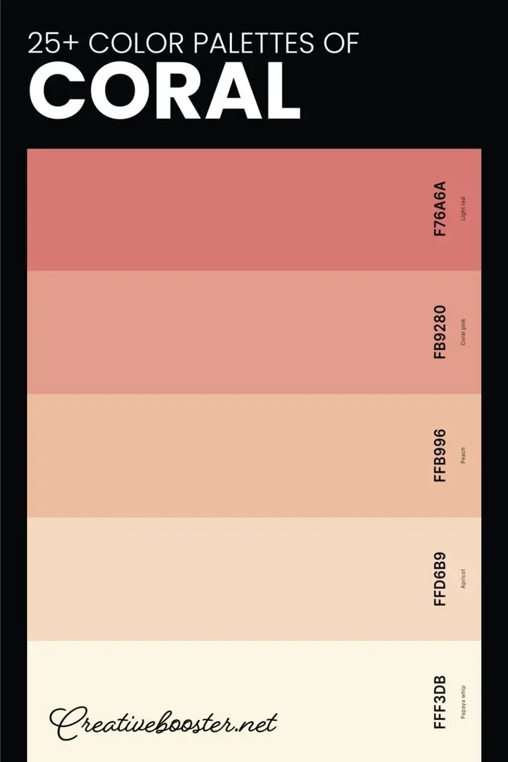
- Steer clear of using exclusively cool-toned neutrals with a warm, peachy pink, as this can make the room feel disjointed and uninviting.
- Always incorporate a third neutral color to act as a bridge between the pink and your secondary accent color.
Why pink works with neutral tones
Pink is technically a tint of red, which means it carries the warmth of red but in a more muted, approachable form. When paired with neutrals, pink acts as a "neutral-plus," meaning it provides color without being as aggressive as red or orange. White is the most popular partner for pink because it provides a clean, blank canvas that allows the pink to stand out as a focal point. Gray is another excellent choice, as its cool, industrial nature tames the sweetness of pink, resulting in a mature and refined look.
Beige and tan are also trending pairings, particularly in "Japandi" or minimalist styles. These earth-toned neutrals ground the pink, making it feel more organic and less artificial. By using a range of textures—such as linen, wool, or wood—you can prevent the pink and neutral combination from feeling flat. The key is to ensure the neutral you choose has an undertone that matches your pink, creating a seamless flow that feels intentional rather than accidental.
How to accessorize with pink accents
If you are hesitant to commit to large pink furniture or wall paint, accessorizing is the perfect way to introduce the color into your home. Small, intentional pops of pink can transform a room without requiring a major renovation. Start by focusing on textiles, which are easy to swap out if your tastes change. Consider adding pink throw pillows to a neutral sofa, or placing a patterned rug with subtle pink undertones in a hallway.
- Start with small items like vases, candles, or picture frames to see how the color interacts with your existing decor.
- Introduce artwork that features pink as a secondary color to tie the palette together across the room.
- Use window treatments, such as sheer pink curtains, to filter natural light and cast a warm, soft glow throughout the entire space.
- Incorporate metallic accents like brass or copper hardware, which naturally complement the warmth of most pink shades.
By starting small, you can build confidence in your color choices and learn how different shades of pink react to your home's unique lighting and architecture. This incremental approach ensures that your space remains balanced, stylish, and reflective of your personal aesthetic preferences.
Key facts
- Pair soft blush pink with charcoal gray or navy blue to create a sophisticated, balanced aesthetic.
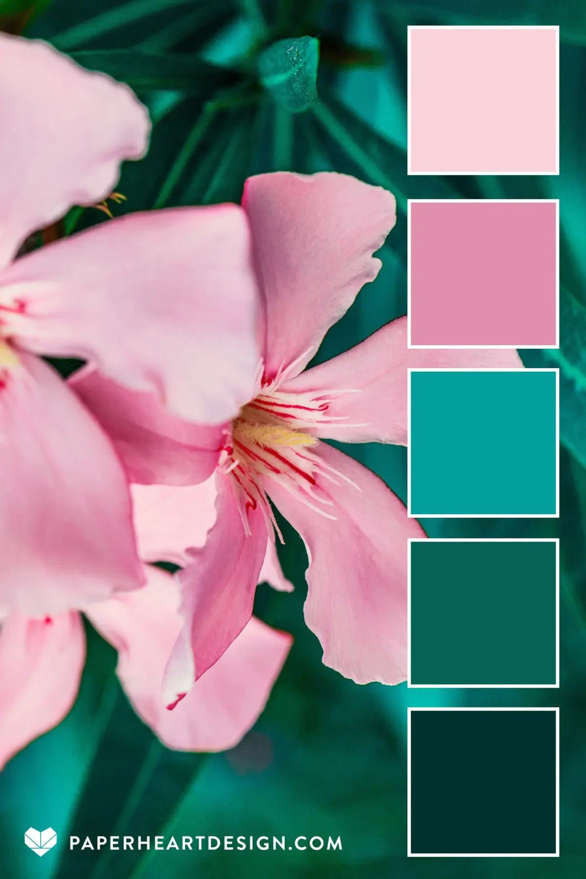
- Combine hot pink with emerald green or mustard yellow for a high-contrast, energetic, and modern color scheme.
- Use metallic accents like gold or brass to add warmth and luxury to both pale and vibrant shades of pink.
- Avoid pairing pink with too many other pastels, as this can make a room or outfit look juvenile rather than intentional.
- Incorporate white or cream as a neutral base to prevent pink from overwhelming a space or a visual composition.
- Test pink shades in different lighting, as cool-toned pinks may appear sterile while warm, peachy pinks can look orange under yellow light.
The bottom line
Pink is a versatile color that adapts to various moods depending on its pairing. For a professional or elegant look, anchor pink with neutrals like navy, gray, or cream. If you prefer a bold, contemporary style, experiment with contrasting jewel tones like emerald or mustard. By balancing saturation and undertones, you can successfully integrate pink into any design project or wardrobe while maintaining a sophisticated, intentional aesthetic.
People also ask
Does pink go well with black?
Yes, black provides a sharp, grounding contrast that prevents pink from appearing too sugary or soft. This combination is often used in fashion to create a bold, edgy look.
What is the best pink to pair with earth tones?
Dusty rose or terracotta-leaning pinks work best with brown, beige, and olive green. These muted tones create a cohesive, natural, and calming environment.
Can I wear pink with red?
Modern fashion rules allow for pink and red pairings, which create a vibrant, monochromatic-adjacent look. For the best result, choose shades with similar undertones, such as pairing fuchsia with cherry red.
How do I choose the right shade of pink for a room?
Consider the room's function and natural light. Lighter, cooler pinks work well in bedrooms for a tranquil feel, while deeper, saturated pinks are excellent for accent walls in social spaces like living rooms.
Is pink considered a neutral color?
In interior design, certain muted, desaturated shades of pink—often called "millennial pink"—can function as a neutral. They provide a subtle warmth that complements wood tones and metallic finishes effectively.
What colors should I avoid mixing with pink?
Avoid pairing pink with neon colors that clash in undertone, such as a cool-toned bubblegum pink with a warm, neon orange. Always ensure the saturation levels complement each other to avoid a disjointed appearance.
This answer was created with the help of AI research tools and reference sources. Spotted an error? Let us know — we correct mistakes quickly. See our editorial policy.