What colors go with gray?
Short answer
Gray is a versatile, neutral foundation that pairs exceptionally well with almost any color. Warm grays harmonize with earthy tones like terracotta and gold, while cool, blue-based grays contrast beautifully with crisp whites, navy, or vibrant jewel tones. Choosing the right shade depends on the desired mood and the natural lighting of your space.

On this page
Which colors pair best with gray?
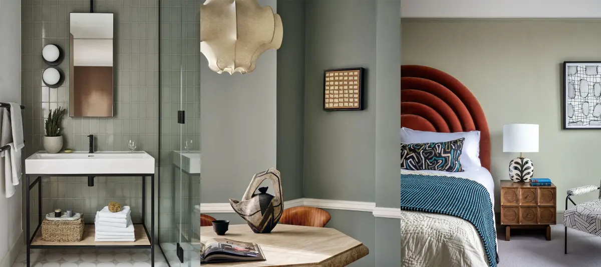
Gray acts as a chameleon in interior design because it lacks a strong hue, allowing it to serve as a bridge between bold and subtle palettes. When selecting a partner for gray, consider the undertone of the paint or fabric. Warm grays, which often contain hints of brown or yellow, look sophisticated when paired with natural materials like oak wood, cream, or warm metallics such as brass. Conversely, cool grays—those with blue or green undertones—create a clean, modern aesthetic when combined with high-contrast colors like stark white, charcoal, or deep navy blue.
For those seeking a more energetic environment, pairing gray with vibrant accent colors is highly effective. Because gray is muted, it prevents bright colors from feeling overwhelming. Consider these popular combinations for a balanced look:
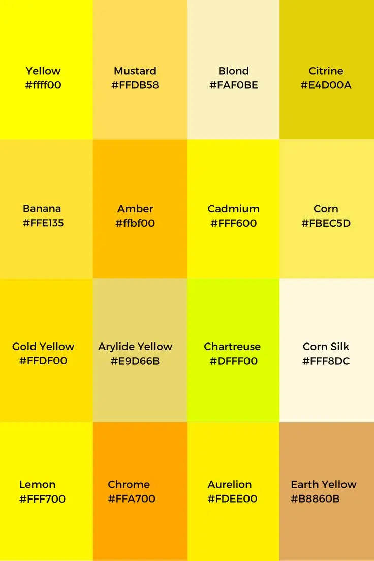
- Mustard yellow or ochre for a mid-century modern feel.
- Blush pink or dusty rose to soften the clinical edge of cool gray.
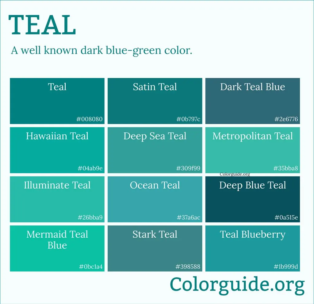
- Emerald green or deep teal for a luxurious, moody atmosphere.
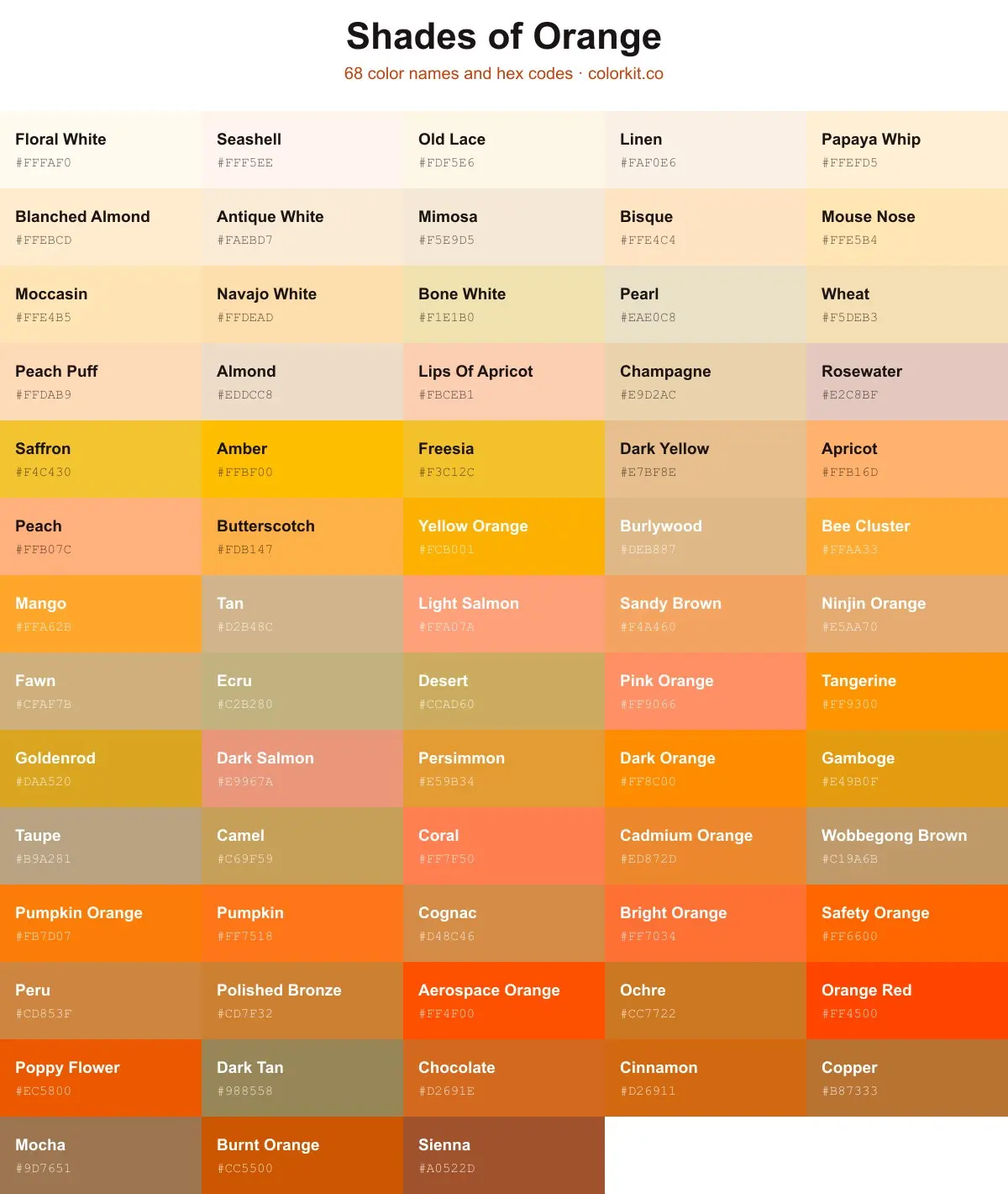
- Burnt orange or terracotta to ground the space with warmth.
How to choose the right shade of gray?
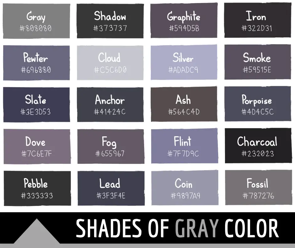
The success of a color scheme relies heavily on identifying the undertones within your gray. To determine the undertone, place a sample of the gray next to a pure white sheet of paper. If the gray looks slightly pink, yellow, or brown, it is a warm gray. If it appears to have a subtle blue, purple, or green cast, it is a cool gray. Selecting colors that share the same temperature ensures that your palette feels intentional rather than accidental.
Lighting plays a critical role in how these colors interact throughout the day. A room with north-facing windows receives cool, blue-tinted light, which can make cool grays feel chilly; in these spaces, warmer accents like gold or wood tones are essential. South-facing rooms receive warm, golden light, making them ideal for cooler grays or crisp white contrasts. Always test paint swatches on different walls at various times of the day to observe how the color shifts under changing light conditions before committing to a full design plan.
Why do some gray combinations fail?
The most common reason a gray-based palette fails is a lack of contrast. If you pair a mid-tone gray with another color of the exact same saturation level, the room can feel flat, muddy, or "dim." To avoid this, focus on value contrast. If you choose a light, airy gray for your walls, pair it with a dark, grounding color like charcoal or navy for your furniture or textiles. Conversely, if you use a dark, dramatic charcoal gray, use lighter accents like cream or light wood to prevent the space from feeling claustrophobic.
Another frequent error is ignoring the "temperature clash." Mixing a distinctly cool, blue-based gray with a warm, buttery yellow can sometimes create a jarring visual tension that feels unrefined. While high contrast is often a design goal, it should be achieved through brightness rather than clashing undertones. If you are unsure of your ability to balance these elements, stick to a monochromatic scheme by using varying shades of gray, then introduce a single, high-impact accent color to draw the eye and provide a focal point.
How to layer textures with gray?
Since gray is a neutral, it relies heavily on texture to provide visual interest and prevent a space from feeling sterile. When you simplify your color palette, you must increase the complexity of your materials. A gray sofa, for instance, becomes much more inviting when layered with a chunky knit wool throw, velvet pillows, and a linen rug. These different textures reflect light differently, adding depth to the room even if the colors are strictly monochromatic.
Follow these steps to successfully layer textures within a gray color scheme:
- Start with a matte base, such as flat-finish gray walls or a wool-blend rug.
- Introduce one high-sheen material, such as a glass coffee table, polished chrome lamp, or silk cushion covers.
- Add a natural, organic element like a woven seagrass basket, a leather chair, or a wood-grain side table.
- Incorporate a soft, tactile element like a faux-fur throw or heavy cotton drapery to balance the harder, colder surfaces.
Common mistakes when decorating with gray?
One major mistake is overusing gray in a space that lacks natural light. If a room has small windows or faces a shaded area, painting the walls a dark gray can make the space feel like a cave. In such cases, it is better to use gray as an accent color through furniture or art, while keeping the walls a lighter, more reflective color. Another mistake is ignoring the impact of metallic finishes. Silver and chrome naturally complement cool grays, while brass, gold, and copper provide a necessary warmth that prevents gray rooms from feeling overly industrial or cold.
Finally, do not neglect the "rule of three" when introducing colors. If you decide to pair gray with white and one accent color, such as navy, ensure that these three colors are distributed throughout the room. If all the navy is concentrated in one corner, the room will feel unbalanced. Distribute your accent colors across the space through pillows, artwork, and decorative objects to create a cohesive flow that guides the eye naturally around the room. By following these principles, you can create a sophisticated, timeless interior that remains comfortable and inviting for years to come.
Key facts
- Gray is a neutral color that acts as a bridge between stark white and deep black.
- Warm grays, often called "greige," pair best with earthy tones like terracotta, cream, and olive green.
- Cool grays with blue or purple undertones harmonize well with crisp whites, navy blue, and silver.
- High-contrast pairings, such as charcoal gray with mustard yellow or hot pink, create a modern, energetic look.
- Use the 60-30-10 rule: 60% of the room should be a neutral base, 30% a secondary color, and 10% an accent.
- Avoid using too many shades of gray in one space, as this can make a room feel flat or sterile.
The bottom line
Gray is a foundational neutral that offers endless design possibilities depending on the undertones you select. By pairing cool grays with vibrant blues or warm grays with earthy tones and metallic accents, you can create a balanced, professional aesthetic. Remember to maintain consistency in your undertones and use high-contrast colors sparingly to add personality without overwhelming the neutral base of your space.
People also ask
Does gray go with brown?
Yes, pairing gray with brown creates a sophisticated, grounded aesthetic. To ensure success, choose a warm-toned gray or a greige to prevent the colors from clashing with the natural wood tones of the brown.
What is the best color to pair with light gray walls?
Light gray is highly versatile and works well with soft pastels like blush pink or sage green for a calming effect. For a more dramatic look, incorporate navy blue or emerald green through furniture and textiles.
Can I mix different shades of gray in one room?
You can mix shades, but you must maintain a balance of undertones. Ensure that all chosen grays are either consistently "cool" or "warm" to avoid an unintentional, mismatched appearance.
Which accent colors make gray look expensive?
Metallic accents like gold, brass, or copper provide a luxurious contrast against gray. These warm metals add depth and prevent the coolness of the gray from feeling cold or uninviting.
Is gray a good color for small rooms?
Light gray can make a small room feel larger and more open by reflecting light. However, avoid dark charcoal in small, windowless spaces, as it can make the area feel cramped and cave-like.
How do I choose the right gray for my home?
Always test paint samples on your walls at different times of the day. Natural light shifts significantly, which can change how the undertones of the gray appear in your specific environment.
This answer was created with the help of AI research tools and reference sources. Spotted an error? Let us know — we correct mistakes quickly. See our editorial policy.