What colors go with black?
Short answer
Black is a versatile neutral that pairs effectively with almost any color. High-contrast combinations include white, metallics, and bold primary colors like red or yellow. For softer, sophisticated palettes, pair black with muted earth tones, jewel tones, or subtle shades of gray. Its neutrality allows it to anchor virtually any aesthetic design.

On this page
What colors go best with black for home decor?
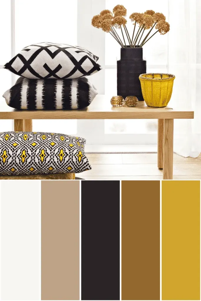
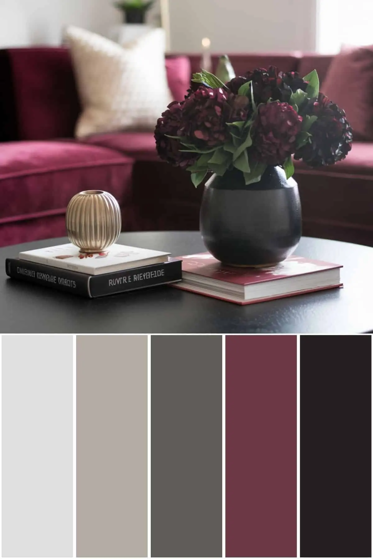
Black acts as a foundational anchor in interior design, providing depth and definition to a room. When choosing colors to pair with it, consider the mood you wish to establish. Crisp white remains the most popular choice for a timeless, modern aesthetic, as it creates a sharp graphic contrast. For a more dramatic or moody atmosphere, deep jewel tones such as emerald green, sapphire blue, or plum provide a luxurious, velvet-like richness.
To achieve a balanced look, follow these professional design guidelines:
- Use a 60-30-10 ratio: 60% dominant color, 30% secondary, and 10% accent.
- Incorporate textures like wood, brass, or wool to prevent a black-and-color scheme from feeling flat.
- Utilize metallic finishes like gold or chrome to reflect light, which prevents black surfaces from absorbing all the visual energy in a space.
- Introduce natural greenery to add organic warmth against stark black walls or furniture pieces.
How to style black clothing for a balanced outfit?
Styling black in fashion is about managing contrast and texture to avoid a monotonous appearance. Because black absorbs light, wearing it head-to-toe can sometimes wash out skin tones or hide the silhouette of a garment. To elevate a black outfit, introduce one or two complementary colors through accessories, layering pieces, or footwear. Vibrant colors like cobalt blue, fuchsia, or mustard yellow create a striking focal point against a dark base.
If you are unsure where to start, try these classic combinations:
- Black and camel: This pairing is the hallmark of sophisticated, minimalist style.
- Black and denim: A classic blue jean provides a casual, approachable texture that softens the severity of black.
- Black and metallic: Silver, gold, or copper accessories add a necessary highlight to evening wear.
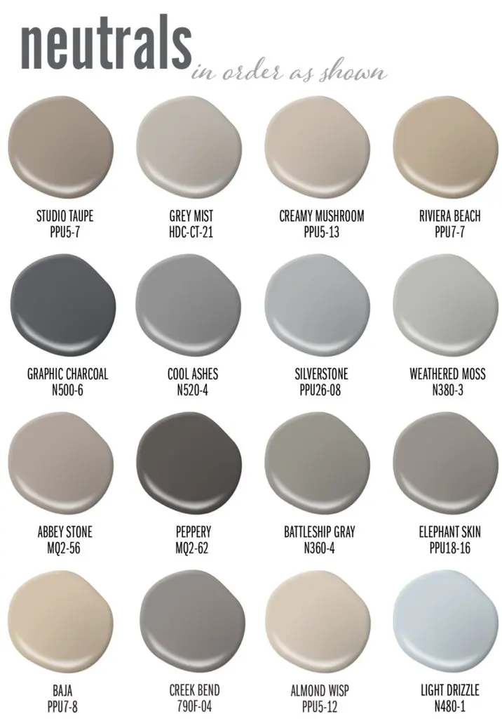
- Black and monochrome gray: Mixing different shades of charcoal and slate creates a refined, layered look that feels intentional rather than accidental.
Why does black look good with almost everything?
Black is technically the absence of visible light, which makes it the ultimate neutral in the color wheel. Unlike colors with specific undertones—such as navy or brown, which can clash with certain hues—black is achromatic. This means it does not compete with the color temperature of other shades. Whether you are pairing it with "cool" colors like blues and purples or "warm" colors like oranges and reds, black remains neutral and grounding.
This unique property allows black to serve as a bridge between disparate colors in a complex pattern or palette. It acts as a visual "reset" for the eye, allowing more vibrant colors to pop without overwhelming the viewer. By placing black next to a bright color, you increase the saturation and perceived intensity of that color. This is why artists and designers frequently use black outlines or borders to make colors appear more vivid and defined within their compositions.

Common mistakes when pairing colors with black
One of the most frequent errors is ignoring the importance of texture. When you combine black with another dark color, such as navy or dark brown, the lack of contrast can make the items look like they were meant to match but failed. To avoid this "missing match" look, ensure the materials have different finishes. For example, pair a matte black cotton shirt with a glossy leather jacket. The difference in light reflection will create the necessary separation.
Another mistake is failing to account for lighting conditions. In a dimly lit room, black furniture combined with dark wall colors can make a space feel claustrophobic. If you are working with a small or poorly lit area, always pair black with reflective surfaces or lighter accent colors to maintain a sense of openness. Finally, avoid using too many different accent colors with black, as this can create a chaotic, disjointed appearance that loses the elegant simplicity black is known for providing.
How to choose the right accent colors for black?
Selecting the right accent color depends largely on the intended level of contrast. High-contrast pairings, such as black and white or black and neon, are ideal for modern, bold, or minimalist designs. Low-contrast pairings, such as black and charcoal or black and deep forest green, are better suited for cozy, intimate, or traditional settings. Always consider the "temperature" of your accent color; cool tones often feel more professional and calm, while warm tones feel inviting and energetic.
To refine your selection, consider these final tips:
- Test your colors in the actual lighting of the space or under the light you will be wearing them in.
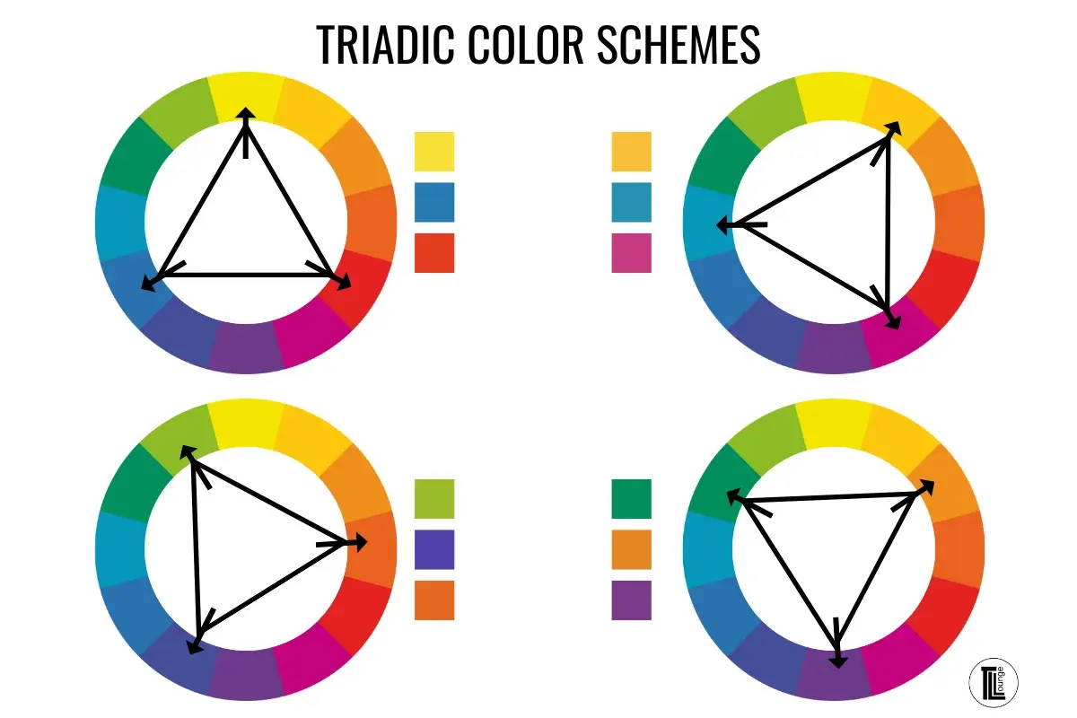
- Use a color wheel to find complementary colors if you want a bold, high-energy look.
- Stick to one or two accent colors to maintain a cohesive theme.
- When in doubt, let the black be the primary color and use your chosen accent color for small, impactful details like pillows, jewelry, or trim.
Key facts
- Black is an achromatic color, meaning it lacks hue, which allows it to pair effectively with virtually every color on the visible spectrum.
- High-contrast pairings, such as black and white, create a timeless, formal aesthetic often associated with sophistication and clarity.
- Pairing black with metallic tones like gold, silver, or copper adds a sense of luxury and depth to interior design or fashion.
- Warm colors like red, yellow, and orange appear more vibrant and intense when placed against a black background.
- Cool tones such as navy blue or dark charcoal can create a "near-black" look that provides a subtle, sophisticated monochromatic transition.
- To avoid a "heavy" visual weight in a room or outfit, incorporate textures like velvet, wood, or glass to break up solid black surfaces.
The bottom line
Black is the ultimate neutral, serving as a versatile foundation that enhances the intensity of other colors. Whether you are designing a living space or curating a wardrobe, the secret lies in balancing contrast and texture. By integrating metallic accents, vibrant hues, or varied materials, you can prevent black from feeling overwhelming, ensuring your final composition remains sophisticated, intentional, and visually balanced for any professional or personal setting.
People also ask
Is it acceptable to wear black with navy blue?
Yes, this combination is a modern classic that moves away from outdated fashion rules. To make it work, ensure there is enough contrast between the two shades so the outfit looks intentional rather than like a mismatched attempt at a single color.
How do I keep a black-dominated room from feeling too dark?
Introduce reflective surfaces like mirrors, metallic accents, or glass furniture to bounce light around the space. Additionally, layering different textures—such as a wool rug, leather chair, and silk curtains—prevents the room from appearing flat or gloomy.
What is the best way to accessorize a black dress?
Bold, bright colors like emerald green, fuchsia, or cobalt blue create an eye-catching focal point. Alternatively, metallic jewelry in gold or silver adds a refined, polished finish suitable for evening events.
Can black be paired with brown?
While once considered a fashion faux pas, black and brown are now frequently paired in high-end design. The key is to choose a rich, dark brown or a distinctively light tan to ensure the colors do not look like they are simply clashing.
What are the common mistakes when styling black?
A frequent error is wearing too many different shades of black that have faded at different rates, which can look messy. Another mistake is failing to use lighting or texture, which makes black areas look like a "black hole" rather than a design element.
Does black work well with pastel colors?
Black provides a grounding effect that prevents pastels from looking too childish or overly sweet. Using black as a trim or an accent color helps define the shape of soft pinks, mint greens, or baby blues.
This answer was created with the help of AI research tools and reference sources. Spotted an error? Let us know — we correct mistakes quickly. See our editorial policy.