How do you use a color wheel?
Short answer
A color wheel is a visual tool that organizes the visible spectrum into a circle to illustrate the relationships between colors. By identifying primary, secondary, and tertiary hues, you can use it to select harmonious color schemes, balance saturation, and create specific visual moods for design, art, or interior decorating projects.
On this page
How to understand the basic structure
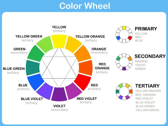
The standard color wheel, often called the RYB model, is based on the work of painters and color theorists like Johannes Itten. It consists of twelve distinct hues arranged to show how they transition into one another. At the center are the three primary colors: red, yellow, and blue. These are the foundation because they cannot be created by mixing other pigments.
Surrounding the primaries are the secondary colors, which are created by mixing two primary colors together. These include green, orange, and violet. Finally, the outer ring features tertiary colors, formed by mixing a primary color with an adjacent secondary color. Examples include red-orange, yellow-green, and blue-violet. Understanding this hierarchy is essential for predicting how colors will interact when placed side by side.
- Primary: Red, Yellow, Blue.
- Secondary: Orange, Green, Violet.
- Tertiary: Red-Orange, Yellow-Orange, Yellow-Green, Blue-Green, Blue-Violet, Red-Violet.
How to choose a color scheme
Selecting a palette is the most practical application of the wheel. Designers use geometric shapes placed over the center of the wheel to find colors that work well together. A monochromatic scheme uses one hue with varying shades and tints, creating a clean, sophisticated look. An analogous scheme uses colors that sit side-by-side, such as blue, blue-green, and green, which feels natural and calming.
For higher contrast, designers often turn to complementary or triadic schemes. Complementary colors are located directly across from each other, such as red and green, providing maximum visual impact. Triadic schemes involve three colors spaced evenly around the wheel, forming an equilateral triangle. This approach offers a vibrant, balanced palette that is often used in branding and illustration to ensure that no single color dominates the composition entirely.
- Monochromatic: One hue, different values.
- Analogous: Three adjacent colors.
- Complementary: Two opposite colors.
- Triadic: Three colors forming a triangle.
How to adjust shades and tints
A color wheel primarily shows pure hues, but real-world application requires depth and variety. You can modify any color on the wheel by adding white, black, or gray to change its value and intensity. Adding white creates a tint, which makes a color lighter and softer. Adding black creates a shade, which makes a color deeper and more dramatic.
Adding gray to a color creates a tone, which reduces the intensity or "brightness" of the hue. This is crucial for creating professional-looking designs where you want to avoid a "neon" or jarring effect. By using tints, shades, and tones, you can expand a simple three-color scheme into a complex, multi-layered palette. This technique allows for better readability and visual hierarchy, ensuring that important elements stand out while background colors remain subtle and supportive.
Why color temperature matters
The color wheel is effectively divided into two temperature zones: warm and cool. Warm colors—reds, oranges, and yellows—are associated with energy, heat, and sunlight. They tend to advance, meaning they appear closer to the viewer and can make a space feel smaller or more intimate. Cool colors—blues, greens, and purples—are associated with water, sky, and shade. They tend to recede, making a space feel larger and more tranquil.
Understanding temperature is vital for setting the mood of a room or a graphic design. If you want to create a cozy living room, you might lean toward warm, analogous colors. If you are designing a website for a financial institution, you might choose cool, monochromatic blues to convey trust and stability. Balancing these temperatures is key to preventing a design from feeling overwhelming or emotionally flat.
Common mistakes when using a color wheel
One of the most frequent errors is ignoring the 60-30-10 rule when applying a chosen scheme. Beginners often give every color equal weight, which makes a design feel chaotic or cluttered. Instead, aim for 60% of your primary color, 30% of a secondary color, and 10% of an accent color. This proportion creates a natural focal point and gives the eye a place to rest within the composition.
Another common mistake is failing to account for lighting conditions. A color that looks perfect on the wheel may appear drastically different under warm incandescent lighting versus cool daylight. Always test your chosen colors in the actual environment where they will be used. Finally, avoid using too many high-saturation colors at once, as this creates visual fatigue. By muting some of your choices with gray or choosing lighter tints, you can create a much more professional and harmonious result.
Key facts
- The traditional color wheel, popularized by Isaac Newton in 1666, organizes the visible spectrum into a circle to show the relationships between hues.
- Primary colors—red, yellow, and blue—are the foundation colors that cannot be created by mixing other pigments.
- Secondary colors, including green, orange, and purple, are formed by mixing two primary colors in equal parts.
- Complementary colors sit directly opposite each other on the wheel, creating high-contrast, vibrant combinations when used together.
- Analogous colors are located side-by-side on the wheel and create harmonious, serene palettes that are easy on the eyes.
- To create a triad scheme, select three colors that are evenly spaced around the wheel, forming an equilateral triangle.
The bottom line
The color wheel is an essential tool for artists, designers, and hobbyists to master visual harmony. By understanding the relationships between primary, secondary, and tertiary hues, you can move beyond guesswork to create intentional, balanced palettes. Whether you are painting a room, designing a logo, or selecting an outfit, applying these fundamental principles ensures that your color choices feel professional, cohesive, and visually engaging every time.
People also ask
What is the difference between hue, tint, and shade?
A hue is the pure color itself, such as red or blue. A tint is created by adding white to a hue, while a shade is created by adding black to a hue.
How do I use the color wheel for interior design?
Designers often use the 60-30-10 rule: 60 percent of the room is a dominant neutral, 30 percent is a secondary color, and 10 percent is an accent color from the wheel. This creates balance without overwhelming the space.
Can the color wheel help with choosing clothing colors?
Yes, identifying your skin’s undertone helps you select colors that complement your complexion. People with cool undertones often look best in blue-based colors, while those with warm undertones favor yellow-based hues.
What are tertiary colors?
Tertiary colors are created by mixing a primary color with an adjacent secondary color. Examples include red-orange, yellow-green, and blue-violet.
Read the full answer →Why do some color combinations look "clashing" or unpleasant?
Clashing usually occurs when colors with high intensity are placed together without a neutral bridge. Using the color wheel helps you avoid this by identifying discordant pairings that lack a clear relationship.
Is the color wheel the same for digital screens and paint?
No, digital screens use the RGB (Red, Green, Blue) model based on light, while painting uses the RYB (Red, Yellow, Blue) model based on pigments. The principles of relationships remain similar, but the results of mixing differ.
This answer was created with the help of AI research tools and reference sources. Spotted an error? Let us know — we correct mistakes quickly. See our editorial policy.