How do you choose a color palette?
Short answer
Choosing a color palette requires balancing emotional intent with visual harmony. Start by selecting a primary base color, then use the color wheel to find complementary or analogous shades. Limit your selection to three or four colors to maintain cohesion, ensuring that contrast levels remain high enough for readability and aesthetic balance.
On this page
How to use the color wheel for harmony
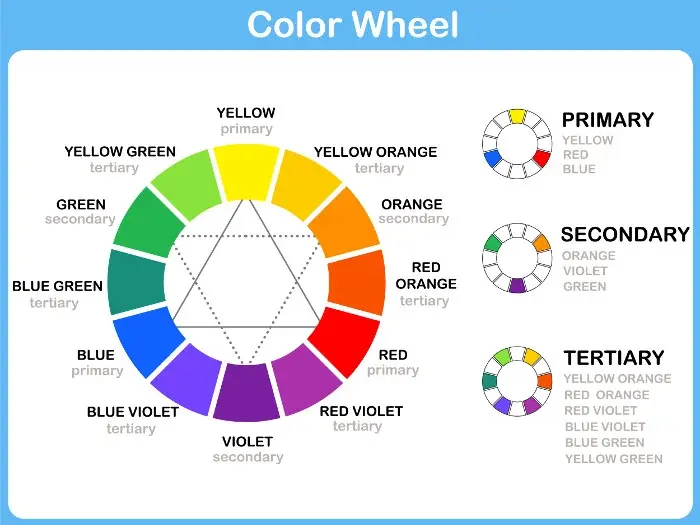
The color wheel is the foundational tool for building professional palettes. It organizes colors based on their relationships, helping you identify combinations that are naturally pleasing to the human eye. By understanding these geometric relationships, you can move beyond guesswork and create schemes that feel intentional and balanced.
To create a palette, apply these standard formulas:
- Complementary: Choose two colors directly opposite each other for high-energy contrast.
- Analogous: Pick three colors side-by-side on the wheel for a serene, natural look.
- Triadic: Select three colors equally spaced around the wheel for a vibrant, balanced scheme.
- Monochromatic: Use various shades, tints, and tones of a single hue for a sophisticated, minimalist effect.
When applying these, remember the 60-30-10 rule. Allocate 60% of your design to a dominant neutral, 30% to a secondary color, and 10% to an accent color. This ratio prevents colors from competing for attention and ensures a clear visual hierarchy.
How to choose colors based on psychology
Colors carry inherent psychological weight and cultural associations that influence how a viewer perceives your project. For instance, blue is frequently associated with trust and stability, making it a staple for corporate branding. Red often evokes urgency or passion, while green suggests growth, health, and environmental consciousness.
When selecting your palette, consider the emotional goal of your project:
- Identify the primary emotion you want to evoke.
- Research the cultural context of your target audience, as color meanings vary globally.
- Select a base color that aligns with those findings.
- Add secondary colors that support the mood without distracting from the primary message.
Avoid using too many high-intensity colors at once, as this can create visual fatigue. If your goal is to convey calmness, prioritize desaturated colors or pastels. If you want to signal excitement, lean toward high-saturation hues, but keep them limited to small, impactful areas.
Best tools for building a color palette
Modern digital tools have simplified the process of extracting and testing color schemes. You no longer need to manually mix pigments to see how colors interact; software allows you to generate palettes from images or explore pre-made libraries. These tools are essential for ensuring your colors are accessible and technically accurate.
Popular resources for palette generation include:
- Adobe Color: Offers a deep interface for exploring color rules and extracting themes from uploaded photos.
- Coolors: A fast generator that allows you to lock specific colors and shuffle the rest until you find a match.
- Color Hunt: A curated library of community-created palettes that are useful for inspiration when you are stuck.
- WebAIM Contrast Checker: A vital tool to ensure your text colors are legible against your background colors.
Always test your chosen palette in the medium where it will live. A color that looks vibrant on a backlit computer screen may appear dull when printed on matte paper.
Common mistakes when choosing a color palette
The most frequent error in palette creation is ignoring contrast. If your background and foreground colors are too similar in value, your content becomes unreadable, regardless of how "pretty" the colors are. Always check for a sufficient contrast ratio, especially when dealing with text, to ensure your design remains accessible to all users.
Another mistake is overcomplicating the scheme. Beginners often try to include too many colors, which leads to a cluttered and unprofessional appearance. A palette with two or three well-chosen colors is almost always more effective than one with six or seven.
Avoid these common pitfalls:
- Relying on pure black and pure white for every design; try using dark grays or off-whites for a softer, more modern feel.
- Choosing colors based solely on personal preference rather than the needs of the project or audience.
- Failing to consider how colors look in grayscale, which helps reveal if your design relies too heavily on hue rather than value.
How to test your palette for accessibility
Accessibility is a non-negotiable aspect of professional design. A palette is only successful if it can be understood by everyone, including those with color vision deficiencies. Approximately 8% of men and 0.5% of women have some form of color blindness, most commonly red-green color blindness. Designing with these users in mind ensures your work is inclusive.
To verify your palette, follow these steps:
- Use a color blindness simulator to view your design through different filters.
- Ensure that you do not rely solely on color to convey important information, such as error states or status updates.
- Use patterns or icons alongside color to provide secondary visual cues.
- Check your final design against the Web Content Accessibility Guidelines (WCAG) to ensure your contrast ratios meet the minimum standards for readability.
By validating your choices through these technical checks, you ensure that your palette is not only aesthetically pleasing but also functional and equitable for your entire audience.
Key facts
- Use the 60-30-10 rule: 60% of your space is a primary color, 30% is secondary, and 10% is an accent.
- Complementary colors are located directly across from each other on the color wheel, providing high contrast.
- Analogous colors sit next to each other on the wheel, creating a harmonious and calm visual effect.
- The Adobe Color tool or Coolors.co are industry-standard digital resources for generating balanced palettes.
- Natural light significantly alters how colors appear, so always test swatches in the actual environment.
- Neutral colors like beige, gray, and white act as essential buffers to prevent vibrant colors from clashing.
The bottom line
Choosing a color palette is a strategic process that balances aesthetic harmony with functional communication. By applying established color theory principles like the 60-30-10 rule and understanding the psychological impact of different hues, you can create cohesive designs. Always test your choices in their final environment to ensure they remain effective, and remember that simplicity is often the most powerful tool in professional design work.
People also ask
How many colors should be in a palette?
Most professional designs utilize three to five colors. Using fewer than three can feel monotonous, while exceeding five often creates visual clutter and confusion.
What is the difference between warm and cool colors?
Warm colors include reds, oranges, and yellows, which evoke energy and intimacy. Cool colors consist of blues, greens, and purples, which typically suggest professionalism, calm, and distance.
Why do my colors look different on screen versus in print?
Screens use the RGB (red, green, blue) color model, while printers use CMYK (cyan, magenta, yellow, black). Always convert your digital files to CMYK before printing to ensure color accuracy.
How do I choose colors for a professional brand?
Consider color psychology, such as blue for trust or orange for creativity. Ensure your palette has high contrast for readability and remains consistent across all marketing materials.
Can I use black and white as part of my palette?
Yes, black and white are considered neutrals and are excellent for providing structure. They help ground a palette and allow more vibrant colors to stand out effectively.
Should I pick my favorite colors first?
Personal preference should be secondary to the intended purpose of the project. Prioritize the mood you want to convey and the expectations of your target audience.
This answer was created with the help of AI research tools and reference sources. Spotted an error? Let us know — we correct mistakes quickly. See our editorial policy.