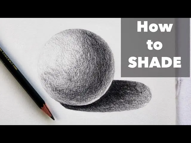
How do you color shadows with colored pencils?
Short answer
Coloring shadows with colored pencils requires moving beyond black or grey to create depth and realism. By selecting complementary or cool-toned colors, you can mimic how light interacts with surfaces. Layering these hues over your base colors, while adjusting pressure and blending, transforms flat shapes into three-dimensional, vibrant, and professional-looking illustrations.
On this page
Why use colors instead of black for shadows
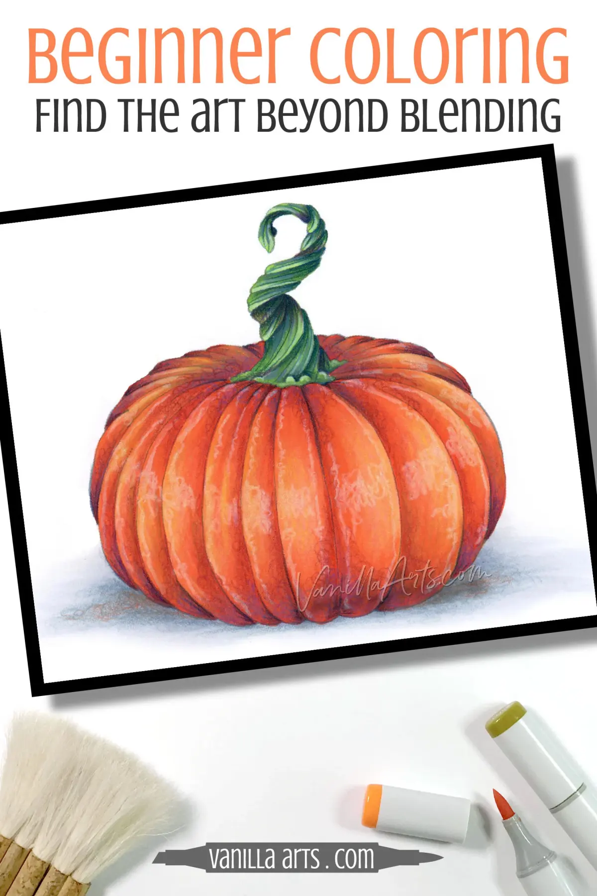
Using black to darken colors often results in a muddy, dull appearance that flattens the artwork. In reality, shadows are rarely pure black; they are composed of reflected light and the ambient tones of the environment. By choosing a color that complements your base hue, you preserve the richness of the pigment while achieving the necessary contrast. For example, a shadow on a red apple looks more natural when deepened with a dark violet or a deep blue rather than a harsh charcoal.
This technique is rooted in the principles of color theory. Shadows often take on the temperature of the light source or the surrounding environment. If you are drawing in warm sunlight, your shadows might lean toward cool blues or purples. If you are in a room with warm artificial light, your shadows might incorporate deep browns or burnt oranges. Understanding these relationships allows you to manipulate the viewer's perception of light, making your subjects appear solid and grounded within their specific space.
How to choose the right shadow colors
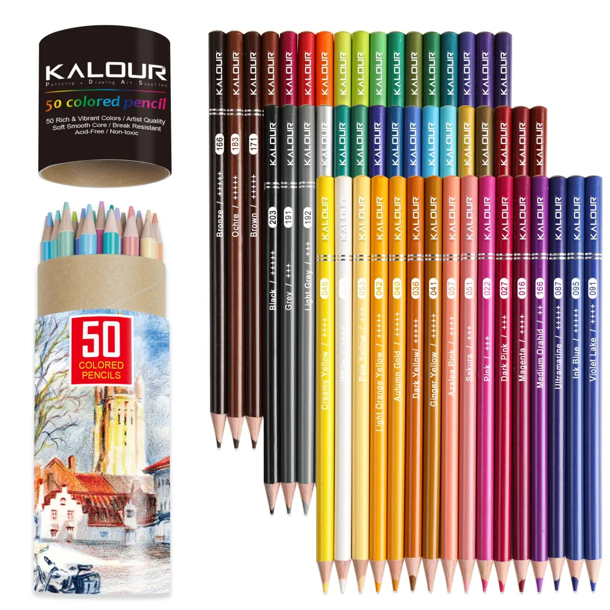
Selecting the perfect shadow color involves analyzing the base color and the light source. A reliable method is to use the color wheel to find the complement of your base color. If your object is yellow, a deep purple or indigo shadow will create a striking, luminous effect. If your object is green, a reddish-brown or deep burgundy shadow can add warmth and depth. Experimenting with these combinations helps you move away from generic grey shading.
When selecting pencils, consider these guidelines for effective color matching:
- Use cool colors like ultramarine, indigo, or violet for shadows in daylight.
- Use warm, dark earth tones like burnt umber or dark chocolate for indoor settings.
- Avoid using pure black to darken colors, as it desaturates the vibrancy of the original hue.
- Test your shadow color on a scrap piece of paper layered over your base color before applying it to your main drawing.

Step by step guide to layering shadows
Layering is the process of building up color intensity gradually to create smooth transitions. Start with a light touch, as you can always add more pigment, but removing it is difficult. By applying multiple thin layers, you allow the base color to show through the shadow, which creates a complex, glowing effect that looks far more realistic than a single, heavy layer of dark pigment.
Follow these steps to achieve a professional shadow application:
- Apply your base color lightly across the entire object, including the area destined for the shadow.
- Select a darker, cooler color and gently shade the areas furthest from the light source.
- Use a circular motion to blend the edges where the shadow meets the light, creating a soft transition.
- Add a final, very light layer of the base color over the shadow to unify the tones and soften the transition.
- Use a colorless blender pencil or a light-colored pencil to burnish the area, locking the pigments together for a smooth finish.
Common mistakes when coloring shadows
One of the most frequent errors is applying too much pressure too early in the process. When you press hard, you fill the "tooth" of the paper, making it impossible to add further layers or blend effectively. This often leads to a waxy, uneven surface that lacks depth. Always maintain a light, consistent touch, building the intensity of the shadow slowly to ensure the color remains vibrant and the texture stays consistent across the drawing.
Another common mistake is neglecting the reflected light within the shadow. Shadows are not uniform voids; they often contain subtle hints of color reflected from nearby objects or surfaces. Beginners often make their shadows too uniform, which makes the subject look like a flat cutout. To avoid this, observe your subject closely and look for areas where the shadow might be slightly lighter or warmer. By incorporating these subtle variations, you add a level of sophistication and realism that elevates your work from a simple sketch to a finished piece.
Best colored pencil techniques for depth
To achieve professional-grade results, you must master the art of blending and burnishing. Blending involves overlapping colors to create a seamless transition, while burnishing involves using heavy pressure to melt the wax or oil binders in the pencil, creating a dense, polished look. When working on shadows, use a combination of these techniques to ensure the transitions between light and dark are smooth and convincing.
Consider these advanced tips to enhance your shadow work:
- Cross-hatching: Use intersecting lines of different shadow colors to build depth and texture.
- Scumbling: Apply small, circular scribbles to create a soft, atmospheric shadow effect.
- Eraser lifting: Use a kneaded eraser to lift out small highlights within a shadow to suggest reflected light.
- Paper selection: Use high-quality, toothy paper that can hold multiple layers of pigment without becoming oversaturated.
- Patience: Take your time to build the shadow in stages, as rushing the process often leads to muddy colors and lost details.
Key facts
- Avoid using black pencils for shadows, as they often make colors look muddy or flat.
- Use complementary colors, such as blue or violet, to deepen shadows on warm-toned subjects.
- Apply light pressure initially to build up layers, which allows for smoother transitions and depth.
- Incorporate cool colors in the shadows of objects lit by warm light to create natural contrast.
- Use a white or light-colored pencil to burnish or blend the edges of shadows into the background.
- Test your color combinations on a scrap piece of paper before applying them to your final drawing.
The bottom line
To master colored pencil shadows, move away from using black and embrace the use of complementary colors to achieve depth and realism. By layering colors with light pressure and considering the temperature of your light source, you can create shadows that feel vibrant and grounded. Practice observing how light interacts with objects, and always test your color combinations to ensure they harmonize with your subject.
People also ask
Should I use black to darken colors in a shadow?
It is generally better to use a darker shade of the object's local color or a complementary color. Black can desaturate your work and make shadows appear dull rather than vibrant.
How do I make shadows look soft rather than harsh?
Use a light touch and layer your colors gradually to soften the edges. You can also use a blending stump or a colorless blender pencil to smooth out the pigment.
What are complementary colors and why do they matter for shadows?
Complementary colors are opposites on the color wheel, such as blue and orange. Using them creates a neutral, realistic shadow that feels more integrated into the overall composition.
Can I use colored pencils over graphite?
You can, but it is often difficult because the wax or oil in the pencils may not adhere well to graphite. It is usually best to stick to one medium for the entire drawing.
How do I determine which color to use for a shadow?
Observe the light source and the surrounding environment. If the light is warm, the shadows will likely lean toward cool tones like blues, purples, or dark greens.
What is the best way to fix a shadow that looks too dark?
Use a kneaded eraser to gently lift excess pigment from the paper. If the color is already heavily layered, you may need to lighten it by blending a lighter color over the top.
This answer was created with the help of AI research tools and reference sources. Spotted an error? Let us know — we correct mistakes quickly. See our editorial policy.