What is the complementary color of orange?
Short answer
The complementary color of orange is blue. In color theory, complementary colors sit directly opposite each other on the traditional color wheel. When placed side-by-side, they create high-contrast, vibrant visual effects. Mixing these opposites together typically results in a neutral brown or gray, as they neutralize each other's chromatic intensity.
On this page
What is the color wheel?
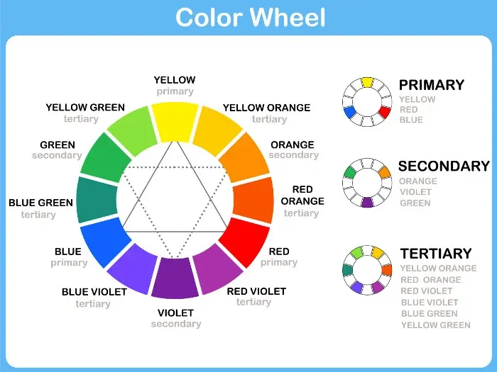
The traditional color wheel, often called the RYB model, is a circular arrangement of colors organized by their chromatic relationship. Developed by artists and theorists over centuries, it serves as the foundational tool for understanding how colors interact. At its core, the wheel consists of primary colors—red, yellow, and blue—which cannot be created by mixing other pigments. Secondary colors, such as orange, green, and violet, are formed by combining two primary colors.
Complementary colors are those positioned directly across from one another on this wheel. Because they share no common hues, they provide the strongest possible contrast. When you look at the wheel, you will find orange situated between red and yellow. Directly across from this position lies blue, which serves as its perfect complement. This relationship is essential for artists, designers, and decorators who wish to create dynamic, balanced compositions that capture the viewer's attention through intensity and depth.
How to use complementary colors in design
Using complementary colors effectively requires an understanding of visual balance. Because orange and blue are so visually distinct, using them in equal amounts can create a jarring, flickering effect known as vibration. To avoid this, designers often use one color as the dominant base and the other as a subtle accent. For example, a room painted in a soft, muted blue can be enlivened with small, bright orange accessories like throw pillows or artwork.
When working with these pairings, consider the following strategies to achieve a professional look:
- Use varying shades and tints: Pair a deep navy blue with a pale, creamy peach to soften the intensity of the contrast.
- Adjust the saturation: A bright, electric orange will pop significantly against a dark, desaturated slate blue.
- Control the proportions: Apply the 80/20 rule, where 80 percent of the space features one color and 20 percent features the complement to maintain harmony.
- Focus on texture: Use different materials, such as a matte blue wall against a glossy orange ceramic vase, to add physical depth to the color scheme.
Why do complementary colors look good together?
The visual appeal of complementary colors is rooted in human biology and the way our eyes process light. When you stare at a bright orange object for a prolonged period and then shift your gaze to a white wall, your eyes will often perceive a faint blue "afterimage." This phenomenon occurs because the photoreceptors in your retinas—specifically the cone cells—become fatigued by the orange light. As they recover, they signal the brain to perceive the opposite color to rebalance the visual field.
Beyond biology, this pairing is aesthetically pleasing because it satisfies the brain's desire for balance. By combining a warm color like orange, which advances toward the viewer, with a cool color like blue, which recedes, you create a sense of spatial structure. This push-and-pull effect is a classic technique used in cinematography and fine art to draw focus to specific subjects. It ensures that the composition feels complete and intentional rather than chaotic or flat.
Common mistakes when mixing colors
One of the most frequent errors when working with orange and blue is failing to account for the undertones. Not all oranges are pure, and not all blues are neutral. A reddish-orange will interact differently with a purple-leaning blue than it will with a green-leaning cyan. If you mix the wrong variants, you may end up with a muddy, unattractive brown instead of a clean, vibrant contrast. Always test your color swatches in the actual lighting conditions where they will be displayed.
To ensure your color combinations remain crisp and intentional, follow these steps to avoid common pitfalls:
- Identify the dominant undertone of your orange (is it leaning toward red or yellow?).
- Select a blue that complements that specific undertone rather than choosing a random shade.
- Avoid using 100 percent saturation for both colors simultaneously, as this can cause visual strain.
- Use a neutral bridge color, such as white, gray, or cream, to separate the two colors if the contrast feels too aggressive.
- Check your work under both natural daylight and artificial indoor lighting, as colors shift significantly between these environments.
Best tools for finding color palettes
Modern digital tools have made it easier than ever to find the perfect complementary shades without relying on guesswork. Websites and mobile applications like Adobe Color or Coolors allow users to select a base color and automatically generate its exact complement. These tools provide precise hex codes, RGB values, and CMYK percentages, ensuring that your digital designs and physical prints remain consistent across all media platforms.
If you prefer a hands-on approach, purchasing a physical color wheel is an excellent investment for any creative project. These wheels often include windows or sliders that reveal complementary, analogous, and triadic color schemes instantly. Whether you are painting a canvas, selecting fabric for a quilt, or choosing a color scheme for a website, having a reliable reference ensures that your choices are grounded in proven color theory. By mastering the relationship between orange and blue, you gain the ability to manipulate mood and focus in any visual project you undertake.
Key facts
- The complementary color of orange is blue, as they sit directly opposite each other on the traditional color wheel.
- Complementary colors create the highest possible contrast when placed side-by-side, making both colors appear more vibrant.
- In the RYB (red-yellow-blue) color model used by artists, mixing orange and blue results in a neutral brown or gray.
- Complementary color schemes are frequently used in cinematography and graphic design to create visual balance and focus.
- Avoid mixing complementary colors in large quantities if you want to keep a hue bright, as they will neutralize each other into a muddy tone.
- To tone down an overly bright orange, add a tiny amount of blue to the mixture to desaturate it toward a muted earth tone.
The bottom line
The complementary color of orange is blue, a relationship defined by their direct opposition on the standard color wheel. Understanding this pairing allows you to manipulate visual contrast effectively, whether you are mixing pigments for art or selecting palettes for design. By balancing these opposites, you can create either high-impact, vibrant displays or muted, sophisticated tones, depending on the ratio of colors you choose to apply.
People also ask
What is the difference between complementary and analogous colors?
Complementary colors are opposites on the color wheel, providing maximum contrast. Analogous colors sit next to each other, creating a harmonious and less intense visual effect.
Why do orange and blue look good together?
Our eyes perceive these two colors as a balanced pair because they represent the full spectrum of primary and secondary hues. This pairing is visually stimulating because it satisfies the eye’s need for color equilibrium.
How do I use complementary colors in interior design?
Use one color as the dominant base for walls or large furniture and the other as an accent in pillows or artwork. This prevents the high contrast from becoming overwhelming in a living space.
Do digital screens use the same complementary colors as paint?
Digital screens use the RGB (red-green-blue) model, where the complement of orange is cyan. While the physical principles differ from paint, the concept of color opposition remains the foundation for digital design.
Can I use complementary colors to fix a mistake in a painting?
Yes, if a color is too intense, adding a small amount of its complement will neutralize it. This is a standard technique for creating shadows or realistic skin tones in portraiture.
Are there more than one set of complementary colors?
Yes, every color has a specific complement based on the color model being used. For instance, in the CMYK model used for printing, the complement of orange is a specific shade of cyan-blue.
This answer was created with the help of AI research tools and reference sources. Spotted an error? Let us know — we correct mistakes quickly. See our editorial policy.