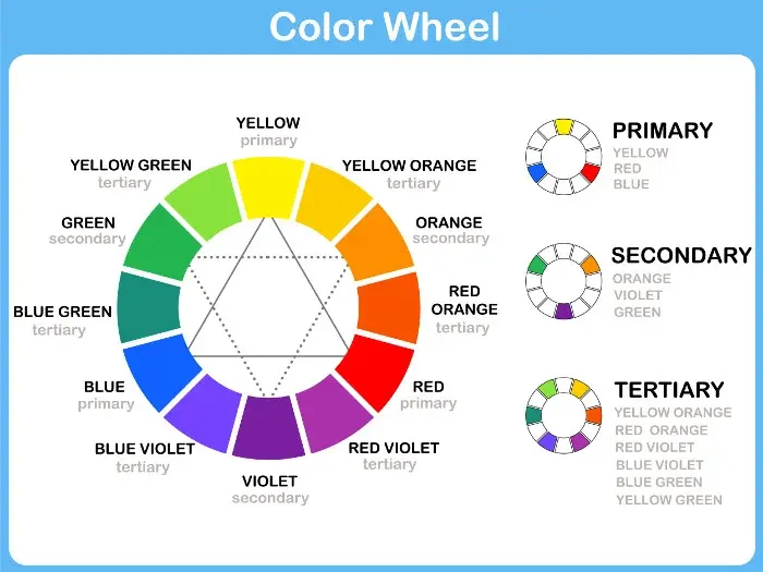
What colors make sepia?
Short answer
Sepia is created by mixing warm brown tones with a touch of yellow or orange, often balanced with a small amount of black or gray to desaturate the hue. In traditional photography, it was a reddish-brown pigment derived from the ink sac of the common cuttlefish, Sepia officinalis, used to tone prints.
On this page
What colors make sepia paint?
To recreate the classic sepia tone using standard artist paints, you must combine warm earth tones with a neutral base. The most effective starting point is a mixture of Burnt Umber and a small amount of Yellow Ochre or Raw Sienna. Burnt Umber provides the deep, dark brown foundation, while the yellow pigments introduce the characteristic warmth that distinguishes sepia from a flat, muddy brown.
If you find the mixture is too dark or lacks that aged, vintage quality, you can adjust the saturation by adding a tiny touch of white or a very pale gray. Conversely, if the color appears too vibrant or orange, introduce a microscopic amount of Ultramarine Blue. This complementary color will neutralize the intensity, pulling the mixture toward a more authentic, desaturated sepia tone. Always mix in small increments to maintain control over the final shade.
How to mix sepia for digital art
Digital color mixing relies on the RGB (Red, Green, Blue) color model rather than physical pigments. To achieve a sepia effect on a computer, you generally aim for a specific range of values where red and green are high, and blue is significantly lower. A standard hex code for a classic sepia tone is #704214, which translates to an RGB value of approximately 112, 66, 20.
- Open your color picker tool in your software of choice.
- Set your Red value to roughly 110-120.
- Set your Green value to 60-70.
- Set your Blue value to 15-25.
- Adjust the brightness slider to move between a light "aged paper" sepia and a dark "antique photograph" sepia.
By manipulating these specific ratios, you can create a custom palette that mimics the chemical toning processes used in the 19th century.
Why sepia looks the way it does
The unique appearance of sepia is rooted in the chemical process of toning black-and-white photographs. During the late 1800s, photographers used a solution containing sodium sulfide to replace the metallic silver in a print with silver sulfide. This chemical transformation fundamentally changed the light-absorbing properties of the image, shifting the neutral gray tones into a warm, brownish spectrum that was more resistant to fading and environmental damage.
This process was not merely an aesthetic choice but a practical method for archival preservation. Because the resulting silver sulfide particles were more stable than pure silver, sepia-toned images often survived in better condition than their black-and-white counterparts. The color became synonymous with the early era of photography, creating a visual shorthand for history, nostalgia, and the passage of time that persists in modern design and film aesthetics today.
Common mistakes when mixing sepia
One of the most frequent errors when attempting to create sepia is relying too heavily on black paint. Adding pure black to a brown mixture often results in a dull, "dead" color that lacks the luminous warmth associated with antique photographs. Instead of black, use a dark blue or a deep violet to deepen your shadows; these colors provide depth without stripping the mixture of its essential warmth.
Another common pitfall is over-mixing the pigments. When you blend colors too thoroughly, you lose the subtle variations in tone that give sepia its organic, textured feel. To avoid this, try these techniques:
- Use a palette knife to fold colors together rather than a brush.
- Leave small streaks of unmixed yellow or ochre to create visual interest.
- Test your mixture against a piece of cream-colored paper to ensure the tone matches your desired vintage aesthetic.
Best ways to apply sepia tones
When applying sepia to a project, context is critical. If you are painting on canvas, sepia works best as an underpainting or "imprimatura" layer. By establishing your composition in sepia before adding full-color glazes, you create a cohesive, warm foundation that unifies the entire piece. This technique, used by Old Masters, allows the warmth of the sepia to peek through the subsequent layers, providing a natural glow that is difficult to achieve with a white gesso base.
For those working in design or photography, sepia is best used as a filter or a gradient map rather than a solid block of color. Applying a gradient that transitions from a deep, dark sepia in the shadows to a pale, creamy beige in the highlights mimics the natural dynamic range of historical prints. By following these professional guidelines, you can ensure your work maintains a sophisticated, timeless quality that avoids looking artificial or overly processed.
Key facts
- Sepia is traditionally derived from the ink sac of the common cuttlefish, Sepia officinalis.
- Modern digital sepia is typically a desaturated orange-brown color with a hex code of #704214.
- In painting, you can mix burnt umber with a small amount of deep blue or black to achieve a similar dark, warm tone.
- Historically, sepia was used as a permanent pigment for ink and watercolors because of its lightfastness.
- To create a sepia effect on paper, artists often use a base of raw sienna mixed with a touch of violet or grey.
- Avoid using pure red or yellow, as these will create a vibrant orange rather than the muted, earthy quality characteristic of sepia.
The bottom line
Sepia is an earthy, desaturated brown that mimics the historical ink derived from cuttlefish. While you can approximate the color by mixing burnt umber with subtle amounts of blue or grey, the most authentic results come from using specific artist pigments or digital color grading tools. Understanding that sepia is a warm, muted tone helps artists and photographers consistently replicate this classic, nostalgic aesthetic in their work.
People also ask
Is sepia the same as black and white photography?
No, sepia is a monochromatic tone that replaces the neutral grey scale of a black and white image with warm, brownish hues. While black and white uses only shades of grey, sepia introduces a specific color bias.
Why do old photographs look sepia?
Many 19th-century photographs turned sepia due to a chemical process called sepia toning, which replaced metallic silver in the print with silver sulfide. This process was originally intended to increase the archival stability and longevity of the photographic print.
Can I mix sepia using primary colors?
You can create a sepia-like brown by mixing red, yellow, and blue, but it is difficult to achieve the exact muted shade. It is more practical to start with a brown earth pigment like burnt umber and adjust the temperature with blue or white.
How do I make a digital image look sepia?
Most photo editing software includes a dedicated sepia filter that automatically adjusts the color balance and saturation. You can manually achieve the look by decreasing the saturation and shifting the color balance toward the orange-brown spectrum.
Does sepia ink fade over time?
Natural sepia ink is remarkably stable and resistant to light compared to many other organic dyes. This durability is why many historical manuscripts and sketches created with sepia ink remain legible centuries later.
Are there different shades of sepia?
Yes, sepia ranges from a light, golden-brown to a deep, dark chocolate tone depending on the concentration of the pigment. Modern digital variations often lean toward cooler or warmer tones depending on the desired aesthetic effect.
This answer was created with the help of AI research tools and reference sources. Spotted an error? Let us know — we correct mistakes quickly. See our editorial policy.