What colors go with green?
Short answer
Green is a versatile color that pairs beautifully with neutrals like white, gray, and beige for a clean look. For contrast, pair green with warm tones like terracotta, gold, or soft pink. Complementary colors, specifically shades of red and burgundy, create a bold, high-energy aesthetic that draws the eye immediately.
On this page
Which colors complement green best?
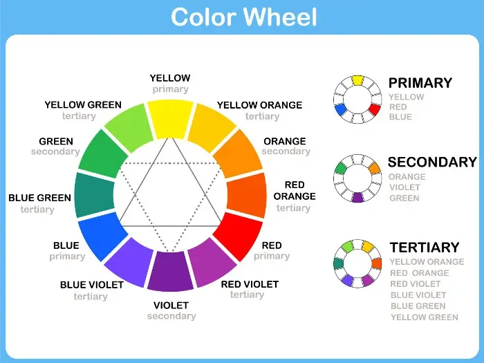
Green sits in the middle of the visible light spectrum, making it a bridge between cool and warm tones. To find the perfect match, designers often look to the color wheel. Complementary colors, which sit directly opposite green, include shades of red, magenta, and burgundy. These pairings create high-contrast, vibrant interiors or fashion statements. If you want a more subtle approach, analogous colors like yellow-green or blue-green create a harmonious, monochromatic flow.
Natural color palettes are often the most successful because they mimic the outdoors. Think of a lush forest or a garden; green is almost always accompanied by earth tones. Brown, tan, and cream act as a grounding force, preventing the green from becoming overwhelming. Whether you are painting a room or choosing an outfit, these pairings provide a sophisticated, timeless quality that rarely goes out of style.
How to use green in interior design
Integrating green into your home requires balancing the intensity of the shade. Dark, moody greens like forest or emerald work exceptionally well with metallic accents, particularly brass or gold. These metals add a touch of luxury and warmth that cuts through the coolness of deep green walls. For lighter, minty, or sage greens, crisp white trim and light oak wood tones are ideal choices to maintain an airy, open feeling.
When selecting your palette, consider the following steps to ensure balance:
- Identify the undertone of your green; cool greens have blue bases, while warm greens lean toward yellow.
- Choose a neutral anchor color, such as charcoal gray or warm beige, to cover at least sixty percent of the space.
- Apply your accent color—such as terracotta or mustard yellow—through textiles, pillows, or artwork to create focal points.
- Use wood textures to bridge the gap between the green and your other chosen colors, adding organic warmth.
What are the best color combinations for clothing?
Fashion styling with green involves understanding how different shades interact with your skin tone. Olive green is a neutral powerhouse that pairs effortlessly with denim blue, cream, and deep chocolate brown. It is a staple for casual wear because it feels grounded and approachable. If you are wearing a brighter lime or kelly green, keep the rest of your outfit neutral to avoid a cluttered appearance. Black is a classic choice, but navy blue often looks more modern and intentional when paired with vibrant green.
If you want to experiment with bold fashion, look at these specific combinations:
- Emerald green paired with metallic silver or bright white for a formal, high-fashion look.
- Sage green combined with soft lavender or dusty rose for a romantic, spring-inspired aesthetic.
- Forest green matched with camel or tan for a professional, polished office ensemble.
- Teal paired with mustard yellow for a retro, mid-century modern color story.
Why do some color combinations look off?
The most common issue with color pairing is a lack of contrast or clashing undertones. If you pair a cool, blue-based mint green with a warm, orange-based tan, the colors may look muddy or disjointed. This happens because the "temperature" of the colors is fighting against each other. To avoid this, always check your colors against each other in natural light before committing to a permanent choice like paint or a large furniture purchase.
Another frequent mistake is using too many competing bright colors alongside green. Green is already a dominant color in most environments; adding another high-saturation hue, such as bright purple or neon orange, can create visual tension that feels chaotic. If you want to use a bold color, keep the green as the primary base and use the second color sparingly as an accent. This allows the eye to rest and prevents the space or outfit from feeling over-stimulated or visually exhausting.
Common mistakes when pairing colors with green
Many people struggle with green because they underestimate how much light affects the color. A sage green that looks beautiful in a sunny living room might appear gray or dull in a windowless hallway. Always test your color samples in the specific room where they will live, observing how they change from morning to evening. Furthermore, avoid the "holiday" trap by pairing bright red with bright green unless you specifically intend to evoke a festive, seasonal theme.
To ensure your color choices remain timeless, follow these professional guidelines:
- Avoid matching a dark green with black if the room lacks sufficient natural light, as this can make the space feel like a cave.
- Do not ignore the texture of your materials; a velvet green sofa will reflect light differently than a matte green wall, changing how it interacts with nearby colors.
- Steer clear of using more than three distinct colors in a single palette, as this often leads to a lack of cohesion.
- Always prioritize a neutral base to act as a buffer between your green and any secondary accent colors you choose to incorporate.
Key facts
- Green is a secondary color created by mixing blue and yellow, making it highly versatile in interior and fashion design.
- Complementary colors, such as red or magenta, sit directly opposite green on the color wheel and create the highest visual contrast.
- Analogous colors like yellow-green and blue-green produce a harmonious, soothing effect when paired with a primary green shade.
- Neutral tones, including white, beige, grey, and cream, act as buffers that prevent vibrant greens from overwhelming a space.
- Metallic accents like gold and brass add warmth to cool-toned greens, while silver complements deep forest or emerald shades.
- Using the 60-30-10 rule—60% primary color, 30% secondary, and 10% accent—helps balance green with other colors effectively.
The bottom line
Green is a remarkably flexible color that thrives when balanced correctly. By utilizing the color wheel, you can achieve harmony through analogous pairings or excitement through complementary contrasts. Always use neutrals to ground your palette and prevent visual clutter. Whether designing a room or styling an outfit, prioritize the 60-30-10 rule to ensure your green elements remain the focal point without overwhelming the surrounding environment.
People also ask
Does green go with blue?
Yes, blue and green are analogous colors found side-by-side on the color wheel. This combination creates a cool, calming environment often inspired by nature, such as the ocean or a forest.
Can I wear green with black?
Black is a neutral that grounds bright greens, making it a sophisticated choice for clothing. It prevents neon or lime shades from looking too casual while adding depth to darker tones like olive.
What is the best color to pair with lime green?
Lime green is an energetic, high-intensity color that works best with crisp white or charcoal grey. These neutrals tone down the brightness, preventing the color from becoming visually exhausting.
Is it okay to mix different shades of green?
Monochromatic schemes using multiple shades of green are highly effective if you vary the textures and saturation levels. Use a dark moss for furniture and a pale sage for walls to create depth.
Does brown match green?
Brown and green are a classic, organic pairing derived from earth tones. Because brown acts as a natural neutral, it pairs seamlessly with almost any shade of green, from light mint to deep hunter.
How do I avoid color clashing when using green?
Avoid pairing green with colors that have clashing undertones, such as certain warm oranges that may look muddy. Stick to the color wheel to ensure your chosen shades share a common temperature.
This answer was created with the help of AI research tools and reference sources. Spotted an error? Let us know — we correct mistakes quickly. See our editorial policy.