What is color harmony?
Short answer
Color harmony is the practice of combining colors in a way that is visually pleasing and balanced to the human eye. Based on the color wheel, it relies on mathematical relationships between hues to create aesthetic order. Designers use these principles to ensure that color schemes feel intentional, cohesive, and professional.
On this page
What is the history of color harmony?
The study of color harmony dates back to the 17th century when Sir Isaac Newton developed the first circular color diagram. By refracting white light through a prism, Newton identified the visible spectrum and mapped it onto a wheel, establishing the primary, secondary, and tertiary relationships that define color theory today. This scientific foundation allowed artists to move beyond intuition and toward a systematic approach to composition.
In the 19th century, Johann Wolfgang von Goethe and Michel Eugène Chevreul further refined these concepts. Chevreul, a French chemist working at a tapestry factory, discovered the principle of simultaneous contrast, noting that colors appear different depending on the hues placed next to them. His work became the bedrock for Impressionist painters and modern graphic designers. Today, color harmony remains a standardized language used globally in industries ranging from interior design to digital interface development to ensure visual clarity and emotional impact.
How do you use the color wheel?
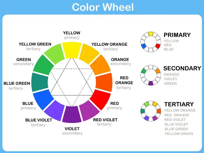
The color wheel serves as the primary tool for selecting harmonious palettes. It consists of twelve colors: three primary colors (red, yellow, blue), three secondary colors (green, orange, purple), and six tertiary colors. By selecting colors based on their geometric position on this wheel, you can create balanced combinations that feel natural and intentional.
To build a professional palette, follow these standard formulas:
- Complementary: Two colors directly opposite each other on the wheel, creating high contrast.
- Analogous: Three colors sitting side-by-side, providing a serene and comfortable aesthetic.
- Triadic: Three colors spaced evenly around the wheel, offering a vibrant and balanced look.
- Split-Complementary: A base color plus the two colors adjacent to its complement, reducing the intensity of a standard complementary scheme.
- Monochromatic: Variations of a single hue using different tints, tones, and shades.
Why does color harmony matter?
Color harmony is essential because it dictates how a viewer perceives and interacts with a design. When colors clash, they create visual tension that can cause fatigue or confusion, making it difficult for the audience to focus on the intended message. Conversely, harmonious palettes guide the eye, establish a clear hierarchy, and evoke specific psychological responses.
For example, warm colors like red and orange often stimulate energy, while cool colors like blue and green promote calm. By applying harmony, you ensure that the emotional tone of your work is consistent. Whether you are painting a room, designing a website, or creating a logo, harmony acts as the structural glue that holds your visual elements together. It transforms a random collection of hues into a cohesive experience that feels polished and trustworthy to the observer.
Best color harmony tips for beginners
Starting with color harmony is best done by limiting your palette. Beginners often make the mistake of using too many colors, which leads to a chaotic result. By sticking to a simple formula, such as a monochromatic or analogous scheme, you can learn how different values—the lightness or darkness of a color—affect the overall mood of your project.
Follow these steps to develop your first harmonious scheme:
- Choose a dominant color that represents the primary mood you want to convey.
- Select a harmony formula, such as complementary or triadic, to find your secondary colors.
- Use the 60-30-10 rule: 60 percent of the space for your dominant color, 30 percent for your secondary color, and 10 percent for an accent color.
- Adjust the brightness and saturation of your chosen colors to create depth and interest without disrupting the underlying harmony.
- Test your palette in a small area before applying it to your entire project to ensure the balance feels correct.
Common mistakes when choosing colors
One of the most frequent errors is ignoring the role of neutral colors. Many people focus exclusively on vibrant hues and forget that grays, whites, and blacks are necessary to give the eye a place to rest. Without these neutrals, a design can quickly become overwhelming or difficult to read, regardless of how well the primary colors work together.
Another common pitfall is failing to consider the context of the colors. A palette that looks beautiful on a small digital screen may behave differently when printed on paper or applied to a large wall. Lighting conditions also play a significant role; natural sunlight often makes colors appear warmer, while fluorescent office lighting can make them look sterile or washed out. Always evaluate your color choices in the environment where they will actually be used. By accounting for these variables, you avoid the frustration of a design that looks perfect on paper but fails to perform in reality.
Key facts
- Color harmony is the aesthetic arrangement of colors that creates a pleasing visual balance for the human eye.
- The color wheel, first developed by Isaac Newton in 1666, serves as the primary tool for identifying harmonious combinations.
- Complementary colors sit directly opposite each other on the wheel, such as blue and orange, providing high contrast and energy.
- Analogous schemes use three colors located side-by-side on the wheel, creating a serene and comfortable visual experience.
- The 60-30-10 rule suggests using a primary color for 60% of a space, a secondary for 30%, and an accent for 10%.
- Avoid "vibration" by not placing two highly saturated, opposing colors directly against one another, as this causes eye strain.
The bottom line
Color harmony is the intentional selection of colors that work together to create visual order and beauty. By utilizing tools like the color wheel and adhering to balanced proportions, you can avoid clashing palettes and achieve professional results. Whether you are designing a room or creating art, the key is to prioritize contrast and unity, ensuring your chosen colors support rather than compete with one another.
People also ask
How do I choose a color palette for a room?
Start by selecting a dominant neutral color for the walls, then pick two or three accent colors from the opposite side of the color wheel. Use the 60-30-10 rule to ensure the proportions feel balanced rather than chaotic.
What is the difference between warm and cool colors?
Warm colors like red, orange, and yellow evoke energy and intimacy, while cool colors like blue, green, and purple suggest calmness and distance. Mixing both types in a single space creates depth and prevents the room from feeling one-dimensional.
Can I use more than three colors in a design?
Yes, but you should designate one color as the primary anchor to prevent the design from looking cluttered. Use additional colors sparingly as small accents to draw the eye toward specific focal points.
Why do some color combinations look "muddy" together?
Muddy colors often occur when you mix too many colors with different undertones or low saturation levels. Stick to a defined scheme, such as monochromatic or triadic, to keep the relationships between hues clear and intentional.
What is a monochromatic color scheme?
A monochromatic scheme uses variations in lightness and saturation of a single hue. This approach is highly effective for creating a sophisticated, minimalist look that is easy on the eyes.
How does lighting affect color harmony?
Natural and artificial light sources shift the appearance of pigments throughout the day. Always test paint or fabric samples in the specific room where they will be used to see how they react to the available light.
This answer was created with the help of AI research tools and reference sources. Spotted an error? Let us know — we correct mistakes quickly. See our editorial policy.