What colors go with yellow?
Short answer
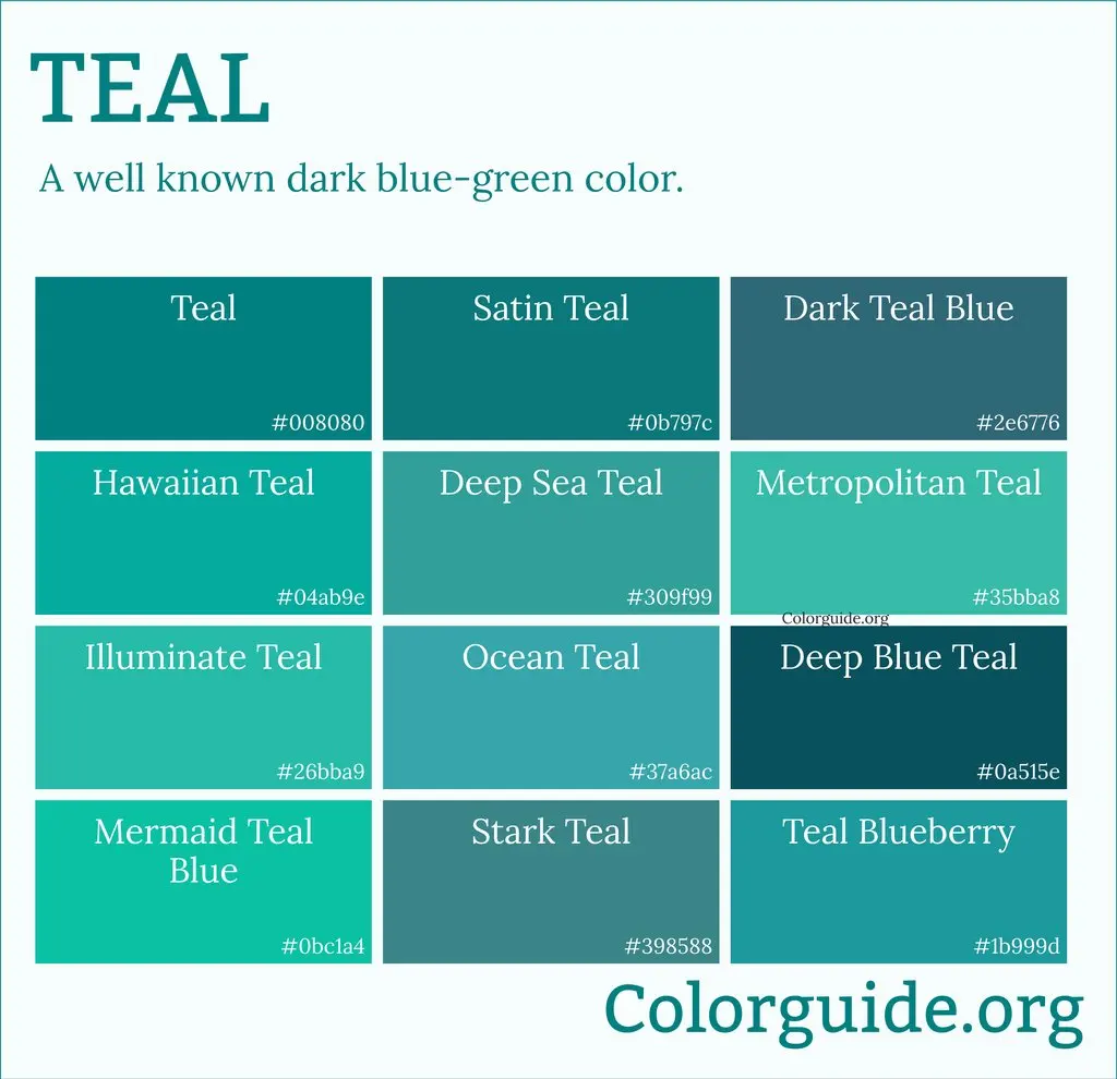
Yellow pairs beautifully with neutrals like gray, white, and navy, which ground its brightness. For bold contrasts, pair it with purple or deep teal. Soft pastels like sage green or blush pink create a gentle, sophisticated look. The key is balancing intensity; pair vibrant yellows with muted tones to maintain visual harmony.
On this page
Which colors complement yellow best?
Yellow is a primary color that radiates warmth and energy, making it a versatile choice for interior design and fashion. Because it sits on the warmer end of the spectrum, it works best when balanced by colors that provide either contrast or calm. Complementary colors, which sit directly opposite yellow on the color wheel, are the most effective for creating high-impact, energetic schemes. Purple, ranging from deep plum to soft lavender, offers a sophisticated contrast that prevents yellow from feeling overwhelming.
For those seeking a more harmonious and natural palette, analogous colors like orange and yellow-green provide a softer transition. These combinations mimic the colors found in nature, such as a sunset or a meadow, creating a sense of organic flow. When selecting a secondary color, consider the undertone of your yellow; a cool, lemon yellow pairs better with blues and grays, while a warm, golden yellow thrives alongside earthy browns and terracotta tones.
How to use yellow in home decor
Incorporating yellow into a living space requires a strategic approach to avoid sensory overload. Start by using yellow as an accent color rather than a primary wall color to maintain a balanced atmosphere. Textiles are an excellent entry point, as they can be easily swapped if the room feels too bright. Consider these effective ways to integrate yellow:
- Use yellow throw pillows on a charcoal or navy blue sofa to create a sharp, modern contrast.
- Incorporate mustard yellow curtains in a room with neutral, cream-colored walls to add depth without clutter.
- Place a vibrant yellow rug in an entryway to provide a welcoming, high-energy focal point.
- Add yellow ceramic vases or artwork to a kitchen with white cabinets to introduce a cheerful, sunny aesthetic.
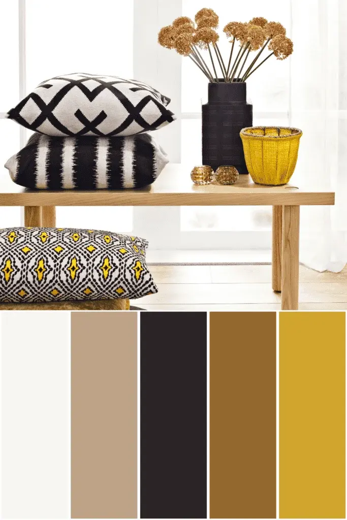
When pairing yellow with furniture, wood tones play a significant role. Light oak and pine enhance the brightness of yellow, creating a Scandinavian-inspired look, while dark walnut or mahogany grounds the color, giving it a more formal, traditional appearance.
Best color combinations for fashion
Yellow is a statement color that can elevate an outfit when paired with the right neutrals or complementary shades. For a professional or polished look, navy blue is the gold standard; the deep, dark tones of navy act as an anchor, allowing the yellow to pop without appearing garish. White and gray are also essential partners, providing a clean, crisp backdrop that keeps the overall ensemble feeling light and airy.
If you are feeling bolder, try pairing yellow with contrasting tones like teal or fuchsia. These combinations are visually striking and work particularly well in accessories, such as a yellow handbag paired with a teal dress. When building an outfit, follow these steps to ensure balance:
- Identify the intensity of your yellow garment, such as neon, pastel, or mustard.
- Select a neutral base color that matches the undertone of your yellow.
- Add a third, smaller accent color, such as metallic gold or silver, to tie the look together.
- Keep the silhouette simple to ensure the color remains the primary focus of the outfit.
Why yellow can be difficult to style
The primary challenge with yellow lies in its high visibility and psychological impact. As one of the most luminous colors, it demands attention and can quickly dominate a space or an outfit if used in excess. A common issue is "visual fatigue," where the brightness of the color causes the eye to tire, making a room feel chaotic or an outfit feel aggressive. This is particularly true with neon or primary yellow shades, which carry a high saturation level.
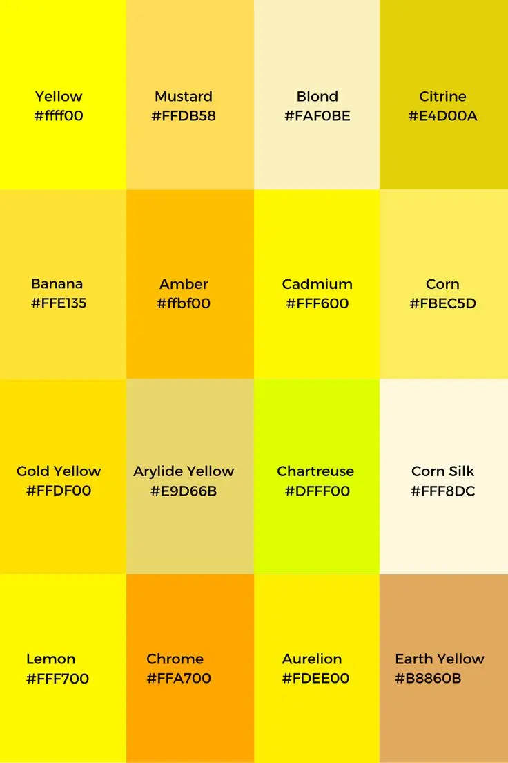
Another difficulty is the "undertone clash." Yellows can lean toward green or orange, and failing to match these undertones with surrounding colors can lead to a muddy or discordant appearance. For example, a cool, greenish-yellow will look jarring against a warm, reddish-brown. To avoid this, always test color swatches in the specific lighting conditions where they will be used, as natural daylight and artificial bulbs significantly alter how yellow appears to the human eye.
Common mistakes when pairing yellow
Many people make the mistake of using yellow in rooms with poor natural light, which can make the color appear dingy or sickly. In spaces without ample sunlight, yellow often loses its vibrancy and takes on an unappealing, greenish hue. Another frequent error is using too many bright colors at once; yellow should generally be the "star" of the palette, supported by more muted tones. If you pair yellow with other high-intensity colors like bright red or electric blue, the result is often overwhelming and lacks a clear focal point.
Finally, avoid using yellow in large, monochromatic blocks unless you are aiming for a very specific, avant-garde aesthetic. Instead of painting all four walls yellow, try a single accent wall or incorporate the color through patterned wallpaper. By limiting the surface area, you retain the positive, uplifting energy of the color while ensuring the space remains comfortable and inviting. Always prioritize balance by ensuring that at least sixty percent of your palette consists of neutral tones to ground the vibrancy of the yellow.
Key facts
- Complementary colors, such as purple or violet, sit directly opposite yellow on the color wheel and create the highest visual contrast.
- Analogous color schemes, which pair yellow with neighboring shades like orange and green, produce a harmonious and natural aesthetic.
- Neutral colors including gray, white, and black serve as effective anchors to balance the intensity of bright yellow accents.
- Navy blue is a classic pairing for yellow, offering a sophisticated, high-contrast look often used in interior design and fashion.
- When working with yellow, use the 60-30-10 rule: 60% neutral, 30% secondary color, and 10% yellow as a bold accent.
- Avoid pairing yellow with too many other bright, saturated colors, as this can overwhelm the eye and create a chaotic visual environment.
The bottom line
Yellow is a versatile, high-energy color that thrives when balanced with the right partners. Whether you are decorating a home or styling an outfit, prioritize contrast by using deep blues or purples, or maintain harmony with greens and oranges. Always test your yellow shades in the actual lighting conditions of your environment to avoid unpleasant surprises, and remember that less is often more when using bold accents.
People also ask
Does yellow work well in small rooms?
Yellow can brighten a small space, but it is best used as an accent color rather than a primary wall color. Too much yellow in a cramped area can feel claustrophobic or overly stimulating.
What shade of yellow is easiest to match?
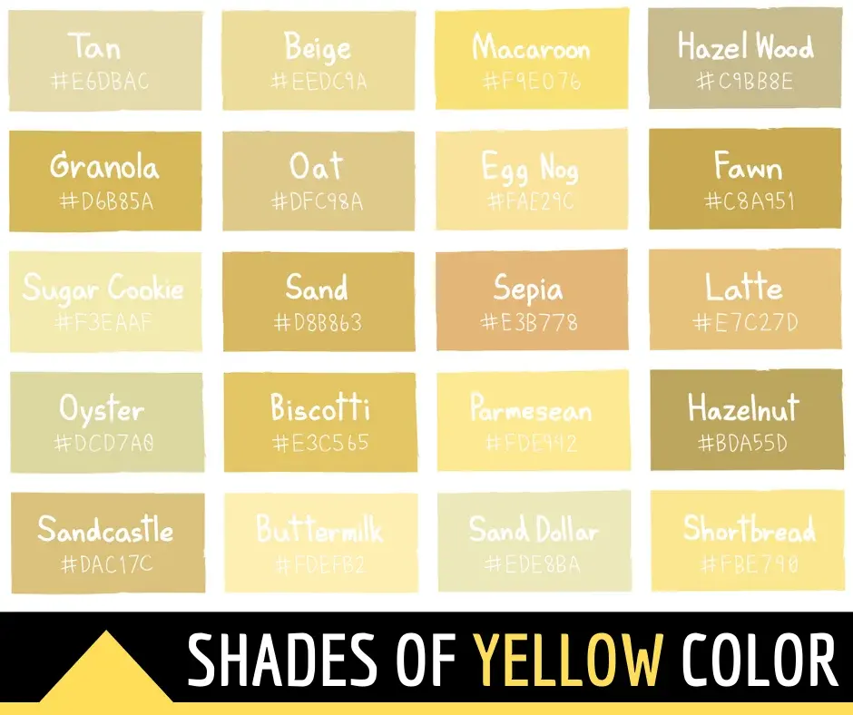
Muted, buttery, or mustard yellows are generally easier to incorporate into a space than neon or high-vis yellow. These softer tones act almost like neutrals and pair seamlessly with wood textures and earth tones.
Can I wear yellow if I have a cool skin tone?
Yes, look for cool-toned yellows that lean toward lemon or pale pastel rather than warm, golden hues. These shades complement the blue undertones in your skin without washing you out.
Why does my yellow paint look different on the wall than on the swatch?
Yellow is highly reflective and sensitive to ambient light. It will appear significantly brighter in direct sunlight and may take on green or orange undertones depending on the lightbulbs used in the room.
Is yellow a good color for a bedroom?
Soft, pale yellows can be soothing, but vibrant yellows are often too energetic for a sleeping space. If you want yellow in the bedroom, opt for light, creamy shades to maintain a restful atmosphere.
How do I combine yellow with metallic finishes?
Gold and brass finishes enhance the warmth of yellow, creating a luxurious and cohesive look. Silver and chrome provide a sharper, more modern contrast that helps ground the brightness of the yellow.
This answer was created with the help of AI research tools and reference sources. Spotted an error? Let us know — we correct mistakes quickly. See our editorial policy.