What colors go with sage green?
Short answer
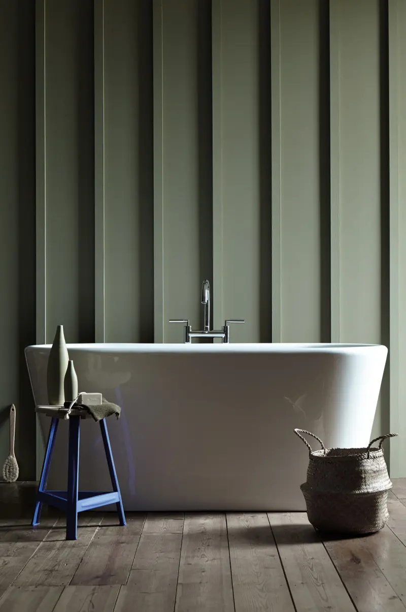
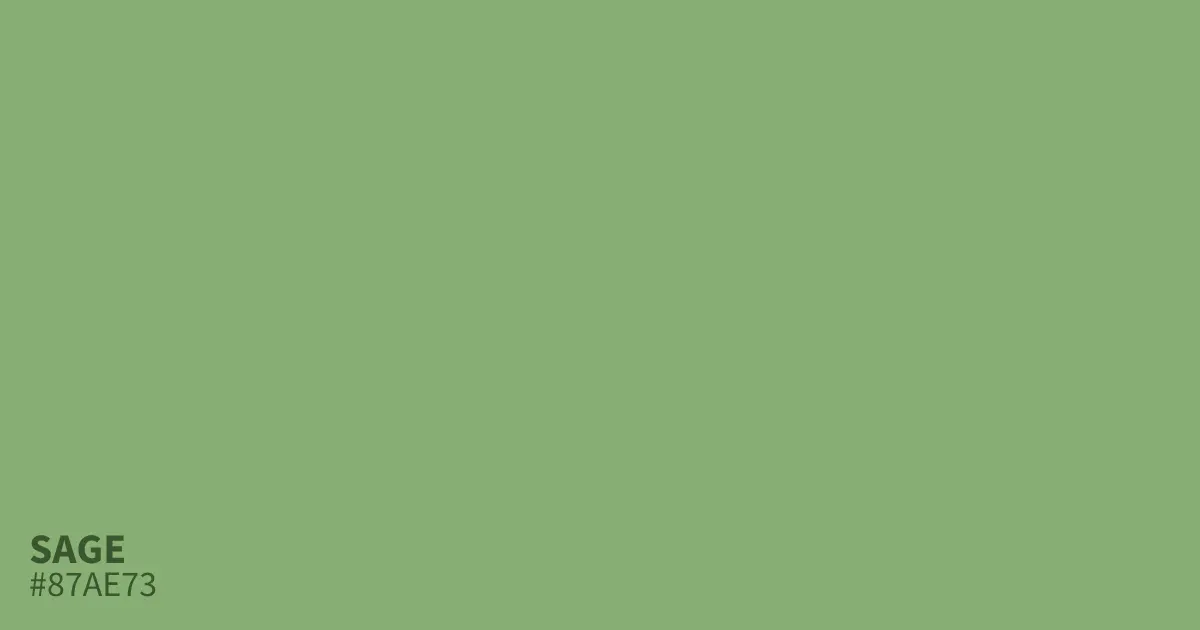
Sage green is a versatile, muted gray-green that pairs beautifully with earthy neutrals, warm metallics, and soft pastels. It thrives alongside creamy whites, charcoal grays, rich terracottas, and dusty pinks. Because of its cool, desaturated undertones, it acts as a sophisticated neutral base that anchors vibrant accents or complements monochromatic palettes.
On this page
Which neutral colors pair best with sage green?
Sage green functions as a bridge between nature-inspired tones and traditional neutrals, making it an ideal candidate for layering. The most successful pairings involve colors that respect the muted, organic quality of sage. Crisp, bright white can sometimes feel too stark against the softness of sage, so opt for warmer, cream-based whites or off-white shades like ivory and parchment to maintain a cohesive, gentle aesthetic.
For a more grounded or dramatic look, deep charcoal or slate gray provides a sophisticated contrast. These darker neutrals emphasize the green undertones in the sage, preventing the room from feeling washed out. If you prefer a warmer foundation, consider pairing sage with beige, sand, or light taupe. These colors share the same earthy DNA, creating a seamless, tranquil environment that feels both professional and inviting.
- Cream and off-white: Best for a bright, airy, and classic look.
- Charcoal gray: Ideal for adding depth, structure, and a modern edge.
- Sand and beige: Perfect for creating a warm, monochromatic, and soothing space.
- Greige: A balanced mix that bridges the gap between cool and warm tones.
How to use accent colors with sage green?
Introducing accent colors allows you to personalize a sage-based palette while maintaining the color's inherent calm. Because sage is desaturated, it handles both warm and cool accents well. If you want to lean into the nature-inspired theme, incorporate terracotta, burnt orange, or mustard yellow. These warm, earthy tones pop against the cool green, creating a vibrant, high-contrast look that feels grounded rather than chaotic.
For a more serene or romantic atmosphere, look toward the cooler side of the color wheel. Dusty rose, soft lavender, and muted plum provide a gentle, feminine contrast that feels elegant and timeless. If you prefer a bolder approach, navy blue or deep forest green can create a moody, sophisticated interior. When selecting accents, keep the saturation levels similar to the sage to ensure the colors do not clash or fight for visual dominance.
- Select one primary accent color to avoid overwhelming the sage base.
- Distribute the accent color in small doses, such as through throw pillows, artwork, or decorative vases.
- Use a secondary, neutral metallic to tie the accent color to the sage backdrop.
- Balance the intensity of the accent by adjusting the amount of natural light in the room.
What metallic finishes complement sage green?
Metallics act as the jewelry of a room, and sage green provides a unique backdrop that changes depending on the metal chosen. Warm metallics like antique brass, gold, and copper are widely considered the best partners for sage. These metals introduce a necessary warmth that balances the cool, grayish undertones of the green, resulting in a look that feels luxurious and high-end.
If you prefer a more industrial or minimalist aesthetic, brushed nickel or matte black hardware works exceptionally well. Matte black, in particular, creates a sharp, graphic contrast that makes sage green look more modern and edgy. Avoid polished chrome if you want to maintain a soft, organic feel, as its high shine can sometimes feel too clinical against the muted nature of sage. Instead, focus on brushed or satin finishes that offer a subtle, sophisticated glow.
Common mistakes when decorating with sage green
One of the most frequent errors when working with sage is failing to account for lighting. Because sage is a chameleon color, it can shift from appearing distinctly green to looking almost entirely gray depending on the light source. In rooms with north-facing windows, the cool light can make sage appear cold or drab. Always test paint swatches or fabric samples at different times of the day before committing to a large-scale design choice.
Another mistake is using too many competing colors in one space. While sage is a neutral, it still carries a distinct personality. Introducing too many bright or primary colors can strip away the relaxing, restorative quality that makes sage so popular. Stick to a limited palette of three to four colors to maintain a sense of harmony. Finally, avoid pairing sage with neon or overly saturated colors, as these will make the sage look muddy and dated rather than intentional and curated.
How to style sage green in different rooms?
In a bedroom, prioritize restfulness by pairing sage with soft textures and light, airy neutrals. Use linen bedding in cream or white, and add depth with a wool throw in a darker shade of green or charcoal. In a kitchen, sage green cabinets look stunning when paired with white marble countertops and brass hardware. This combination feels clean, timeless, and professional, providing a refreshing alternative to the standard all-white kitchen.
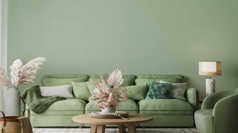
In living areas, use sage as a wall color to create a backdrop for furniture in warm wood tones like walnut or oak. These natural materials highlight the organic roots of the green, making the space feel connected to the outdoors. Regardless of the room, the key to success is layering textures—such as velvet, wood, stone, and metal—to ensure the sage green remains the star of the show without feeling flat or one-dimensional.
Key facts
- Sage green is a low-saturation, grey-toned green that functions as a neutral base in interior design.
- Pair sage with warm wood tones like walnut or oak to ground the space and create an organic, earthy aesthetic.
- Crisp white or soft cream accents provide high contrast, preventing the muted green from appearing muddy or dull.
- For a sophisticated, modern look, combine sage with metallic finishes like brushed brass or matte black hardware.
- Use terracotta or burnt orange as an accent color to create a complementary, vibrant contrast against the cool green.
- Avoid pairing sage with neon or overly saturated primary colors, as these can overwhelm its subtle, calming nature.
The bottom line
Sage green is a versatile, muted neutral that thrives when paired with natural textures and complementary warm tones. By balancing its cool, grey-toned base with crisp whites, earthy wood finishes, or metallic accents, you can create a sophisticated and calming environment. Focus on maintaining a cohesive palette by avoiding overly vibrant colors, ensuring that the subtle elegance of sage remains the primary feature of your space.
People also ask
Is sage green considered a warm or cool color?
Sage green is generally considered a cool color because of its blue and grey undertones. However, its earthy quality allows it to bridge the gap between warm and cool, making it highly versatile for various lighting conditions.
Can I use sage green in a small, dark room?
Yes, sage green works well in small rooms if you choose a lighter shade with higher reflectivity. Using it on all four walls can create a cozy, "jewel box" effect, especially when paired with light-colored furniture.
What wall color works best with sage green furniture?
Soft whites, greige, or light taupe are ideal choices for walls when you have sage green furniture. These neutral backdrops allow the green to serve as the focal point without making the room feel cluttered.
Does sage green go with grey?
Sage green and grey are a natural pairing because they share similar cool, desaturated undertones. To keep the room from feeling too cold, incorporate textures like wool, linen, or natural wood to add warmth.
Which metal finishes look best with sage green?
Brushed brass and gold are the most popular choices because they provide a warm, luxurious contrast to the muted green. Matte black offers a more modern, industrial edge, while chrome can feel a bit too clinical.
How do I choose the right shade of sage for my home?
Test paint samples on different walls to see how the color shifts throughout the day under natural and artificial light. Sage can look significantly greener in bright, sunny rooms and more grey in spaces with limited natural light.
This answer was created with the help of AI research tools and reference sources. Spotted an error? Let us know — we correct mistakes quickly. See our editorial policy.