What techniques did Emily Carr use?
Short answer
Emily Carr primarily utilized oil paints on paper, often thinning them with gasoline to create a watercolor-like effect. She employed rhythmic, swirling brushwork to depict the movement of nature, bold outlines to define forest giants, and a restricted, earthy palette to capture the atmospheric intensity of the Pacific Northwest landscape.
On this page
How did Emily Carr apply paint to paper?
Carr famously moved away from traditional canvas, preferring the texture and portability of paper. She often used a homemade medium consisting of house paint thinned with gasoline, which allowed for rapid, fluid application. This technique enabled her to work quickly in the field, capturing the fleeting light and dense atmosphere of the British Columbia rainforests before the paint dried.
To achieve her signature look, follow these steps:
- Prepare a heavy-duty, absorbent paper surface to withstand moisture.
- Mix your pigments with a thinning agent to achieve a translucent, wash-like consistency.
- Apply the paint in broad, sweeping motions, focusing on the rhythm of the subject rather than minute details.
- Use a dry brush or a rag to lift pigment if you need to create highlights or soften transitions.
Avoid using too much pressure with your brush, as this can tear the paper fibers when they are saturated with solvent-based mediums.
What brushwork techniques define her style?
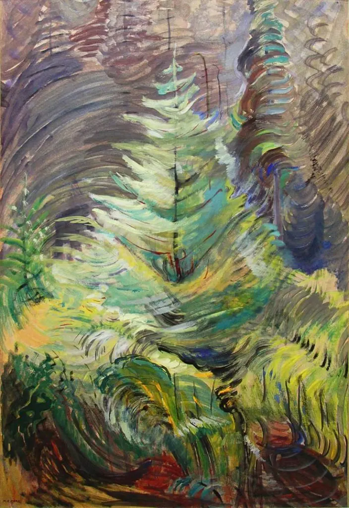
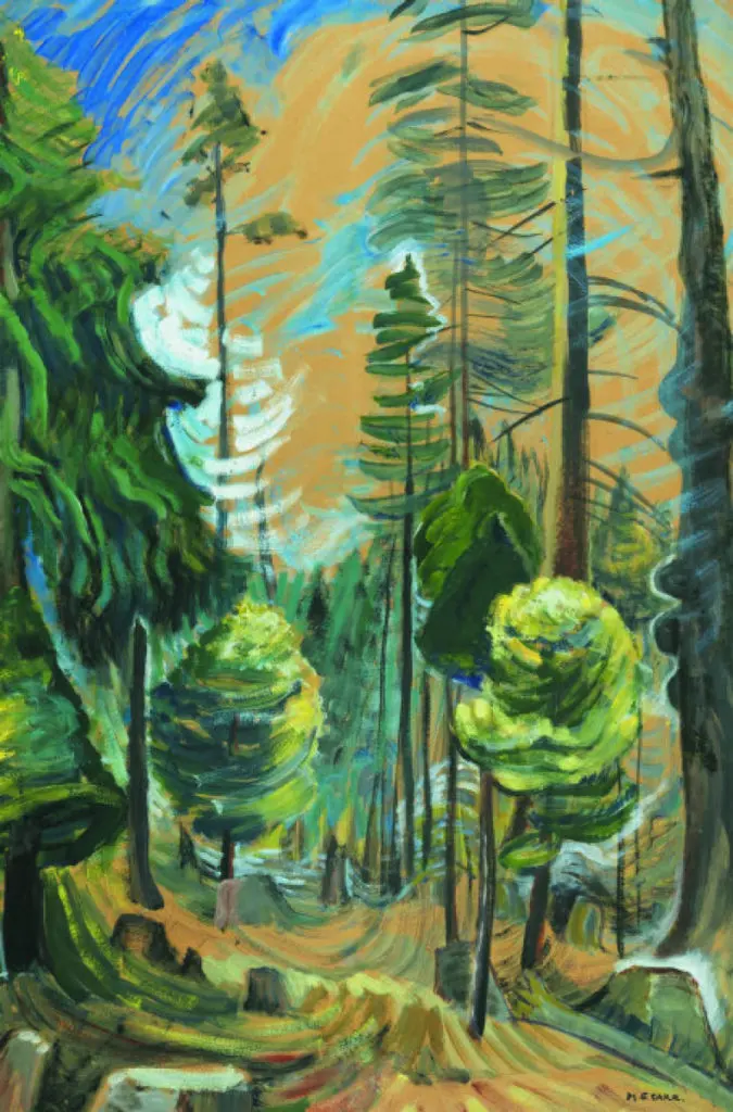
The hallmark of Carr’s mature work is her use of rhythmic, repetitive brushstrokes that suggest the vitality of living trees. She did not paint trees as static objects; instead, she captured their "movement" through swirling lines that mimic the growth patterns of cedar and fir branches. Her brushwork often looks sculptural, with thick, directional strokes that guide the viewer’s eye upward toward the canopy.
- Use curved, C-shaped strokes to represent the drooping boughs of conifers.
- Employ vertical, jagged lines to emphasize the height and strength of tree trunks.
- Vary the pressure of your brush to create a sense of depth, with darker, heavier strokes in the foreground and lighter, thinner marks in the distance.
By focusing on the "swing" of the tree rather than individual needles or leaves, you create a more visceral, emotional connection to the forest environment.
How did she use color to create atmosphere?
Carr’s palette was deeply influenced by the overcast, misty conditions of the West Coast. She frequently used muted greens, deep browns, ochres, and slate grays to reflect the damp, mossy reality of the woods. Rather than using bright, localized colors, she used tonal shifts to suggest the way fog clings to the mountains and how light filters through heavy foliage.
To develop a Carr-inspired color palette, consider these strategies:
- Limit your primary colors to earth tones and deep, forest-inspired pigments.
- Use stark white or pale yellow sparingly to represent the rare, piercing shafts of sunlight that break through the canopy.
- Apply darker colors in the shadows to create a sense of mystery and depth, ensuring the focal point of the painting remains illuminated.
Common mistakes include using too many saturated colors that clash with the natural, somber mood of the forest. Keep your transitions subtle to maintain the atmospheric integrity of the scene.
Why did she use bold outlines in her work?
As her style evolved, particularly after her contact with the Group of Seven, Carr began incorporating bold, dark outlines into her compositions. These lines served to anchor her swirling, rhythmic brushwork, preventing the image from becoming too chaotic or abstract. The outlines act as a structural framework, giving the massive totems and forest giants a sense of permanence and weight.
When integrating outlines into your own landscape paintings, keep these factors in mind:
- Use a dark, neutral tone like charcoal or deep brown rather than pure black, which can look artificial.
- Apply the outlines after the main color blocks are established to define the shapes more clearly.
- Do not outline every single element; focus on the primary subjects, such as the silhouette of a totem pole or the trunk of a dominant tree, to keep the composition balanced.
Over-outlining can make a painting look like a cartoon, so use these lines sparingly to provide structure without sacrificing the organic feel of the subject.
Common mistakes when painting like Emily Carr
Many artists attempting to emulate Carr’s style fail because they over-complicate the composition. Carr was a master of simplification; she stripped away unnecessary branches and foliage to reveal the "spirit" of the tree. If you find your work looks cluttered, try squinting at your subject to identify the three most important shapes and focus only on those.
Another frequent error is ignoring the importance of negative space. Carr often used the sky or the gaps between trees to create a sense of breathing room. Ensure your composition allows the viewer's eye to move through the painting without getting trapped in a sea of texture. Finally, remember that her work was deeply personal and rooted in her specific environment. Do not merely copy her brushstrokes; observe the natural world around you and allow your own emotional response to dictate the rhythm and intensity of your application. By focusing on the essential energy of the landscape, you can capture the same raw, expressive power that defined her iconic artistic legacy.
Key facts
- Carr utilized a unique medium of gasoline-thinned oil paints on manila paper to achieve quick, fluid brushstrokes during her forest excursions.
- She frequently employed a "rhythmic" application of paint, using sweeping, curved lines to emphasize the energy and movement of the natural landscape.
- Her palette transitioned from muted, traditional tones in her early career to vibrant, high-contrast colors influenced by the Fauvist movement.
- When painting large-scale canvases, she often used long-handled brushes to stand back from the work, allowing for broader, more gestural marks.
- A common technique involved "scumbling," where she dragged a dry, opaque layer of paint over an underlayer to create texture and depth.
- To avoid muddy colors, she applied paint in distinct, separate strokes rather than over-blending, ensuring the vibrancy of each hue remained intact.
The bottom line
Emily Carr’s artistic legacy is defined by her ability to synthesize the raw, untamed energy of the Canadian landscape through bold, rhythmic brushwork and expressive color. By mastering the balance between structural form and fluid motion, she transformed traditional landscape painting into a deeply personal, spiritual experience. Her techniques remain a masterclass in capturing the vitality of nature through purposeful, gestural marks and vibrant, unblended pigments.
People also ask
Did Emily Carr paint primarily in the studio or outdoors?
While she finished large canvases in her studio, she famously created her initial sketches and studies outdoors in the British Columbia wilderness. She often carried her supplies into the forest to capture the immediate spirit of the trees and totem poles.
What was the significance of the "Group of Seven" to her technique?
Lawren Harris of the Group of Seven encouraged Carr to simplify her forms and adopt a more spiritual, abstract approach. This influence helped her move away from descriptive realism toward the bold, expressive style for which she is best known.
Why did she use manila paper for her oil paintings?
Manila paper was inexpensive, lightweight, and portable, making it ideal for a traveling artist working in remote areas. The paper’s absorbent surface also allowed the oil paint to dry faster, which was practical for her rapid, on-site painting process.
How did she represent the totem poles in her art?
Carr treated totem poles as living entities rather than static objects, often framing them against dense, swirling forest backgrounds. She used sharp, graphic outlines and deep shadows to make these cultural symbols stand out against the organic chaos of the woods.
What are common mistakes when trying to emulate her style?
A frequent error is over-blending colors, which results in a dull, muddy appearance that contradicts her energetic aesthetic. Another mistake is failing to establish a strong, rhythmic composition, as her work relies heavily on the flow of lines rather than photographic detail.
How did her style change over her lifetime?
Her early work was more traditional and academic, but her time in France exposed her to Post-Impressionism and Fauvism. This shifted her focus toward emotional expression, leading to the dramatic, stylized landscapes that defined her later, most celebrated period.
This answer was created with the help of AI research tools and reference sources. Spotted an error? Let us know — we correct mistakes quickly. See our editorial policy.