What colors make mint green?
Short answer
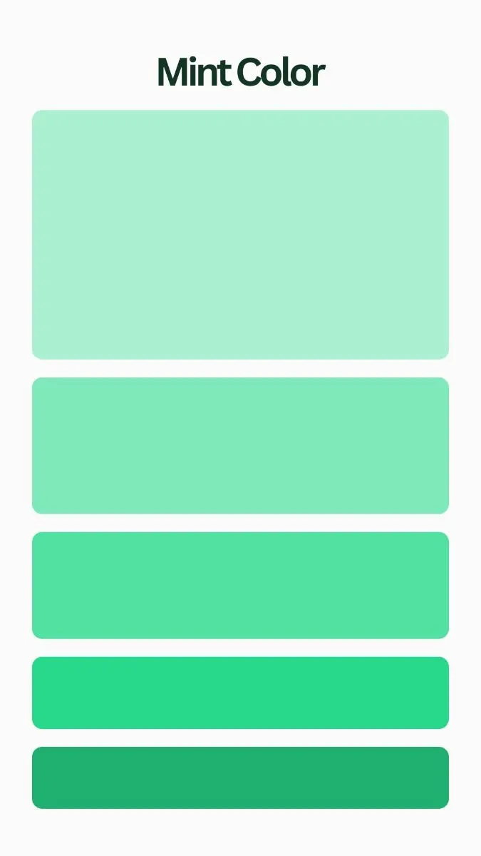
Mint green is created by mixing a primary green pigment with a significant amount of white to achieve a soft, pastel tint. To fine-tune the hue, small amounts of blue are often added to shift the color toward a cooler, cyan-leaning mint, or yellow to create a warmer, spring-like mint tone.
On this page
How to mix mint green with paint
Creating mint green requires a base of green paint, which acts as the foundation for the color. Because standard greens from tubes are often quite saturated or dark, you must lighten them significantly using white. Start by placing a generous dollop of white paint on your palette, as you will need much more white than green to achieve the characteristic pastel look of mint.
Slowly add small amounts of green to the white paint rather than the other way around. This controlled approach prevents you from accidentally making the color too dark, which is a common issue for beginners. If you want a classic mint, stick to a standard green, but consider these adjustments to shift the temperature:
- Add a tiny touch of phthalo blue to achieve a crisp, cool, "icy" mint.
- Add a small amount of lemon yellow if you prefer a warmer, softer, "seafoam" mint.
- Use titanium white for the best opacity and brightness in your final mixture.
Why mint green looks different in light
Color perception is heavily influenced by the surrounding light, which is why mint green can appear vastly different depending on the environment. Mint is a high-key color, meaning it reflects a large amount of light. In a room with cool, northern-facing light, mint green may lean toward a sterile or blueish tone, while southern-facing light can make the same shade appear more vibrant and yellow-toned.
When choosing a mint green for a project, always test the color in the specific space where it will be used. Paint a small swatch on a piece of cardboard and observe how it changes throughout the day. You will notice that as the sun sets and artificial lighting takes over, the subtle undertones of blue or yellow become much more prominent. Understanding these shifts helps you avoid the disappointment of a color that looks perfect on the palette but off-putting on a wall.
Common mistakes when mixing mint green
The most frequent error when mixing mint green is adding too much green pigment too quickly. Because green is a strong color, it can easily overpower the white base, resulting in a shade that is more of a vibrant lime or grass green than a soft pastel. Always work in small increments, stirring thoroughly between each addition to ensure the color is fully incorporated before deciding if you need more.
Another mistake is failing to account for the drying time of acrylic or oil paints. Many paints appear slightly darker when wet and shift in tone as they dry. To avoid frustration, follow these steps:
- Mix a small test batch and allow it to dry completely on a scrap piece of paper.
- Compare the dried color to your desired reference shade under natural light.
- Adjust the ratio of white or blue/yellow only after the test swatch has fully cured.
- Keep a clean brush for every color addition to prevent muddying your mixture.

How to use mint green in design
Mint green is a versatile color that works well in various design applications, from interior walls to graphic design projects. Because it is a cool, calming color, it pairs exceptionally well with neutral tones like crisp white, soft gray, or warm beige. These combinations prevent the mint from feeling overwhelming while allowing it to serve as a refreshing focal point in a room or a layout.
For a more sophisticated palette, consider pairing mint green with metallic accents like gold or copper, which provide a warm contrast to the cool green. If you want a bolder look, you can use complementary colors like soft coral or dusty pink. These colors sit opposite green on the color wheel, creating a harmonious balance that feels professional and intentional. Whether you are painting a piece of furniture or designing a website, the key is to let the mint green breathe by surrounding it with enough negative space.
Best tools for color mixing
Achieving the perfect mint green is easier when you have the right tools to ensure consistency and cleanliness. A glass or plastic palette is ideal because it does not absorb the paint, allowing you to see the true color as you mix. Use a palette knife rather than a brush to combine your paints; the flat edge of a knife is much more efficient at blending colors without trapping excess pigment in the bristles.
Investing in high-quality pigments also makes a significant difference in the final result. Professional-grade paints have a higher concentration of pigment, which means they maintain their hue better when mixed with large amounts of white. If you are working on a large-scale project, mix more paint than you think you will need to ensure you do not run out, as recreating an exact custom shade of mint can be difficult once you have started your work.
Key facts
- Mint green is a cool-toned pastel created by mixing a dominant amount of white with smaller portions of green and a touch of blue.
- To achieve the classic mint hue, start with a base of white paint or pigment and slowly add green until you reach a light lime shade.
- Adding a tiny drop of blue to your green-and-white mixture shifts the color from a yellow-based leaf green to the crisp, cool spectrum of mint.
- If the color appears too vibrant or neon, add a microscopic amount of gray or black to desaturate the pigment and achieve a softer, more muted tone.
- Avoid adding too much blue early in the process, as this can quickly turn the mixture into a turquoise or cyan rather than a soft mint.
- Always mix more paint than you think you need, as recreating the exact ratio of white, green, and blue once the batch is exhausted is notoriously difficult.
The bottom line
Creating the perfect mint green is a process of balancing a large volume of white with small, controlled additions of green and blue. By starting with a white base and slowly introducing pigment, you maintain control over the final saturation and temperature. Always remember that it is easier to darken a light color than to lighten a dark one, so proceed with patience and precision.
People also ask
Is mint green considered a warm or cool color?
Mint green is categorized as a cool color because it contains significant amounts of blue and white. Its high light reflectance and blue undertones make it feel refreshing and airy in interior design.
How do I make mint green darker?
To darken mint green, add a very small amount of black or a dark forest green. Introduce these colors in tiny increments, as dark pigments can overpower the delicate white base very quickly.
Does mint green look different on screens versus paper?
Yes, colors appear differently due to the medium. Monitors use the RGB color model, which emits light to create colors, while paint and ink use subtractive CMYK or pigment mixing, which reflects light.
What is the difference between mint green and seafoam green?
While both are pastel, seafoam green contains more blue and sometimes a hint of yellow compared to the cleaner, more balanced mint. Seafoam often mimics the appearance of ocean water, whereas mint resembles the herb.
Can I use yellow to adjust my mint green?
You can add a tiny amount of yellow if your mint looks too "icy" or blue, as this pulls the color back toward a warmer, more natural green. Use caution, as too much yellow will turn your mint into a pale chartreuse.
Why does my mint green look muddy?
Muddy colors usually occur when you mix too many complementary colors or add too much black or brown. Stick to pure white, a clean green, and a touch of blue to keep the mixture bright and crisp.
This answer was created with the help of AI research tools and reference sources. Spotted an error? Let us know — we correct mistakes quickly. See our editorial policy.