What is the complementary color of navy blue?
Short answer
The complementary color of navy blue is a bright, vibrant orange. In color theory, complementary colors sit directly opposite each other on the color wheel. Because navy blue is a dark, desaturated shade of blue, its direct complement is a high-intensity, warm orange that creates a striking visual contrast.
On this page
What is the color wheel and how does it work?
The color wheel is a circular diagram that organizes colors according to their hue, saturation, and value. It serves as the foundational tool for artists, designers, and decorators to understand the relationships between different pigments. At its core, the wheel is divided into primary, secondary, and tertiary colors, which help define how light interacts with the human eye.
Complementary colors are those positioned exactly 180 degrees across from one another on this wheel. When placed side-by-side, these pairs create the highest possible visual contrast, making each color appear more intense and vibrant. For navy blue, which is a deep, muted shade of blue, the direct complement is a vivid, energetic orange. This pairing is frequently used in branding, fashion, and interior design to draw the viewer’s eye and create a sense of balance between cool and warm tones.
Why does navy blue pair well with orange?
The effectiveness of the navy and orange pairing lies in the concept of simultaneous contrast. Because navy blue is a dark, cool, and recessive color, it provides a stable, sophisticated background. Adding a pop of bright orange introduces warmth and vitality, preventing the navy from feeling too somber or heavy. This relationship is essentially a play between light and dark, as well as temperature.
- Navy blue acts as a neutral anchor, similar to black or charcoal.
- Orange provides the necessary visual energy to prevent the design from feeling flat.
- The high contrast makes the orange appear even brighter than it would on its own.
- The deep blue tones ground the intensity of the orange, preventing it from becoming overwhelming.
This combination is a staple in professional sports uniforms, corporate logos, and nautical-themed decor, where the goal is to be both authoritative and approachable.
How to use navy blue and orange in design
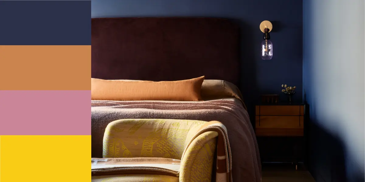
When incorporating these colors into a space or a project, the key is to manage the proportions. Using equal amounts of navy and orange can be jarring, as both colors fight for dominance. Instead, designers typically use the 80/20 rule: 80 percent of the space or composition should be dominated by the navy blue, while the orange serves as a strategic accent.
- Use navy blue for large surfaces like walls, sofas, or primary clothing items.
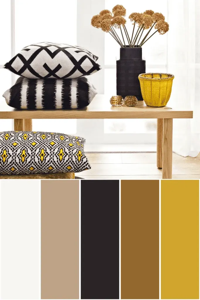
- Use orange for smaller, impactful details like throw pillows, vases, or accessories.
- Choose muted or burnt orange shades for a more sophisticated, mature aesthetic.
- Opt for bright, neon-leaning oranges if you want a modern, high-energy, or athletic look.
By following these guidelines, you ensure that the orange highlights the navy without distracting from the overall professional or aesthetic intent of the design.
Common mistakes when pairing colors
One of the most frequent errors when working with navy blue is choosing an orange that is too similar in value. If the orange is as dark or muted as the navy, the contrast becomes muddy and difficult to distinguish at a distance. Always ensure that the orange possesses enough brightness or saturation to stand out against the deep blue backdrop.
Another mistake is failing to consider the undertones of the navy. Some navy blues lean toward purple, while others lean toward green. If your navy has a strong violet undertone, a standard orange might clash; in these cases, a reddish-orange or a coral shade may provide a more harmonious balance. Always test your color swatches in the actual lighting conditions of your environment, as artificial light can drastically shift the appearance of both the navy and the orange throughout the day.
Best practices for color selection
Achieving a professional finish requires careful attention to the finish and texture of the materials chosen. A matte navy wall paired with a glossy, metallic orange accessory creates a sophisticated tension that feels intentional and curated. Conversely, using the same texture for both colors can sometimes make the combination feel like a basic school uniform or a sports team logo, which may not be the aesthetic you desire.
- Evaluate the lighting: Check how the colors look under both warm incandescent bulbs and cool daylight.
- Balance the textures: Mix matte, glossy, and fabric finishes to add depth to your color scheme.
- Test the ratio: Start with small accents and slowly increase the amount of orange until the balance feels correct.
- Consider the mood: Remember that navy blue conveys stability and trust, while orange conveys excitement and sociability.
By thoughtfully applying these principles, you can successfully leverage the power of complementary colors to create visually compelling and balanced results in any creative endeavor.
Key facts
- The complementary color of navy blue is a bright, warm shade of orange.
- On the standard color wheel, complementary colors sit directly opposite one another.
- Navy blue is a dark, desaturated shade of blue, so its complement is often a vibrant, saturated orange.
- Using complementary colors creates high contrast, making both colors appear more intense when placed side-by-side.
- In design, pairing navy with gold or copper provides a sophisticated, metallic version of the orange complement.
- To balance a navy room, use orange as an accent color in pillows or art rather than as a primary wall color.
The bottom line
The complementary color to navy blue is orange, a pairing that offers striking visual contrast. By placing these opposites together, you create a dynamic balance between cool, authoritative tones and warm, energetic highlights. Whether you are decorating a room or designing a graphic, using these colors strategically—often by choosing muted or metallic variants—ensures a sophisticated aesthetic that avoids appearing overly loud or cartoonish in its application.
People also ask
What is the difference between complementary and analogous colors?
Complementary colors are opposites on the color wheel, providing maximum contrast. Analogous colors sit next to each other, creating a harmonious and softer look.
How do I use navy blue and orange in a professional setting?
Use navy as your base for suits or branding to convey authority and trust. Add small pops of orange in ties, pocket squares, or logos to inject energy without appearing unprofessional.
Is navy blue considered a neutral color?
Yes, navy blue is widely treated as a neutral in fashion and interior design. It serves as a versatile foundation that pairs well with almost any other color.
Why does navy blue look different under various light sources?
Navy is a deep, cool tone that absorbs light. Under warm indoor lighting, it may look nearly black, while bright natural light reveals its true blue undertones.
Can I use yellow instead of orange as a complement to navy?
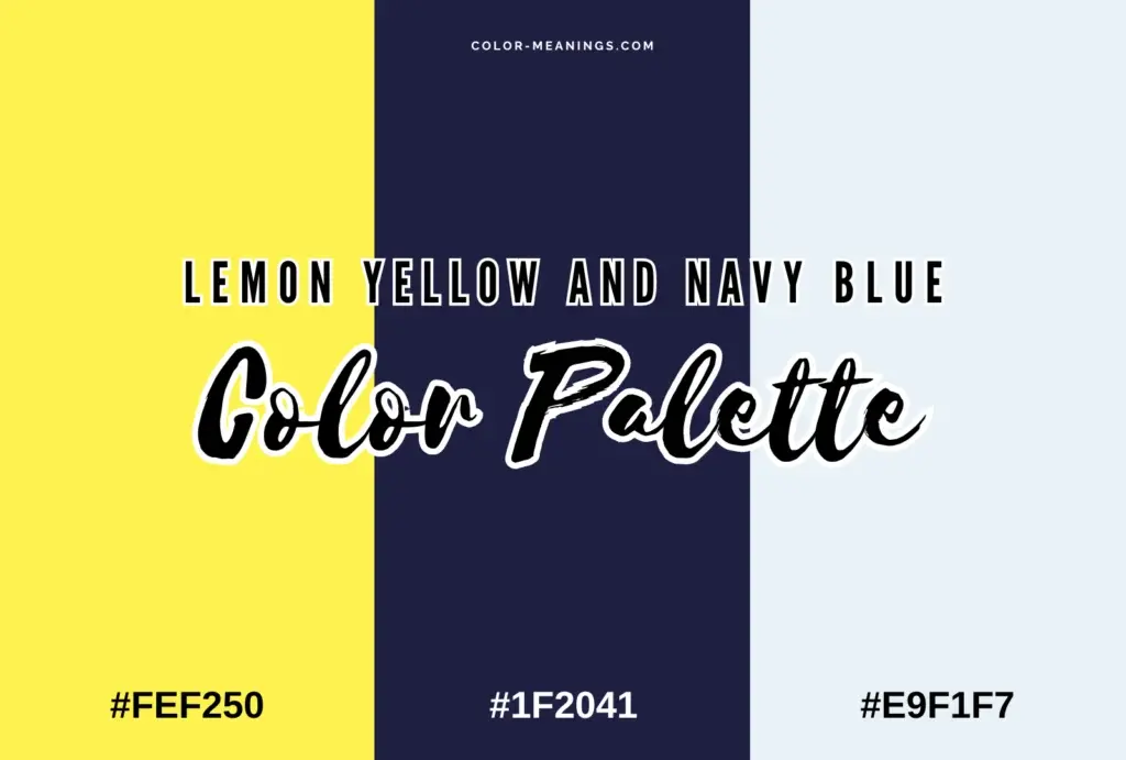
Yellow is a split-complementary choice that works well with navy. It provides a bright, cheerful contrast that feels less aggressive than a true orange.
What is the best way to avoid a "sports team" look when using navy and orange?
Avoid pairing bright, primary navy with intense, neon orange. Instead, use muted or metallic versions, such as charcoal-navy with burnt sienna or brushed copper.
This answer was created with the help of AI research tools and reference sources. Spotted an error? Let us know — we correct mistakes quickly. See our editorial policy.