What are neutral colors?
Short answer
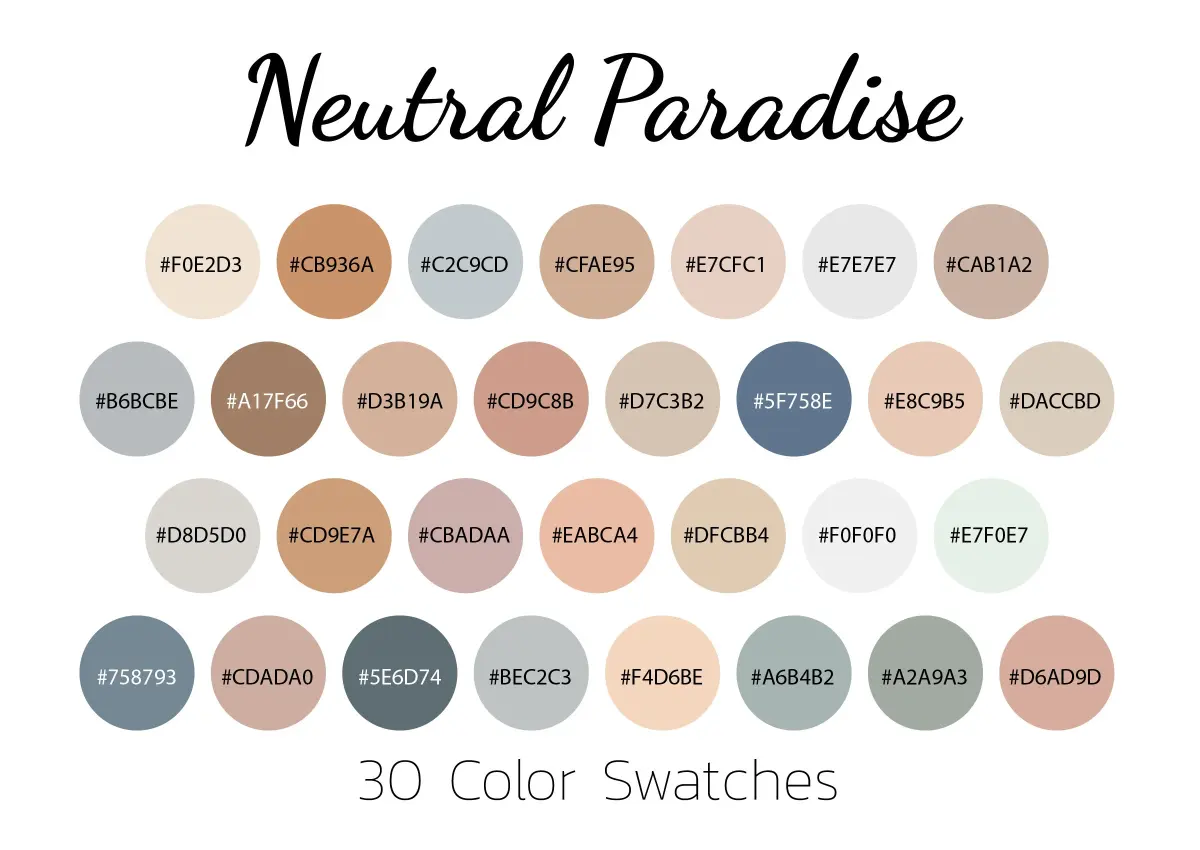
Neutral colors are hues that appear to lack saturation, meaning they do not sit prominently on the traditional color wheel. These shades—primarily black, white, gray, beige, and brown—serve as the foundation for design. They are created by mixing complementary colors or balancing primary hues to produce a muted, versatile visual effect.
On this page
What are the main neutral colors?
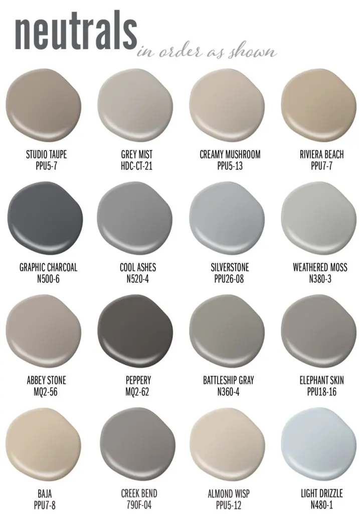
Neutral colors are defined by their absence of intense chromatic properties. While they may contain subtle undertones of blue, yellow, or red, they are perceived by the human eye as unobtrusive and calm. Designers categorize these into two primary groups: true neutrals and near-neutrals. True neutrals consist of black, white, and the various shades of gray that fall between them. Near-neutrals are colors that possess a slight color cast, such as cream, taupe, tan, or charcoal.
The following list outlines common neutral categories found in interior design and fashion:
- Pure Neutrals: Stark white, absolute black, and neutral gray.
- Earthy Neutrals: Beige, sand, taupe, and various shades of brown.
- Cool Neutrals: Colors with blue or green undertones, such as slate or silver.
- Warm Neutrals: Colors with red, orange, or yellow undertones, like cream, ivory, or warm tan.
Understanding these categories helps in selecting the right palette for a space or an outfit. By identifying the underlying temperature of a neutral, you can ensure that different elements harmonize rather than clash.
How to use neutral colors in design
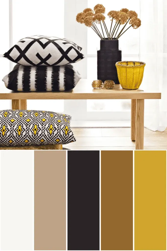
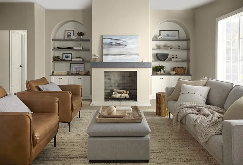
Using neutrals effectively requires an understanding of texture and contrast. Because these colors lack the vibrancy of primary or secondary hues, the visual interest must come from surface quality and depth. A room decorated entirely in beige can feel sophisticated if you incorporate varied textures like wool, linen, velvet, and wood. Without these textural differences, a neutral-heavy space risks appearing flat, sterile, or uninviting to the eye.
To create a balanced neutral scheme, follow these steps:
- Select a dominant neutral for the largest surfaces, such as walls or flooring.
- Choose a secondary neutral for furniture pieces to provide a slight contrast.
- Introduce a third, darker or lighter neutral as an accent to define the space.
- Layer in natural materials like stone, metal, or wood to break up the monochromatic monotony.
By following this layered approach, you prevent the environment from feeling stagnant while maintaining the calming, timeless appeal that neutrals provide.
Why do neutral colors work well together?
The effectiveness of neutral colors stems from their ability to act as a bridge between more vibrant shades. In color theory, neutrals are often considered "achromatic" or "near-achromatic," meaning they do not compete for attention. This allows them to anchor a design, providing a stable backdrop that lets other elements—such as a piece of art, a colorful rug, or a bright accessory—stand out. Because they do not have a strong hue, they are less likely to clash with other colors.
Furthermore, neutrals are highly adaptable to changing trends. A neutral-based interior allows a homeowner to update the look of a room simply by swapping out small, colorful accessories rather than repainting walls or replacing expensive furniture. This versatility makes them a practical choice for long-term investments. Whether you prefer a minimalist aesthetic or a traditional, layered look, neutrals provide the necessary flexibility to refine your style over time without requiring a complete overhaul of your surroundings.
Common mistakes when using neutral colors
A frequent error when working with neutrals is ignoring the color temperature. Many people assume all whites are the same, but a "cool" white with blue undertones will look jarring when placed next to a "warm" beige with yellow undertones. This mismatch creates a muddy or disjointed appearance. Another common mistake is failing to incorporate enough contrast. If every element in a room is of a similar value—meaning they are all roughly the same level of lightness or darkness—the space will lack definition and depth.
To avoid these pitfalls, consider these tips:
- Always test paint samples in the specific lighting of the room at different times of the day.
- Ensure there is at least one dark element to ground the space, such as a black picture frame or a dark wood table.
- Mix different materials to prevent a "washed out" look.
- Pay attention to the undertones; keep all your neutrals within the same "warm" or "cool" family unless you are intentionally creating high-contrast tension.
How to choose the right neutral for your space
Choosing the right neutral depends heavily on the natural light available in your environment. Rooms with north-facing windows receive cooler, bluish light, which can make a space feel chilly. In these areas, warm neutrals like cream or camel are ideal because they counteract the coolness and add a sense of comfort. Conversely, south-facing rooms get warm, golden light throughout the day, making them excellent candidates for cooler neutrals like soft gray or icy white, which help balance the intensity of the sunlight.
Beyond lighting, consider the intended mood of the space. Darker, moody neutrals like charcoal or espresso create an intimate, sophisticated atmosphere, which works well in bedrooms or studies. Lighter, brighter neutrals like off-white or light taupe expand the visual space, making them perfect for small rooms or areas where you want to emphasize openness. By assessing the light and the desired function of the room, you can select a neutral that enhances the architecture and improves the overall quality of your living environment.
Key facts
- Neutral colors are hues that appear to lack saturation, meaning they do not sit prominently on the traditional color wheel.
- The primary neutral palette consists of black, white, gray, beige, and brown, often referred to as "achromatic" or "near-neutral" tones.
- Neutrals serve as the foundation of interior design because they provide a balanced backdrop that allows accent colors to stand out.
- Warm neutrals, such as cream or taupe, contain undertones of yellow or red, while cool neutrals, like slate gray, feature blue or green undertones.
- A common mistake is mixing warm and cool neutrals in the same space, which can create a jarring or "muddy" visual effect.
- To create depth in a neutral room, incorporate varied textures like wool, linen, wood, and metal rather than relying solely on flat paint colors.
The bottom line
Neutral colors act as the essential canvas for any design project, providing balance, versatility, and a sense of calm. By understanding the difference between warm and cool undertones and layering various textures, you can create a space that feels both professional and inviting. Mastering the use of neutrals allows you to highlight specific architectural features or accent pieces while maintaining a timeless, cohesive aesthetic throughout your home.
People also ask
Can neutral colors be considered "boring"?
While some perceive neutrals as dull, they are actually versatile tools that create sophisticated, timeless environments. When layered with different textures and metallic finishes, neutral spaces often feel more luxurious than those overwhelmed by bright, saturated colors.
How do I identify the undertone of a neutral paint color?
Place a sample of the paint next to a pure white piece of paper to reveal hidden hints of color. If the neutral looks slightly blue or green, it is cool; if it leans toward pink, yellow, or orange, it is warm.
Which neutral colors work best for small rooms?
Lighter neutrals like off-white, light gray, or soft beige are ideal for small spaces because they reflect light and make walls appear to recede. This optical illusion helps the room feel more open and airy rather than cramped.
Should I use the same neutral throughout my entire home?
Using a consistent neutral base throughout a home creates a cohesive flow and makes spaces feel larger. However, you can vary the intensity or the undertones in different rooms to give each area a unique personality.
What are "earth tones" in relation to neutrals?
Earth tones are a subset of neutrals inspired by nature, including shades like terracotta, sage green, and sand. They bridge the gap between pure neutrals and vibrant colors, offering a grounded, organic feel to interior design.
Can I use black as a neutral in my decor?
Yes, black is a powerful neutral that adds immediate contrast and definition to a room. Use it sparingly in accents like picture frames, hardware, or light fixtures to anchor a space without making it feel too dark.
This answer was created with the help of AI research tools and reference sources. Spotted an error? Let us know — we correct mistakes quickly. See our editorial policy.