What colors go with teal?
Short answer
Teal is a versatile blue-green hue that pairs beautifully with neutrals like crisp white, charcoal gray, and soft beige. For a bold look, combine it with metallic gold, copper, or vibrant coral. These combinations create balance, as teal acts as a sophisticated anchor that bridges the gap between cool and warm tones.
On this page
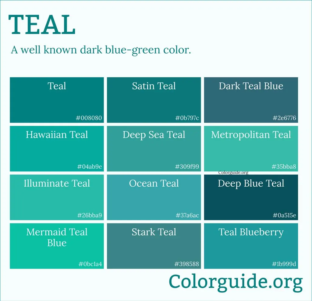
Which colors complement teal best?
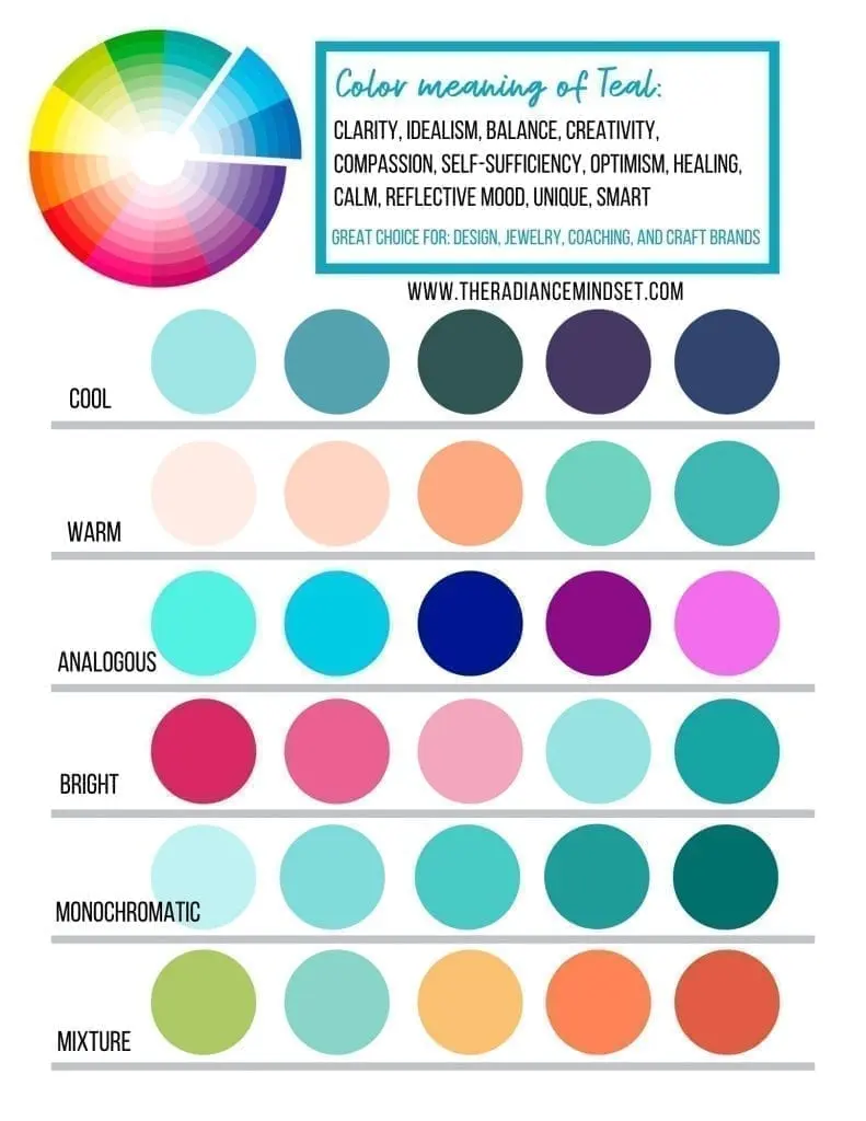
Teal is a complex color that sits between blue and green on the color wheel. Because it contains both cool and warm undertones, it is surprisingly flexible when paired with other shades. The most effective way to choose a complementary color is to look at the opposite side of the color wheel. Coral, peach, and burnt orange provide a high-contrast, energetic look that makes the teal appear deeper and more vibrant. These warm, earthy tones prevent the room from feeling too cold or clinical.
If you prefer a more subtle or monochromatic aesthetic, you can pair teal with various shades of blue or green. Using lighter seafoam greens or deeper navy blues creates a sense of depth and tranquility. When selecting these secondary colors, consider the saturation levels. If your teal is dark and moody, opt for lighter, muted tones to avoid overwhelming the space. If your teal is bright, you can lean into richer, more saturated companions to maintain a cohesive, high-energy environment.
How to use teal in interior design
Incorporating teal into your home requires a strategic approach to balance. Using teal as a primary wall color creates a dramatic, moody atmosphere, while using it as an accent color adds a pop of personality to a neutral room. To integrate this color effectively, consider the "60-30-10" rule: 60 percent of the room is a neutral base, 30 percent is a secondary color, and 10 percent is your bold accent. Teal works exceptionally well as either the 30 percent secondary color or the 10 percent accent.
When designing a space with teal, follow these professional steps:
- Identify your base neutral, such as warm white or light gray, to keep the space from feeling cramped.
- Choose a metallic finish that complements your chosen teal, such as brushed gold for a luxurious feel or matte black for a modern industrial look.
- Layer textures like velvet, linen, or wood to soften the intensity of the teal.
- Distribute the color throughout the room using pillows, artwork, or rugs to draw the eye across the space.
Best metallic accents for teal
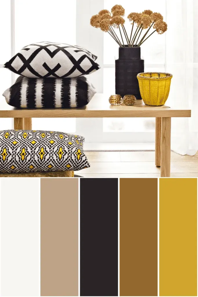
Metallics are essential when working with teal because they act as a bridge between the color’s cool blue base and its warm green undertones. Gold is perhaps the most popular choice, as the yellow undertones in gold provide a striking contrast that makes teal look elegant and expensive. Rose gold and copper are also excellent options, as they lean into the warmer side of the spectrum, adding a soft, inviting glow that prevents the teal from feeling too sterile or dark.
Silver and chrome are better suited for modern, minimalist designs where you want to emphasize the cooler, blue-heavy aspects of the teal. These metallics provide a crisp, clean aesthetic that feels professional and sharp. When mixing metallics with teal, consider the following:
- Use brushed or matte finishes to create a sophisticated, understated look.
- Use polished or shiny finishes to draw attention to specific focal points like lamps or mirrors.
- Avoid mixing too many different metallic types in one room, as this can create visual clutter that distracts from the teal itself.
Common mistakes when decorating with teal
One of the most frequent errors is using teal in a room that lacks natural light. Because teal is a mid-to-dark tone, it can absorb light rather than reflect it, making small, north-facing rooms feel like a cave. If you are determined to use teal in a dim space, ensure you have adequate artificial lighting, such as warm-toned floor lamps or recessed lighting, to brighten the corners. Another mistake is failing to balance the color with enough neutrals. Without a lighter color to break up the intensity, the teal can quickly dominate the room and make the furniture feel heavy.
Additionally, many people forget to consider the undertones of their flooring and existing furniture. If your floors have strong orange or red wood tones, teal will look incredibly vibrant due to the contrast. However, if your furniture is a cool-toned gray, a warm-leaning teal might clash. Always test a paint swatch or fabric sample in the room at different times of the day. Observe how the color changes as the natural light shifts from morning to evening, as this will prevent costly mistakes.
Why teal works in modern spaces
Teal has become a staple in modern design because it is a "bridge" color that feels both timeless and trendy. It carries the calming properties of blue while maintaining the organic, refreshing qualities of green. This makes it an ideal choice for bedrooms and bathrooms where relaxation is the priority. In living areas, it provides a sophisticated alternative to standard navy or forest green, offering a unique visual interest that feels curated rather than generic.
Beyond its aesthetic appeal, teal is highly functional because it hides dirt and wear well, making it a practical choice for upholstery or high-traffic areas. It pairs just as well with dark, moody palettes as it does with bright, airy ones, allowing for significant versatility as your tastes change over time. By incorporating teal through modular elements like curtains or throw blankets, you can easily update your space without committing to a permanent renovation. This adaptability ensures that teal remains a relevant and stylish choice for years to come.
Key facts
- Teal is a medium-to-deep blue-green color, created by mixing blue and green with a touch of white.
- Neutral colors like crisp white, charcoal gray, and beige provide a balanced backdrop that allows teal to stand out.
- Metallic accents such as gold, brass, and copper create a sophisticated, high-contrast look against teal surfaces.
- For a bold, monochromatic scheme, pair teal with lighter shades like mint or deeper tones like navy blue.
- Complementary colors, specifically warm corals and burnt oranges, sit opposite teal on the color wheel and create striking visual energy.
- Avoid pairing teal with too many competing bright colors, as this can overwhelm a room and make it feel cluttered.
The bottom line
Teal is a highly adaptable color that bridges the gap between calming blue and energetic green. To achieve a balanced look, pair it with neutral tones for elegance or warm metallics for luxury. Whether you choose bold complementary oranges or subtle monochromatic greens, the key is to manage your lighting and texture to ensure the space remains inviting, cohesive, and visually balanced throughout the day.
People also ask
Does teal work better in large or small rooms?
Teal is versatile, but it can make small rooms feel cozy or cramped depending on the lighting. In smaller spaces, use teal as an accent wall or in decor, while larger, well-lit rooms can handle full-wall applications.
Should I use cool or warm lighting with teal walls?
Warm lighting is generally preferred because it softens the blue undertones of teal. Cool-toned bulbs can sometimes make the color appear too clinical or harsh in a residential setting.
Is teal considered a modern or traditional color?
Teal is a chameleon that fits both styles. It is a staple in mid-century modern design but also appears in traditional Victorian interiors, often paired with dark wood furniture and ornate gold frames.
How do I choose the right shade of teal?
Consider the natural light in your space. If the room faces north, choose a teal with more green to prevent it from looking cold; south-facing rooms can handle deeper, bluer teals.
What textures pair best with teal?
Natural textures like light oak wood, velvet, and linen work beautifully with teal. These materials add depth and prevent the color from looking flat or one-dimensional.
Can I mix teal with other shades of green?
Yes, layering teal with olive or sage creates a sophisticated, nature-inspired palette. Ensure there is enough contrast in brightness between the shades to keep the design feeling intentional.
This answer was created with the help of AI research tools and reference sources. Spotted an error? Let us know — we correct mistakes quickly. See our editorial policy.