How do you draw gold?
Short answer
Drawing gold requires capturing its unique reflective properties rather than just using a yellow color. You must focus on high-contrast values, placing bright white highlights directly next to deep, dark shadows. By layering warm yellows, ochres, and browns, you create the illusion of metallic luster and complex light interaction on surfaces.
On this page
How to capture the color of gold
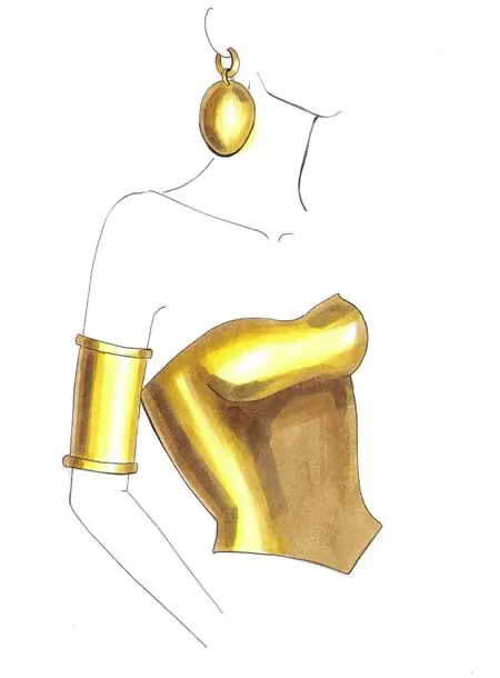
Gold is not simply yellow; it is a complex interplay of reflected light and deep, warm shadows. To draw it convincingly, you must avoid using a single flat yellow marker or pencil. Instead, think of gold as a spectrum ranging from pale cream and bright white to burnt sienna and dark umber. The secret lies in the transition between these shades.
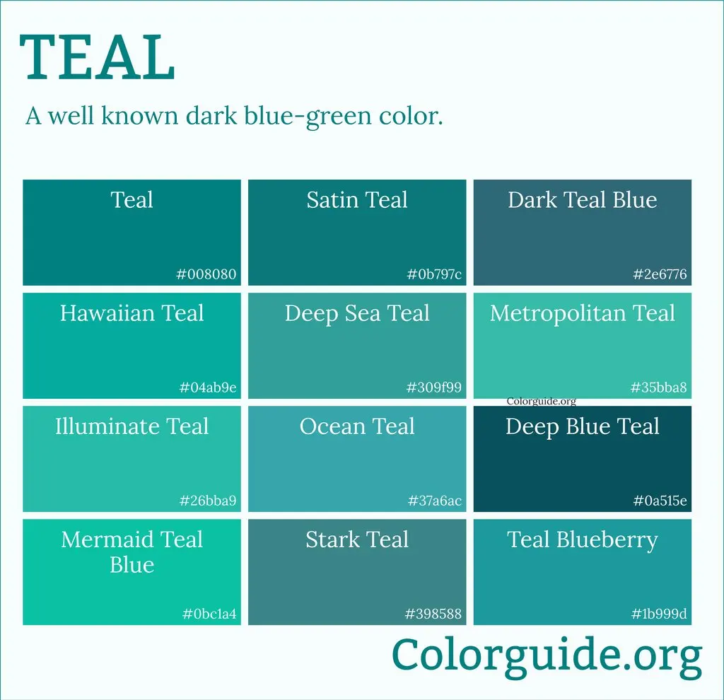
When selecting your palette, choose at least four distinct tones. Start with a light, creamy yellow for the brightest areas, then move to a vibrant goldenrod for the mid-tones. For the shadows, incorporate rich browns or even touches of cool gray to prevent the drawing from looking muddy. By layering these colors, you build the depth necessary to mimic the density of a precious metal.
- Use white gouache or a gel pen for sharp, final highlights.
- Apply light pressure to build up color density gradually.
- Use a blending stump or tortillon to soften transitions between light and shadow.
How to render metallic reflections
The defining characteristic of gold is its high reflectivity. Unlike matte objects, gold surfaces act like mirrors, distorting and compressing the environment around them. To achieve this look, you must observe how light hits the object and creates sharp, sudden changes in value. These "hard edges" are what tell the viewer’s brain that the material is hard and metallic.
When drawing a gold object, such as a ring or a coin, look for the "horizon line" of the reflection. This is often a dark band that separates the light hitting the top of the object from the light reflecting off the bottom. By placing a very dark shadow immediately adjacent to a brilliant highlight, you create the high-contrast effect known as "specular reflection," which is essential for a realistic metallic appearance.
- Sketch the basic shape with light, thin lines.
- Identify the brightest light source and mark the highlight areas.
- Block in the darkest shadows to establish the core contrast.
- Fill in the mid-tones to bridge the gap between light and dark.
- Add the sharpest, brightest highlights last to make the surface pop.
Best drawing tools for beginners
For those just starting, graphite pencils are excellent for learning the principles of light and shadow before adding color. Once you understand value, transition to colored pencils, which offer superior control for layering. Wax-based pencils are particularly effective for gold because they can be burnished to create a smooth, shiny finish that mimics the surface of polished metal.
If you prefer painting, metallic acrylics can be helpful, but they often lack the depth of custom-mixed colors. Professional illustrators often prefer using standard pigments to "paint" the light rather than relying on metallic flakes. This approach allows for more control over the warmth and coolness of the gold, ensuring the final piece looks like an expensive metal rather than a craft project. Always use high-quality, heavy-weight paper that can withstand multiple layers of pigment without tearing.
- Wax-based colored pencils for smooth blending.
- A white gel pen for precise, tiny highlights.
- A kneaded eraser to lift color and create soft light reflections.
- Smooth-surface paper to prevent unwanted texture in the metallic finish.
Why gold looks realistic in drawings
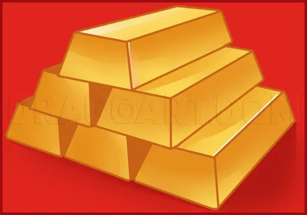
The realism of a gold drawing depends entirely on the accuracy of your values. Our eyes perceive gold as valuable because of how it catches light, creating bright spots that are almost blindingly white. If your drawing lacks these extreme highlights, the gold will appear dull or like a matte yellow plastic. The contrast is the primary indicator of material quality.
Furthermore, gold often reflects the colors of its surroundings. If a gold object is sitting on a blue cloth, you should incorporate subtle hints of blue or purple into the shadows of the gold. This phenomenon, known as color reflection, adds a layer of sophistication that makes the drawing feel grounded in a real space. By observing these environmental influences, you move beyond drawing a yellow object and begin drawing the light itself.
Common mistakes when drawing gold
One of the most frequent errors is over-blending, which creates a soft, fuzzy appearance that contradicts the hard, polished nature of gold. Gold is a rigid metal, so it requires crisp edges and distinct boundaries between light and shadow. If you blend too much, you lose the sharp highlights that give the metal its characteristic shine and weight.
Another mistake is failing to push the shadows dark enough. Beginners often fear using black or dark brown on a gold object, worrying it will look dirty. However, without deep shadows, the highlights have nothing to contrast against, leaving the drawing looking flat and unconvincing. Remember that the darker your shadows, the brighter your highlights will appear by comparison. Always keep your pencils sharp to maintain control over these critical details, as dull points will inevitably lead to messy, imprecise transitions that ruin the illusion of a smooth, metallic surface.
Key facts
- Gold is not a single color; it is a reflective surface that requires a range of yellows, browns, and whites to mimic metallic luster.
- The secret to drawing gold is high contrast, specifically placing pure white highlights directly next to deep, dark shadows.
- Use a "hard edge" transition between light and dark areas to simulate the smooth, non-porous surface of metal.
- Avoid using only one shade of yellow, as this will result in a flat, matte appearance rather than a metallic one.
- Incorporate cool tones like light blues or purples in the shadows to reflect the surrounding environment, which adds realism.
- Always leave the brightest highlight as the pure white of the paper to create the illusion of intense light reflection.
The bottom line
To draw convincing gold, focus on high-contrast values rather than just color. By placing sharp, pure white highlights against deep, dark shadows, you create the illusion of a reflective metallic surface. Use a variety of yellows and cool-toned shadows to mimic the way gold interacts with its environment. Keep your edges crisp and avoid over-blending to maintain the hard, polished look of genuine precious metal.
People also ask
What materials are best for drawing gold?
Graphite pencils work well for studying light values, but colored pencils or gouache are superior for capturing the specific hue of gold. Metallic markers can be used, but they often lack the depth provided by layering different shades of yellow and brown.
How do I make gold look shiny instead of yellow?
Shiny surfaces reflect their surroundings, so you must draw sharp, geometric shapes of light and dark. A matte surface has soft, diffused transitions, whereas gold requires crisp, sudden shifts in value to mimic a polished finish.
Should I use a blending stump to smooth out gold?
Avoid excessive blending, as it creates a soft, hazy look that contradicts the sharp nature of metal. Use light, deliberate strokes to build color, keeping the edges of your highlights and shadows distinct and crisp.
How do I handle reflections on a gold object?
Observe the object closely to see what it is reflecting, such as the horizon line or nearby objects. These reflections should be rendered as distorted, dark shapes that follow the curvature of the gold item.
Why does my gold drawing look like wood?
This usually happens because the shading is too soft and the colors are too earthy. Introduce brighter, punchier yellows and ensure your darkest shadows are nearly black to create the necessary metallic contrast.
Is it better to draw gold from life or a photo?
Drawing from life is ideal because you can see how the highlights move as you shift your perspective. If using a photo, ensure it has high resolution so you can clearly see the sharp edges of the reflected light.
This answer was created with the help of AI research tools and reference sources. Spotted an error? Let us know — we correct mistakes quickly. See our editorial policy.