How do you draw a medal step by step?
Short answer
Drawing a medal involves creating a circular or shaped base, adding a textured ribbon attachment, and detailing a central emblem. By using geometric guides, you can ensure symmetry and depth. Focus on shading the metallic edges to create a realistic, reflective appearance that distinguishes the object from a flat, two-dimensional drawing.
On this page
How to draw a medal step by step
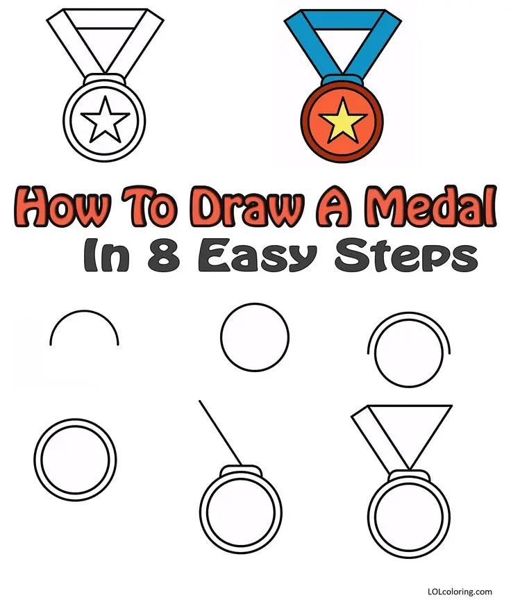
To begin your drawing, start by sketching a perfect circle using a compass or a circular object as a template. Lightly draw a smaller circle inside the first one to create a thick border, which will serve as the frame for your medal. Above the circle, draw a small rectangle or a trapezoid to represent the metal loop that connects the medal to its ribbon. Ensure these shapes are perfectly centered to maintain the balance of the design.
Once the basic structure is established, add the ribbon extending upward from the top loop. You can draw the ribbon as two vertical strips that flare out slightly at the top, mimicking the way fabric drapes over a garment. Use light pencil strokes to define the folds in the ribbon, as this adds a sense of realism and movement to the otherwise static metallic object.
- Sketch a primary circle and a smaller inner circle for the frame.
- Add a small rectangular loop at the top for the ribbon connection.
- Draw the ribbon as two flared vertical strips extending from the loop.
- Refine the outlines with a darker pencil to solidify the medal's shape.
Best tools for drawing medals
For beginners, a standard set of graphite pencils ranging from 2H to 4B is ideal for achieving varied levels of shading. A 2H pencil is excellent for the initial light sketching phase, as it leaves faint lines that are easy to erase. Meanwhile, the softer 4B pencil allows you to create deep, rich shadows that are essential for depicting the reflective properties of metal surfaces.
In addition to pencils, a high-quality white vinyl eraser and a blending stump are indispensable tools. The eraser helps you carve out highlights on the medal’s surface, while the blending stump allows you to soften transitions between light and dark areas. If you prefer working with ink, a fine-liner pen with a 0.5mm tip works well for adding sharp, permanent details once your initial graphite sketch is complete.
- Graphite pencils (2H for sketching, 4B for shading).
- A circular template or compass for perfect geometry.
- A blending stump to create smooth metallic gradients.
- A kneaded eraser for lifting highlights and correcting errors.
How to shade a medal for realism
Shading is the most critical step in making a medal look like authentic metal rather than a flat drawing. Start by identifying where your light source is coming from, such as the top-left corner. Apply darker shading to the opposite side of the medal and the bottom edge, gradually lightening your strokes as you move toward the light source. This technique, known as a gradient, mimics the way light reflects off curved, polished surfaces.
To enhance the metallic effect, leave thin, bright white strips near the edges of the medal to represent specular highlights. These sharp reflections are characteristic of gold, silver, or bronze materials. Use your blending stump to smooth out the graphite, ensuring there are no harsh, unintended lines in the transition zones. The contrast between the deepest shadows and the brightest highlights will give your drawing a three-dimensional, tangible quality.

Common mistakes when drawing medals
One of the most frequent errors is failing to maintain symmetry between the left and right sides of the medal. Even a slight misalignment in the circular frame or the ribbon can make the entire drawing appear distorted or amateurish. To avoid this, use vertical and horizontal guidelines that intersect at the center of your circle to ensure that all decorative elements are placed equidistant from the middle.
Another common mistake is neglecting the texture of the ribbon. Beginners often draw the ribbon as a flat, stiff board, which contrasts poorly with the detailed metal piece. Remember that fabric is flexible and creates natural folds and shadows. By adding subtle, wavy lines across the ribbon and shading the recessed areas of those folds, you create a more natural look that complements the rigid, polished appearance of the medal itself.
How to add details and emblems
The final step is adding the central design, which could be a star, a laurel wreath, or a custom symbol. Sketch this design lightly first to ensure it fits perfectly within the inner circle of the medal. If you are drawing a wreath, use small, repetitive leaf shapes that follow the curvature of the frame. This framing technique draws the viewer’s eye toward the center, making the medal look more professional and intentional.
Once the emblem is drawn, use a sharp pencil to add fine details like engraved lettering or intricate patterns on the border. If you are aiming for a vintage look, you can add small scratches or stippling effects to the background of the medal to suggest wear and age. Finally, re-examine your work to ensure the contrast is strong enough, adding a final layer of dark graphite to the shadowed areas to make the entire piece pop off the page.
Key facts
- Medals typically consist of three parts: the planchet (the metal disc), the suspension ring, and the ribbon.
- Use a compass to draw a perfect circle for the planchet to ensure symmetry.
- A standard medal diameter ranges from 30 to 60 millimeters for most commemorative or athletic awards.
- Add depth to your drawing by shading one side of the circle to create a three-dimensional metallic effect.
- The ribbon should be drawn with slight folds or "V" shapes to suggest fabric texture and movement.
- Avoid drawing perfectly straight lines for the ribbon, as fabric naturally curves and hangs under gravity.
The bottom line
To draw a realistic medal, start with a precise circular base and establish a clear light source to guide your shading. Focus on creating high-contrast metallic textures by blending deep shadows with sharp, unshaded highlights. By carefully sketching the ribbon with natural folds and ensuring the connection point is structurally sound, you can create a compelling illustration that captures the weight and luster of a physical award.
People also ask
What is the best medium for drawing metallic surfaces?
Graphite pencils are excellent for beginners because they allow for smooth transitions between light and dark tones. Using a range from 2H for light sketches to 6B for deep shadows helps mimic the reflective quality of polished metal.
How do I make the medal look shiny?
Focus on high-contrast highlights and deep shadows. Leave small, sharp white areas untouched to represent the reflection of light sources on the metal surface.
Should I include text on the medal?
Adding text adds authenticity, but keep it simple. Use a ruler to draw faint horizontal guidelines so your letters remain centered and aligned along the curve of the medal.
What are the most common shapes for medals?
While circular discs are the industry standard, medals can also be rectangular, star-shaped, or custom-cut to match a specific logo or emblem.
How do I draw the connection between the ribbon and the medal?
Most medals use a jump ring or a decorative bail. Draw a small loop at the top of the medal and ensure the ribbon passes through it naturally without looking stiff.
Is it better to draw from a reference photo?
Yes, using a reference photo helps you understand how light hits curved surfaces. Observe where the highlights cluster and how the shadows fall to achieve a realistic result.
This answer was created with the help of AI research tools and reference sources. Spotted an error? Let us know — we correct mistakes quickly. See our editorial policy.