What colors make navy blue?
Short answer
Navy blue is created by mixing a primary blue pigment with a small amount of black or a dark complementary color like burnt umber. To achieve the deep, desaturated tone characteristic of navy, artists typically combine ultramarine blue with a touch of black, adjusting the ratio until the desired intensity is reached.
On this page
How to mix navy blue with paint
Creating navy blue involves darkening a standard blue pigment. Because blue is a primary color, it cannot be created by mixing other colors, but it can be modified in value and saturation. The most effective way to reach a navy hue is to start with a high-quality ultramarine or phthalocyanine blue and introduce a darkening agent.
When mixing, start with a larger amount of blue than you think you need. Gradually add your darkening agent in tiny increments, as black pigment is incredibly potent and can quickly overpower the blue, turning it into a muddy grey. If you want a more complex, "natural" navy, substitute the black with a dark brown, such as burnt umber, which warms the tone and prevents the color from looking flat or industrial.
- Place a dollop of ultramarine blue on your palette.
- Add a very small amount of black or burnt umber to the side.
- Gradually pull the dark pigment into the blue using a palette knife.
- Test the color on a scrap piece of paper, as it will appear darker once dry.
Why navy blue looks different in light
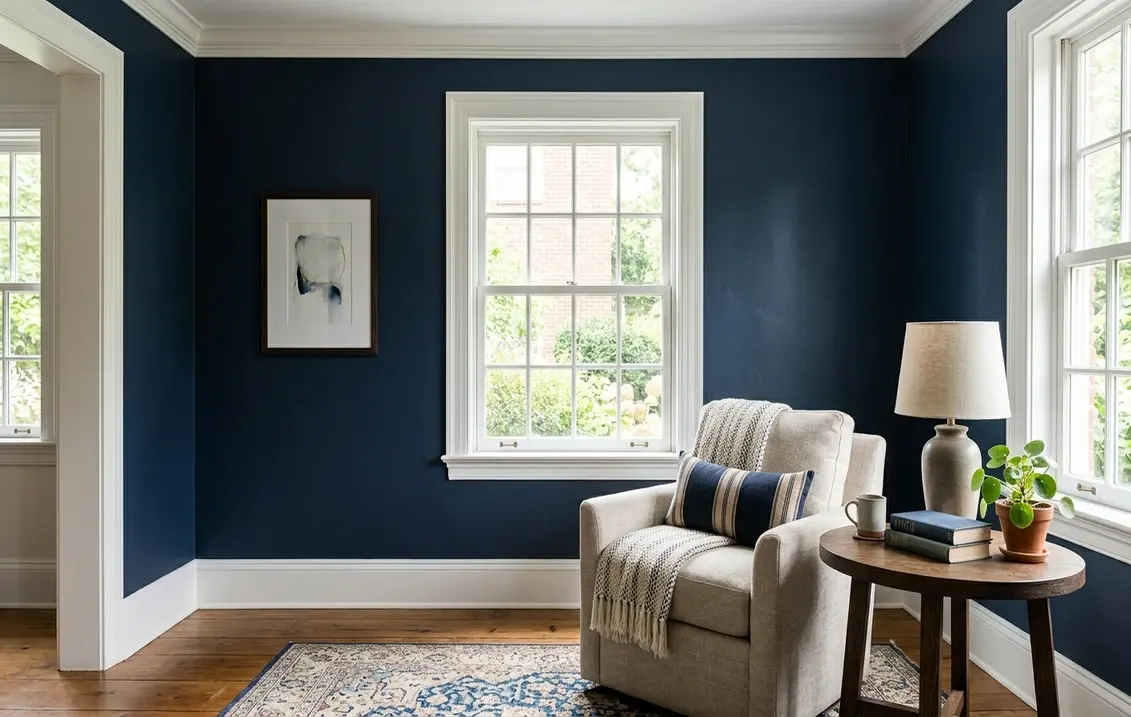
Navy blue is a dark, desaturated shade that behaves differently depending on the surrounding light source. In physics, color is the result of light reflecting off a surface; navy blue absorbs almost all visible light, reflecting only a small portion of the blue spectrum. This makes the color highly susceptible to "metamerism," a phenomenon where two colors appear to match under one light source but differ under another.
If you are painting a room or selecting fabric, observe the navy blue in both natural daylight and artificial indoor lighting. Under warm, yellow-toned incandescent bulbs, navy can sometimes appear almost black or lose its blue identity entirely. Conversely, in cool, bright daylight, the blue undertones become more prominent. Always test your navy samples in the specific environment where they will be displayed to ensure the tone remains consistent throughout the day.
Best tools for mixing navy blue
Achieving a professional-grade navy requires using pigments with high tinting strength. Artists often prefer using a "cool" blue, such as phthalocyanine, because it has a natural leaning toward green, which helps create a sophisticated, deep navy when mixed with a touch of red or black. If you use a "warm" blue like cobalt, you may find that the resulting navy leans toward a brighter, more vibrant shade that lacks the necessary depth.
For those working with digital media or printing, the process is different. You are not mixing physical pigments but adjusting light values. In the CMYK color model used for printing, navy is achieved by using high percentages of cyan and black ink. In the RGB model, which governs digital screens, navy is defined by low values of red, green, and blue, specifically set to a dark intensity.
- Use a palette knife for physical mixing to ensure the pigments are fully integrated.
- Keep a clean brush nearby to test the color on white paper.
- Work on a neutral grey palette surface to avoid color bias while mixing.
- Use high-quality, professional-grade paints for better saturation control.

Common mistakes when mixing navy blue
A frequent error is adding too much black pigment too quickly. Once a mixture becomes "black-dominant," it is difficult to revert to a true navy without adding a significant amount of fresh blue. This leads to wasted materials and a muddy, dull color that lacks the richness associated with navy. If you find the mixture has become too dark, add a touch of white or a brighter blue to pull it back toward a deep navy tone.
Another mistake is failing to account for the drying shift. Many acrylic and oil paints darken as they dry, meaning the mixture you see on your palette may end up being nearly black on the canvas. Always mix a slightly lighter shade than your target color to compensate for this shift. If you are uncertain, keep a reference swatch of your desired navy nearby to compare against your mixture as you work.
How to adjust the tone of navy blue
Once you have achieved a base navy, you can refine it to suit specific aesthetic needs. To create a "warm" navy, add a tiny amount of red or violet; this shifts the color toward a midnight blue, which feels more luxurious and less clinical. To create a "cool" or "steely" navy, add a small amount of green or grey. These subtle adjustments change the "temperature" of the color, allowing it to harmonize better with other elements in your design or painting.
If the navy feels too intense or "electric," you can desaturate it by adding its complementary color, which is orange. Adding a tiny amount of orange to your blue-black mixture will neutralize the intensity, resulting in a more muted, sophisticated navy that feels grounded and professional. This technique is essential for artists who want to avoid the "toy-like" appearance that overly saturated blues can sometimes create in a composition. By mastering the balance between blue, black, and complementary undertones, you can create a versatile navy that serves as a perfect anchor for any project.
Key facts
- Navy blue is created by mixing a primary blue pigment with a small amount of black or a dark complementary color like burnt umber.
- To achieve a rich navy, start with a base of ultramarine or phthalo blue and gradually add black until you reach the desired depth.
- Adding a tiny touch of red or violet to your blue-black mixture prevents the navy from looking like a flat, lifeless charcoal gray.
- If you are painting with acrylics or oils, avoid using pure lamp black, as it can often make the blue look muddy or dull.
- Complementary colors, such as orange or burnt sienna, can be used to darken blue naturally without the graying effect of black pigment.
- Always add your dark pigments to the blue in small increments, as it is much easier to darken a shade than to lighten it.
The bottom line
Creating the perfect navy blue requires a careful balance of pigment and patience. By starting with a high-quality blue base and slowly incorporating black or complementary earth tones, you can achieve a deep, sophisticated hue. Remember to avoid over-mixing with black to prevent a muddy appearance. With practice, you will master the subtle adjustments needed to produce the exact shade of navy for your artistic projects.
People also ask
Is navy blue considered a primary color?
No, navy blue is a dark shade of blue rather than a primary color. Primary colors are red, yellow, and blue, while navy is a secondary or tertiary variation created through mixing.
Why does my navy blue look like gray when I mix it?
This usually happens because you added too much black or a neutral gray tone to the blue. To fix this, add a small amount of pure blue or a hint of deep violet to restore the color's vibrancy.
Can I make navy blue using only primary colors?
Yes, you can achieve a dark navy by mixing blue with a significant amount of orange or a combination of red and yellow. These colors act as the complement to blue, effectively darkening it without needing black paint.
What is the difference between navy blue and midnight blue?
Navy blue is a standard dark blue, whereas midnight blue is significantly darker and often has a subtle undertone of black or deep violet. Midnight blue is designed to mimic the appearance of the night sky.
Does the type of paint affect how I mix navy blue?
Yes, oil paints and acrylics have different pigment densities and drying times. Acrylics tend to darken slightly as they dry, so you should mix your navy a shade lighter than your target color.
How do I make navy blue lighter if I make it too dark?
You can lighten a navy mixture by adding small amounts of white, though this will turn the color into a dusty slate blue. For a cleaner result, it is better to start over with a fresh base of blue.
This answer was created with the help of AI research tools and reference sources. Spotted an error? Let us know — we correct mistakes quickly. See our editorial policy.