What colors make periwinkle?
Short answer
Periwinkle is created by mixing blue and white with a small amount of red or violet. This combination results in a soft, pastel shade that balances the coolness of blue with the warmth of a subtle purple undertone. The exact hue depends on the ratio of pigments used during the mixing process.
On this page
How to mix periwinkle paint
To create periwinkle, start with a base of primary blue and gradually add white to achieve a light, pastel tone. Once you have reached the desired lightness, introduce a very small amount of red or magenta. Because red is a warm color, it will shift the cool blue toward the violet spectrum, which is the defining characteristic of periwinkle.
If you are working with acrylics or oils, always add the darker pigments to the white base rather than the other way around. This prevents you from wasting paint while trying to lighten an overly dark mixture. If the color looks too much like sky blue, add a tiny bit more red. If it looks too much like lavender, add a touch more blue.
- Begin with a generous amount of titanium white on your palette.
- Slowly stir in a small dollop of ultramarine or cerulean blue.
- Add a tiny amount of alizarin crimson or quinacridone violet.
- Mix thoroughly and adjust the ratios until you achieve the desired balance.
Why periwinkle is considered a bridge color
Periwinkle occupies a unique space on the color wheel, sitting precisely between blue and violet. Because it is a tertiary color, it possesses the calming properties of blue while gaining depth from the inclusion of red. This makes it a versatile choice for interior design and fashion, as it pairs well with both cool and warm palettes.
The name itself is derived from the Vinca minor flower, which displays this specific shade in nature. Unlike pure purple, which can feel regal or heavy, periwinkle maintains a light, airy quality due to its high white content. This makes it an ideal choice for spaces where you want to introduce color without overwhelming the visual environment.
- It acts as a bridge between blue-based decors and purple accents.
- It provides a sense of tranquility in bedrooms and bathrooms.
- It serves as a sophisticated alternative to standard baby blue.

Best tools for mixing colors accurately
Achieving the perfect periwinkle requires high-quality pigments that do not muddy when mixed. If you use low-quality paints with too many fillers, the mixture may turn gray or dull rather than vibrant. Professional-grade paints, such as heavy-body acrylics or artist-grade oils, typically offer higher pigment loads that produce cleaner color transitions.
When mixing, use a palette knife rather than a brush to combine your colors. A knife ensures that the pigments are fully incorporated without trapping air bubbles or leaving streaks of unmixed paint. Always clean your tools between adjustments to avoid contamination from previous colors, especially when working with strong pigments like deep blues or intense reds.
- Palette knives: Essential for even blending and avoiding color streaks.
- Glass or wood palettes: Provide a smooth surface for consistent mixing.
- Paper towels: Necessary for cleaning tools to maintain color purity.
- Natural light: Always evaluate your mixture under daylight to see the true hue.

Common mistakes when making periwinkle
The most frequent error when mixing periwinkle is adding too much red or violet at the start. Because these colors are often more intense than blue, they can quickly overpower the mixture, turning your soft periwinkle into a dark, muddy grape color. Always add your darker pigments in the smallest increments possible, often referred to as "the size of a pinhead."
Another common mistake is failing to account for the drying shift. Many acrylic paints darken significantly as they dry, meaning a color that looks perfect on the palette may appear too intense once applied to a canvas or wall. To avoid this, paint a small swatch on a scrap piece of material and let it dry completely before committing to the full project.
- Over-saturating the mixture with too much red pigment.
- Forgetting that acrylics darken as they dry on the surface.
- Using a dirty brush that introduces unwanted secondary tones.
- Working in poor lighting conditions that obscure the true color.
How to adjust periwinkle for different moods
You can easily modify your periwinkle mixture to suit different aesthetic goals by adjusting the underlying ratios. If you want a "dusty" or vintage version of periwinkle, add a tiny speck of raw umber or black. This desaturates the color, giving it a muted, sophisticated appearance that works well in historical restoration projects or minimalist interior designs.
Conversely, if you want a more vibrant, electric periwinkle, use a brighter blue like phthalo blue and a more intense magenta. This creates a modern, high-energy version of the color that stands out in graphic design or contemporary art. By understanding the relationship between the blue base and the red modifier, you gain complete control over the final temperature and intensity of your custom-mixed periwinkle shade.
Key facts
- Periwinkle is a pastel shade created by mixing blue and red in a ratio that heavily favors blue.
- To create the color from paint, start with a base of sky blue and add a very small amount of red or violet.
- The name originates from the Vinca minor flower, which features petals in this specific light blue-purple hue.
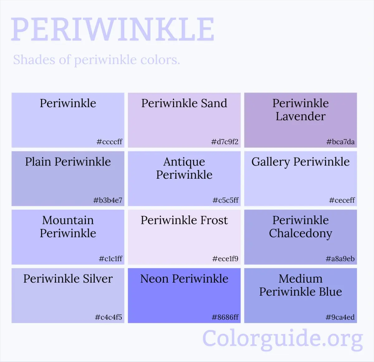
- In the RGB color model used for digital screens, periwinkle is defined by the hex code #CCCCFF.
- Adding too much red will turn the mixture into a dusty mauve or lavender, which is a common mistake for beginners.
- You can adjust the intensity of the color by adding white paint to lighten the tone or a tiny touch of gray to desaturate it.
The bottom line
Periwinkle is a delicate, soothing color that balances the coolness of blue with the warmth of a subtle violet tint. By starting with a bright blue base and carefully introducing small amounts of red or purple, you can achieve this iconic floral hue. Always mix gradually to avoid over-saturating the color, as it is much easier to add more pigment than it is to lighten a mixture.
People also ask
Is periwinkle considered a shade of blue or purple?
Periwinkle is technically classified as a light, purplish-blue color. It sits on the color wheel between blue and violet, occupying a space often described as a soft lavender-blue.
How do I make periwinkle look more vibrant?
To increase the vibrancy, ensure you are using a clean, bright blue base rather than a muted or muddy blue. Avoid adding black, as this will quickly turn the mixture into a dull, grayish-slate color.
What colors complement periwinkle in interior design?
Periwinkle pairs exceptionally well with warm neutrals like cream, beige, or soft gold. It also creates a striking contrast when placed next to its complementary color, which is a pale, warm yellow.
Can I use yellow to adjust periwinkle?
Adding a tiny drop of yellow can neutralize the purple undertones if you feel the mixture is becoming too violet. Use caution, as adding too much yellow will shift the color toward a greenish-blue or teal.
Why does my periwinkle look different on paper than on my screen?
Digital screens use light-based RGB color, while paint uses pigment-based subtractive color. These two systems operate differently, making it difficult to achieve an exact match between a monitor and a physical canvas.
Does periwinkle change appearance in different lighting?
Yes, periwinkle is highly sensitive to ambient light. In cool, natural daylight, the blue tones will appear more prominent, while warm incandescent lighting may make the purple undertones look more pronounced.
This answer was created with the help of AI research tools and reference sources. Spotted an error? Let us know — we correct mistakes quickly. See our editorial policy.