What does the color purple mean in art?
Short answer
Purple in art symbolizes royalty, spiritual mystery, and creative ambition. Historically associated with expensive dyes, it conveys luxury and status. In contemporary practice, it serves as a bridge between the warmth of red and the coolness of blue, often used to evoke feelings of magic, introspection, and profound emotional depth.
On this page
Why is purple historically significant in art?
The historical significance of purple is rooted in the extreme scarcity and cost of the pigment Tyrian purple. Produced from the mucus of predatory sea snails, it took thousands of mollusks to dye a single garment. In the ancient world, this made the color an exclusive marker of emperors, kings, and high-ranking religious officials. Because it was so difficult to obtain, artists rarely used it in paintings until synthetic alternatives were developed.
When purple did appear in classical art, it was almost exclusively used to denote divine power or imperial authority. It was a visual shorthand for status that required no explanation to the viewer. This historical weight remains in the collective consciousness today, ensuring that when an artist uses deep, saturated purple, the viewer instinctively perceives a sense of gravity, importance, or otherworldly majesty.
- Tyrian purple was prized by the Phoenicians and later the Roman Empire.
- The color was legally restricted to the elite in various historical periods.
- Synthetic purple, known as mauveine, was accidentally discovered by William Henry Perkin in 1856.
- The availability of cheap, synthetic pigments democratized the color for artists across all social classes.
How does purple affect the viewer psychologically?
Purple occupies a unique space on the visible light spectrum, sitting at the intersection of the warm red and cool blue wavelengths. This duality creates a psychological tension that artists exploit to suggest mystery or spiritual transition. Because it is rarely found in nature in high concentrations, it often feels artificial or surreal, which makes it an excellent choice for depicting dreamscapes or supernatural phenomena.
The emotional impact of purple depends heavily on its saturation and shade. Lighter shades like lavender are often associated with nostalgia, grace, and femininity, while dark, moody violets can evoke feelings of melancholy or profound intellectual curiosity. By adjusting the balance of red and blue within the mixture, an artist can shift the mood of a canvas from aggressive and vibrant to calm and meditative.
- Use deep, dark purples to ground a composition and create a sense of mystery.
- Incorporate bright, neon violets to draw the eye toward a focal point.
- Apply light, desaturated purples in the background to create atmospheric perspective.
- Experiment with purple shadows to add complexity to skin tones or landscapes.
What are the best ways to mix purple in painting?
Mixing purple is a fundamental skill for any painter, yet it is often misunderstood. The most common mistake is attempting to create a vibrant violet by mixing a red that contains orange or a blue that contains green. These "warm" reds and "green-leaning" blues create a muddy, brownish-gray rather than a clean, brilliant purple. To achieve a clean color, you must select pigments that lean toward the violet side of the spectrum.
For the best results, start with a cool red, such as Alizarin Crimson or Quinacridone Magenta, and combine it with a cool blue, such as Ultramarine or Phthalo Blue. By keeping these two components "cool," you avoid the dulling effect of the complementary color, yellow, which is present in warm-toned pigments. Once you have a base violet, you can adjust the hue by adding small amounts of white to lighten it or black to deepen the value.
- Use a palette knife to ensure the pigments are fully integrated before applying them to the canvas.
- Test your mixture on a scrap piece of paper, as some colors dry differently than they appear when wet.
- Keep a clean brush or rag nearby to avoid cross-contamination of your primary colors.
- Remember that adding white will shift the color toward a cooler, chalky lilac.
Common mistakes when using purple in art
The most frequent error artists make when working with purple is failing to manage its intensity. Because purple is a high-contrast color, it can easily overwhelm a composition if used in large, uniform blocks. Many beginners apply purple straight from the tube, resulting in a flat, artificial look that lacks the nuance found in natural light. This lack of variation makes the color feel disconnected from the rest of the painting.
Another common mistake is ignoring the role of complementary colors. Purple’s direct complement is yellow. If you place a bright, saturated purple next to a bright yellow, the colors will vibrate against each other, which can be visually jarring or distracting. While this can be used intentionally for high-energy effects, it often leads to a chaotic image. Instead, try using muted versions of the complement to balance the intensity of the purple.
- Avoid using purple in shadows without considering the reflected light from surrounding objects.
- Do not overuse purple as a highlight color, as it can make objects look bruised or sickly.
- Be cautious when mixing purple with high amounts of yellow, as this will quickly turn the mixture into a dull, unappealing olive or brown.
How to use purple to create depth and harmony
Purple is an exceptional tool for creating depth because of its ability to recede visually. In landscape painting, artists often use thin, bluish-purple glazes in the distance to simulate atmospheric haze. This technique, known as aerial perspective, helps the viewer perceive the vast distance between the foreground and the horizon. By layering these cool, purple tones, you can make a flat canvas appear three-dimensional and expansive.
To create harmony, consider using a limited palette that incorporates a "purple anchor." By using a consistent violet hue in the shadows of different objects throughout a painting, you tie the disparate elements together into a cohesive whole. This creates a rhythmic visual flow that guides the viewer's eye across the work. Whether you are working in oils, acrylics, or watercolors, the strategic use of purple provides a sophisticated way to unify your artistic vision.
Key facts
- Historically, purple dye was derived from the Bolinus brandaris sea snail, making it so expensive that only royalty could afford it.
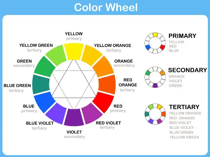
- In color theory, purple is a secondary color created by mixing the primary colors red and blue.
- Artists often use purple to signify mystery, magic, or the supernatural due to its rarity in the natural world.
- To create a vibrant purple, use a cool red (like Alizarin Crimson) and a warm blue (like Ultramarine) to avoid muddy, brownish tones.
- If your purple looks too dull, add a touch of white or a brighter blue to increase its luminosity and clarity.
- Avoid mixing purple with its complementary color, yellow, unless you intend to neutralize it into a muted, earthy gray or brown.
The bottom line
Purple serves as a versatile tool for artists, bridging the gap between the warmth of red and the coolness of blue. Whether used to signify regal authority or to add subtle depth to shadows, it remains a powerful instrument for visual storytelling. By mastering the balance of pigment undertones, you can harness this complex color to bring sophistication and emotional resonance to your creative work.
People also ask
Why is purple often associated with luxury?
Because the ancient Phoenician process for creating Tyrian purple was incredibly labor-intensive and required thousands of snails for a small amount of dye. This exclusivity cemented the color as a status symbol for emperors and monarchs throughout history.
How does purple affect the mood of a painting?
Purple is considered a bridge between the intensity of red and the calmness of blue, often creating a sense of balance. Depending on the shade, it can evoke feelings of spiritual reflection, creativity, or even melancholic introspection.
Is purple a warm or cool color?
Purple is technically a variable color that depends on its temperature bias. A purple leaning toward red is considered warm, while a purple leaning toward blue is considered cool, allowing artists to manipulate depth and temperature in a composition.
Can I make purple by mixing other colors?
Yes, purple is a secondary color produced by combining red and blue pigments. However, the specific result depends on the undertones of the paints used, as some reds contain yellow and some blues contain green, which can dull the mixture.
Why do artists use purple in shadows?
Using purple in shadows instead of black adds depth and visual interest to a piece. It creates a more natural, vibrant look because it maintains color harmony while still suggesting the absence of light.
What is the difference between violet and purple?
Violet is a spectral color found on the visible light spectrum, meaning it has a specific wavelength. Purple is a non-spectral color that does not exist on the light spectrum and is instead a human perception created by mixing red and blue light or pigment.
This answer was created with the help of AI research tools and reference sources. Spotted an error? Let us know — we correct mistakes quickly. See our editorial policy.