What colors make taupe?
Short answer
Taupe is created by mixing brown and gray, or by blending the three primary colors—red, blue, and yellow—with a significant amount of white. Because taupe is a neutral shade, the exact ratio depends on the desired warmth or coolness, often requiring subtle adjustments of black or complementary colors to achieve balance.
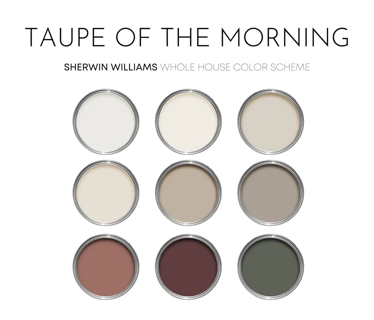
On this page
What colors make taupe paint?
To create taupe using a standard color palette, you must combine a dark neutral base with lighter tones to achieve that signature earthy, grayish-brown appearance. Most artists start with a base of brown and gradually introduce small amounts of gray until the desired level of desaturation is reached. If you are mixing from primary colors, you can create a brown base by combining red, yellow, and blue, then adding white to lighten the mixture.
The exact hue of taupe is highly subjective and can shift toward pink, green, or purple undertones depending on the pigments used. To ensure a professional result, consider these foundational mixing steps:
- Begin with a generous amount of white paint as your base.
- Add small, incremental amounts of raw umber or burnt umber to introduce the brown element.
- Slowly stir in a neutral gray or a tiny touch of black to mute the intensity.
- Adjust the temperature by adding a speck of yellow for warmth or blue for a cooler, stone-like finish.
How to adjust taupe undertones
Achieving the perfect taupe often involves correcting the undertones that emerge during the mixing process. Because taupe sits at the intersection of brown and gray, it is sensitive to the specific pigments in your primary colors. If your mixture appears too muddy or overly orange, you are likely dealing with an excess of warm-toned brown.
To refine the color, follow these adjustments to steer the shade in the right direction:
- If the color is too warm, add a tiny amount of blue or violet to neutralize the orange or red pigments.
- If the color is too cool or looks like "flat" gray, add a small drop of yellow or raw sienna to bring back a natural, organic warmth.
- If the color is too dark, increase the white content gradually rather than adding large amounts at once.
- Always test the color on a scrap piece of paper and let it dry completely, as wet paint often appears darker than the final result.
Why taupe looks different in different lighting
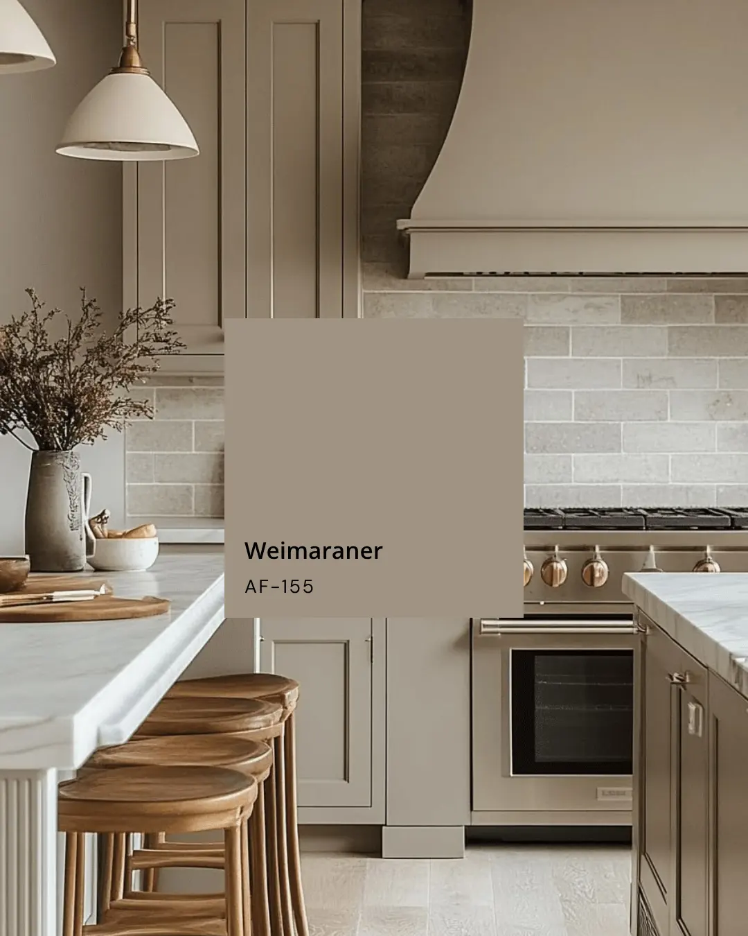
One of the most common challenges with taupe is its tendency to change appearance based on the ambient light of a room. This phenomenon, known as metamerism, occurs because taupe contains a complex balance of wavelengths. In cool, north-facing light, taupe can often take on a stark, grayish, or even greenish quality that may feel cold or uninviting.
Conversely, in south-facing rooms or under warm incandescent lighting, the same taupe can appear significantly browner or even take on a fleshy, pinkish hue. This happens because the light source interacts with the underlying pigments in the paint. To avoid surprises, always view your mixed sample in the specific environment where it will be used. Observe the color at different times of the day, specifically during the morning, high noon, and evening hours, to see how the shifting light alters the perception of the gray and brown components.
Common mistakes when mixing taupe
The most frequent error when mixing taupe is adding too much black paint too early in the process. Black is an incredibly powerful pigment that can quickly overpower the delicate balance of brown and white, resulting in a flat, muddy charcoal rather than a sophisticated taupe. It is almost impossible to "undo" a mixture that has become too dark, so always work from light to dark.
Another mistake is failing to mix enough paint for the entire project at once. Because taupe relies on precise ratios of multiple colors, it is extremely difficult to recreate the exact shade if you run out midway through a task. Always mix a slightly larger batch than you anticipate needing. Additionally, avoid mixing different brands of paint if possible, as varying binder compositions and pigment concentrations can lead to inconsistent textures or separation issues that ruin the final finish of the color.
Best tools for mixing colors
Using the right equipment ensures that your taupe mixture remains consistent and free of streaks. For small projects or artistic endeavors, a stainless steel palette knife is superior to a brush for mixing, as it prevents air bubbles and ensures that pigments are fully incorporated. If you are mixing larger quantities for home improvement, a mechanical drill attachment designed for paint mixing is essential to ensure the heavy pigments at the bottom of the can are evenly distributed.
When working with acrylics or oils, consider the following tools to improve your precision:
- A glass or plastic palette that is easy to clean between color trials.
- A set of high-quality measuring spoons or syringes to track exactly how much of each color you add.
- A neutral-colored background or gray card to compare your mixed taupe against, which helps your eyes remain objective during the process.
- A dedicated notebook to record the specific ratios used, allowing you to replicate your favorite shade of taupe for future creative projects or touch-ups around your home.
Key facts
- Taupe is a neutral color that sits between brown and gray on the color spectrum.
- To create basic taupe, mix equal parts of brown and gray paint together.
- Adding a tiny amount of white paint will lighten the mixture and soften the overall tone.
- If the mixture appears too muddy, introduce a small drop of violet or blue to neutralize unwanted yellow undertones.
- Always start with a larger amount of gray and add brown incrementally to maintain control over the final shade.
- Test your color on a scrap piece of paper and let it dry completely, as paint often darkens or shifts once the moisture evaporates.
The bottom line
Taupe is a versatile, sophisticated neutral achieved by blending brown and gray, often with a touch of white for balance. By carefully adjusting these proportions, you can create a custom shade that complements any interior design scheme. Always test your mixture on a sample surface and allow it to dry fully, as the final color will shift significantly once the paint has settled and cured.
People also ask
Is taupe considered a warm or cool color?
Taupe can be either warm or cool depending on the specific ratio of brown to gray. A higher concentration of brown creates a warmer, earthier taupe, while more gray results in a cooler, more clinical appearance.
How does taupe differ from beige?
Beige is typically a pale, sandy color with distinct yellow or golden undertones. Taupe is significantly darker and relies on gray, making it appear more sophisticated and muted compared to the brightness of beige.
What happens if I add too much black to my taupe mixture?
Adding black often makes the color look flat or dirty rather than deep. Use a dark gray or a deep umber instead to darken the shade without losing the subtle complexity of the taupe hue.
Can I use complementary colors to adjust taupe?
Yes, you can use small amounts of complementary colors to shift the undertones. A touch of orange can warm up a cool gray-taupe, while a hint of blue can cool down a brown-heavy taupe.
Why does my taupe look different on the wall than on the palette?
Lighting conditions significantly impact how taupe is perceived in a room. Natural daylight often highlights the gray components, while artificial incandescent lighting tends to draw out the warmer brown tones.
Should I use acrylic or oil paints for mixing taupe?
Both mediums work well, but they handle differently during the drying process. Acrylics tend to darken slightly as they dry, so you should mix your taupe a shade lighter than your target color.
This answer was created with the help of AI research tools and reference sources. Spotted an error? Let us know — we correct mistakes quickly. See our editorial policy.