What colors make lilac?
Short answer
Lilac is created by mixing blue and red to form a cool-toned purple, which is then lightened significantly by adding white. Because lilac is a pastel shade, the white component must be the dominant color in the mixture. Adjusting the ratio of blue to red determines whether the lilac appears warmer or cooler.
On this page
How to mix lilac paint
To achieve a standard lilac, begin by creating a base purple. Mix a primary blue, such as ultramarine or cerulean, with a primary red, such as alizarin crimson or magenta. Because red and blue create a dark violet, you must introduce a large amount of white paint to transform the deep tone into a soft, pastel lilac.
It is best to start with a generous dollop of white on your palette and slowly incorporate the purple mixture. By adding the dark color to the white rather than the reverse, you maintain better control over the final intensity. If the mixture looks too gray, you may have used a blue with too much green or a red that is too earthy. Aim for a clean, vibrant purple base before adding the white to ensure the lilac remains crisp and bright.
Why lilac looks different based on color ratios
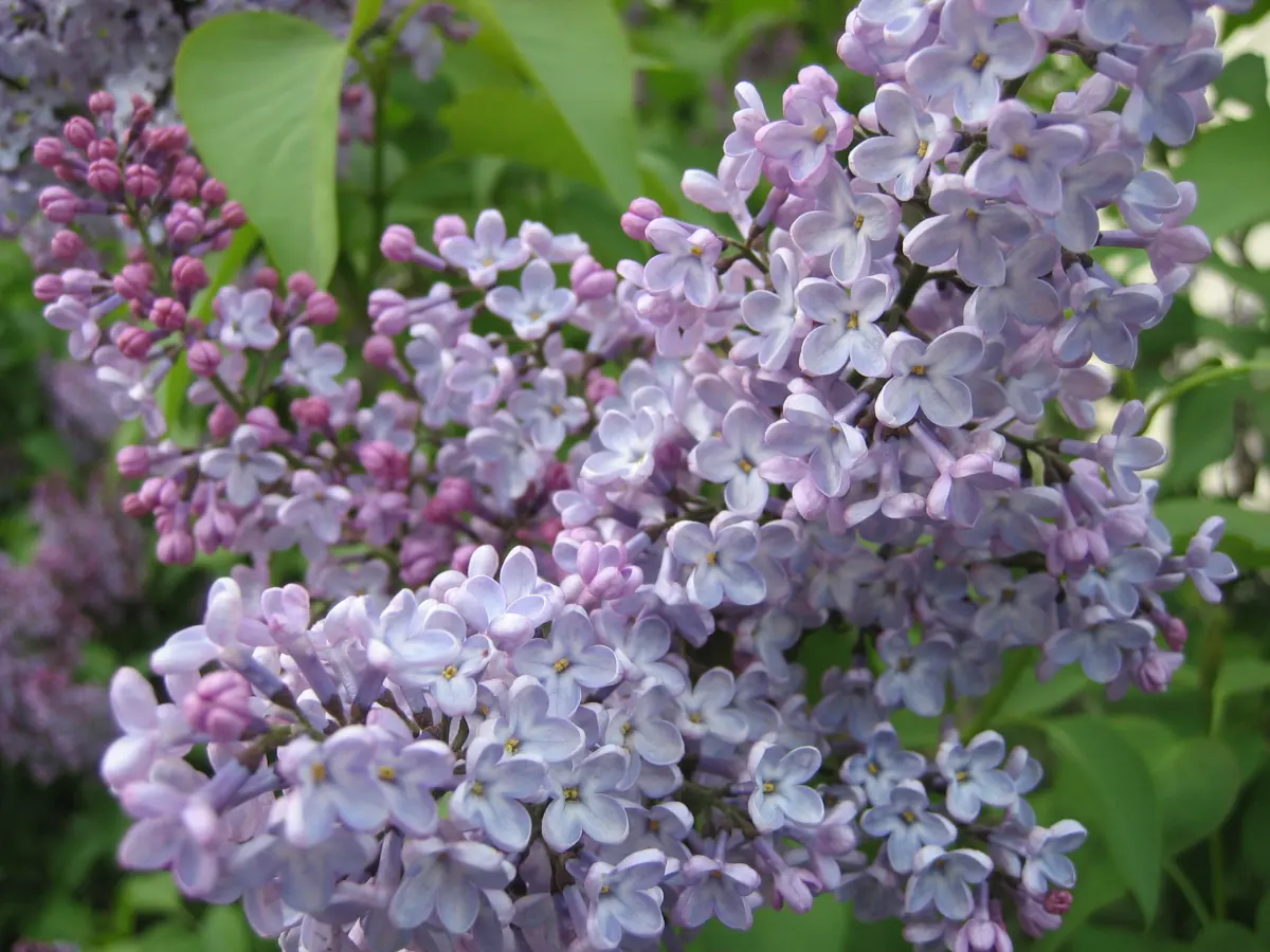
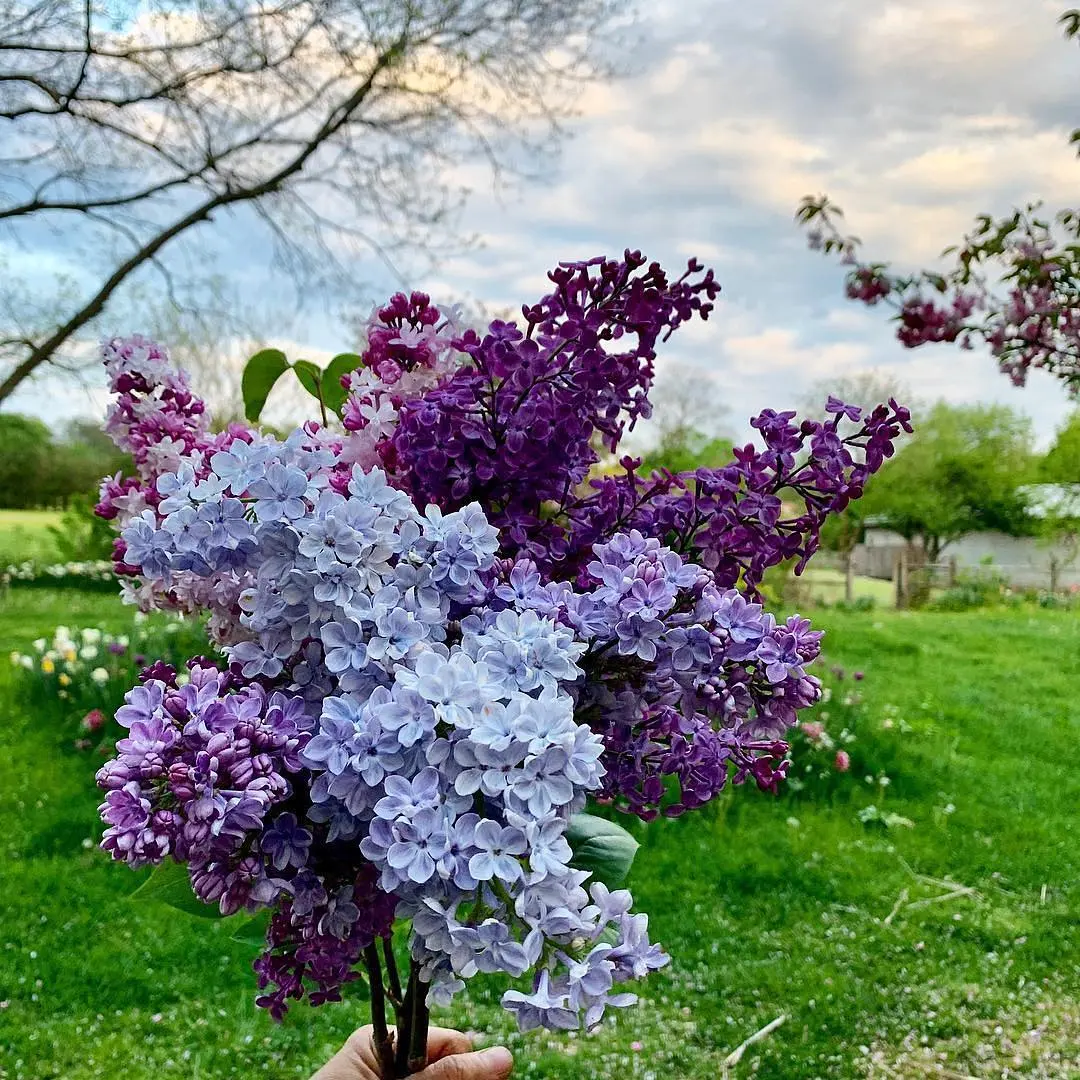
The specific shade of lilac depends heavily on the "temperature" of the red and blue pigments you select. If you use a warm red, such as cadmium red, your lilac will lean toward a soft, dusty lavender or mauve. Conversely, using a cool, blue-leaning red like quinacridone magenta will yield a brighter, more floral lilac that feels closer to the actual flower.
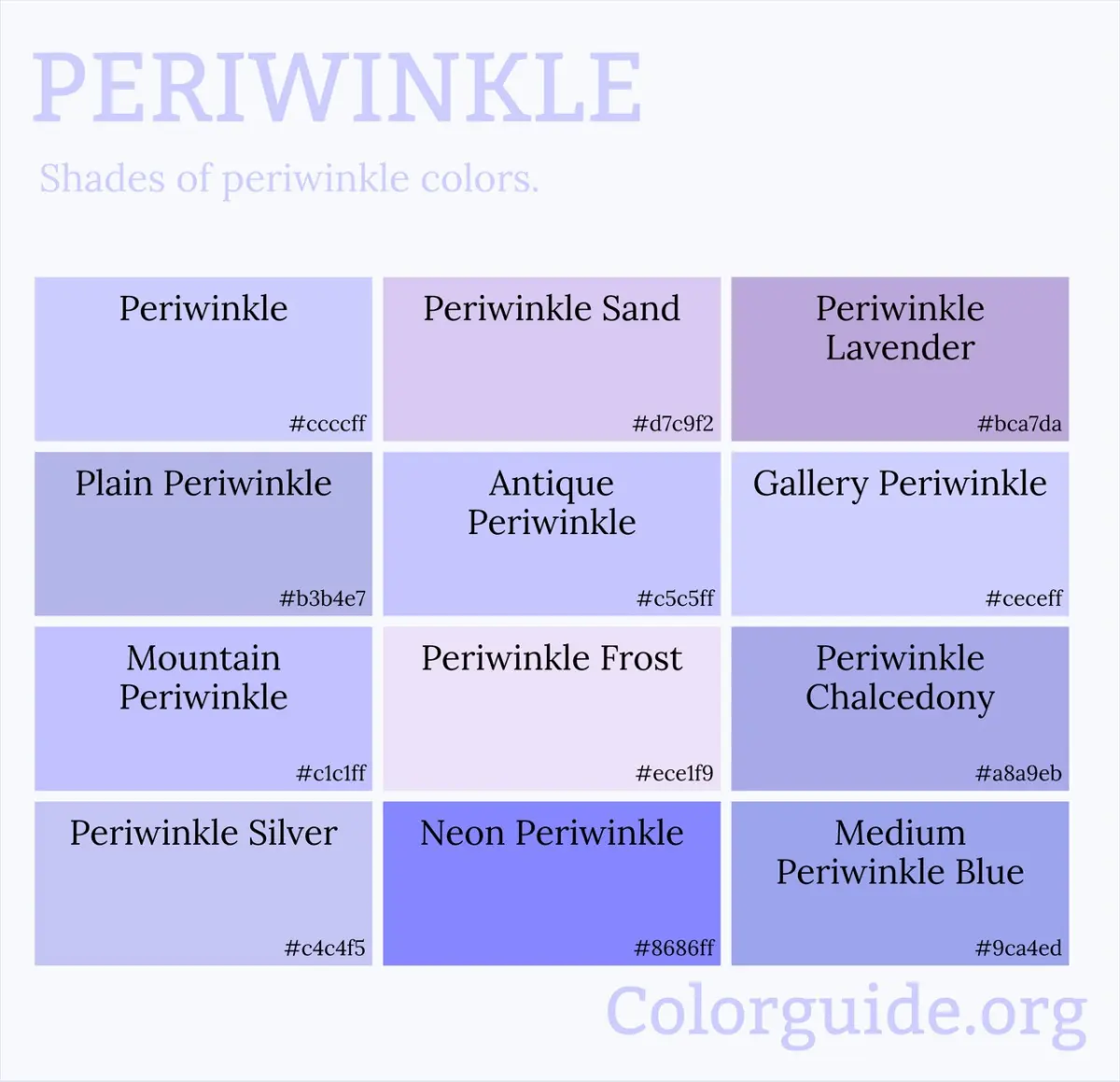
The blue pigment also plays a critical role in the final outcome. Using a green-leaning blue, such as phthalo blue, can result in a periwinkle-tinted lilac, while a red-leaning blue, like ultramarine, creates a deeper, more traditional violet base. To master the color, consider these variations:
- For a cool, icy lilac: Use magenta and a touch of ultramarine.
- For a warm, pinkish lilac: Use a larger proportion of red and a tiny amount of blue.
- For a muted, vintage lilac: Add a tiny speck of yellow or raw umber to neutralize the brightness.
Common mistakes when mixing lilac
A frequent error is adding too much blue, which quickly turns the mixture into a dark, muddy indigo or navy. Because blue is a strong pigment, it can easily overpower the red and white. Always add blue in tiny increments, testing the color on a scrap piece of paper or canvas before committing to a larger batch.
Another common issue is "over-mixing," which can lead to a flat, lifeless color. If your lilac looks dull, it is often because the pigments have been agitated too much, causing them to lose their individual brilliance. To keep the color fresh, gently fold the pigments together with a palette knife rather than vigorously stirring them with a brush. If the color looks too dark, do not be afraid to add more white; lilac is defined by its lightness, and it is almost always better to have a slightly lighter tint than one that is too dark.
Best tools for mixing colors
Achieving the perfect lilac requires a clean surface and high-quality pigments. A white plastic or glass palette is essential because it allows you to see the true tint of the mixture against a neutral background. If you mix on a dark or colored surface, your perception of the lilac's lightness will be distorted, leading to an inaccurate final result.
When preparing to mix, ensure you have the following items ready to maintain consistency:
- A palette knife: This is superior to a brush for mixing because it prevents pigment from getting trapped in the bristles.
- A clean rag or paper towel: Use this to wipe your knife between additions to prevent cross-contamination of colors.
- A test sheet: Keep a piece of white paper nearby to swatch your progress, as wet paint often looks darker than it will once it dries.
- High-opacity white: Use a titanium white, which provides the best coverage and lightening power for pastel shades.
How to adjust lilac for different projects
If you are working with digital media or light-based color systems, the process is slightly different than working with physical paint. In the RGB color model, lilac is created by combining high values of red and blue with a moderate amount of green. Because screens emit light, you increase the brightness of the color by moving toward white, effectively balancing the red and blue channels to achieve the desired pastel hue.
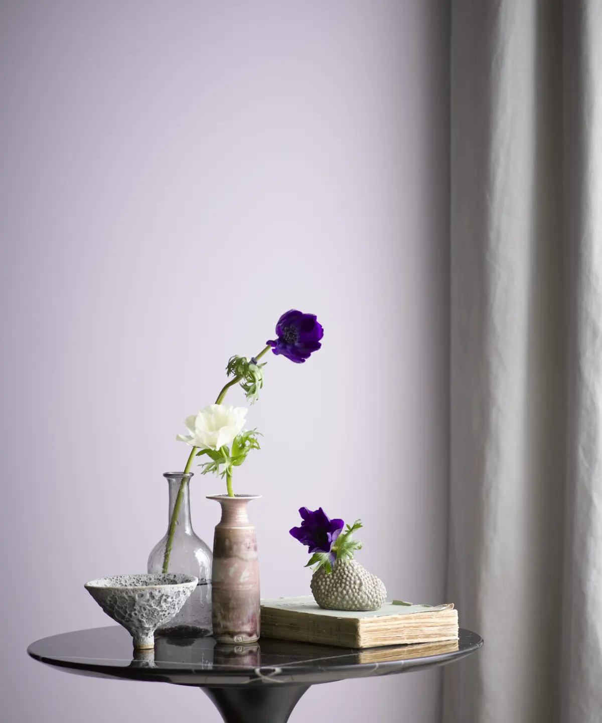
For interior design or fabric dyeing, consider the lighting conditions before finalizing your lilac mixture. Lilac is a reactive color that shifts significantly depending on whether it is viewed under warm incandescent light or cool daylight. If you are painting a room, always test a large sample on the wall and observe it at different times of the day. If the lilac appears too cold in the morning, you can adjust the mixture by adding a minute amount of warm red to balance the light. Always record your ratios if you are mixing a large batch, as replicating a specific lilac tint by eye is notoriously difficult.
Key facts
- Lilac is a pale, cool-toned shade of purple created by mixing blue and red with a significant amount of white.
- To achieve the correct shade, start with a base of white paint and add tiny amounts of blue and red incrementally.
- Use a cool-toned blue, such as ultramarine or phthalo blue, to ensure the lilac remains crisp rather than muddy.
- Avoid adding too much red, as this will shift the color toward a warmer, pinkish magenta or orchid hue.
- If the mixture looks too gray, you have likely added too much of all three colors; add more white to brighten the saturation.
- Always mix colors on a clean palette and test the shade on a scrap piece of paper, as colors often darken slightly when drying.
The bottom line
Creating the perfect lilac requires a careful balance of white, blue, and red. By keeping your base white and slowly introducing cool-toned blue and red, you maintain control over the shade's intensity. Avoid the common pitfall of adding too much pigment, which can lead to a muddy or overly dark result. With patience and incremental adjustments, you can achieve a soft, balanced, and professional-looking lilac hue.
People also ask
Is lilac the same color as lavender?
While often used interchangeably, lilac is typically more pink-toned than lavender, which leans closer to a soft, cool blue-purple. Lavender usually contains more blue, whereas lilac requires a slightly higher ratio of red.
How do I make lilac darker?
To darken lilac, add a very small amount of black or a complementary color like yellow to desaturate the hue. Use caution, as adding too much dark pigment can quickly turn the delicate lilac into a dull, brownish gray.
Can I use acrylics and oils interchangeably for this mix?
The color theory remains the same, but the drying times and transparency levels differ significantly between mediums. Oils remain workable for days, while acrylics dry rapidly, necessitating faster mixing to ensure a consistent color.
Why does my lilac turn brown when I mix it?
Brown occurs when you mix all three primary colors—red, blue, and yellow—together in roughly equal proportions. Ensure your blue and red pigments are pure and do not contain hidden yellow undertones that might muddy the mix.
How do I adjust the temperature of lilac?
You can make lilac feel warmer by adding a tiny touch of extra red or cooler by adding a drop of blue. Keep adjustments minimal, as purple pigments are highly concentrated and can overpower the white base quickly.
What is the best way to lighten a lilac that is too dark?
The most effective method is to add more white paint to the existing mixture. If you have already mixed a large batch, it is often easier to start with a fresh pile of white and gradually incorporate the dark mixture into it.
This answer was created with the help of AI research tools and reference sources. Spotted an error? Let us know — we correct mistakes quickly. See our editorial policy.