What colors make teal?
Short answer
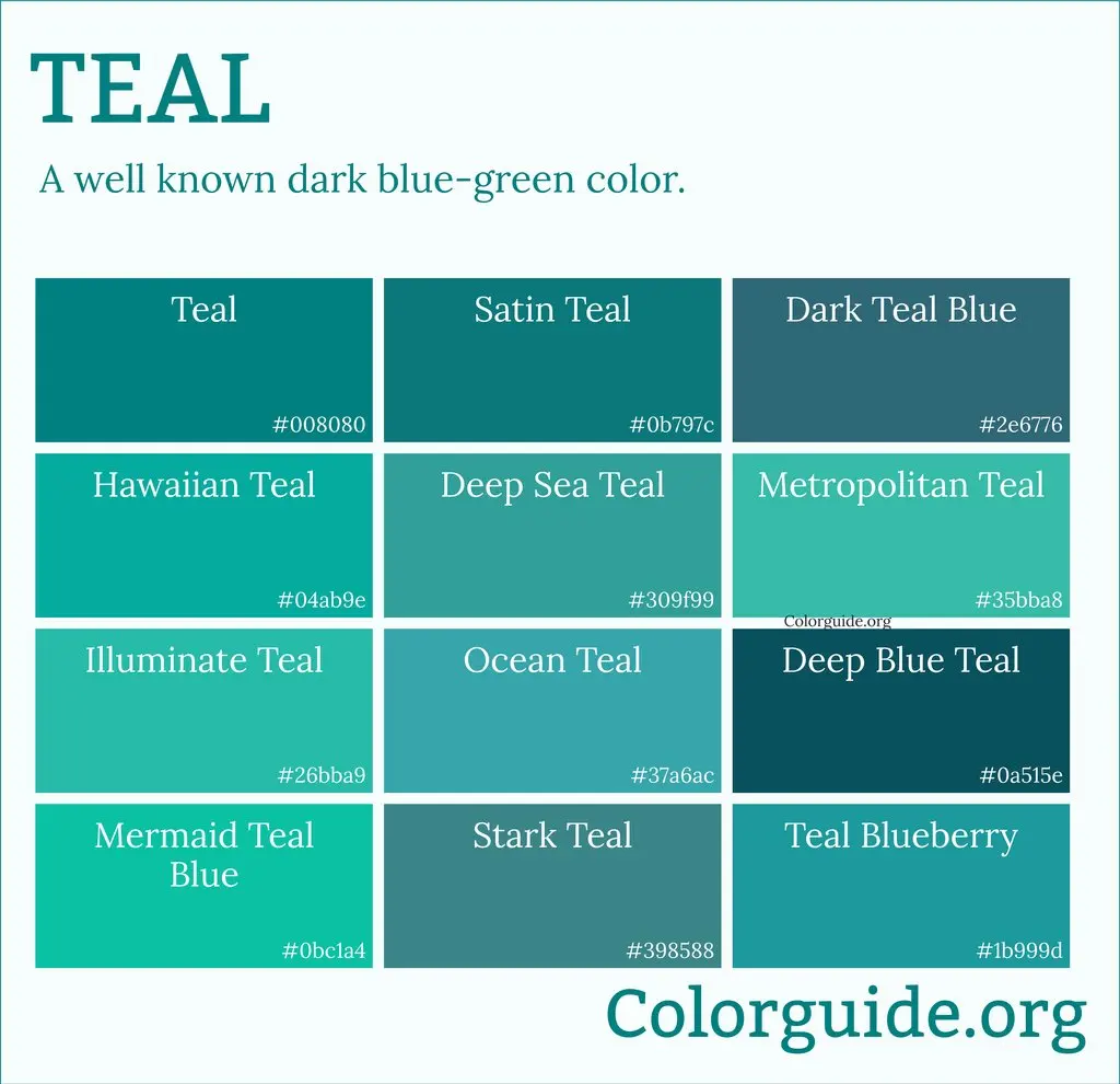
Teal is created by mixing blue and green, typically with a small amount of white to adjust the brightness and saturation. It is a medium-to-dark blue-green hue that resembles the coloring of the common teal duck. By varying the ratios of these primary and secondary pigments, you can achieve diverse shades.
On this page
How to mix teal paint colors
To create a basic teal, you start with a primary blue and a primary green. Because blue and green are analogous colors on the color wheel, they blend seamlessly to form a rich, deep hue. If you are using acrylics or oils, begin with a larger portion of blue and slowly add green until the desired depth is reached.
For a more nuanced shade, follow these steps:
- Start with a base of phthalocyanine blue or cerulean blue on your palette.
- Gradually incorporate a vibrant green, such as viridian or permanent green, in small increments.
- Add a tiny touch of white paint to soften the intensity and move the color toward a classic teal.
- Test the mixture on a scrap piece of paper, as the color will often dry slightly darker than it appears when wet.
What is the color theory behind teal
Teal sits between blue and green on the visible light spectrum, typically falling in the wavelength range of 490 to 520 nanometers. In the subtractive color model used for physical pigments, teal is a tertiary color. It is essentially a desaturated cyan, which is one of the three primary colors in modern printing processes.
When working with light—such as on a computer screen—teal is produced using the RGB model. By setting the red channel to a low value, the green channel to a medium-high value, and the blue channel to a high value, you create the specific digital representation of teal. This mathematical approach ensures consistency across different displays, whereas physical paint mixing remains subject to the specific chemical properties of the pigments used.
Why teal looks different in different lighting
The appearance of teal is highly dependent on metamerism, a phenomenon where colors appear to match under one light source but differ under another. Because teal contains both cool blue and warm green undertones, it reacts dynamically to the color temperature of your environment. In cool, north-facing daylight, teal may appear more blue, while under warm incandescent bulbs, the green undertones become more prominent.
To ensure your teal remains consistent in a physical space, consider these factors:
- Natural sunlight provides a full spectrum, showing the true balance of the blue and green pigments.
- Fluorescent lighting often shifts teal toward a muddy or greyish appearance due to its limited spectral output.
- LED lighting with a high Color Rendering Index (CRI) is the best choice for accurately perceiving the depth of teal in interior design or art projects.
Common mistakes when mixing teal
A frequent error is adding too much black paint to darken the mixture. Black pigment often contains undertones of brown or violet, which can instantly turn a vibrant teal into a dull, muddy slate color. Instead of black, use a "chromatic black" or a deeper blue like ultramarine to darken the shade without compromising the clarity of the hue.
Another common mistake is failing to clean your brush between additions of blue and green. If your brush is contaminated with red or yellow, you will inadvertently create a brown or olive tone, ruining the purity of the teal. Always use a clean palette knife or brush to integrate your pigments. If the mixture starts to look too much like a standard forest green, add a tiny amount of white or a touch more blue to pull the color back toward the teal spectrum.
Best ways to adjust teal shades
Once you have achieved a base teal, you can easily customize it to suit specific design needs. Adding more blue creates a "deep teal" or "peacock blue," which feels more formal and calming. Conversely, adding more green creates a "teal green," which feels more organic and energetic. You can also experiment with opacity by thinning your paint with a medium or water.
Consider these adjustments to refine your results:
- For a muted, vintage teal: Add a very small amount of burnt umber or raw sienna to neutralize the brightness.
- For a brighter, modern teal: Increase the proportion of white or add a drop of bright cyan.
- For a metallic or shimmering effect: Mix your teal base with a pearlescent medium or silver acrylic paint to catch the light.
By systematically adjusting these ratios, you can create a custom palette that ranges from dark, moody oceanic tones to light, refreshing tropical shades that perfectly match your creative vision.
Key facts
- Teal is a medium-to-dark blue-green color created by mixing blue and green pigments.
- To achieve a standard teal, start with a base of blue and gradually add small amounts of green.
- Adding a touch of white paint will lighten the mixture to a sky-teal or a softer pastel shade.
- Mixing in a tiny amount of black or gray will deepen the hue, resulting in a muted, sophisticated dark teal.
- A common mistake is adding too much green too quickly, which shifts the color toward a bright turquoise or emerald.
- Always test your color on a scrap piece of paper or canvas before applying it to your final project, as colors often darken when they dry.
The bottom line
Teal is a versatile, sophisticated color achieved by blending blue and green pigments. By adjusting the ratios and introducing small amounts of white, black, or complementary colors, you can customize the shade to suit any aesthetic. Mastering this color requires patience, as small additions significantly alter the final result. Always mix in small increments to maintain control over the depth and vibrancy of your unique teal.
People also ask
Is teal the same color as turquoise?
No, while both are blue-green, turquoise contains more yellow and appears brighter and lighter. Teal is a deeper, more muted shade that leans more heavily toward the blue spectrum.
How do I make teal look more professional or "muted"?
To tone down a vibrant teal, add a small amount of its complementary color, which is red or orange. This neutralizes the intensity and creates a more earthy, sophisticated tone.
Can I make teal using only primary colors?
Yes, you can create teal by mixing blue and yellow to make green, then adding more blue to that green mixture. Ensure your blue is a cool-toned shade to avoid a muddy result.
Why does my teal paint look different on the wall than on the palette?
Lighting conditions significantly impact how teal appears in a room. Natural daylight often makes teal look greener, while artificial yellow-toned light can make it appear much darker or more blue.
What is the difference between teal and cyan?
Cyan is a bright, primary subtractive color used in printing, whereas teal is a secondary, darker mixture. Cyan is much more vibrant and lacks the deep blue-green complexity of teal.
How do I lighten teal without making it look chalky?
Instead of using pure white, try adding a very small amount of pale yellow or cream. This maintains the warmth of the color while increasing its luminosity without losing the depth of the blue-green base.
This answer was created with the help of AI research tools and reference sources. Spotted an error? Let us know — we correct mistakes quickly. See our editorial policy.