What colors make sage green?
Short answer
Sage green is created by mixing green with a small amount of gray or a complementary color like red. To achieve the specific muted, earthy tone, you must desaturate a vibrant green base. By adjusting the proportions of gray, white, or red, you can shift the shade toward cooler or warmer undertones.
On this page
How to mix sage green with paint
To create sage green using standard acrylic or oil paints, start with a primary green base, such as phthalo or hooker’s green. Because these pigments are often intense and saturated, you must neutralize them to achieve the characteristic dusty, muted appearance of sage. The most reliable method is to add a neutral gray to your green base. If you do not have pre-mixed gray, create it by combining black and white.
Alternatively, you can introduce a tiny amount of red to the green. Since red and green are complementary colors on the color wheel, they naturally dull each other when mixed. This process creates a sophisticated, brownish-green tone that mimics the natural appearance of sage leaves. To lighten the mixture and achieve the desired pastel quality, slowly incorporate white paint until you reach the preferred level of brightness.
- Start with a base of medium green.
- Add a small amount of gray or a touch of red to desaturate the hue.
- Gradually stir in white to adjust the lightness.
- Test the color on a scrap surface, as it will darken slightly as it dries.
What colors make sage green in color theory
In the context of color theory, sage green is classified as a tertiary or quaternary color that has been desaturated. It sits on the spectrum between yellow-green and blue-green, but its defining characteristic is its low chroma. Chroma refers to the purity or intensity of a color; sage green has a very low chroma because it contains a significant amount of gray or an opposing color.
When you mix colors, you are essentially subtracting light from the spectrum. Adding gray to a vibrant green lowers its intensity without shifting its hue significantly toward blue or yellow. If you add too much black, the color becomes muddy or olive-toned rather than sage. Understanding this balance is essential for artists who want to maintain the cool, airy quality of sage without accidentally creating a dark, forest-like shade that lacks the necessary gray undertones.
Best tools for mixing sage green
Achieving the perfect sage green requires a controlled environment and the right selection of pigments. Beginners often struggle because they use too much pigment at once, which makes it difficult to backtrack. Using a palette knife is significantly more effective than a brush for mixing, as it ensures the colors are fully integrated without trapping air bubbles or leaving streaks of unmixed paint.
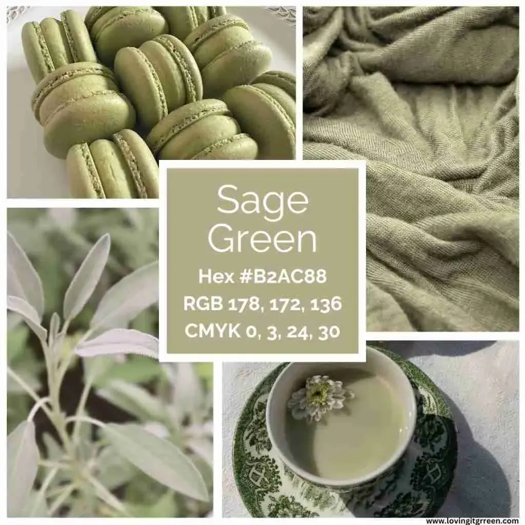
For those working with digital design or printing, sage green is defined by specific color codes. In the RGB color model, which is used for screens, sage green typically falls around the values of R:188, G:204, B:170. In the CMYK printing process, the mixture involves a combination of cyan, magenta, yellow, and black, specifically prioritizing a high percentage of yellow and cyan with a small amount of black to achieve the muted effect.
- Palette knife for smooth, consistent blending.
- High-quality titanium white for lightening without losing opacity.
- A neutral gray or a muted red pigment for desaturation.
- A clean mixing surface to prevent color contamination from previous projects.
Why sage green looks different in different lighting
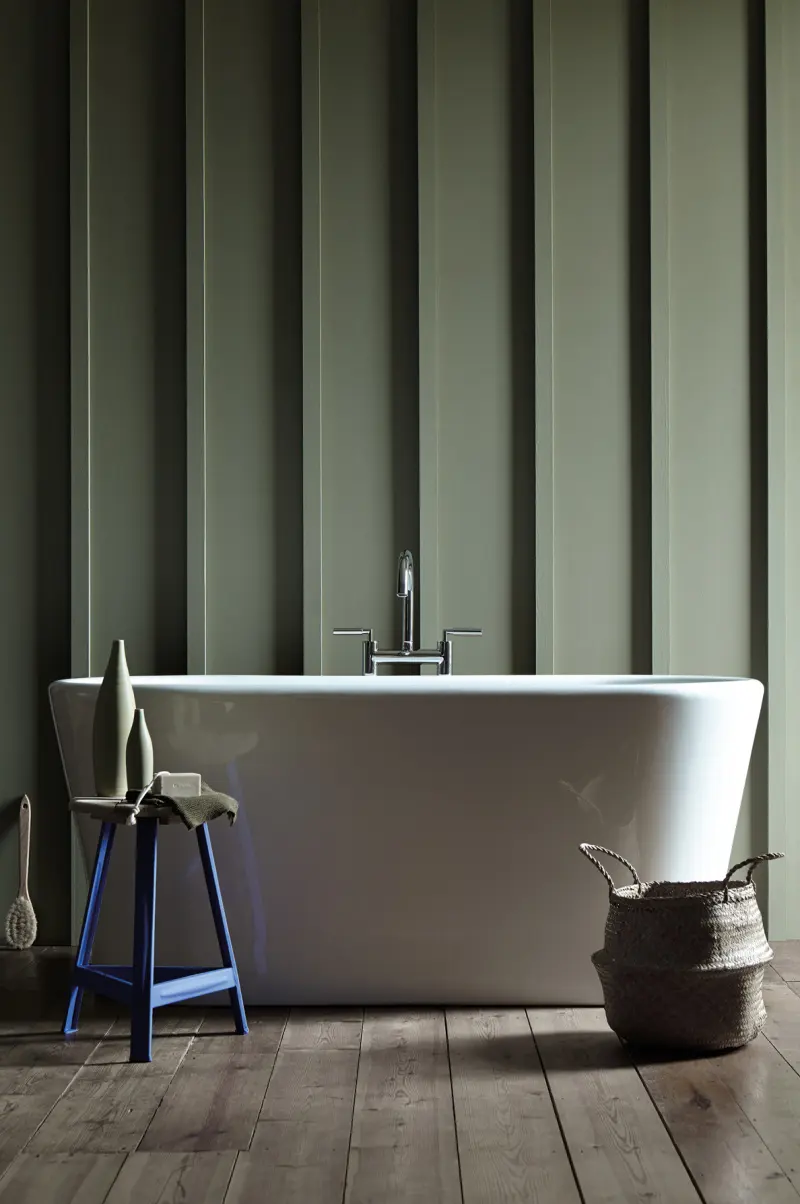
Sage green is notoriously sensitive to its environment, a phenomenon known as metamerism. Because sage is a complex, desaturated color, it reflects light differently depending on the source. In cool, northern-facing light, sage green may appear more blue or gray, emphasizing its colder undertones. Conversely, in warm, southern-facing light or under incandescent bulbs, the yellow components of the green base become more prominent, making the color appear warmer and more earthy.
When selecting a sage green for interior design or art, it is vital to test the color in the exact location where it will be displayed. A swatch that looks perfect in a store under fluorescent lighting will often shift significantly when moved to a living room with natural sunlight. Always observe your color mixture at different times of the day to ensure the undertones remain consistent with your original vision for the space or project.
Common mistakes when mixing sage green
The most frequent error when attempting to mix sage green is adding too much black paint. Black is extremely powerful and can quickly turn a beautiful, muted green into a dull, muddy brown or a dark, swampy olive. If you accidentally add too much black, you will often find it nearly impossible to correct the shade without wasting a large amount of paint. Always add dark pigments in microscopic increments to maintain control over the final result.
Another common mistake is failing to account for the drying time and color shift of acrylics. Many artists forget that acrylic paints tend to dry darker than they appear when wet. If your mixture looks like the perfect sage while wet, it may end up being too dark once the water evaporates. To avoid this, mix your paint slightly lighter than your target shade, allowing for the natural darkening that occurs during the curing process.
- Adding black pigment too quickly, resulting in a muddy, dark mess.
- Over-mixing the colors, which can lead to a flat, lifeless appearance.
- Ignoring the base undertones of the green pigment being used.
- Failing to test the color on a surface that matches the final project material.
Key facts
- Sage green is a desaturated, grayish-green hue that mimics the natural color of dried sage leaves.
- To create sage green, mix a primary green base with a small amount of red or a complementary color to neutralize its vibrancy.
- Adding white is essential to lighten the mixture and achieve the characteristic soft, muted pastel quality of sage.
- A touch of blue can be added to the mixture if you prefer a cooler, sea-foam variation of the shade.
- Always start with a small amount of the darkening or neutralizing color, as it is easier to add more than to correct an oversaturated mixture.
- Use a palette knife to blend your pigments thoroughly on a mixing board to ensure a consistent, streak-free color.
The bottom line
Creating the perfect sage green requires balancing vibrancy with neutrality. By mixing a base green with white and a hint of red or gray, you effectively desaturate the color to achieve its signature muted look. Always introduce darker pigments sparingly, as subtle adjustments have a significant impact on the final shade. With careful blending and patience, you can customize this versatile, calming color for any project.
People also ask
Is sage green considered a warm or cool color?
Sage green is generally considered a cool color because of its strong green and gray undertones. However, depending on the ratio of yellow or red added, it can lean toward a warmer, earthier appearance.
Why does my sage green look like muddy brown?
This usually happens when you add too much red or complementary color to the green base. To fix this, add more white to brighten the mixture or small amounts of pure green to restore the hue.
Can I use black paint to make sage green?
While black can darken a green, it often creates a dull, dirty tone rather than a sophisticated sage. It is better to use gray or a mix of complementary colors to achieve the desired desaturated look.
Does lighting affect how sage green looks on a wall?
Yes, sage green is highly reactive to light. In rooms with north-facing natural light, it may look cooler and more gray, while in south-facing rooms, it often appears brighter and warmer.
What is the best way to lighten sage green paint?
The most effective method is to add white paint gradually until you reach the desired tint. Avoid using water or thinner, as these can alter the consistency and coverage of the paint.
How do I match a specific sage green shade I saw online?
Use a digital color picker tool to identify the RGB or hex code of the image. You can then take these values to a professional paint store where they can use a spectrophotometer to color-match the sample.
This answer was created with the help of AI research tools and reference sources. Spotted an error? Let us know — we correct mistakes quickly. See our editorial policy.