What does the color green mean in art?
Short answer
Green in art represents a complex spectrum of meanings, primarily symbolizing nature, fertility, and renewal. Historically, it has also signified poison, jealousy, and social status. Because it sits between cool blue and warm yellow, artists use green to create balance, evoke tranquility, or introduce a sense of unsettling, synthetic artificiality.
On this page
Why does green have different meanings in art?
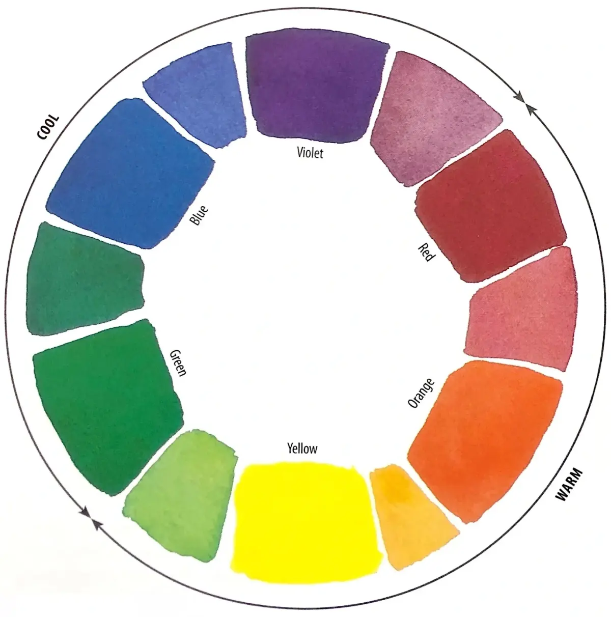
Green occupies a unique position on the color wheel as a secondary color created by mixing blue and yellow. This duality allows it to embody both the calming stability of the ocean and the vibrant energy of sunlight. In Western art history, green has been used to denote the natural world, representing lush landscapes and the cycle of life. However, its meaning shifted significantly during the 18th century when chemists developed synthetic pigments like Scheele’s Green, which contained arsenic.
Because these early synthetic greens were toxic, the color began to be associated with danger and death in literature and visual culture. This historical baggage persists today, where artists use vibrant, acidic greens to create a sense of unease or toxicity. Understanding this duality is essential for interpreting how a specific shade of green functions within a composition. Whether it represents a peaceful meadow or a decaying, artificial environment depends entirely on the artist's choice of hue, saturation, and context.
How to use green in color theory
Artists use green to manipulate the viewer's emotional response and direct their focus across a canvas. Because green is the most restful color for the human eye, it is often employed to create focal points of stability. When placed next to its complementary color, red, green creates high-contrast vibrations that make both colors appear more intense. This technique was famously utilized by Vincent van Gogh in The Night Café to create an atmosphere of "terrible passions."
To effectively incorporate green into your own work, consider these fundamental principles:
- Use desaturated, earthy greens to push background elements away and create atmospheric perspective.
- Apply high-saturation, bright greens in the foreground to draw the viewer’s eye immediately.
- Mix green with warm yellows to suggest sunlight and growth, or with cool blues to suggest shadow and mystery.
- Balance large areas of green with neutral tones to prevent the color from overwhelming the composition.
What do different shades of green represent?
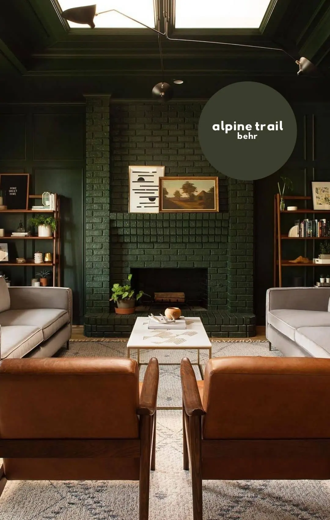
The psychological impact of green changes dramatically based on its specific shade and undertone. A deep, forest green often conveys maturity, tradition, and security, making it a staple in portraiture and historical painting. In contrast, bright, lime-colored greens are associated with modernity, electricity, and synthetic materials. These lighter, more acidic shades can feel jarring or futuristic, reflecting the rapid industrialization of the 20th century.
Consider these common associations when selecting your palette:
- Olive green: Often symbolizes peace, resilience, or earthy, grounded maturity.
- Emerald green: Historically linked to luxury, wealth, and the precious gemstone.
- Mint green: Frequently used to evoke freshness, cleanliness, and a sense of nostalgia.
- Chartreuse: A high-energy, acidic yellow-green that signals danger or intense, unnatural vitality.
- Sage green: A muted, greyish tone that communicates wisdom, calm, and organic softness.
Common mistakes when painting with green
One of the most frequent errors artists make when working with green is relying too heavily on tube colors without modification. Straight from the tube, green can look flat, plastic, or overly artificial, failing to capture the subtle variations found in nature. To avoid a "cartoony" appearance, you must mix your greens with other pigments to create depth and complexity. Adding a touch of red or purple can neutralize a green, making it appear more realistic and grounded.
Another common mistake is failing to account for light temperature. Many beginners paint all foliage the same shade of green, ignoring how light sources change the color's appearance. In direct sunlight, greens should shift toward yellow, while in the shade, they should lean toward blue or violet. By failing to observe these shifts, the painting loses its sense of three-dimensional form. Always study your subject under consistent lighting to ensure your green tones accurately reflect the environment you are trying to recreate.
How to mix natural greens for landscapes
Achieving a realistic green requires a disciplined approach to color mixing. Rather than buying a single "leaf green" tube, professional painters build their greens from a primary blue and yellow base. By adjusting the ratios and adding small amounts of white, black, or complementary colors, you can create an infinite variety of natural tones. This process allows for a more harmonious painting where the greens feel unified rather than disjointed.
Follow these steps to mix more sophisticated greens:
- Start with a cool yellow, such as lemon yellow, and mix it with a warm blue like ultramarine to create a vibrant, grassy base.
- Introduce a tiny amount of burnt sienna or alizarin crimson to dull the intensity and create a more natural, earthy tone.
- Use a palette knife to ensure the colors are thoroughly blended before applying them to the canvas.
- Test your mixture against your reference material, adjusting with small amounts of white to lighten or black to deepen the value.
- Apply the paint in thin, layered glazes to allow the underpainting to show through, which adds a luminous quality to the final result.
Key facts
- Green is a secondary color created by mixing blue and yellow, occupying the center of the visible light spectrum.
- Historically, the pigment "Scheele's Green," created in 1775, contained arsenic and was famously toxic to both artists and homeowners.
- In Renaissance art, green often symbolized hope, rebirth, and the fertility of the natural world.
- Impressionist painters like Claude Monet used green to capture the fleeting, atmospheric light of gardens and landscapes.
- When mixing green paint, avoid adding too much red, as it will neutralize the hue into a muddy brown or gray.
- To create a more natural, organic green, mix a cool yellow with a warm blue rather than using a pre-mixed tube color.
The bottom line
Green serves as a bridge between the natural world and emotional expression in art. By mastering the balance between warm and cool pigments, artists can evoke everything from lush vitality to eerie, psychological tension. Whether you are mixing paints or analyzing a masterpiece, remember that green is rarely a single, static hue; it is a complex, shifting spectrum that defines the depth of any composition.
People also ask
Why is green considered a difficult color to mix?
Green is sensitive to the underlying temperature of the blue and yellow pigments used. If you mix a warm yellow containing red undertones with a blue, you will inadvertently create a dull, brownish shade instead of a vibrant green.
What does green symbolize in religious paintings?
In medieval and Renaissance art, green often represented the Holy Spirit, resurrection, and the triumph of life over death. It was frequently used in depictions of the Virgin Mary to signify her role as a vessel of new life.
How do artists use green to create depth in landscapes?
Artists use atmospheric perspective by painting foreground greens with high saturation and warm undertones. As the landscape recedes into the distance, they shift to cooler, desaturated, and bluer greens to mimic the effect of air and light.
Is green a warm or cool color?
Green is technically a cool color, but it is highly versatile because it sits at the transition point between the warm and cool sides of the color wheel. A yellow-leaning green feels warmer, while a blue-leaning green feels significantly cooler.
What is the most common mistake when painting with green?
The most common error is using a single tube of green paint directly from the manufacturer for an entire landscape. This creates a flat, artificial look; successful artists always mix multiple variations of green to add realism.
How did the invention of synthetic pigments change green in art?
The 19th-century development of stable, non-toxic pigments like Viridian and Phthalo Green allowed artists to use intense, permanent colors that did not fade or poison the painter. This expanded the palette available for modern expressionist and abstract works.
This answer was created with the help of AI research tools and reference sources. Spotted an error? Let us know — we correct mistakes quickly. See our editorial policy.