What does the color orange mean in art?
Short answer
Orange represents energy, warmth, and vitality in art. As a secondary color created by mixing red and yellow, it bridges the gap between caution and enthusiasm. Artists utilize its high visibility to draw the viewer’s eye, evoke autumnal moods, or convey a sense of accessibility and playfulness within a composition.
On this page
Why do artists use the color orange?
Orange is a high-energy color that sits between the intensity of red and the luminosity of yellow. In color theory, it is categorized as a warm, advancing color, meaning it appears to come forward toward the viewer rather than receding into the background. This quality makes it an essential tool for creating focal points or injecting a sense of movement and excitement into a static image.
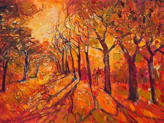
Beyond its physical properties, orange carries deep psychological associations. It is often linked to the harvest, fire, and the transition of seasons, particularly autumn. Because it is less aggressive than red but more stimulating than yellow, it is frequently used to represent friendliness, creativity, and social interaction. Artists leverage these associations to influence the emotional temperature of their work, ensuring that the viewer perceives the intended mood.
How to use orange in color compositions
To effectively incorporate orange into a painting or design, artists often rely on the color wheel to establish balance. Complementary colors, which sit directly opposite each other, provide the highest contrast and visual impact. For orange, the complementary partner is blue; when placed side-by-side, these two colors intensify one another, creating a vibrant, pulsating effect that is difficult for the human eye to ignore.
When working with orange, consider the following strategies to maintain visual harmony:
- Use a split-complementary scheme by pairing orange with blue-green and blue-violet to reduce harshness while maintaining contrast.
- Apply a monochromatic approach by using various tints, tones, and shades of orange to create depth without overwhelming the viewer.
- Utilize orange as an accent color in neutral palettes to guide the viewer’s gaze toward specific subjects.
- Experiment with glazing techniques to layer transparent orange over other colors, creating a glowing, luminous effect that mimics natural light.
What are the historical meanings of orange in art?
Historically, the use of orange was limited by the availability of pigments. Before the 19th century, artists relied on earth-based minerals like realgar or orpiment, which were often toxic and difficult to stabilize. Consequently, orange appeared less frequently in classical European painting compared to primary colors, often relegated to depicting robes, sunsets, or specific symbolic items like the garments of Buddhist monks or the robes of deities in Eastern traditions.
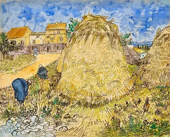
The 19th century marked a turning point with the invention of synthetic pigments like chrome orange and cadmium orange. These vibrant, opaque colors allowed artists to explore the spectrum with newfound freedom. Impressionists and Post-Impressionists, such as Vincent van Gogh, famously utilized these bold oranges to capture the intensity of light and the raw emotion of their subjects. Today, orange remains a staple in modern art, representing everything from industrial caution to avant-garde boldness.
Common mistakes when painting with orange
One of the most frequent errors artists make when using orange is failing to manage its saturation. Because orange is naturally vibrant, it can easily dominate a canvas and make other colors appear muddy or dull by comparison. Beginners often apply pure, tube-strength orange directly to the canvas, which can create a jarring effect that lacks nuance. It is generally better to mix your own oranges or desaturate them by adding a touch of their complementary blue or a neutral gray.
- Avoid using orange straight from the tube without testing it against your background colors first.
- Do not neglect the value of your orange; ensure it is not too light or too dark for the surrounding composition.
- Stop over-mixing your orange pigments, as this can lead to a flat, lifeless appearance.
- Always clean your brushes thoroughly between applications, as even a small amount of residual blue can turn your orange into an unattractive brown.
Best practices for mixing orange pigments
Achieving the perfect shade of orange requires a methodical approach to color mixing. Start by identifying the temperature of your base colors; a warm yellow mixed with a warm red will produce a vibrant, glowing orange, while a cool yellow combined with a cool red will result in a more muted, earthy tone. By adjusting these ratios, you can create a vast range of oranges, from soft peach and apricot to deep, burnt sienna and terracotta.
To master the mixing process, follow these professional guidelines:
- Start with a larger amount of yellow and gradually add red, as red is a much stronger pigment and can quickly overpower the yellow.
- Use a palette knife to mix your colors rather than a brush to ensure the pigments are fully incorporated without damaging the bristles.
- Keep a record of your successful mixes in a sketchbook to replicate specific hues for future projects.
- Test your mixed orange on a scrap piece of canvas or paper before applying it to your final work, as colors often shift as they dry.
Key facts
- Orange is a secondary color created by mixing red and yellow, sitting between them on the visible light spectrum.
- In color theory, orange is a "warm" color that advances toward the viewer, making it ideal for creating focal points.
- Artists often use orange to symbolize energy, enthusiasm, and warmth, though it can also signal caution or danger.
- Complementary to blue, orange creates high-contrast, vibrant visual tension when placed next to its opposite on the color wheel.
- During the 19th century, the invention of synthetic pigments like chrome orange allowed artists like Vincent van Gogh to use more intense, saturated hues.
- To avoid a muddy appearance, mix orange with white to create tints rather than adding black, which can turn the color into a dull brown.
The bottom line
Orange is a powerful, energetic tool in an artist’s toolkit, serving as a bridge between the intensity of red and the luminosity of yellow. By mastering its relationship with its complement, blue, you can create striking visual contrast and depth. Whether used to capture the warmth of a sunset or to draw the eye to a focal point, orange remains essential for conveying vitality and emotion.
People also ask
Why do artists use orange to create depth?
Because orange is a warm color, it naturally appears to move forward in a composition. By placing orange elements in the foreground and cooler colors like blue or violet in the background, artists create a strong sense of atmospheric perspective.
How can I mix the perfect shade of orange?
Start with a warm yellow and add small amounts of red, as red pigment is typically much stronger than yellow. If the resulting color is too dark, add a touch of white to brighten the mixture without losing the orange tone.
What is the emotional impact of orange in a painting?
Orange is frequently associated with joy, creativity, and vitality due to its connection to sunlight and autumn harvests. However, because it is highly visible, it can also evoke feelings of urgency or warning when used in large, aggressive strokes.
Is orange considered a difficult color to work with?
Many artists find orange challenging because it can easily overpower more subtle colors in a palette. To manage this, use it sparingly as an accent color or neutralize it by mixing in a small amount of its complement, blue.
How did the Impressionists use orange?
Impressionist painters utilized orange to capture the specific quality of light during sunset or sunrise. By applying pure, unmixed orange strokes next to blue shadows, they achieved a shimmering, vibrant effect that mimicked the intensity of natural light.
What are the most common mistakes when using orange?
A frequent error is over-mixing orange, which leads to a flat or "dirty" appearance. Another mistake is failing to balance orange with enough neutral space, which can overwhelm the viewer and make the artwork feel chaotic.
This answer was created with the help of AI research tools and reference sources. Spotted an error? Let us know — we correct mistakes quickly. See our editorial policy.