What colors go with beige?
Short answer
Beige is a versatile neutral that pairs beautifully with crisp whites, deep charcoals, soft pastels, and bold earth tones. Because it contains both warm and cool undertones, it acts as a flexible foundation for monochromatic schemes, high-contrast modern looks, or sophisticated, nature-inspired palettes depending on the desired mood and lighting conditions.
On this page
How to choose colors that complement beige
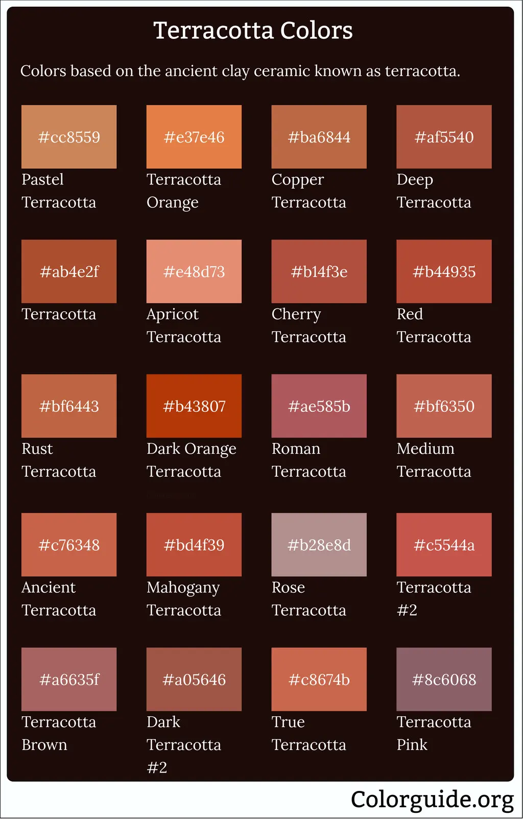
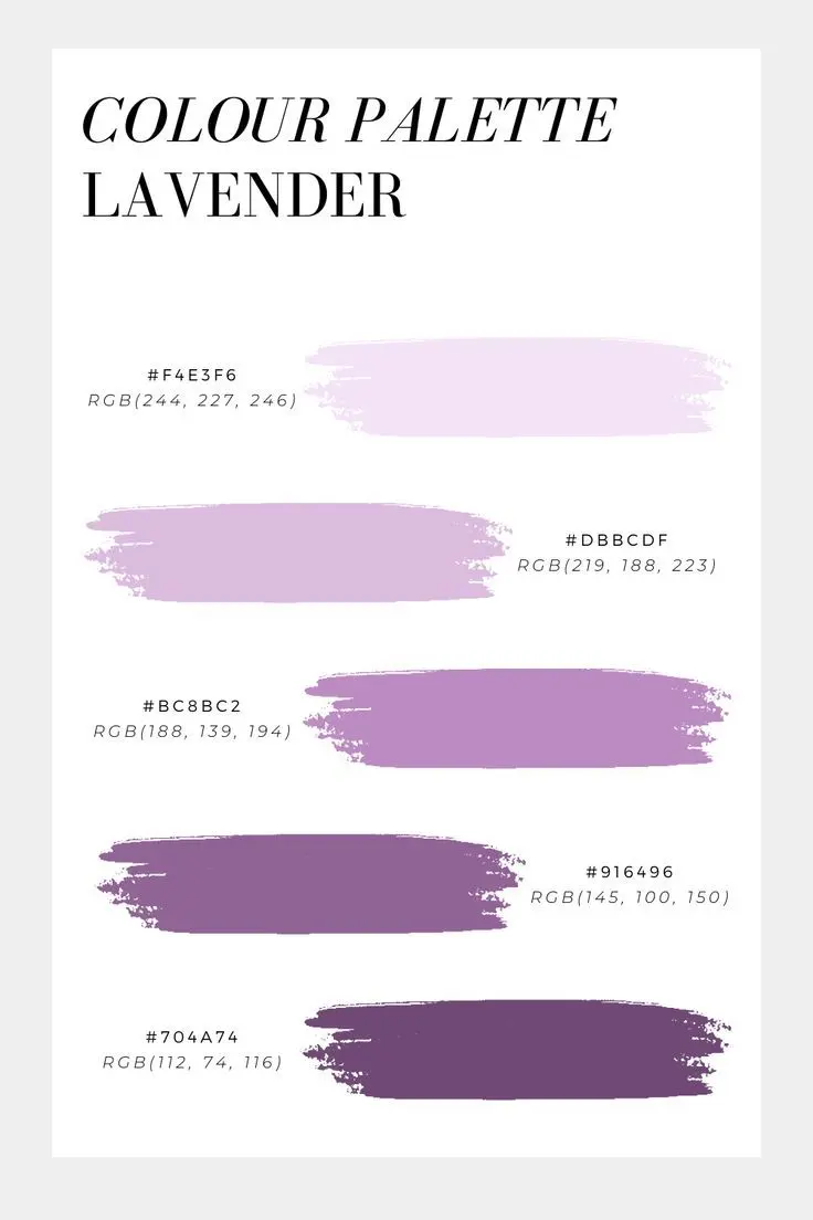
Beige functions as a chameleon in interior design because it bridges the gap between warm and cool spectrums. To determine the best pairing, first identify the specific undertone of your beige. If your beige leans toward yellow or orange, it is a warm neutral that thrives when paired with earthy tones like terracotta, sage green, or deep navy. Conversely, if your beige has gray or pinkish undertones, it is considered a cool neutral that pairs exceptionally well with slate blue, crisp white, or soft lavender.
When selecting a secondary color, consider the "60-30-10" rule to maintain visual balance. Use beige for 60 percent of the room—typically the walls or large furniture pieces—and reserve your secondary color for 30 percent, such as curtains or area rugs. The final 10 percent should be an accent color that provides a pop of interest. This structure prevents the space from feeling flat while ensuring the beige remains the grounding element.
Best color combinations for modern interiors
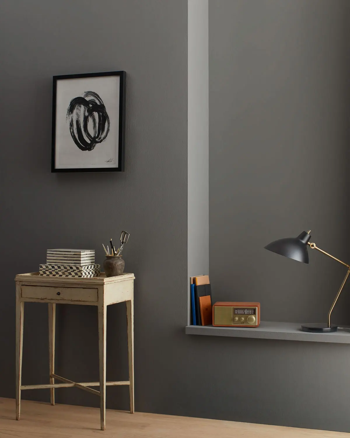
Modern design often relies on high-contrast pairings to create visual depth and architectural interest. When working with beige, introducing dark, saturated colors prevents the space from feeling washed out or overly traditional. Combining beige with charcoal gray or matte black creates a sophisticated, gallery-like aesthetic that highlights clean lines and minimalist furniture. This pairing is particularly effective in living rooms where you want to emphasize a focal point, such as a fireplace or a large piece of art.
For those seeking a more organic modern look, consider these pairings:
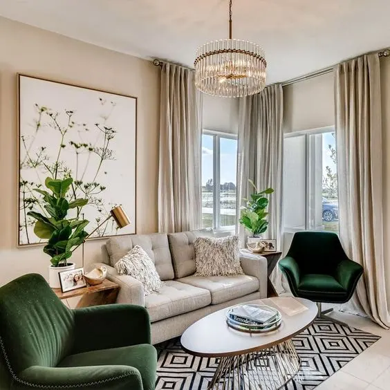
- Beige and forest green: Brings an earthy, grounded quality to the space.
- Beige and navy blue: Offers a timeless, nautical-inspired contrast that feels professional and calm.
- Beige and metallic bronze: Adds a touch of luxury and warmth to a neutral palette.
- Beige and dusty rose: Softens the room while maintaining a contemporary, elegant edge.
Why undertones matter when pairing colors
The most common mistake when decorating with beige is ignoring the underlying pigments that define its character. Many people assume all beige is identical, but paint manufacturers often infuse these shades with subtle hints of green, red, or blue. If you pair a "yellow-based" beige with a "blue-based" gray, the colors will often clash, making the beige look dirty or the gray appear muddy. Always test paint samples in your specific lighting conditions before committing to a full color scheme.
Lighting plays a critical role in how these undertones interact throughout the day. Natural sunlight from a north-facing window can make a warm beige look dull, while the same color might glow beautifully in a south-facing room. To ensure compatibility, observe your chosen colors at three distinct times:
- Early morning, when the light is cool and blue.
- Mid-afternoon, when the light is at its brightest and most neutral.
- Evening, under artificial lighting, which often casts a yellow or orange hue.
How to layer textures with neutral colors
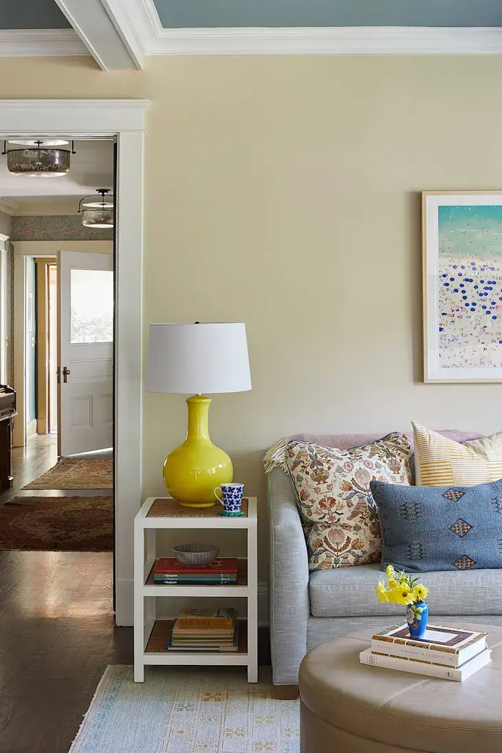
When you limit your palette to beige and other neutrals, the room can easily feel monotonous. To combat this, prioritize texture over color variety to create a sensory-rich environment. By mixing materials like linen, wool, velvet, and wood, you add depth that the eye perceives as movement. A beige sofa looks significantly more expensive when paired with a chunky knit throw blanket, a smooth leather ottoman, and a jute area rug.
Texture also helps define the "temperature" of the room. If your beige space feels too clinical, incorporate natural wood grains or woven rattan to introduce warmth. If the room feels too chaotic, use smooth, reflective surfaces like glass or polished nickel to create a sense of order and calm. By focusing on tactile elements, you ensure that the beige acts as a canvas that allows the quality of your furnishings to take center stage.
Common mistakes when decorating with beige
A frequent error is relying on "beige-on-beige" without enough variation in shade or saturation. When walls, furniture, and flooring are all the exact same hue, the room loses its definition and can feel claustrophobic or dated. To avoid this, always aim for a range of tones. If you have light beige walls, choose a darker, sand-colored rug and cream-colored upholstery to create a layered, intentional look. This "tonal" approach provides the comfort of a neutral room without the risk of it feeling flat.
Another mistake involves neglecting the power of accent colors to break up the neutral flow. While a monochromatic beige room is safe, it often lacks personality. Incorporate small doses of high-impact colors through accessories to keep the space vibrant. Common pitfalls to avoid include:
- Using too many competing patterns alongside neutral walls.
- Ignoring the impact of warm versus cool lighting bulbs.
- Forgetting to include at least one dark anchor piece to ground the room.
- Overlooking the importance of wall art to provide a necessary color contrast.
Key facts
- Pair beige with navy blue or charcoal gray to create a sophisticated, high-contrast professional aesthetic.
- Use warm metallic accents like brass or gold to enhance the natural undertones of beige and add luxury.
- Incorporate sage green or terracotta to bring an organic, earthy feel to a neutral beige foundation.
- Avoid pairing beige with stark, cool-toned whites, as this can make the beige appear dingy or yellowed.
- Treat beige as a canvas; use bold, saturated colors like emerald green or deep plum for accent pillows and art.
- Balance room proportions by using darker shades of beige on the floor and lighter, creamier tones on the walls.
The bottom line
Beige is a foundational neutral that thrives on contrast and texture. By pairing it with bold jewel tones, earthy greens, or metallic accents, you can transform a simple space into a sophisticated environment. Avoid matching it with clashing cool whites and focus on layering different shades to create depth. Ultimately, successful design with beige relies on balancing warmth and light to maintain a cohesive, inviting atmosphere.
People also ask
Does beige go with grey?
Yes, "greige"—a blend of grey and beige—is a popular neutral. To combine them successfully, ensure the grey has warm undertones to prevent the room from feeling cold or disconnected.
Can I mix different shades of beige in one room?
Absolutely, layering monochromatic beige tones creates depth and visual interest. Use varying textures like linen, wool, and velvet to keep the space from looking flat.
What is the best way to brighten a beige room?
Introduce reflective surfaces like mirrors, glass tables, or polished chrome. These elements bounce light around the room, preventing the beige from appearing muted or dull.
Is beige considered an outdated color choice?
While beige fell out of favor during the minimalist grey trend of the 2010s, it has returned as a staple of "warm minimalism." It is now valued for its versatility and calming properties.
Should I use beige for furniture or walls?
Both are effective, but using beige on walls provides a flexible backdrop for changing decor. If you choose beige furniture, opt for high-quality fabrics that are easy to clean.
How do I choose the right beige for my lighting?
Beige is highly sensitive to light; it can look pink, yellow, or grey depending on the time of day. Always test paint samples on multiple walls to see how they shift under natural and artificial light.
This answer was created with the help of AI research tools and reference sources. Spotted an error? Let us know — we correct mistakes quickly. See our editorial policy.