What colors go with terracotta?
Short answer
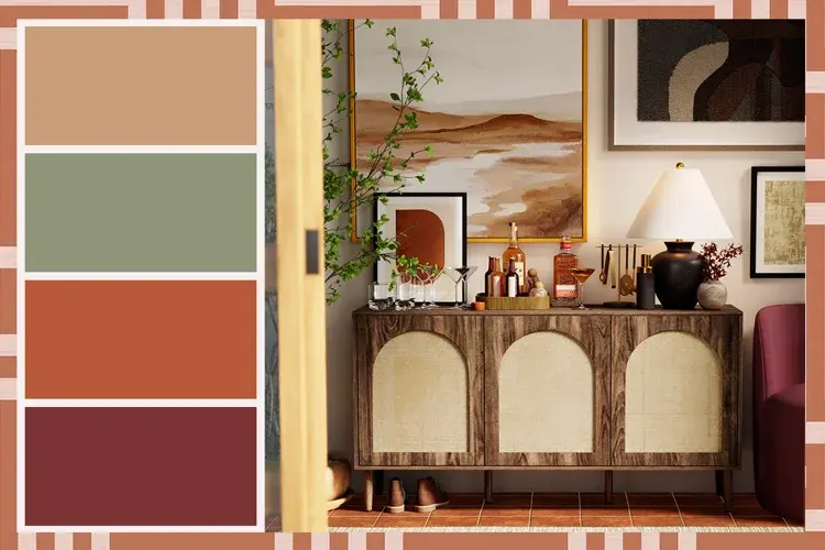
Terracotta pairs harmoniously with neutral tones like cream, beige, and soft gray, which ground its earthy warmth. For a bolder aesthetic, deep blues, forest greens, and charcoal provide a striking contrast. Whether aiming for a Mediterranean-inspired retreat or a modern minimalist look, balancing these rich, sun-baked pigments with complementary colors ensures visual cohesion.
On this page
Which neutral colors complement terracotta?
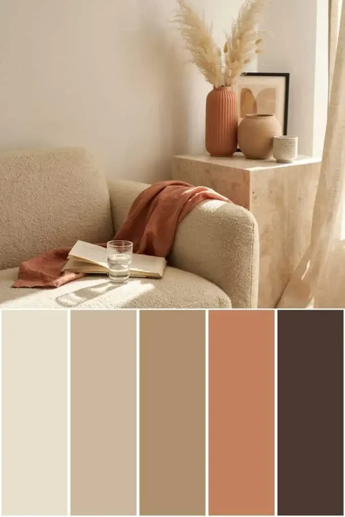
Neutral colors are the most effective way to balance the intense saturation of terracotta, which is essentially a brownish-orange clay pigment. Because terracotta is inherently warm, pairing it with cool-toned neutrals creates a sophisticated visual tension that prevents a room from feeling overwhelming. Cream and off-white shades are particularly successful because they reflect light and allow the reddish-brown undertones of the terracotta to stand out without competing for attention.
For a more grounded, organic feel, incorporate various shades of beige, taupe, or greige. These colors bridge the gap between the vibrancy of the clay and the starkness of white walls. When selecting your palette, consider the following neutral pairings:
- Warm cream: Ideal for softening the edges of terracotta tiles or pottery.
- Crisp white: Best for modern, high-contrast spaces where you want the terracotta to be the focal point.
- Soft gray: Provides a contemporary, slightly industrial edge that modernizes traditional terracotta elements.
- Greige: A versatile middle ground that works well in transitional design styles.
How to use bold colors with terracotta
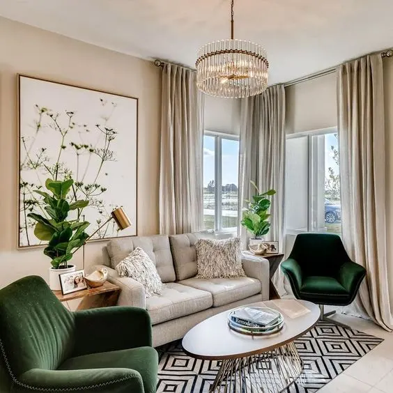
If you prefer a more dramatic aesthetic, pairing terracotta with deep, saturated colors creates a high-impact environment. The key is to look at the color wheel; terracotta sits in the warm, orange-red quadrant, meaning that colors on the opposite side—specifically blues and greens—will create a natural, eye-pleasing contrast. Deep navy blue, for example, provides a sophisticated, nautical, or Mediterranean feel that anchors the lightness of the terracotta.
Forest green and olive tones are equally effective, as they mimic the natural world and reinforce the earthy origins of the material. When working with these bold combinations, follow these steps to ensure a balanced look:
- Identify the primary color: Decide if the terracotta is the star (e.g., floor tiles) or an accent (e.g., decorative vases).
- Apply the 60-30-10 rule: Use the neutral as the 60% base, the terracotta as the 30% secondary color, and the bold blue or green as the 10% accent.
- Distribute the color: Ensure the accent color appears in at least three different areas of the room to pull the eye around the space.
Why terracotta works well with earth tones
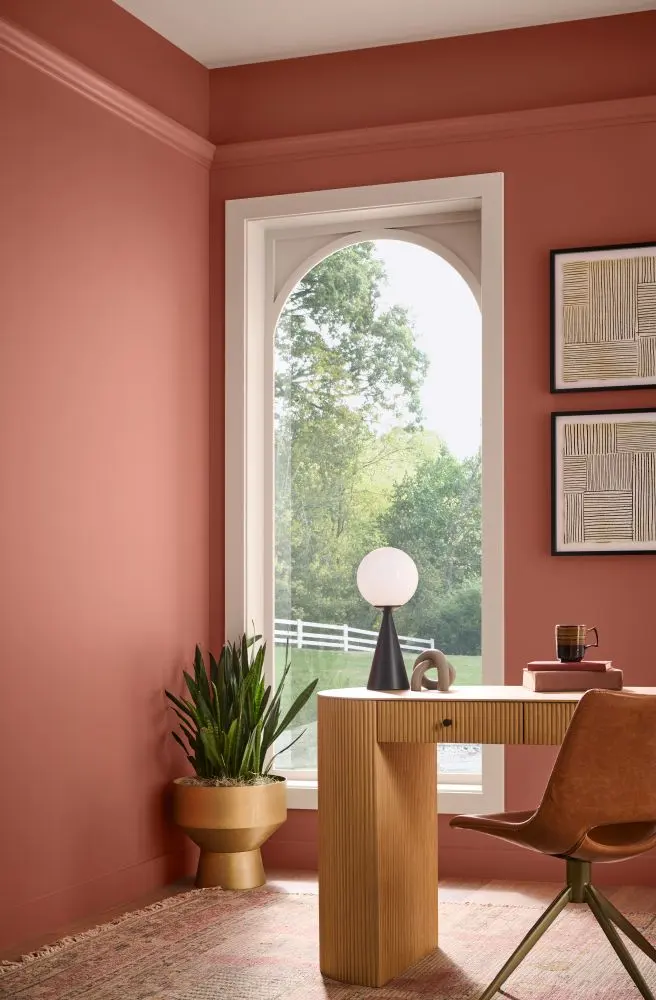
Terracotta is a quintessential earth tone, making it inherently compatible with other colors found in nature. By layering shades like chocolate brown, ochre, sage, and slate, you create a monochromatic or analogous color scheme that feels cohesive and calming. This approach is often seen in Southwestern or desert-inspired interior design, where the goal is to bring the outside in.
The beauty of an earth-toned palette lies in the variation of textures. When you combine terracotta with materials like unvarnished wood, woven jute, or matte stone, the color palette feels intentional rather than accidental. Avoid using too many bright, synthetic colors, as they can clash with the organic, muted quality of the clay. Instead, stick to colors that have a slight "dusty" or desaturated quality to maintain a harmonious, grounded atmosphere that feels timeless and welcoming.
Common mistakes when decorating with terracotta
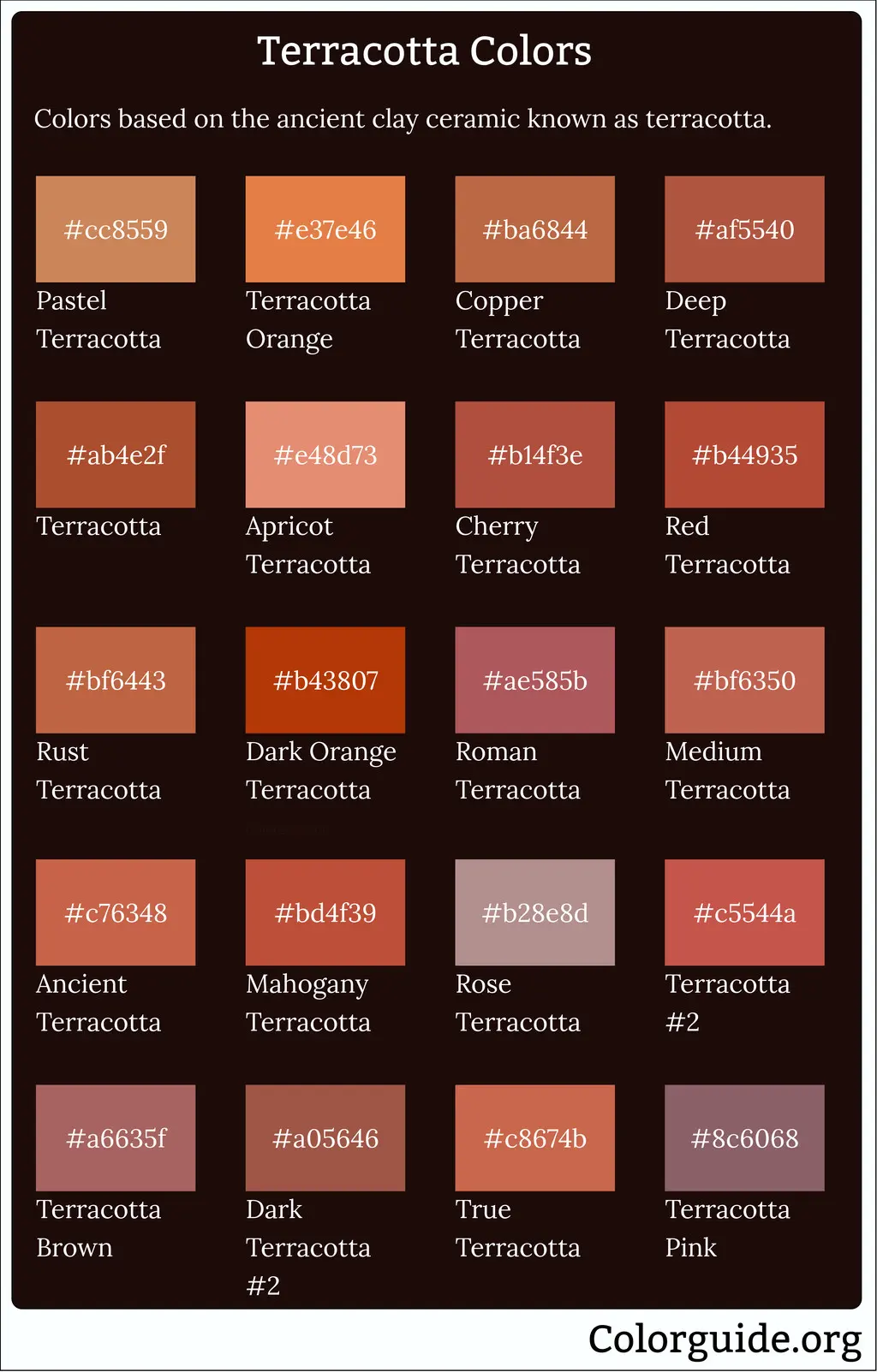
One of the most frequent errors when working with terracotta is failing to account for the undertones of the surrounding colors. Terracotta can lean toward either a bright, orangey-red or a deeper, browner-red. If you pair a bright, orange-leaning terracotta with a cool, blue-based white, the walls may end up looking unpleasantly stark or clinical. Always test your paint samples or fabric swatches against the physical terracotta item in both natural and artificial light.
Another common mistake is overcrowding a space with too many warm-toned elements, which can make a room feel claustrophobic or "heavy." If you have terracotta flooring, avoid painting the walls in equally warm shades like yellow or peach. This lack of contrast makes the space feel one-dimensional. To avoid these pitfalls, keep these tips in mind:
- Do not ignore lighting: Terracotta changes significantly under warm incandescent bulbs versus cool LED lighting.
- Avoid overly shiny finishes: High-gloss paints often clash with the matte, porous nature of traditional terracotta.
- Don't neglect texture: Balance the smooth surface of terracotta with soft textiles like wool or linen.
Best accent colors for terracotta decor
When you want to add personality to a room without committing to large-scale changes, accent colors are your best tool. Metallic accents, particularly brass and copper, are excellent choices because they share the same warm, glowing undertones as terracotta. These metals add a touch of luxury and refinement to the rustic nature of the clay, helping it feel more polished.
For a more playful or eclectic approach, consider using muted pinks or dusty rose. These colors sit close to terracotta on the color spectrum, creating a soft, layered effect that feels very current. If you want to introduce a touch of black, use it sparingly in the form of thin metal frames or small decor pieces. Black provides a necessary sharp edge that prevents the warm, earthy palette from feeling too soft or washed out. By carefully selecting these secondary and tertiary colors, you can transform terracotta from a simple material into a sophisticated design feature that defines the entire aesthetic of your home.
Key facts
- Terracotta is a warm, earthy orange-brown pigment derived from fired clay, making it a natural neutral in interior design.
- Pair terracotta with cool blues or teals to create a high-contrast, balanced look that mimics the Mediterranean landscape.
- Cream, beige, and soft whites prevent terracotta from feeling overwhelming, providing a clean backdrop for its intensity.
- Sage green and olive tones harmonize with terracotta by echoing the natural colors found in desert or garden environments.
- Metallic accents, particularly brushed brass or matte black, add a modern, sophisticated edge to the rustic nature of terracotta.
- Avoid pairing terracotta with neon or overly synthetic colors, as these clash with its organic, matte-finish origins.
The bottom line
Terracotta is a versatile, grounded hue that thrives when paired with natural materials and contrasting cool tones. To achieve a balanced aesthetic, prioritize a neutral foundation of cream or sage, using terracotta as a vibrant accent. By focusing on texture and avoiding overly synthetic pairings, you can create a sophisticated, timeless space that feels both warm and inviting, successfully blending rustic charm with modern interior design principles.
People also ask
Does terracotta work well in small rooms?
Yes, it works well if used as an accent rather than a primary wall color. Use it for textiles or decor to add warmth without shrinking the perceived size of the space.
Should I use terracotta on the floor or the walls?
Terracotta tiles are a classic choice for flooring due to their durability and heat retention. If using it on walls, choose a muted, dusty shade to avoid making the room feel enclosed.
Is terracotta considered a trendy or timeless color?
Terracotta is a timeless, historic color used in architecture for thousands of years. While its popularity fluctuates, it remains a staple in Mediterranean and Southwestern design styles.
What texture works best with terracotta?
Natural textures like rattan, jute, linen, and raw wood complement the earthy quality of terracotta. These materials enhance the organic, tactile feel of the color palette.
Can I mix terracotta with other warm colors like yellow or pink?
You can mix it with muted ochre or dusty rose for a monochromatic, sunset-inspired look. Ensure the undertones match to keep the room from appearing chaotic or mismatched.
How do I prevent a terracotta room from looking dated?
Incorporate modern furniture silhouettes and clean lines to balance the rustic nature of the color. Avoid heavy, ornate patterns that can make the space feel trapped in the past.
This answer was created with the help of AI research tools and reference sources. Spotted an error? Let us know — we correct mistakes quickly. See our editorial policy.