What colors make terracotta?
Short answer
Terracotta is created by mixing orange with a smaller amount of brown, often adjusted with a touch of blue or gray to dull the intensity. Because terracotta is an earth tone, it relies on the balance between warm saturation and muted neutrality. Achieving the perfect shade requires careful, incremental color blending.
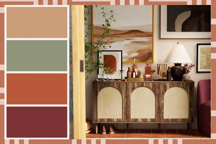
On this page
What colors do you need to mix to make terracotta?
To replicate the classic, earthy hue of fired clay, you must combine primary and secondary colors strategically. The most reliable base is a bright orange, which provides the necessary warmth and vibrancy. However, pure orange is often too neon or artificial for a natural terracotta look. To ground the color, you must introduce a darker, earthier pigment, such as burnt umber or a deep brown.
The secret to a realistic terracotta lies in the subtle addition of a complementary color. Adding a tiny amount of blue or a cool gray helps to neutralize the orange, shifting it from a "safety cone" brightness to a sophisticated, baked-earth tone. Because color theory is subjective, artists often use these specific components:
- Cadmium Orange or a mixture of Yellow and Red.
- Burnt Umber or Burnt Sienna for depth.
- Ultramarine Blue or Payne’s Gray for muting the intensity.
- Titanium White if you need to lighten the mixture for highlights.
How to mix terracotta paint step by step
Creating the perfect shade of terracotta is a process of trial and error that requires patience. Start with a clean palette and a palette knife to ensure your colors are thoroughly integrated without becoming muddy. If you are working with acrylics or oils, always start with the lightest color first to avoid overwhelming the mixture.
Follow these steps to achieve the desired consistency:
- Place a dollop of orange on your palette as your base color.
- Add a small amount of brown, roughly one-quarter of the volume of your orange, and mix thoroughly.
- Observe the hue; if it is too bright, add a tiny speck of blue to desaturate the mixture.
- Continue adding brown or blue in microscopic increments until you reach the desired earthy depth.
- If the color becomes too dark, add a touch of white to bring it back to a terracotta tone.
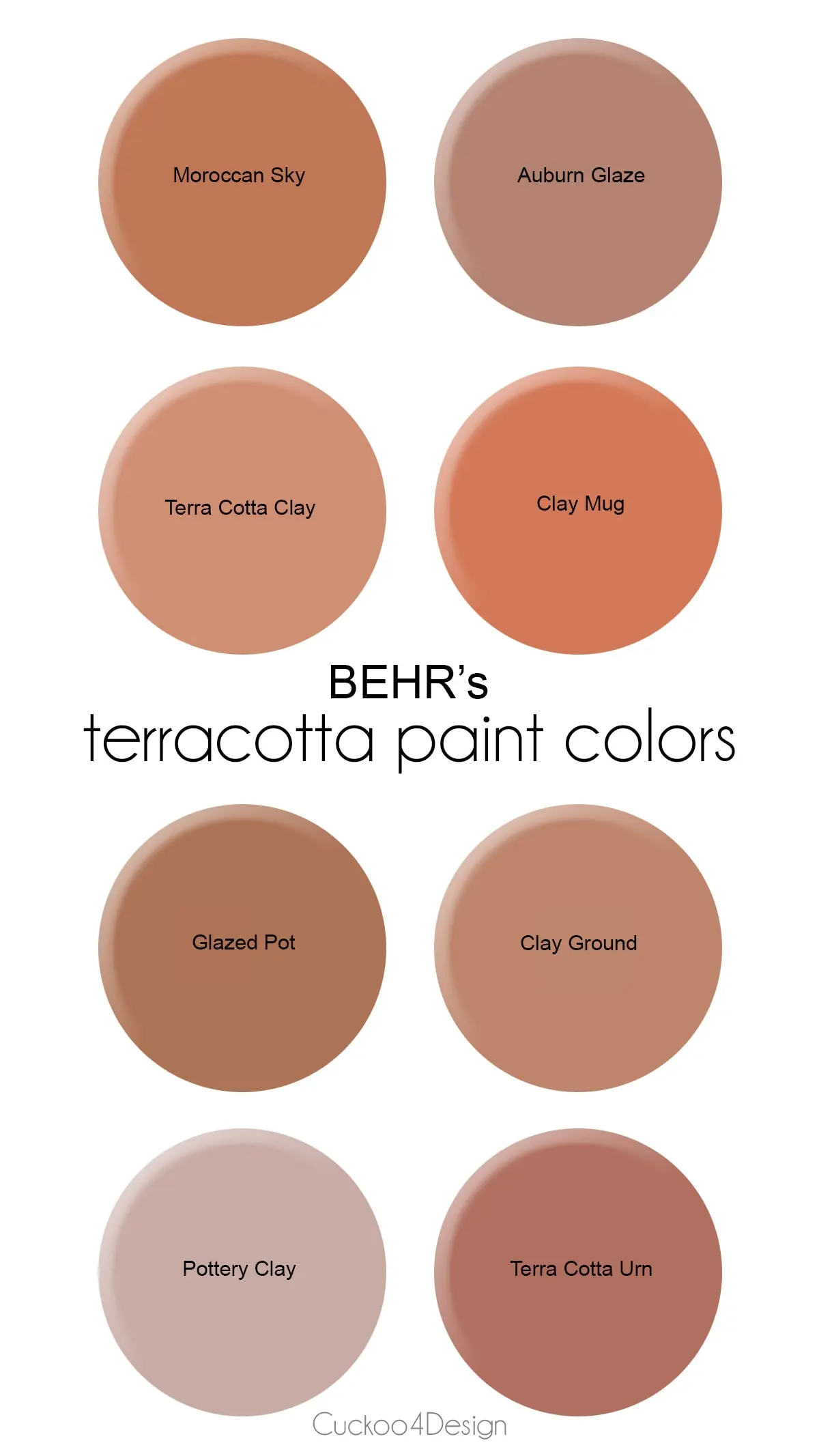
Why does terracotta look different in different lights?
Terracotta is a warm, mid-tone color that reacts significantly to ambient lighting conditions. In bright, natural sunlight, the orange undertones become more prominent, making the color appear vibrant and energetic. Conversely, in low-light or indoor settings, the brown and gray components take over, causing the color to look more muted, somber, and sometimes even purplish depending on the blue used.
This phenomenon occurs because terracotta sits at a complex intersection of the color wheel. It is not a pure hue, but rather a tertiary or quaternary mixture that reflects light differently based on the spectrum hitting its surface. To maintain a consistent look in a room or on a canvas, you must test your mixture under the specific lighting conditions where it will be displayed. A color that looks perfect under a daylight lamp might appear dull or overly brown under warm, incandescent bulbs.
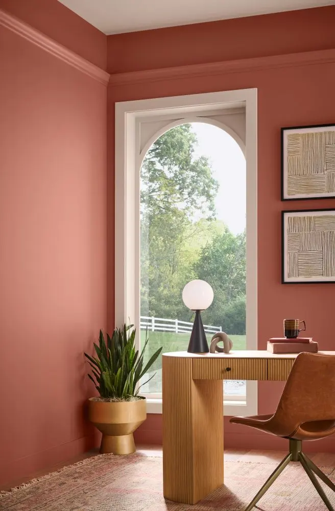
Common mistakes when mixing terracotta
One of the most frequent errors is adding too much blue or black at the beginning of the mixing process. Because these colors are high-tinting, they can quickly overpower the orange, turning your mixture into a muddy, unappealing gray or dark sludge. Always introduce darker pigments in small, controlled amounts to maintain the integrity of the orange base.
Another common mistake is failing to mix the colors completely. When the pigments are not fully blended, the final result may appear streaky or inconsistent, which ruins the natural, uniform look of terracotta. Ensure you are using a palette knife to scrape the sides of your mixing area to incorporate every bit of pigment. If you find your mixture has become too dark or muddy, do not try to fix it by adding more orange; it is often better to start over with a fresh base to ensure the color remains clean and vibrant.
Best tips for matching terracotta shades
Matching a specific terracotta shade—such as the color of a vintage clay pot or a specific architectural brick—requires a methodical approach. Start by analyzing the undertones of your target color. Some terracotta shades lean heavily toward red, while others are more yellow or brown. If your target is red-leaning, incorporate a touch of Alizarin Crimson into your orange base before adding the brown.
If you are trying to match a physical object, place a small sample of your mixed paint on a piece of scrap paper and let it dry completely. Paint often shifts in color as it cures, especially acrylics, which tend to darken slightly. By comparing the dried sample to your target object, you can make informed adjustments. Remember that terracotta is a living, organic-feeling color, so slight variations in shade often add to the aesthetic appeal rather than detracting from it. Consistency is helpful, but the natural beauty of terracotta lies in its subtle, earthy complexity.
Key facts
- Terracotta is a warm, earthy hue derived from the Italian words for "baked earth."
- To mix the color, combine a primary red with a smaller amount of yellow and a touch of blue or brown to dull the intensity.
- A standard ratio for a basic terracotta is three parts red, two parts yellow, and a tiny dab of blue or black.
- Adding white paint will lighten the mixture to a soft, dusty peach or clay tone.
- Natural terracotta pigment is historically derived from iron oxide, which gives the material its characteristic rust-red appearance.
- Avoid using too much blue or black, as this will quickly turn the warm mixture into a muddy, dull grey.
The bottom line
Creating the perfect terracotta requires a balance of warm red and yellow pigments, tempered by a subtle hint of blue or brown to achieve that signature earthy depth. By adjusting the ratios, you can shift the color toward a brighter clay or a muted, dusty tone. Always start with small amounts of dark pigment to avoid muddiness, ensuring a rich, natural finish for your project.
People also ask
Does terracotta look different depending on the lighting?
Yes, terracotta is highly reactive to light, appearing more vibrant and orange in direct sunlight and deeper, more brownish in dim indoor lighting. Always test your color swatch in the specific room where it will be used.
Can I use terracotta for exterior painting?
Terracotta is an excellent choice for exteriors because iron oxide pigments are naturally resistant to UV fading. Ensure you use high-quality exterior-grade binders to prevent the color from washing away during rain.
Is terracotta considered a neutral color?
Interior designers often classify terracotta as a warm neutral because it pairs well with both cool greys and warm creams. It provides a grounded, organic feel that acts as a bridge between bold accents and subtle backgrounds.
What is the difference between terracotta and burnt sienna?
While they are similar, burnt sienna is typically more transparent and has a deeper, more reddish-brown undertone. Terracotta is generally more opaque and leans closer to an orange-clay hue.
How do I make terracotta look more rustic?
To achieve a rustic, aged look, apply a thin brown or black glaze over the dried terracotta base coat. This technique, known as antiquing, highlights the texture and mimics the appearance of weathered clay pottery.
Why does my terracotta mix look like bright orange?
If your mixture is too bright, you have likely added too much yellow or not enough blue. Add a very small amount of complementary color—such as a deep blue or raw umber—to neutralize the intensity.
This answer was created with the help of AI research tools and reference sources. Spotted an error? Let us know — we correct mistakes quickly. See our editorial policy.