What colors make blush pink?
Short answer
Blush pink is created by mixing a primary red pigment with a significant amount of white to achieve a pale, desaturated tone. To reach the specific warm, dusty aesthetic of blush, you must add a tiny touch of yellow or orange. This combination softens the intensity, resulting in a sophisticated, muted pastel hue.

On this page
How to mix blush pink paint
Creating blush pink begins with a base of pure white paint. Because white is the dominant component, you should start with a large container of it and add the other colors gradually to maintain control over the final saturation. A small amount of bright red or magenta is then introduced to tint the white base.
To achieve the "blush" quality rather than a standard bubblegum pink, you must introduce warmth. Use these steps to guide your mixing process:
- Start with a cup of white acrylic or latex paint in a clean mixing bowl.
- Add a tiny drop of warm red, such as cadmium red light or a coral-toned pigment.
- Stir thoroughly until the color is uniform, then evaluate the tone under natural light.
- If the color is too cool or "candy-like," add a microscopic amount of yellow ochre or orange to neutralize the brightness.
Always work in small increments. It is significantly easier to deepen a pale pink than it is to lighten a mixture that has become too dark or saturated.
What colors are in blush pink
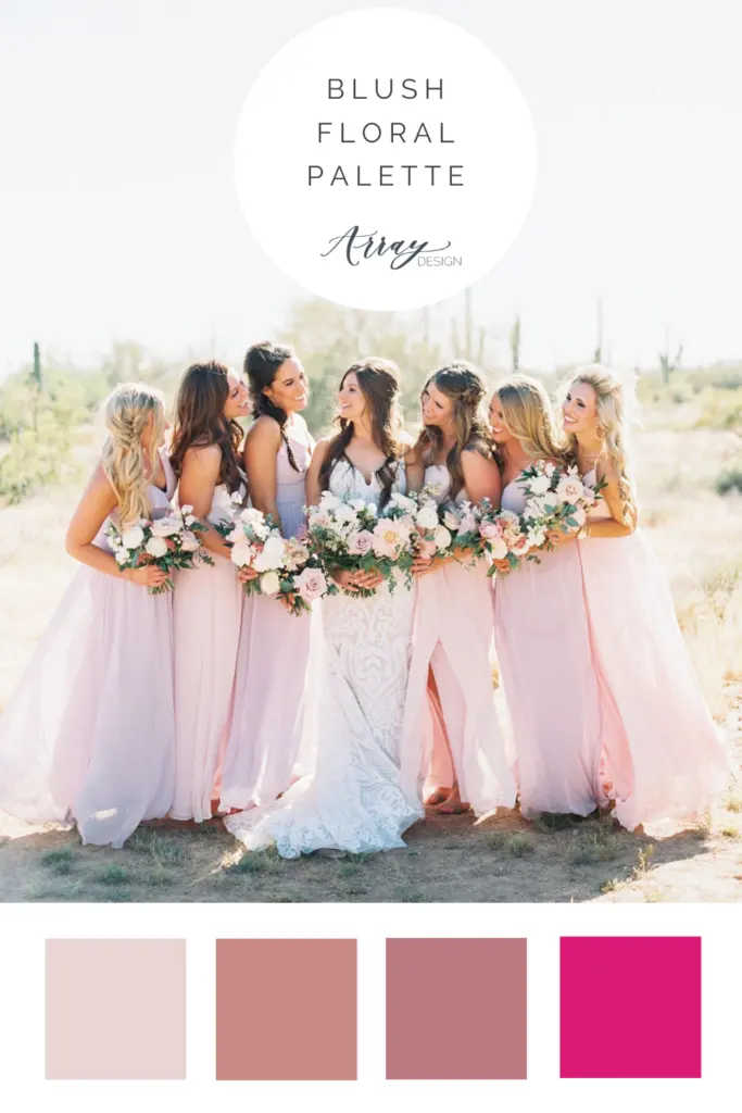
Blush pink is technically a tint of red that sits on the warmer side of the color wheel. While standard pink is often associated with magenta or cool-toned reds, blush relies on the presence of yellow undertones. This specific balance prevents the color from appearing too artificial or neon, giving it a natural, skin-toned appearance that is popular in interior design and fashion.
The color chemistry involves three primary components:
- White: Provides the high-value base that reflects light.
- Warm Red: Supplies the primary hue, typically leaning toward orange rather than blue.
- Yellow or Earth Tones: Acts as the desaturating agent that shifts the color from a bright pink to a muted, dusty blush.
If you are working with digital color models, blush pink is often represented in the RGB color space with high values for red and white-leaning values for green and blue. This combination effectively "washes out" the red to create the soft, airy aesthetic characteristic of the shade.
Common mistakes when mixing blush pink
The most frequent error when mixing this shade is adding too much red pigment at the beginning of the process. Because pigments are highly concentrated, a single drop can drastically shift the color from a soft blush to a vibrant rose. This often forces users to add excessive amounts of white paint to compensate, leading to a much larger volume of paint than originally intended.
Another common pitfall is ignoring the influence of the light source. Blush pink is notoriously sensitive to its environment and can shift appearance based on the surrounding colors.
- Avoid using cool-toned, blue-based reds, as these will create a mauve or lavender tint rather than a true blush.
- Do not mix colors in low or artificial yellow light, as this will mask the true undertones and result in a muddy color once moved to a brighter room.
- Avoid over-mixing, which can sometimes cause pigments to lose their clarity and appear dull or gray.
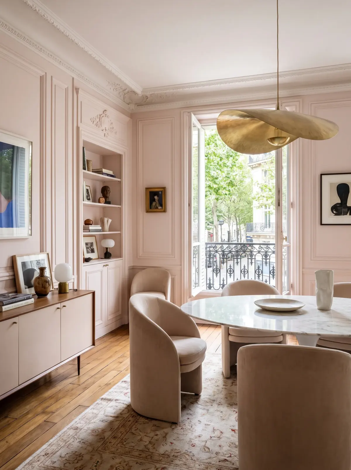
Why blush pink looks different in different lights
Metamerism is the primary reason why blush pink appears to change when you move it from one room to another. This phenomenon occurs because the color reflects light differently depending on the spectral power distribution of the light source. In the warm glow of an incandescent bulb, the yellow undertones of the blush are amplified, making it appear peachier.
Conversely, in cool, north-facing daylight, the blue spectrum is more prominent. This can cause the blush to look slightly gray or even purplish. To ensure consistency, always test your mixed color on a large piece of cardboard or poster board before applying it to a final surface. Observe the sample at different times of the day, specifically at sunrise and sunset, to see how the color behaves under varying intensities of natural light. Understanding this shift is essential for professionals who need the color to remain stable across different surfaces or materials.
Best tools for mixing custom colors
Achieving the perfect shade of blush requires precision tools that allow for accurate measurement. Using a plastic palette knife is ideal for blending paint, as it ensures that no pigment gets trapped in brush bristles. For those mixing large quantities, such as for a wall color, using a digital scale to weigh your pigments can help you replicate the exact shade later if you run out of paint.
When working on smaller projects, consider these professional tips:
- Use a white mixing surface so you can see the true color of the tint as you add it.
- Keep a "control" sample of your base white nearby to compare the progression of your tinting.
- Use high-quality artist pigments, as cheap paints often have fillers that can turn your blush pink into a chalky or dusty mess.
By maintaining a clean workspace and documenting your ratios, you can successfully create and recreate this delicate, timeless color for any application.
Key facts
- Blush pink is created by mixing a primary red with a large amount of white paint.
- Adding a tiny drop of yellow or orange warms the tone, preventing the color from appearing too "cool" or bubblegum-like.
- A touch of gray or brown can be added to desaturate the hue, giving it a sophisticated, dusty, or vintage appearance.
- Always add the darker color into the white base slowly, as it is easier to darken a light color than to lighten a dark one.
- Use titanium white for the base to ensure high opacity and a clean, consistent tint.
- Test your mixture on a scrap piece of paper and let it dry completely, as acrylics and oils often shift in shade once cured.
The bottom line
Creating the perfect blush pink is a balancing act between intensity and subtlety. By starting with a generous amount of white and slowly introducing red, you maintain control over the saturation. Remember that small additions of yellow or gray are essential for shifting the tone from a bright, artificial pink to a soft, elegant blush that complements a wide range of sophisticated interior palettes.
People also ask
Is blush pink considered a warm or cool color?
Blush pink is generally considered a warm, neutral-leaning color. Because it is derived from red, it carries inherent warmth, though the specific undertones depend on whether you add yellow or blue to the mix.
How can I make blush pink look more professional and less like a child's bedroom?
Incorporate desaturated tones by adding a small amount of complementary green or gray to your mix. This creates a "muted" or "dusty" effect that feels more mature and high-end in interior design.
Why does my blush pink paint turn out looking like purple?
You likely added too much blue or used a red pigment with strong blue undertones, such as alizarin crimson. To fix this, add a tiny bit of yellow to neutralize the purple shift and pull the color back toward a warm pink.
Can I use black to darken blush pink?
Avoid using pure black, as it often turns pink into a muddy, unattractive gray. Instead, use a deep brown or a complementary color like olive green to darken the shade while maintaining its vibrancy.
What is the difference between blush pink and rose gold?
Blush pink is a flat, matte color, whereas rose gold contains metallic pigments. You can achieve a rose gold effect by mixing a metallic copper or gold paint into your blush pink base.
How do I store leftover custom-mixed blush pink paint?
Transfer the paint to an airtight glass or plastic container to prevent the solvent from evaporating. Label the container with the ratio of colors used so you can replicate the exact shade for future touch-ups.
This answer was created with the help of AI research tools and reference sources. Spotted an error? Let us know — we correct mistakes quickly. See our editorial policy.