What colors go with gold?
Short answer
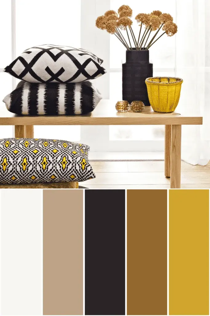
Gold pairs exceptionally well with deep jewel tones like emerald green and navy blue, classic neutrals such as crisp white and charcoal gray, and sophisticated earth tones. Its versatility allows it to function as a warm metallic accent, grounding bold palettes or adding a luminous, luxurious finish to minimalist, monochromatic interior designs.
On this page
Which colors complement gold in interior design?
Gold serves as a sophisticated warm metallic that elevates almost any color palette. When used in interior design, it acts as a bridge between high-contrast elements and soft, muted tones. Deep, saturated colors provide the most dramatic backdrop for gold, as the metallic sheen reflects light against dark surfaces. Conversely, pairing gold with lighter shades creates an airy, elegant aesthetic often associated with contemporary luxury.
To effectively integrate gold into a room, consider the following pairings:
- Navy blue: Creates a nautical yet regal contrast that feels timeless.
- Emerald green: Offers a rich, organic pairing that feels opulent and grounded.
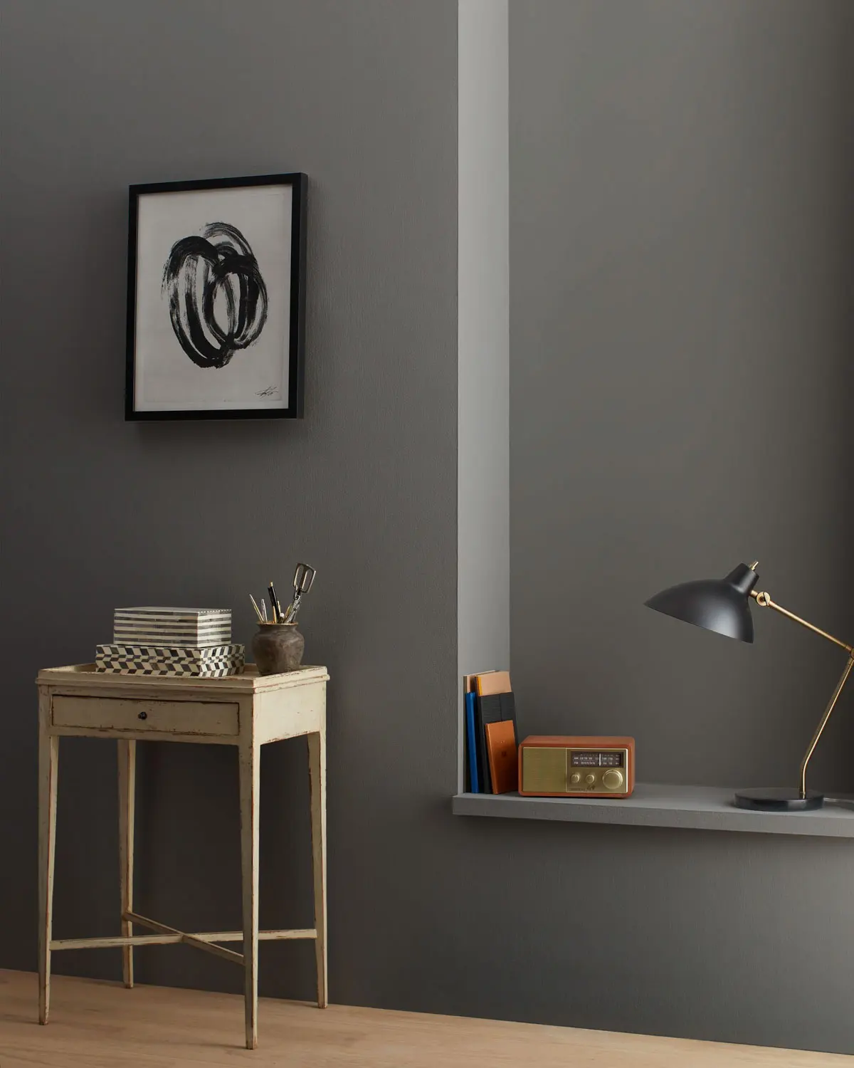
- Charcoal gray: Provides a modern, industrial edge that softens the intensity of gold.
- Crisp white: Enhances the brightness of the room, making gold accents pop with clarity.
- Blush pink: Softens the metallic, creating a romantic and balanced atmosphere.
How to use gold in a color scheme?
Using gold successfully requires a balance between the metallic finish and the surrounding matte surfaces. Designers often follow the 60-30-10 rule, where gold serves as the 10 percent accent, preventing the metallic element from overwhelming the space. By limiting gold to hardware, light fixtures, or decorative frames, you maintain a cohesive look that feels intentional rather than cluttered.
When layering gold into your existing color scheme, follow these steps:
- Identify your primary neutral base, such as beige or off-white, to serve as the foundation.
- Select one or two secondary colors, like forest green or navy, to introduce depth.
- Introduce gold through accessories, such as cabinet pulls, mirrors, or picture frames, to tie the room together.
- Step back to ensure the metallic distribution is even across the space, avoiding heavy concentrations in a single corner.
What are the best metallic combinations?
Mixing metals is a common practice in modern design, though it requires a careful eye for temperature. Gold, being a warm metal, can be successfully paired with cooler metals like silver or nickel if you maintain a primary "dominant" metal. Using a 70/30 ratio ensures that the mix feels curated rather than accidental. If you prefer a warmer aesthetic, pair gold with brass or copper, which share similar undertones.
When mixing metals, aim to keep the finishes consistent. For instance, pairing a polished gold with a brushed nickel can create a jarring contrast, whereas pairing brushed gold with brushed stainless steel feels much more harmonious. If you are a beginner, stick to one dominant metal for hardware and use the secondary metal for smaller decorative objects, such as trays or vases, to minimize the risk of visual dissonance.
Common mistakes when decorating with gold
One of the most frequent errors is overusing gold, which can lead to a space feeling dated or gaudy. Avoid matching every single metal element in a room, as this can make an interior look like a showroom catalog rather than a lived-in home. Additionally, failing to consider the temperature of your lighting can negatively impact how gold appears; cool-toned LED bulbs can make gold look greenish or dull, while warm-toned bulbs enhance its natural glow.
Another common mistake is ignoring the texture of the gold finish. Highly reflective, polished gold creates a formal, high-energy environment, while matte or brushed gold provides a more subdued, modern feel. Choosing the wrong finish for your lifestyle can lead to maintenance issues, as polished surfaces show fingerprints and smudges much more readily than brushed or antiqued alternatives. Always test a small sample in your lighting conditions before committing to expensive fixtures.
Why gold works in any season
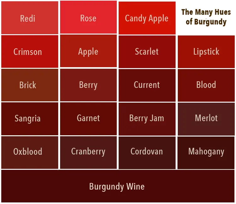
Gold is a uniquely versatile color because it changes character based on the surrounding palette. In the autumn and winter, gold pairs beautifully with deep burgundies, burnt oranges, and dark woods, reflecting the cozy, warm energy of the season. During the spring and summer, the same gold accents can be paired with pastels, light linens, and bright whites to evoke a sense of freshness and sunlight.
Because gold mimics the color of natural light, it inherently makes any room feel warmer and more inviting. It is an excellent tool for brightening north-facing rooms that lack direct sunlight, as the metallic surface bounces ambient light around the space. Whether you are aiming for a minimalist, industrial, or traditional aesthetic, gold remains a reliable choice that adds a sense of permanence and quality to your home. By understanding how to manipulate its intensity through finish and placement, you can ensure your decor remains stylish for years to come.
Key facts
- Navy blue provides a high-contrast, sophisticated backdrop that makes gold accents appear vibrant and luxurious.
- Emerald green and gold create a regal color palette often associated with opulence and traditional interior design.
- White and cream act as neutral bases that prevent gold from overwhelming a space, keeping the overall look clean and airy.
- Black paired with gold creates a modern, high-drama aesthetic that emphasizes the metallic sheen of the gold.
- Blush pink and soft pastels offer a contemporary, feminine balance to the warmth of gold, ideal for minimalist decor.
- Avoid mixing too many different metallic finishes, such as chrome and brass, as this can create a cluttered visual effect.
The bottom line
Gold is a versatile metallic finish that acts as a sophisticated neutral, capable of elevating both warm and cool color palettes. By pairing it with high-contrast tones like navy or black, or soft neutrals like cream, you can achieve a balanced look. Focus on intentional placement and avoid mixing too many competing metal finishes to ensure your space remains elegant, cohesive, and visually refined.
People also ask
Does gold go better with cool or warm colors?
Gold is inherently a warm tone, so it naturally complements other warm colors like terracotta, deep red, and brown. However, it also works exceptionally well with cool tones like navy, charcoal, and forest green to create a balanced, high-contrast aesthetic.
Can you mix gold with silver in the same room?
Yes, mixing metals is a popular design trend, but it requires intentionality to look cohesive. To succeed, choose one metal as the dominant finish and use the other as an accent, ensuring they share a similar sheen, such as both being polished or both being brushed.
What is the best way to use gold in a small room?
In smaller spaces, use gold sparingly through accessories like picture frames, lamp bases, or drawer pulls. This adds a touch of glamour without shrinking the room visually, as heavy use of reflective gold can sometimes overwhelm tight quarters.
Is gold considered a neutral color in design?
Many interior designers treat gold as a neutral because it pairs easily with almost any color in the spectrum. Its metallic quality allows it to reflect light and add depth, serving as a versatile bridge between bold colors and muted tones.
How do you choose between yellow gold and champagne gold?
Yellow gold offers a bold, traditional look that stands out, while champagne or pale gold is more subtle and modern. Choose yellow gold for high-impact pieces and champagne gold for a softer, more understated integration into your existing color scheme.
What common mistake should I avoid when decorating with gold?
The most common mistake is overdoing the metallic finish, which can make a room feel gaudy or dated. Stick to a "less is more" approach by selecting a few high-quality pieces rather than filling a space with many inexpensive, shiny gold items.
This answer was created with the help of AI research tools and reference sources. Spotted an error? Let us know — we correct mistakes quickly. See our editorial policy.