What colors go with burgundy?
Short answer
Burgundy pairs exceptionally well with neutrals like cream, gray, and navy, which balance its intensity. For high-contrast looks, gold, emerald green, and mustard yellow provide sophisticated, complementary energy. Whether you are styling an outfit or decorating a room, these combinations create a timeless, elegant aesthetic that remains visually grounded and harmonious.
On this page
Which neutral colors look best with burgundy?
Neutrals are the foundation of any successful color palette involving burgundy, as they prevent the deep red hue from overwhelming a space or an outfit. Cream and ivory are arguably the most effective partners because their warm undertones soften the richness of burgundy, creating a classic, high-end appearance. Unlike stark white, which can create a jarring contrast, cream provides a gentle transition that feels intentional and cozy.
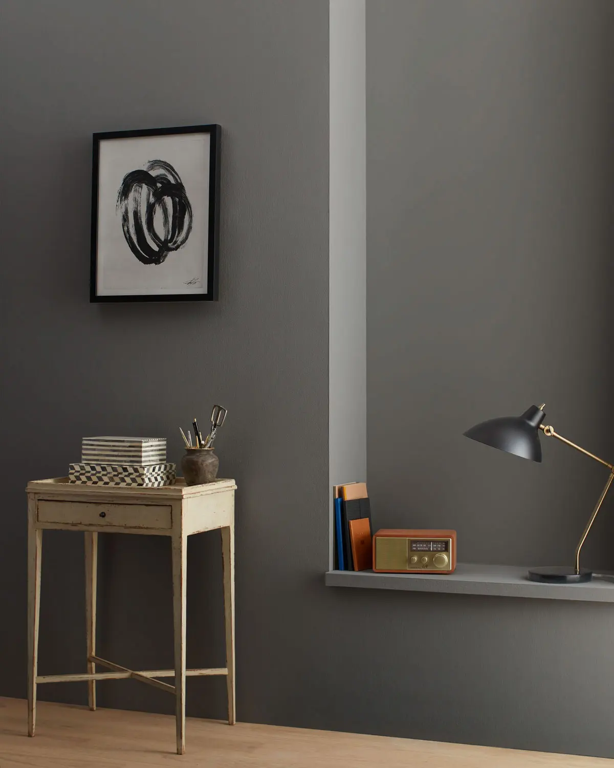
Gray is another versatile choice, particularly when working with cool-toned decor or professional attire. Light gray offers a modern, minimalist vibe, while charcoal gray adds depth and a sense of luxury. When pairing these, consider the following neutral options:
- Cream or off-white for a soft, traditional look.
- Charcoal gray for a sophisticated, masculine edge.
- Beige or taupe to create a warm, earthy atmosphere.
- Black for a bold, dramatic, and high-contrast statement.
How to use metallic accents with burgundy
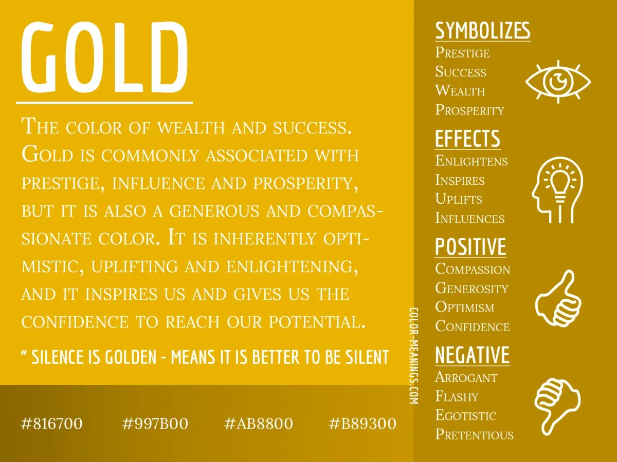
Metallics elevate burgundy from a standard deep red to a regal, opulent color scheme. Gold is the premier choice for this pairing, as the yellow undertones in gold metal reflect the warmth inherent in burgundy. This combination is frequently used in interior design for holiday decor, evening wear, and luxury branding because it signals elegance and prestige.
If you prefer a cooler aesthetic, silver or champagne metals can also work, though they require more careful balancing. To integrate metallics effectively, follow these steps:
- Identify the dominant color; if burgundy is the primary shade, use metallics as secondary accents.
- Choose a finish that matches the mood; polished gold feels formal, while brushed brass feels contemporary.
- Distribute the metal throughout the space or outfit to create visual rhythm.
- Avoid mixing too many different metal tones, as this can clutter the refined look of the burgundy base.
What bold colors complement burgundy?
For those seeking a vibrant, fashion-forward look, pairing burgundy with other saturated colors can be highly effective. Emerald green is a classic complementary choice, as the two colors sit opposite each other on the spectrum of depth and intensity. This pairing is particularly popular in autumn and winter, evoking a sense of richness and natural beauty.
Mustard yellow and navy blue also provide excellent contrast. Mustard yellow adds a playful, energetic pop that breaks up the seriousness of burgundy, while navy blue offers a grounded, nautical-inspired alternative to black. Consider these combinations for bold styling:
- Emerald green for a sophisticated, nature-inspired palette.
- Mustard yellow for a retro or bohemian aesthetic.
- Navy blue for a professional, reliable, and grounded look.
- Blush pink for a softer, more romantic, and modern contrast.
Common mistakes when styling burgundy
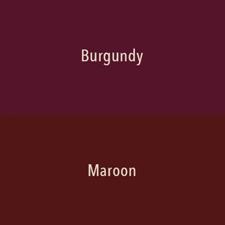
One of the most frequent errors when working with burgundy is pairing it with colors that have clashing undertones. Because burgundy is a deep, cool-leaning red, it can look muddy when placed next to bright, neon oranges or acidic lime greens. These colors fight for visual dominance and can make an outfit or room feel chaotic rather than curated.
Another mistake is failing to account for texture. Because burgundy is a heavy color, it can appear flat if used on too many matte surfaces at once. To avoid this, incorporate varying textures such as velvet, leather, silk, or wood grain. This adds dimension and prevents the color from appearing one-dimensional. Always test your color palette in different lighting conditions, as deep shades often shift significantly between natural daylight and artificial indoor lighting.
Best tips for decorating with burgundy
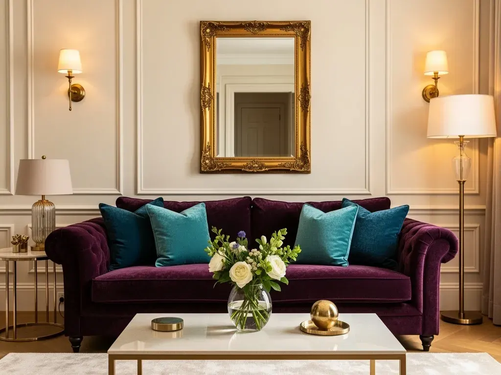
When using burgundy in interior design, balance is the primary goal to ensure the space remains inviting. Use burgundy as an anchor color, such as on a feature wall, a velvet sofa, or large area rugs. By keeping the surrounding walls and flooring in lighter neutral tones, you prevent the room from feeling small or claustrophobic.
To maintain a cohesive look, incorporate the color in smaller doses throughout the room to pull the design together. Use these strategies to achieve a balanced interior:
- Use burgundy throw pillows or curtains to add warmth to a neutral living room.
- Incorporate dark wood furniture, which naturally complements the red undertones of burgundy.
- Add greenery through indoor plants to provide a fresh, living contrast to the deep red.
- Ensure adequate lighting, as dark colors absorb light and can make a room feel dim without proper lamps.
Key facts
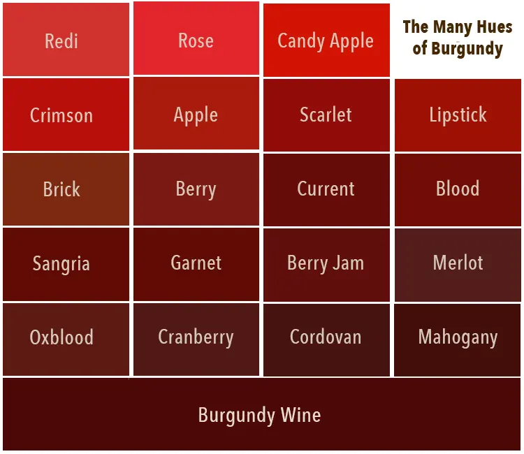
- Burgundy is a deep, brownish-red color named after the wine from the Burgundy region of France.
- Neutrals like cream, beige, and soft gray provide a sophisticated balance to burgundy's intensity.
- Navy blue and forest green create a high-contrast, classic aesthetic when paired with deep red tones.
- Metallic accents, particularly gold and brass, enhance the richness of burgundy, while silver offers a cooler, modern edge.
- Mustard yellow and ochre are complementary choices that create a bold, autumnal color palette.
- Avoid pairing burgundy with bright, neon colors, as these can clash and overwhelm the sophisticated nature of the shade.
The bottom line
Burgundy is a versatile, sophisticated color that thrives when paired with neutrals, metallics, or complementary earthy tones. Whether you are styling an outfit or decorating a room, the key is to balance its deep intensity with lighter or contrasting elements. By avoiding harsh neon clashes and focusing on harmonious color relationships, you can effectively use burgundy to add warmth, elegance, and visual interest to any space.
People also ask
Does burgundy look good with black?
Yes, black and burgundy is a timeless, dramatic combination. However, ensure there is enough light in the room or enough texture in an outfit to prevent the pairing from appearing too dark or somber.
Can I wear burgundy with brown?
Burgundy and brown work well together because they share similar warm, earthy undertones. To make this pairing successful, choose a lighter shade of brown, such as tan or camel, to create visual separation.
Is burgundy considered a neutral color?
While burgundy is a bold hue, it acts as a "power neutral" in fashion and interior design. It provides a strong focal point that can be anchored by traditional neutrals like white, gray, or black.
What colors should I avoid wearing with burgundy?
Avoid pairing burgundy with extremely bright or neon shades like lime green or hot pink. These colors compete for attention and often create a visual clash that distracts from the elegance of the burgundy.
How do I incorporate burgundy into a room without it feeling too dark?
Use burgundy as an accent color through throw pillows, rugs, or artwork rather than painting entire walls. Pair these accents with light-colored furniture or walls to keep the space feeling open and balanced.
Does burgundy match well with denim?
Burgundy is an excellent companion for blue denim. The contrast between the warm red tones and the cool, casual blue creates a balanced look that is perfect for everyday style.
This answer was created with the help of AI research tools and reference sources. Spotted an error? Let us know — we correct mistakes quickly. See our editorial policy.