What colors go with peach?
Short answer
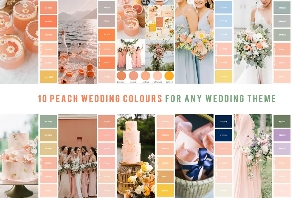
Peach pairs beautifully with soft neutrals like cream and beige for an elegant look, or bold contrasts like navy blue and charcoal for modern depth. Because peach contains warm orange and pink undertones, it harmonizes best with cool greens, crisp whites, and metallic accents like gold or copper to balance its inherent sweetness.
On this page
Which colors complement peach in interior design
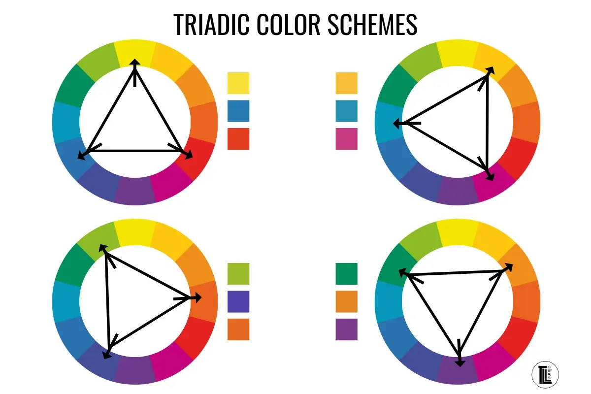
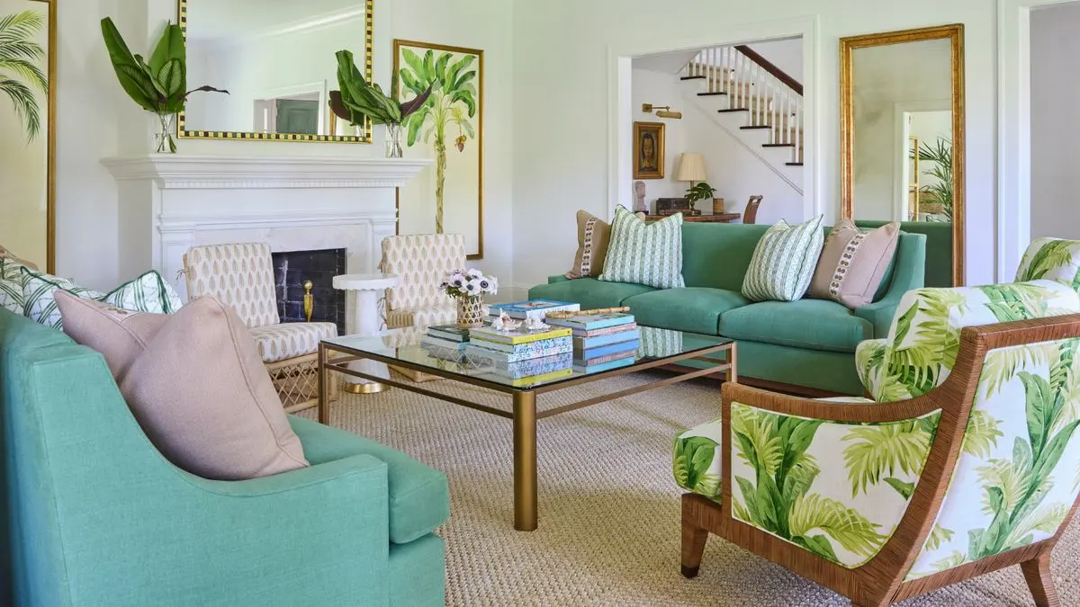
Peach is a versatile, warm hue that bridges the gap between orange and pink. To create a balanced room, interior designers often rely on the color wheel to find complementary or analogous shades. Cool-toned colors provide the most striking contrast, as they neutralize the warmth of the peach. Navy blue, for instance, acts as a sophisticated anchor, preventing a peach-themed room from feeling too sugary or juvenile.
When selecting secondary colors, consider the intensity of the peach shade you are using. A pale, pastel peach works best with airy, light neutrals like crisp white, sand, or soft gray. If you are working with a saturated, vibrant coral-peach, you can afford to introduce deeper, richer tones. The following colors are widely considered the most effective pairings for a professional, cohesive aesthetic:
- Navy blue or midnight blue for high-contrast drama.
- Sage green or olive for a natural, earthy connection.
- Cream, ivory, and soft beige to maintain a light, airy atmosphere.
- Charcoal gray or slate for a modern, grounded look.
- Metallic gold or brass to enhance the warmth of the peach undertones.
How to use peach in a seasonal wardrobe
Incorporating peach into your clothing requires an understanding of your skin’s undertones. Peach is generally a warm color, making it an excellent choice for individuals with golden or olive complexions. If you have cool undertones, you can still wear peach by pairing it with colors that lean toward the blue or green spectrum. This creates a visual bridge that prevents the color from washing out your natural skin tone.
For a polished, everyday outfit, try these combinations to ensure the peach remains the focal point without overwhelming your style:
- Pair a peach blouse with high-waisted navy trousers and white sneakers for a fresh, smart-casual look.
- Layer a peach sweater over a crisp white button-down shirt to add structure and brightness.
- Accessorize a neutral beige or cream dress with peach-toned jewelry or a silk scarf to add a subtle pop of color.
- Combine a peach skirt with an olive green top to create a sophisticated, nature-inspired color palette that feels intentional and stylish.
Best color palettes for graphic design
In graphic design, peach is often used to convey friendliness, approachability, and warmth. Because it is a light, high-value color, it requires strong, dark colors to ensure text remains legible and visual hierarchy is maintained. Using peach as a primary brand color requires careful selection of secondary colors to avoid a "washed out" appearance on digital screens.
Designers often use peach as a background color to soften the impact of bold typography. When designing for web or print, consider these strategic pairings:
- Peach and deep charcoal: This combination is excellent for modern, minimalist websites that want to feel welcoming rather than clinical.
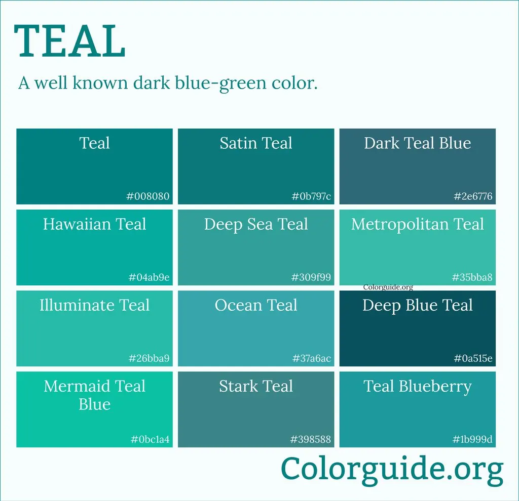
- Peach and teal: This is a classic complementary pairing that feels energetic and creative, often used in branding for wellness or lifestyle companies.
- Peach and terracotta: An analogous palette that creates a sense of harmony and organic warmth, perfect for interior design portfolios or artisanal brands.
- Peach and black: A bold, high-contrast choice that works well for fashion-forward marketing materials, provided the black is used sparingly for accents.

Common mistakes when pairing colors with peach
The most frequent error when working with peach is choosing other warm colors that are too similar in saturation, such as bright yellow or neon orange. This creates a "clashing" effect that makes the space or outfit feel chaotic and visually exhausting. Similarly, avoid pairing peach with harsh, cool-toned neons, which can make the peach look muddy or dirty by comparison.
Another common mistake is ignoring the importance of texture. Because peach is a soft color, it can sometimes appear flat or boring if used on uniform surfaces. To avoid this, mix your materials. If you have peach walls, incorporate textures like velvet, linen, or polished wood to add depth. If you are wearing peach, mix fabrics like silk with denim or leather to create a more dynamic and intentional appearance. Always test your color swatches in the actual light of your room, as peach is notoriously sensitive to changing light conditions throughout the day.
Why peach acts as a neutral in decor
Many designers categorize peach as a "new neutral" because of its ability to blend seamlessly into various styles without dominating a space. Unlike stark white or gray, peach introduces a subtle, humanizing warmth that makes a room feel lived-in and comfortable. It functions effectively as a base color because it reflects light in a way that mimics a sunrise, creating a flattering glow in residential settings.
When you treat peach as a neutral, you gain the freedom to introduce bolder accent colors like emerald green, royal purple, or even mustard yellow. These accents stand out against the peach background, creating a curated look that feels both daring and balanced. By maintaining a foundation of peach, you ensure that your design remains cohesive even when you decide to swap out smaller decor items or accessories. This flexibility makes peach an ideal choice for those who enjoy updating their home decor frequently without needing to repaint or replace large furniture pieces.
Key facts
- Peach is a warm, soft orange-pink hue that pairs naturally with cool tones like sage green or slate blue to create visual balance.
- Pairing peach with crisp white or cream prevents the color from appearing muddy and keeps the overall aesthetic clean and modern.
- For a sophisticated, high-contrast look, combine peach with deep charcoal or navy blue to ground the softness of the pastel.
- Metallic accents such as brushed gold or champagne bronze enhance the warmth of peach, while silver can make it feel cooler and more contemporary.
- Avoid pairing peach with neon or overly saturated primary colors, as these can overwhelm the delicate nature of the shade.
- Using peach as an accent color against a neutral backdrop of beige or taupe creates a serene, monochromatic environment.
The bottom line
To successfully incorporate peach into your design, prioritize balance by pairing its inherent warmth with cool neutrals or grounding dark tones. Whether you are choosing a wardrobe or refreshing a room, avoid clashing it with harsh, neon hues. By utilizing metallic accents and varying textures, you can elevate this soft color into a versatile tool that adds both elegance and comfort to your personal environment.
People also ask
Does peach work well in a kitchen setting?
Peach can look beautiful in a kitchen when paired with white cabinetry or stainless steel appliances. It adds a welcoming, vintage charm that feels less clinical than pure white or gray palettes.
Is peach considered a gendered color for interior design?
While historically associated with feminine aesthetics, peach is a versatile neutral that transcends gender. When paired with masculine textures like leather, dark wood, or industrial metals, it becomes a sophisticated choice for any living space.
Can I wear peach if I have a cool skin undertone?
You can wear peach, but it is best to choose shades that lean more toward pink than orange. Wearing the color away from your face, such as in a skirt or accessories, is a practical way to incorporate it.
What is the difference between peach and coral?
Peach is a pale, muted shade with strong yellow and pink undertones, whereas coral is more vibrant and saturated with deeper orange-red pigments. Coral acts as a bold statement color, while peach functions as a soft neutral.
Should I use peach on all four walls of a room?
Painting all four walls peach can be overwhelming unless the shade is very pale. It is often more effective to use it as an accent wall or to balance it with large neutral furniture pieces.
Does peach go with wood tones?
Peach pairs exceptionally well with light woods like pine or oak, creating a natural, airy feel. Darker woods like walnut provide a striking contrast that makes the peach appear more vibrant and intentional.
This answer was created with the help of AI research tools and reference sources. Spotted an error? Let us know — we correct mistakes quickly. See our editorial policy.