How do you draw a speech bubble?
Short answer
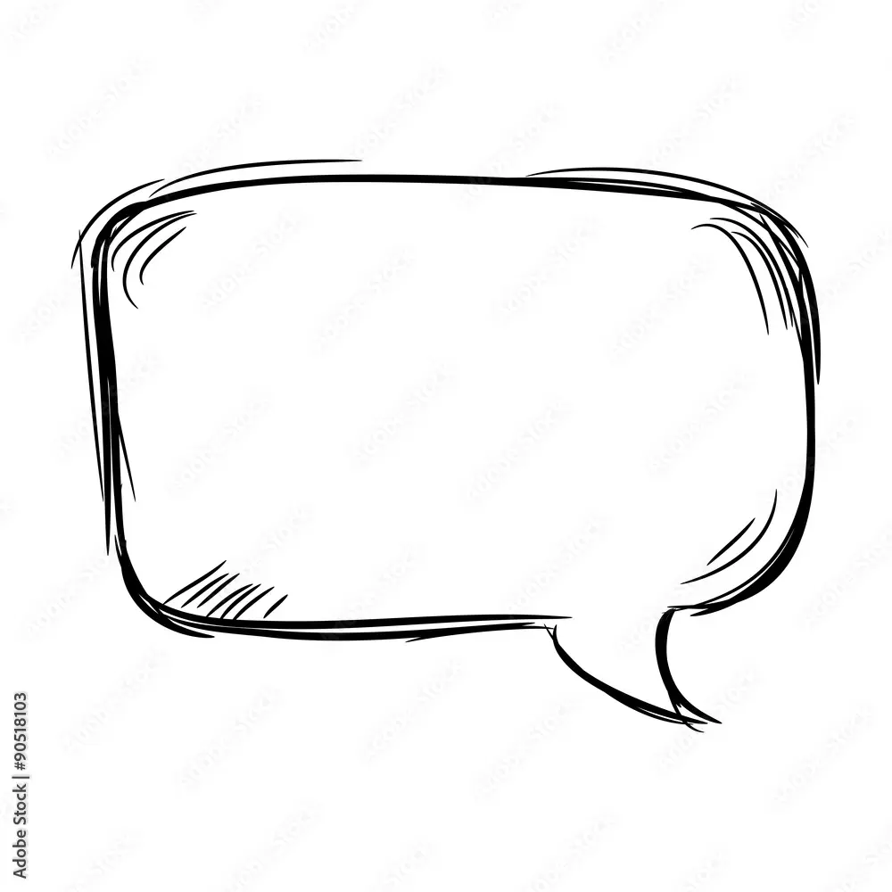
Drawing a speech bubble involves sketching a rounded shape around your text and adding a "tail" pointing toward the speaker. Start by writing your dialogue first to ensure the bubble fits the content. Use smooth, continuous lines for the enclosure and ensure the tail clearly indicates the character currently speaking.
On this page
How to draw a basic speech bubble
The most effective way to create a speech bubble is to prioritize the text before drawing the container. Write your dialogue in the center of the space where you intend the bubble to appear, leaving enough margin for the text to breathe. Once the words are placed, draw a smooth, oval or rectangular shape around the text, maintaining a consistent distance from the letters to ensure the bubble looks balanced and professional.
To achieve a clean look, follow these fundamental steps:
- Write the dialogue clearly in the desired location.
- Lightly sketch a rounded shape around the text, leaving room for margins.
- Refine the outline with a darker pen or marker.
- Add a triangular or curved tail pointing toward the character’s mouth.
- Erase any pencil guidelines that overlap with the ink.
Maintaining consistent margins is crucial for readability. If the bubble is too tight, the text feels cramped and difficult to read; if it is too loose, the bubble may dominate the panel and distract the reader from the artwork.
What tools are best for beginners
For those just starting, simple graphite pencils and fine-liner pens are the most reliable tools. A pencil allows you to adjust the size and shape of the bubble before committing to permanent ink. Using a ruler or a French curve template can help beginners achieve perfect geometric shapes, though hand-drawn bubbles often provide a more organic, artistic feel that suits many comic styles.
When selecting pens, look for archival-quality pigment liners that resist smudging. These tools provide a consistent line width, which is essential for professional-looking speech bubbles. If you are working digitally, use a vector-based brush to ensure your lines remain crisp regardless of how much you zoom in or resize the artwork.
- Use a 2H pencil for initial sketching to avoid dark smudges.
- Select a 0.5mm or 0.8mm ink pen for the final outline.
- Keep an eraser handy to clean up stray marks after inking.
- Utilize a light box if you are tracing over complex backgrounds.
Why speech bubble tails matter
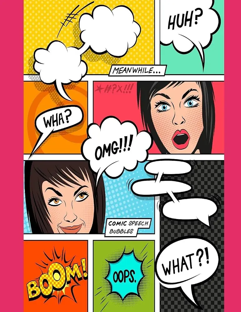
The "tail" of a speech bubble is a vital visual cue that directs the reader’s eye. Its primary function is to identify which character is speaking, especially in panels with multiple people. A well-placed tail should point toward the character’s mouth or head, but it should not physically touch the character, as this can clutter the composition and obscure important details in the illustration.
There are two primary styles of tails: the pointed triangular style and the curved, flowing style. The triangular tail is common in traditional comic books and conveys a sharp, direct tone. The curved tail, often seen in more whimsical or lighthearted strips, feels softer and less aggressive. Regardless of the style, the tail should always emerge from the side of the bubble closest to the speaker to maintain a logical flow of conversation.
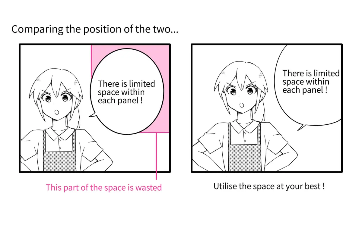
Common mistakes when drawing speech bubbles
One frequent error is failing to plan the bubble size before writing the text. This often results in words being cut off or a bubble that looks lopsided. Another mistake is placing the tail in a way that obscures the character’s facial expressions. Always prioritize the character's eyes and mouth, as these are the most important narrative elements in any panel.
Another common pitfall involves inconsistent line weight. If the bubble outline is significantly thicker or thinner than the character outlines, it will look disconnected from the rest of the artwork. Aim for a line weight that matches the general style of the panel. Furthermore, avoid making the bubbles too complex; overly intricate shapes can distract from the dialogue and make the page look cluttered. Keep the shapes simple to ensure the reader focuses on the story rather than the design.
How to improve speech bubble readability
Readability is the ultimate goal of any speech bubble. To ensure your dialogue is easy to follow, use a clear, legible font or consistent hand-lettering. Avoid decorative scripts that are difficult to decipher at a glance. Additionally, ensure there is sufficient "white space" between the text and the edge of the bubble. This negative space acts as a frame, allowing the eye to process the words without interference from the bubble’s border.
When arranging multiple bubbles in a single panel, follow the natural reading order, which is typically from top to bottom and left to right. If characters are speaking in a specific sequence, overlap the bubbles slightly or arrange them so the tails clearly indicate the order of speech. By maintaining a logical flow and keeping the design clean, you ensure that the reader remains immersed in the narrative. Proper spacing and consistent placement are the hallmarks of a professional layout that enhances rather than hinders the reading experience.
Key facts
- A speech bubble consists of two parts: the main enclosure (the "balloon") and the "tail" or "pointer" that indicates the speaker.
- Ovals and rectangles with rounded corners are the most common shapes for dialogue, while jagged edges typically signify shouting.
- The tail should always point directly toward the speaker's mouth or chin to establish a clear visual connection.
- Keep the text centered within the bubble, leaving a consistent margin of white space between the letters and the border.
- Draw the text first, then draw the bubble around it to ensure the shape fits the content perfectly.
- Use thinner lines for the bubble border to ensure the text remains the primary focus of the reader’s eye.
The bottom line
Drawing an effective speech bubble is a fundamental skill that balances clarity with visual storytelling. By prioritizing the text first, maintaining consistent margins, and ensuring the tail points precisely toward the speaker, you create a seamless reading experience. Whether you are conveying a whisper or a shout, the shape and style of your bubble serve as essential tools to guide the reader through your narrative.
People also ask
How do I show that a character is thinking instead of speaking?
Use a cloud-like, scalloped shape for the bubble and replace the solid tail with a series of small, floating circles that decrease in size as they approach the character.
What is the best way to handle long blocks of dialogue?
Divide the text into two separate bubbles connected by a small gap rather than forcing a large paragraph into one oversized, awkward shape.
Should the tail of the bubble always be straight?
A slight curve in the tail often looks more natural and dynamic than a rigid, perfectly straight line, helping it integrate better with the character's posture.
How can I indicate a whisper in a comic strip?
Draw the bubble with a dashed or dotted line border to suggest a softer, quieter volume compared to the solid lines used for normal speech.
Where should the bubble be placed on the page?
Place bubbles in the top-left corner of the frame if possible, as readers in Western cultures naturally scan from the top-left toward the bottom-right.
What pens are best for drawing speech bubbles?
Fine-liner pens with a consistent tip size are ideal for creating clean, professional borders that do not distract from the hand-drawn quality of the artwork.
This answer was created with the help of AI research tools and reference sources. Spotted an error? Let us know — we correct mistakes quickly. See our editorial policy.